
@hogiyogi597/react-otp-input
v3.1.1
Published
A fully customizable, one-time password input component for the web built with React
Downloads
33
Maintainers
 hogiyogi597
Readme
react-otp-input


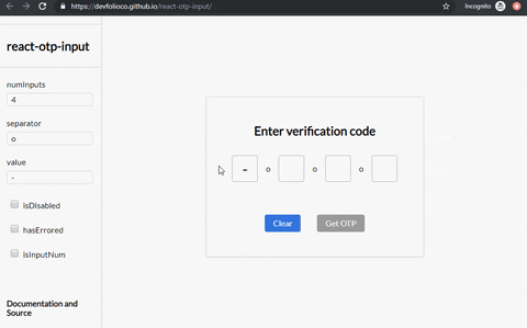
A fully customizable, one-time password input component for the web built with React.
Installation

To install the latest stable version:
npm install --save react-otp-inputStill using v2?
No problem! You can find the documentation for v2 here
Basic usage:
import React, { useState } from 'react';
import OtpInput from 'react-otp-input';

export default function App() {
  const [otp, setOtp] = useState('');

  return (
    <OtpInput
      value={otp}
      onChange={setOtp}
      numInputs={4}
      renderSeparator={<span>-</span>}
      renderInput={(props) => <input {...props} />}
    />
  );
}
API
⚠️ Warning
Do not override the following props on the input component that you return from the renderInput prop. Doing so might lead to unexpected behaviour.
refvalueonChangeonFocusonBluronKeyDownonPasteonInputtypeinputMode
Migrating from v2
The v3 of react-otp-input is a complete rewrite of the library. Apart from making the API more customizable and flexible, this version is a complete rewrite of the library using TypeScript and React Hooks. Here are the breaking changes that you need to be aware of:
You now need to pass your own custom input component that will be rendered for each of the input fields via
renderInputprop. This gives you the flexibility to customize the input fields as you desire. This also means that props likefocusStyle,isDisabled,disabledStyle,hasErrored,errorStyle,isInputNum,isInputSecure,data-cyanddata-testidare no longer supported. You can achieve the same functionality and more by passing the relevant props directly to the input component that you return from therenderInputprop.The
separatorprop has now been renamed torenderSeparator. This prop now apart from accepting a component that will be rendered as a separator between inputs like it used to, now also accepts a function that returns a component. The function will get the index of the separator being rendered as an argument.A new prop called
inputTypehas been added to the component. This prop can be used to specify the type of the input that will be passed to the input element being rendered. The default value of this prop isnumber.
Migrating from v1
react-otp-input is now a controlled component to facilitate functionalities that weren't possible before from the application using it, such as clearing or pre-assigning values. For v1.0.0 and above, a value prop needs to be passed in the component for it to function as expected.
Development
To run the vite example:
cd example
npm run dev
Checklist

- [ ] Write tests
- [ ] Add actions for lint checks and tests
Contributing


Feel free to open issues and pull requests!
License

Contributors ✨
Thanks goes to these wonderful people (emoji key):
This project follows the all-contributors specification. Contributions of any kind welcome!