
@huymobile/react-native-country-codes-picker
v1.0.4
Published
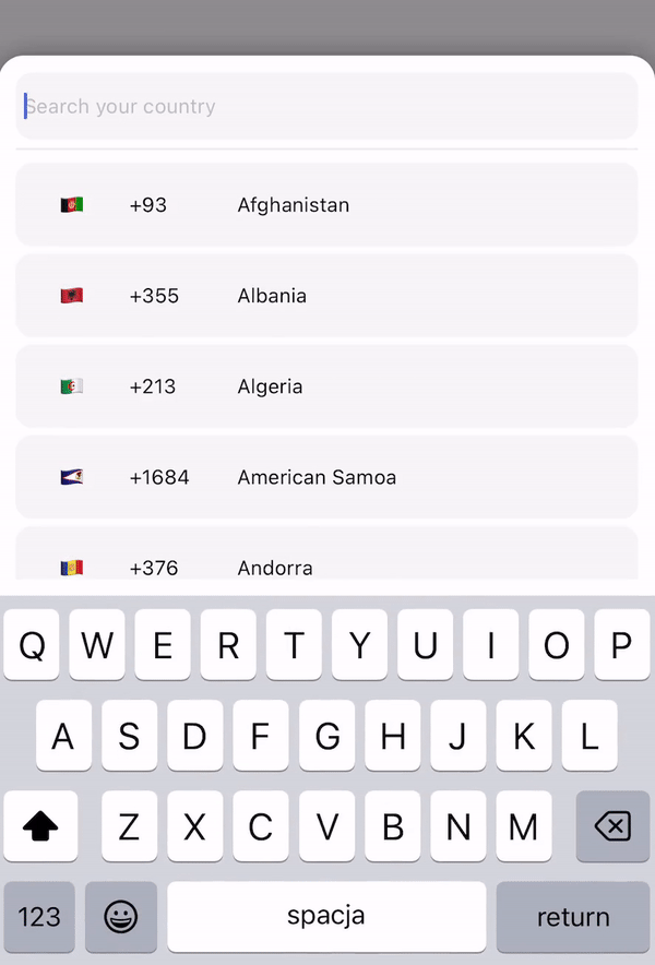
This lib. provide country iso picker with search functionality
Maintainers
 huymobile
Readme
React Native Country Codes Picker
⚡️ A versatile, multilingual country picker and country list component with search functionality for React Native and Expo applications. Fully cross-platform with support for multiple languages and customizable styling.
Features
- Modal and List view components
- Multi-language support
- Search functionality with diacritics handling
- Customizable styling
- Popular countries section
- Custom header components
- Keyboard avoidance
- Accessibility support
- React Native Reanimated v3 support
Installation
# Using npm
npm install @huymobile/react-native-country-codes-picker

# Using yarn
yarn add @huymobile/react-native-country-codes-picker

# Using expo
expo install @huymobile/react-native-country-codes-picker
This package requires react-native-reanimated (>= 3.0.0) as a peer dependency.
Example
Basic Usage
Modal Component
import { CountryPicker } from "react-native-country-codes-picker";
import { useState } from "react";
import { View, Text, TouchableOpacity } from "react-native";

export default function App() {
  const [show, setShow] = useState(false);
  const [countryCode, setCountryCode] = useState('');

  return (
    <View style={styles.container}>
      <TouchableOpacity
        onPress={() => setShow(true)}
        style={{
          width: '80%',
          height: 60,
          backgroundColor: 'black',
          padding: 10,
        }}
      >
        <Text style={{
          color: 'white',
          fontSize: 20
        }}>
          {countryCode || "Select Country"}
        </Text>
      </TouchableOpacity>

      <CountryPicker
        show={show}
        pickerButtonOnPress={(item) => {
          setCountryCode(item.dial_code);
          setShow(false);
        }}
        onBackdropPress={() => setShow(false)}
      />
    </View>
  );
}
Modal with Popular Countries Header
import { CountryPicker } from "react-native-country-codes-picker";
import { CountryButton } from "react-native-country-codes-picker";
import { useState } from "react";
import { View, Text, TouchableOpacity } from "react-native";

function ListHeaderComponent({countries, lang, onPress}) {
    return (
        <View
            style={{
                paddingBottom: 20,
            }}
        >
            <Text>
                Popular countries
            </Text>
            {countries?.map((country, index) => {
                return (
                    <CountryButton
                        key={index}
                        item={country}
                        name={country?.name?.[lang || 'en']}
                        onPress={() => onPress(country)}
                    />
                )
            })}
        </View>
    )
}

export default function App() {
  const [show, setShow] = useState(false);
  const [countryCode, setCountryCode] = useState('');

  return (
    <View style={styles.container}>
      <TouchableOpacity
        onPress={() => setShow(true)}
        style={{
          width: '80%',
          height: 60,
          backgroundColor: 'black',
          padding: 10,
        }}
      >
        <Text style={{
          color: 'white',
          fontSize: 20
        }}>
          {countryCode || "Select Country"}
        </Text>
      </TouchableOpacity>

      <CountryPicker
        show={show}
        pickerButtonOnPress={(item) => {
          setCountryCode(item.dial_code);
          setShow(false);
        }}
        onBackdropPress={() => setShow(false)}
        ListHeaderComponent={ListHeaderComponent}
        popularCountries={['us', 'gb', 'ca', 'au']}
      />
    </View>
  );
}
List Component
import { CountryList } from "react-native-country-codes-picker";
import { useState } from "react";
import { View, Text } from "react-native";

export default function App() {
  const [countryCode, setCountryCode] = useState('');

  return (
    <View style={styles.container}>
      <View
        style={{
          width: '80%',
          height: 60,
          backgroundColor: 'black',
          padding: 10,
        }}
      >
        <Text style={{
          color: 'white',
          fontSize: 20
        }}>
          {countryCode || "Select Country"}
        </Text>
      </View>

      <CountryList
        lang="en"
        pickerButtonOnPress={(item) => {
          setCountryCode(item.dial_code);
        }}
      />
    </View>
  );
}
Props
| Prop | Type | Default | Description |
|------|------|---------|-------------|
| show | boolean | | Controls the visibility of the modal picker. |
| pickerButtonOnPress | function | | Callback function that receives the selected country data. |
| inputPlaceholder | string | | Custom placeholder text for the search input. |
| searchMessage | string | | Custom message shown during search. |
| lang | string | 'en' | Language code for country names (see Supported Languages). |
| enableModalAvoiding | boolean | false | Enable keyboard avoidance for the modal. |
| androidWindowSoftInputMode | string | | Android-specific keyboard behavior ('pan' recommended if enableModalAvoiding is true). |
| itemTemplate | ReactNode | CountryButton | Custom template component for list items (receives: key, item, style, name, onPress). |
| style | Object | | Custom styles object for the component (see Styling section). |
| disableBackdrop | boolean | false | Disables the modal backdrop if set to true. |
| onBackdropPress | function | | Callback function when the backdrop is pressed. |
| initialState | string | | Pre-selects a country by dial code (e.g., '+1'). |
| excludedCountries | string[] | | Array of country codes to exclude from the list. |
| showOnly | string[] | | Array of country codes to exclusively show in the list. |
| popularCountries | string[] | | Array of country codes to pass to ListHeaderComponent as popular countries. |
| ListHeaderComponent | JSX.Element | | Custom header component for the list (receives: countries, lang, onPress). |
Additionally, you can use any standard props from React Native's FlatList and TextInput components for further customization.
Performance Props
The component also accepts performance optimization props:
| Prop | Type | Description |
|------|------|-------------|
| getItemLayout | function | Pre-computes heights for better performance. |
| windowSize | number | Number of items to render in the window. |
| removeClippedSubviews | boolean | Detaches off-screen views to improve memory usage. |
| maxToRenderPerBatch | number | Maximum number of items to render per batch. |
| initialNumToRender | number | Initial number of items to render. |
Accessibility Props
| Prop | Type | Description |
|------|------|-------------|
| accessibilityLabel | string | Accessibility label for the picker. |
| accessibilityHint | string | Accessibility hint for the picker. |
| accessibilityRole | string | Accessibility role for the picker. |
| searchAccessibilityLabel | string | Accessibility label for the search input. |
| searchAccessibilityHint | string | Accessibility hint for the search input. |
| countryItemAccessibilityLabel | function | Function that returns accessibility label for country items. |
| countryItemAccessibilityHint | string | Accessibility hint for country items. |
Styling
You can customize the appearance using the style prop:
<CountryPicker
    show={show}
    lang="en"
    style={{
        // Modal container
        modal: {
            height: 500,
            backgroundColor: '#FFFFFF',
            borderRadius: 10,
        },
        // Modal backdrop
        backdrop: {
            backgroundColor: 'rgba(0, 0, 0, 0.6)',
        },
        // Bottom line separator
        line: {
            backgroundColor: '#DDDDDD',
            height: 1,
        },
        // Countries list
        itemsList: {
            paddingVertical: 5,
        },
        // Search input
        textInput: {
            height: 50,
            borderRadius: 10,
            padding: 10,
            backgroundColor: '#F0F0F0',
        },
        // Country button
        countryButtonStyles: {
            height: 60,
        },
        // Search message text
        searchMessageText: {
            fontSize: 16,
            color: '#888888',
        },
        // Search message container
        countryMessageContainer: {
            padding: 20,
        },
        // Flag text
        flag: {
            fontSize: 24,
        },
        // Dial code text
        dialCode: {
            fontSize: 14,
            color: '#666666',
        },
        // Country name text
        countryName: {
            fontSize: 16,
            color: '#333333',
        }
    }}
    pickerButtonOnPress={(item) => {
        setCountryCode(item.dial_code);
        setShow(false);
    }}
    onBackdropPress={() => setShow(false)}
/>
Supported Languages
The component includes translations for country names in the following languages:
en - English
ru - Russian
pl - Polish
ua - Ukrainian
cz - Czech
by - Belarusian
pt - Portuguese
es - Spanish
ro - Romanian
bg - Bulgarian
de - German
fr - French
nl - Dutch
it - Italian
cn - Chinese
ee - Estonian
jp - Japanese
he - Hebrew
tr - Turkish
Testing
For automated testing, the component provides the following test IDs:
- The wrapping
FlatList:countryCodesPickerFlatList - The search
TextInput:countryCodesPickerSearchInput - The country button
TouchableOpacity:countryCodesPickerCountryButton
Contributing
Contributions are welcome! If you'd like to add support for additional languages or features, please create a pull request.
License
ISC
Created by George Hope with contributions from Huy Tran and the community.