
@iamkoushik/kp-textinput
v1.0.27
Published
This is a simple TextInput
Maintainers
 iamkoushik
Readme
KPTextInput
A simple react-native implementation of TextInput.
Features
- Can be used as a Custom TextInput
- Custom Styling
- Supports Password show/hide
- Supports Label Text as TextInput Label
Getting started
Install the library using either Yarn:
npm i @iamkoushik/kp-textinputor yarn:
js
yarn add @iamkoushik/kp-textinput
Usage
import KPTextInput from '@iamkoushik/kp-textinput';
const App = () => {
const [value, setValue] = useState('');
return (
<View>
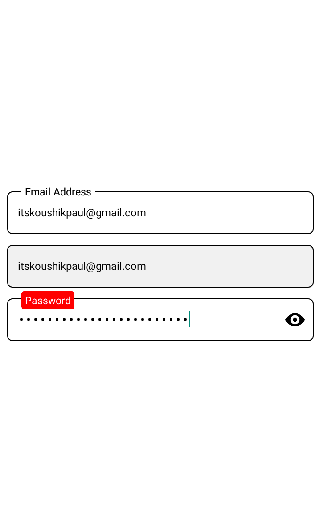
<KPTextInput
textboxStyle={{ height: 48, fontSize: 14, marginTop: 12 }}
placeholder="Email Address"
textboxvalue={value}
type={"email-address"}
isPassword={false}
onChangeText={(value) => setValue(value)}
keyboardType={"default"}
labelplaceholder="Email Address"
/>
<KPTextInput
textboxStyle={{ height: 48, fontSize: 14, marginTop: 12 }}
placeholder="Email Address"
textboxvalue={value}
type={"email-address"}
isPassword={false}
onChangeText={(value) => setValue(value)}
keyboardType={"default"}
editable={false} // Can't edit now
isShowLabel={false} // Not to show the label text
/>
<KPTextInput
labelBackgroundColor="red"
customlabelStyle={{ borderRadius: 3, padding: 2 }}
labelTextColor="#fff"
textboxStyle={{ height: 48, fontSize: 15, marginTop: 12, fontWeight: 'bold' }}
placeholder="Password"
textboxvalue={value}
type={"email-address"}
isPassword={true} // To show the TextInput as Password field
onChangeText={(value) => setValue(value)}
keyboardType={"default"}
showPassword={true}
labelplaceholder="Password"
/>
</View>
)
}Properties
| Name | Type | Description | Default
| ------------ | ------------- | ------------ |------------ |
| textboxStyle | Object | Custom styling | {}
| textboxvalue | String | value of the textinput | ''
| isPassword | Boolean | To show as Password | false
| isShowLabel | Boolean | To show the label | false
| showPassword | Boolean | To show the eye-icon | false
| editable | Boolean | To restrict the edit mode | false
| onChangeText | Function (value: String) | Function called when user start typing | null
| labelBackgroundColor | String | Background color of the Label text | "#fff"
| labelTextColor | String | Text color of the Label | "#000"
Contributing
If you'd like to see something added or changed to this module please open a new GitHub issue. Pull requests are always welcome.
License
© Koushik Paul