
@icelii/ngx-api-paginator
v1.0.2
Published
A modern, lightweight, and highly customizable pagination component for Angular standalone applications with Tailwind CSS support.

Maintainers
 icelii
Readme
@icelii/ngx-api-paginator
A lightweight, modern, and customizable pagination component for Angular 22+, built with Signals, Standalone Components, and Tailwind CSS.


Preview
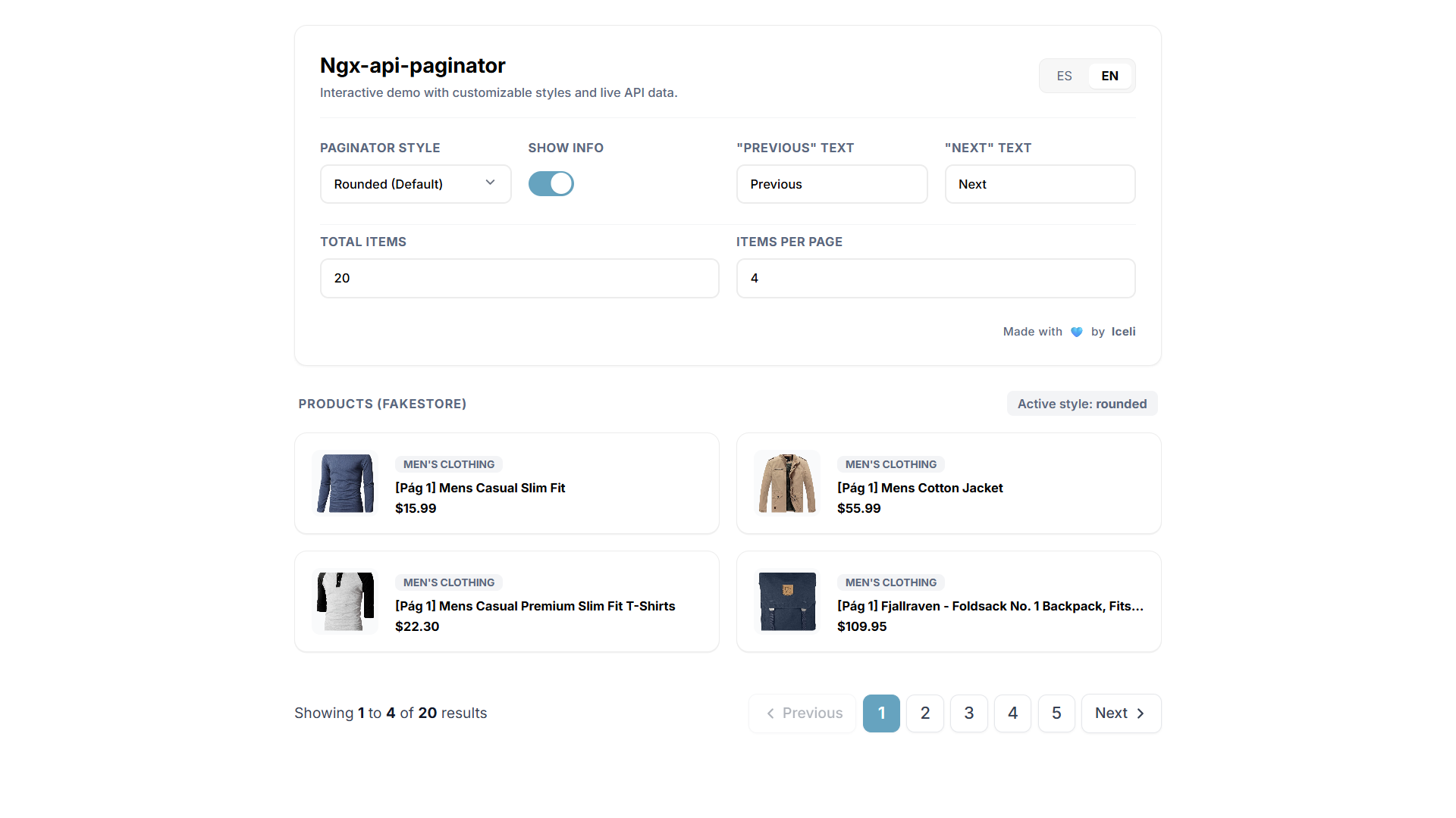
Features
- ⚡ Angular Signals
- 🧩 Standalone component
- 🎨 Tailwind CSS
- 🎯 6 built-in styles
- 🔢 Automatic page calculation
- ✨ Smart pagination with ellipsis
- 🌍 Customizable labels
- 📱 Responsive design
- 🎨 Customizable primary color
- 🧭 Semantic pagination navigation
- 🔌 Works with any paginated API
- 🪶 Lightweight and easy to integrate
Installation
npm install @icelii/ngx-api-paginatorUsage
Import the component into your standalone Angular component:
import { Component, signal } from '@angular/core';
import { NgxApiPaginator } from '@icelii/ngx-api-paginator';

@Component({
  selector: 'app-products',
  standalone: true,
  imports: [NgxApiPaginator],
  template: `
    <lib-ngx-api-paginator
      [currentPage]="currentPage()"
      [perPage]="perPage()"
      [totalItems]="totalItems()"
      (pageChanged)="onPageChange($event)"
    />
  `,
})
export class ProductsComponent {
  currentPage = signal(1);
  perPage = signal(10);
  totalItems = signal(120);

  onPageChange(page: number) {
    this.currentPage.set(page);

    // Fetch the selected page from your API.
  }
}
The component automatically calculates the number of pages from:
Math.max(1, Math.ceil(totalItems / perPage))You only need to provide currentPage, perPage, and totalItems.
API Integration
The paginator does not make API requests. It handles the pagination UI and emits the selected page.
For example, if your API returns:
{
  "data": [],
  "total": 120
}
Update your signals with the API response:
this.items.set(data.data);
this.totalItems.set(data.total);
Then request the selected page when pageChanged is emitted:
onPageChange(page: number) {
  this.currentPage.set(page);
  this.fetchProducts(page);
}
The library is independent of your backend framework and API response format.
Styles
Six built-in styles are available:
| Style | Description |
| ---------- | -------------------------------------- |
| rounded | Rounded buttons with borders. Default. |
| circle | Circular buttons and active page. |
| minimal | Minimal text-based appearance. |
| flat | Flat buttons with subtle backgrounds. |
| bordered | Square buttons with visible borders. |
| shadow | Rounded buttons with elevated shadows. |
Example:
<lib-ngx-api-paginator
  [currentPage]="currentPage()"
  [perPage]="perPage()"
  [totalItems]="totalItems()"
  style="circle"
  (pageChanged)="onPageChange($event)"
/>
Custom Primary Color
The paginator uses the --primary-color CSS variable for its primary elements.
Add it to your global stylesheet:
:root {
  --primary-color: #7c3aed;
}
Any valid CSS color can be used.
Custom Labels
The default language is Spanish, but all displayed labels can be customized.
English
<lib-ngx-api-paginator
  textShowing="Showing"
  textTo="to"
  textOf="of"
  textResults="results"
  textPrevious="Previous"
  textNext="Next"
/>
Spanish
<lib-ngx-api-paginator
  textShowing="Mostrando"
  textTo="a"
  textOf="de"
  textResults="resultados"
  textPrevious="Anterior"
  textNext="Siguiente"
/>
The inputs can also receive Signals or computed values, making them suitable for dynamic translations.
Inputs
| Input | Type | Default |
| -------------- | ------------------------------------------------------------------------ | -------------- |
| currentPage | number | 1 |
| perPage | number | 10 |
| totalItems | number | 0 |
| style | 'rounded' \| 'circle' \| 'minimal' \| 'flat' \| 'bordered' \| 'shadow' | 'rounded' |
| showInfo | boolean | true |
| textShowing | string | "Mostrando" |
| textTo | string | "a" |
| textOf | string | "de" |
| textResults | string | "resultados" |
| textPrevious | string | "Anterior" |
| textNext | string | "Siguiente" |
totalPagesis calculated automatically and is not required as an input.
Outputs
| Output | Type | Description |
| ------------- | -------------------------- | ------------------------------- |
| pageChanged | OutputEmitterRef<number> | Emits the selected page number. |
Example:
<lib-ngx-api-paginator
  (pageChanged)="onPageChange($event)"
/>
onPageChange(page: number) {
console.log('Selected page:', page);
}Optional Controls
Hide results information
<lib-ngx-api-paginator
  [showInfo]="false"
/>
Hide Previous/Next labels
<lib-ngx-api-paginator
  textPrevious=""
  textNext=""
/>
This is useful for compact or mobile layouts.
Requirements
- Angular 22+
- Tailwind CSS
The component uses Tailwind utility classes internally.
Contributing
Contributions are welcome.
To report a bug, suggest an improvement, or propose a new feature, please visit the GitHub repository.
For larger changes, consider opening an issue first to discuss the proposal.
License
MIT © Iceli
Author
Iceli
- Website: https://iceli.dev/
- GitHub: https://github.com/Icelii