
@icke1983/node-red-contrib-ui-multistyle-button
v1.2.0
Published
Node-RED UI widget button that can be styled by input
Downloads
33
Maintainers
 icke1983
Readme
node-red-contrib-ui-multistyle-button Readme
node-red-contrib-ui-multistyle-button is a button for the Node-RED Dashboard that can be styled by input
Install
Directly in Node-RED via palette manager
Start Node-RED
Select 'Manage palette' from menu top-right
Click on the Install tab
Search for ui-multistyle-button in the searchbar and find node-red-contrib-ui-multistyle-button
Manual install
Run command on Node-RED installation directory.
npm install node-red-contrib-ui-multistyle-buttonUsage
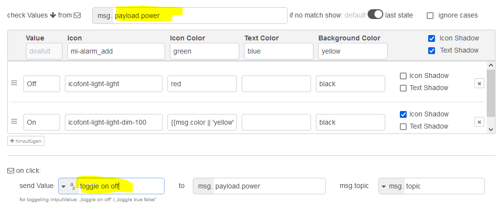
That Button can be styled by the input. Therfor you have to specify the styleoptions of any value, you want. Set the default style.

For each added value, you can set the style-properties separately.
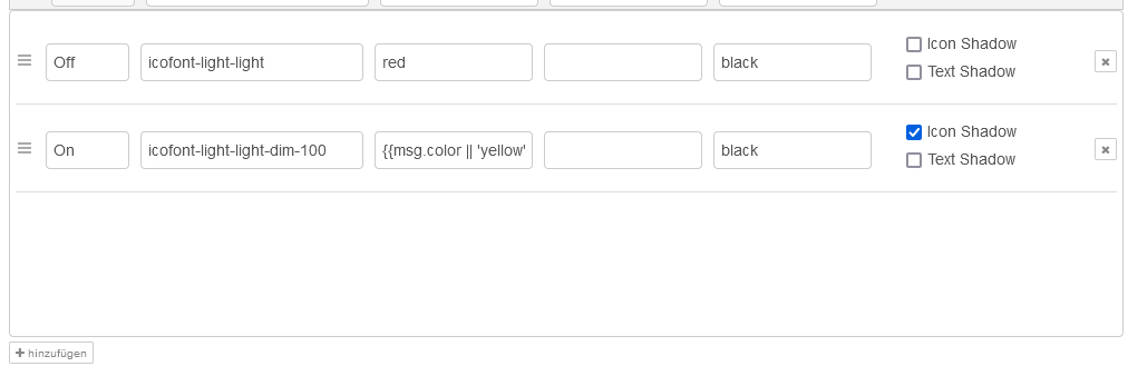
You can use fa-icons, mi-icon and all other icons that are installed.
The colors can be specified by name (e.g. red), by HEX code (e.g. #FF0000) or by rgb-command (e.g. rgb (255, 0, 0) ).
Also the color can get the value of a 'msg.object'. Therfor set the colorfield to {{msg.color}}
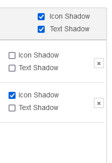
Enable shadows for the icon an thh text seperatly.
Add an additional Label into one corner of the button.

Leave blank the styleoptions if you don't want to specify them.
Determine which 'msg.object' should be considered. It can also be any other object than 'msg.payload'. You can look at 'msg.payload.power' for example. Set the option for behavior when no match is found. Set the option for use or ignore cases of the value letters

Determine the value and the destination 'msg.object' which will be sent at buttonclick.
you can send a string, a number, a bool value or the value of an input 'msg.objeck'
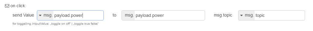
Special strings are toggle on off or toggle true false.
That will toggle the selected input 'msg.object' to the output at buttonclick.
License
The MIT License