
@ilya.sizov/react-datetimepicker
v0.3.8
Published
Date range picker with time
Downloads
110
Maintainers
 ilya.sizov
Readme
React Advanced Date Time Range Picker :rocket: :guitar: :volcano:
This is a fully rewritten, keyboard friendly implementation of a date time range picker. It has been designed for selecting date ranges and currently include a single date picker.
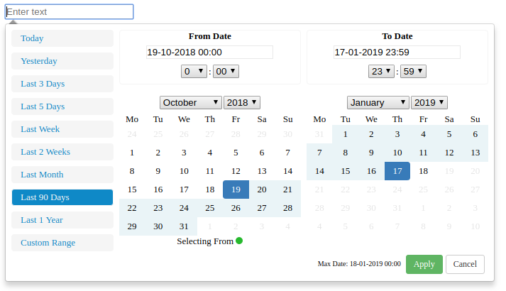
Default:
(New)Calendar mode added:
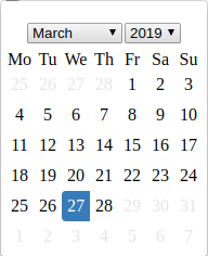
If you want to use simple calendar:
import { CalendarContainer } from '@ilya.sizov/react-datetimepicker'
...
...
...
 <CalendarContainer
   value={this.state.calendarDate}
   maxDate={maxDate}
   onChange={this.onCalendarDateChanged}
   local={local}
 >
     <input
         id="formControlsTextC"
         type="text"
         label="Text"
         placeholder="Select date"
     />
 </CalendarContainer>
See full example below(Wrapper.jsx).
Setup
Run the following command:
npm install @ilya.sizov/react-datetimepickerGeneral Info
This project is based upon v0ltoz/react-datetimepicker (https://github.com/v0ltoz/react-datetimepicker)
What changed:
- Bootstrap completely removed.
- Css styling removed from internal components and moved to wrapper level. One css file for all. Feel free to change it.
- All libs including react updated to actually versions.
- Removed react-dot-fragment package, instead used native React 16 Fragment component.
My goal - to get working component with minimum dependencies. I need it for my projects, but i do not want to add weight to my .js bundle. I do not need jQuery(thanks to v0ltoz). I do not need Bootstrap.
What can be improved(if you have time :muscle:):
- After bootstrap removing i've lost all icons(because component was removed). Would be great to include pretty icons for inputs and selects.
- Would be great to fix tests.
- Would be great to improve default styling for more pretty look.
Properties Required
ranges {React.Object}
Object of ranges that will be you default ranges. Example:
const ranges = {
            "Today Only": [moment(start), moment(end)],
            "Yesterday Only": [moment(start).subtract(1, "days"), moment(end).subtract(1, "days")],
            "3 Days": [moment(start).subtract(3, "days"), moment(end)]
        }
start (Required) {Moment Object}
Initial Start Date that will be selected, should be a moment object
end (Required) {Moment Object}
Initial End Date that will be selected, should be a moment object
local (Required) {Object}
Defines a local format for date labels to be shown as. Can also set Sunday to be first day or Monday. Local object accepts format and sunday first params.
--> format: moment display format --> sundayFirst: True Sunday the first day of the week. False, Monday first day of the week.
const local = {
    "format":"DD-MM-YYYY HH:mm",
    "sundayFirst" : false
}
applyCallback (Required) {React.func} Function which is called when the apply button is clicked/pressed. Takes two params, that start date and the end date.
function applyCallback(startDate, endDate) {
    ...
}
maxDate (optional) {Moment Object} Maximum date that can be selected.
Getting Started
import React, { Fragment } from 'react';
import moment from 'moment';
import DateTimeRangeContainer from './lib/index'
import { CalendarContainer } from './lib/index'
import './DateTimeRange.css'

class Wrapper extends React.Component {

    constructor(props){
        super(props);
        let now = new Date();
        let start = moment(new Date(now.getFullYear(), now.getMonth(), now.getDate(), 0,0,0,0));
        let end = moment(start).add(1, "days").subtract(1, "seconds");
        // start = moment(start).subtract(34, "months").subtract(1, "seconds");
        // end = moment(start).add(5, "days").add();
        this.state = {
            start : start,
            end : end,

            // for calendar
            calendarDate: start,
        }

        this.applyCallback = this.applyCallback.bind(this);
        this.onCalendarDateChanged = this.onCalendarDateChanged.bind(this);
    }

    applyCallback(startDate, endDate){
        console.log("Apply Callback");
        console.log(startDate.format("DD-MM-YYYY HH:mm"));
        console.log(endDate.format("DD-MM-YYYY HH:mm"));
        this.setState(
            {
                start: startDate,
                end : endDate
            }
        )

      if(this.props.onChange) {
        this.props.onChange({
          start: startDate.toISOString(),
          end: endDate.toISOString(),
        })
      }
    }

    onCalendarDateChanged(date) {
       const formatDate = date.format("DD-MM-YYYY")
       console.log(formatDate)
       this.setState({
           calendarDate: date,
       })

       if(this.props.onCalendarChange) {
           this.props.onCalendarChange()
       }
    }

    onRangeChanged(value, startDate, endDate) {
        console.log(value, startDate, endDate)
        this.applyCallback(startDate, endDate)
    }

     render(){
        let now = new Date();
        let start = moment(new Date(now.getFullYear(), now.getMonth(), now.getDate(), 0,0,0,0));
        let end = moment(start).add(1, "days").subtract(1, "seconds");
        let ranges = {
            "Today": [moment(start), moment(end)],
            "Yesterday": [moment(start).subtract(1, "days"), moment(end).subtract(1, "days")],
            "Last 3 Days": [moment(start).subtract(3, "days"), moment(end)],
            "Last 5 Days": [moment(start).subtract(5, "days"), moment(end)],
            "Last Week": [moment(start).subtract(7, "days"), moment(end)],
            "Last 2 Weeks": [moment(start).subtract(14, "days"), moment(end)],
            "Last Month": [moment(start).subtract(1, "months"), moment(end)],
            "Last 90 Days": [moment(start).subtract(90, "days"), moment(end)],
            "Last 1 Year": [moment(start).subtract(1, "years"), moment(end)],
        }
        let local = {
            "format":"DD-MM-YYYY HH:mm",
            "sundayFirst" : false
        }
        let maxDate = moment(start).add(24, "hour")
         return(
             <Fragment>
                 {
                     true &&
                     <DateTimeRangeContainer
                         ranges={ranges}
                         start={this.state.start}
                         end={this.state.end}
                         local={local}
                         maxDate={maxDate}
                         applyCallback={this.applyCallback}
                         onRangeChanged={this.onRangeChanged}
                     >
                         <input
                             id="formControlsTextB"
                             type="text"
                             label="Text"
                             placeholder="Select range of dates"
                         />
                     </DateTimeRangeContainer>
                 }
                 {
                     true &&
                         <div className="simple-calendar">
                             <CalendarContainer
                               value={this.state.calendarDate}
                               maxDate={maxDate}
                               onChange={this.onCalendarDateChanged}
                               local={local}
                             >
                                 <input
                                     id="formControlsTextC"
                                     type="text"
                                     label="Text"
                                     placeholder="Select date"
                                 />
                             </CalendarContainer>
                         </div>
                 }
             </Fragment>
         );
     }
}
export { Wrapper };
Available Scripts
In the project directory, you can run:
npm start
Runs the app in the development mode. Open http://localhost:3000 to view it in the browser.
The page will reload if you make edits. You will also see any lint errors in the console.
npm test
Launches the test runner in the interactive watch mode. See the section about running tests for more information.
npm run build
Builds the app for production to the build folder.
It correctly bundles React in production mode and optimizes the build for the best performance.
npm test -- --coverage
Gets test coverage when running tests to see how much of the code is covered by your tests.