
@ionizeio/canvas
v3.4.2
Published
Universal React Native UI kit: one component API renders natively on iOS, Android, and web.

Maintainers
 nannier
Readme
@ionizeio/canvas
One universal React Native UI kit that renders natively on iOS and Android, and on the web through React Native Web, from a single component API.
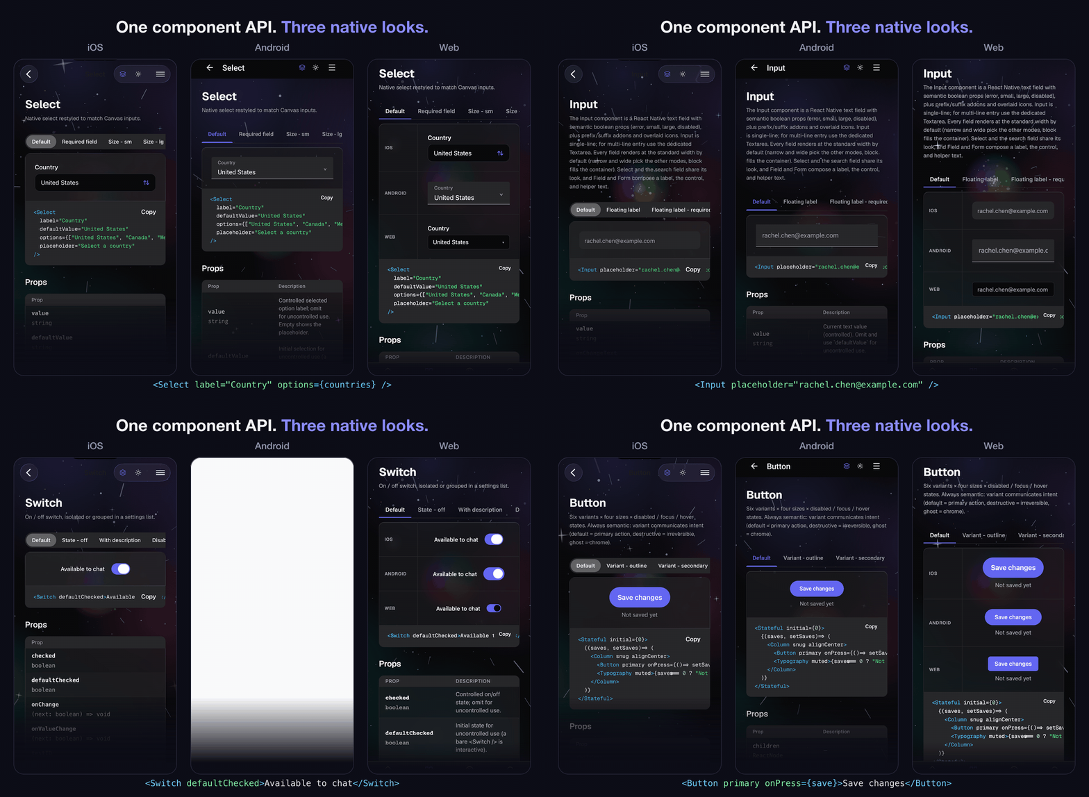


Try it live: the component catalog renders the full library (atoms, molecules, organisms, and charts) in the browser, with dark mode, the glass surface, and density switchable site-wide.
Write your screen once and it runs everywhere. Canvas is built from React Native primitives, React Native SVG, and its own components, so the same tree renders on device and in the browser with each platform's skin. Components are styled with semantic boolean props, expose accessibility roles and state on all three platforms, and are authored desktop-first so they scale down cleanly to phone. Shared material rendering integrates native iOS Liquid Glass, native frost and browser-specific effects where supported. Appearance, material capability and interaction behavior are verified separately on each runtime.
Install
npm install @ionizeio/canvasCanvas ships compiled (no build step in your app) and declares three required peer dependencies you install alongside it:
npm install react react-native react-native-svgOptional peers
Install the optional peers needed by your app's features. The package remains usable without them, with the following fallbacks:
| Package | Install only if | Without it |
| --- | --- | --- |
| react-native-qrcode-svg | you render QR codes with QRCode | the accessible, sized frame remains empty and warns once in development |
| expo-glass-effect | you want native Liquid Glass on supported iOS 26+ devices | forced glass uses expo-blur when available, otherwise the skin's solid fill; automatic surface mode remains solid |
| @ionizeio/canvas-blur | you want Canvas backdrop capture and frost on Android 12+ in Expo SDK 57 (module 0.1.0+) | Canvas uses another supported material or the complete solid appearance |
| expo-blur | you want static frost on iOS, including content beneath iOS 26 Liquid Glass, or supported legacy Android frost | surfaces use their solid fill when no other material is available; browser frost/lenses, native Liquid Glass and the Android capture module remain independent |
| expo-video | you play clips with Video | the frame keeps its size and poster, labeled, and warns once in development |
| expo-clipboard | you want CodeBlock to copy text on native | web can use navigator.clipboard; native copying needs a supplied onCopy handler |
| react-native-safe-area-context | you want safe-area insets in Canvas shells, with your app's SafeAreaProvider | safe-area wrappers render as plain views without insets |
# add any subset you actually use
npm install react-native-qrcode-svg expo-video expo-glass-effect expo-blur expo-clipboard react-native-safe-area-context
# Android native capture also requires rebuilding your custom native app
npm install @ionizeio/canvas-blur
Quick start
Wrap your app once in ThemeProvider, then compose components imported from @ionizeio/canvas. The provider supplies the active color scheme, surface, and token map to every component below it.
import { ThemeProvider, Card, CardHeader, CardTitle, CardContent, Button } from "@ionizeio/canvas";

export default function App() {
  return (
    <ThemeProvider>
      <Card padded>
        <CardHeader>
          <CardTitle>Welcome to Canvas</CardTitle>
        </CardHeader>
        <CardContent>
          <Button primary large onPress={() => console.log("saved")}>
            Save
          </Button>
        </CardContent>
      </Card>
    </ThemeProvider>
  );
}
That exact tree renders natively on iOS and Android and, through React Native Web, in the browser. There is no separate web component set to learn.
For a complete runnable application, see the Expo starter. It independently installs the published Canvas package and includes workspace editing, validation, theme preferences, and nested overlays on web, iOS, and Android. Its source follows the repository's all-rights-reserved terms.
Overlay hosting
Mount an OverlayProvider inside ThemeProvider, outside scrolling page content,
and let it fill the app window. Dropdowns, selects, autocompletes and popovers then
share measured viewport bounds, move above their triggers when needed, and scroll
long content within the available height. Opening a hosted menu preserves the
trigger's native view hierarchy and focus.
Nested providers can scope where cards are placed without restricting them to the
height of a short form. They inherit the root's visible bounds. A card that closes
on an outside tap still paints in the window's outermost provider, at the place
its nearest provider gives it, so a tap anywhere off it closes it, and the page
under it takes no touches until it closes. Use
<OverlayProvider viewport> for a deliberately bounded nested panel, whose size
must come from its viewport rather than its content. Use
<OverlayProvider separateWindow> inside a custom React Native Modal; its
measurements must not inherit bounds from a different native window, and without
it a card that closes on an outside tap paints in the main window's outermost
provider, behind the Modal. Canvas Drawer supplies this boundary automatically.
When page content scrolls under a header, declare the header's measured height as
viewportInsets={{ top: headerHeight }} on the root or a nested viewport host.
The optional bottom inset similarly reserves an overlapping footer. Insets are
relative to that host's own box and are intersected with the keyboard boundary;
changing them updates open cards without remounting their content.
Android keyboard avoidance supports full-screen edge-to-edge windows through native keyboard events, and legacy resize-mode windows through their measured root bounds. Legacy pan/nothing modes and multi-window coordinates are not supported. iOS uses the keyboard frame; at the RN 0.74 support floor, this requires a full-screen window because that RN version reports screen coordinates. Current RN converts the frame to window coordinates. Web fitting uses the layout viewport; RNW does not expose the mobile keyboard's visual viewport. Clipping ancestors that are not viewport hosts do not contribute additional bounds. With no provider, the legacy inline overlay remains available, but has no viewport fitting or outside-tap backdrop.
Styling with semantic boolean props
Every visual variation is a flat boolean prop named for its meaning; passing the prop turns it on, so the call site reads like natural language.
<Button primary large>Save</Button>
<Button destructive>Delete</Button>
<Button ghost small>Cancel</Button>
<Badge success>Active</Badge>
<Card raised selected>...</Card>
Props are grouped into orthogonal axes (intent, size, density, plus stacking state and layout flags). Props on different axes combine freely; within one axis they are mutually exclusive, so you pass at most one and the component resolves any conflict by a fixed precedence.
// Four props from four axes, all applied together.
<Button primary large loading block>Save</Button>
String-valued enum props such as variant="primary", size="lg", or tone="destructive" are not part of the API and are not accepted. The boolean form is the only styling surface, and there is no style-override escape hatch.
Platforms
Canvas targets all three platforms from one install. The only thing that changes is which peers your app already provides.
- Expo apps use the required peers and any optional modules needed by their features. The docs app in this repository is a working Expo example, including native glass and blur modules.
- Bare React Native works the same way once the required peers are installed and linked (
react-native-svgneeds the usual autolinking / pod install). Add the optional peers if you want QRCode or full-fidelity glass. - Web via React Native Web needs one bundler step: install
react-native-weband aliasreact-nativetoreact-native-web, exactly as any RNW project does. Web bundlers use the defaultdist/index.jsentry. On the web you can also flip glass at runtime with the exportedsetSurface("glass")/setSurface("solid")DOM helper.
Metro selects dist/native/index.js through the react-native export condition
or legacy field. That compiled output preserves Metro's iOS and Android module
selection, including native material helpers. No custom Canvas resolver is needed
in consumer apps. Public declarations and the web ESM build remain in dist/.
bun run dev watches both outputs and syncs them to local consumer overlays.
bun run verify-native-consumer packs the build and bundles an isolated React
Native consumer for both platforms with all optional peers omitted. CI also runs
this check on the exact sealed tarball before it can be published.
Theming
ThemeProvider reads the OS color scheme by default and exposes the resolved tokens to every Canvas component through the useTheme hook. Optional props control it:
dark/light(booleans): the scheme axis, spelled like every other Canvas axis (darkwins if both are passed). Omit both to follow the OS appearance. The legacyschemevalue prop ("light" | "dark") stays supported for code that already holds a scheme value.mint(boolean): the palette axis. Omit it for Dark Factory's blush palette, the light default; pass it for Dark Factory's mint. Dark Factory has one dark palette, sodarkwins overmint.ssrPaletteholds a server-rendered palette through hydration the wayssrSchemeholds the scheme, and on the websetPalette("mint")/getPalette()switch the CSS hand-off throughdata-palette="mint"(.darkstill wins).glass/solid(booleans): the surface axis, spelled like every other Canvas axis. Omit both for the platform default (glass on supported iOS 26+, solid elsewhere);glassrequests the material treatment, andsolidrequests complete opaque surfaces. Accessibility preferences and runtime capability determine the rendered material.glasswins if both are passed. The legacysurfacevalue prop ("solid" | "glass") stays supported for config-driven code holding aSurfacevalue.tokens: brand token overrides merged over the active palette, so you can rebrand without forking the token files. Pass a flatPartial<ColorTokens>to apply to both schemes, or{ light, dark }to override each separately. Use a stable reference (a module constant or memoized object). A nested provider resolves only its owntokens(and its own scheme, palette and surface), which is how a subtree shows a palette or brand of its own; pass the same constant again to carry a rebrand into it.fonts: the typefaces the app registered (typeface.sansis Manrope,typeface.monoGeist Mono), as one family per role or a map from weight to the registered face. Pass it once, on the root provider: a nestedThemeProviderthat omits it keeps the nearest parent's faces, and one that passes it uses its own map in place of the parent's ({}returns that subtree to the system face). Omit it on the root and the kit renders in the system face. Use a stable reference.
const brand = { primary: "#7c3aed" };

<ThemeProvider dark glass tokens={brand}>
  <App />
</ThemeProvider>
primary colors filled controls, and primary-foreground colors their labels.
The optional action and action-foreground roles color the call-to-action (the
primary Button and the split button's action) apart from primary, which keeps
what is selected, checked, current, linked or focused. The default palette, Dark
Factory's, sets the two apart: a green call to action beside a violet selection
color. Omitted from a custom token map, actions paint with primary; a
tokens={{ primary: ... }} rebrand repaints actions with its primary pair unless you
pass action too.
The optional primary-text token colors brand text on neutral surfaces, including
links, text actions, and focused Android field labels. The default palette gives
that text its own contrast-safe shade in each scheme. Existing tokens={{ primary: ... }} overrides keep their
brand text color; provide primary-text too when your brand needs a separate shade.
The optional destructive-text role serves error text and destructive text
actions. destructive remains the fill and graphic color, and
destructive-foreground remains the label on that fill. Existing
tokens={{ destructive: ... }} overrides also supply the error text color unless
you provide destructive-text separately. Menus with a documented fixed red
palette keep that palette independently of semantic token overrides.
Custom colors still need contrast checks against the surfaces where you use them. The default text contrast checks cover solid and tonal surfaces. Glass materials depend on the content behind them and need verification in the rendered app.
The material contract distinguishes stable glass content surfaces from functional Liquid Glass, while labels, images, chart marks and layout wrappers remain sharp and unpainted. Native Liquid Glass does not require custom wobble. Explicit solid mode and material fallbacks must restore opaque fill, foreground, boundary and elevation without losing input focus or application state. Android blur needs a safe live backdrop target; a tint-only path does not establish native blur support.
On Android 12+ with Expo SDK 57, the optional @ionizeio/canvas-blur integration
keeps a stable native content host and records only while a glass surface uses it.
OverlayProvider supplies a sibling target to its overlays and a separate-window
target to native modals. Without a safe target, supported
module or hardware material, the complete solid skin remains visible. Modern Expo
blur targets are not kept recording in solid mode. The Android module requires a
native rebuild; Expo Go does not contain it.
The maintained material inventory records intended coverage and verification obligations, not completed runtime evidence.
CSS hand-off consumers should override --primary, --primary-text and --action
(with --action-foreground) when rebranding. For a single-color brand, set
--primary-text: var(--primary), --action: var(--primary) and
--action-foreground: var(--primary-foreground) at the override scope. CSS does not perform the
ThemeProvider override cascade. The same rule applies to destructive colors:
set --destructive-text explicitly, or use --destructive-text: var(--destructive)
to retain the previous single-color behavior.
Documentation and components
Full docs, live examples, and the complete prop reference live at https://canvas.nannier.com/.
DESIGN.md ships with the package: the token values, the type roles,
the shape and elevation scales, and the four API rules that are easy to break by
accident. It is written to be read by an agent building on the kit as much as by a
person, and its numbers are generated from the kit's own sources.
The kit exports components across atoms, molecules, organisms, and charts, all from @ionizeio/canvas:
- Forms and inputs: Button, Button Group, Input, Textarea, Checkbox, Radio, Switch, Slider, Stepper, Input OTP, Select, Autocomplete, Listbox.
- Overlays: Dialog, Alert Dialog, Drawer, Popover, Tooltip, Dropdown, Action Sheet, Toast, Command palette.
- Navigation: Tabs, Tab Bar, Navbars, Sidebar, Breadcrumb, Pagination, Steps.
- Data and content: Data Table, Stacked / Grid Lists, Stats, Calendar, Charts, Card, Avatar, Badge, Description Lists, Media Objects, QR Code.
- Disclosure and feedback: Accordion, Collapsible, Carousel, Progress, Skeleton, Spinner, Alert, Empty State.
Alongside the components, the package exports the style foundation: the theme runtime (ThemeProvider, useTheme), the design tokens (token, hsl), the responsive and motion helpers (useResponsive, useReducedMotion), the glass helpers (liquidGlassAvailable, setSurface), and React Native primitives (View, Text, Pressable, TextInput, ScrollView). Image is a Canvas atom with semantic fit props.
Contributing
Contributions are welcome. CONTRIBUTING.md covers the Bun-based setup, the docs app you develop against, the check battery, and the design principles (semantic boolean props, no styling escape hatches, React Native everywhere) that contributions are reviewed against.
Security
Please report vulnerabilities privately; see SECURITY.md. Do not open public issues for security problems.
License
The compiled package distributed on npm as @ionizeio/canvas is licensed under
MIT. Its tarball includes the license and copyright notice.
The source repository is not covered by that grant and remains all rights reserved. These are separate terms for the distributed package and the repository source.
© 2026 Bobby Nannier.