
@iqs/react-datetimepicker
v2.0.7
Published
datetimepicker
Downloads
99


Readme
Datetimepicker
A simple and reusable Datepicker component for React
Demo Page: https://iq-service-inc.github.io/react-datetimepicker/
Quick Start
Install
npm i @iqs/react-datetimepicker --saveInstall peerDependencies
npm install --save @fortawesome/react-fontawesome prop-types react-intl依賴圖示
使用:@fortawesome/react-fontawesome
使用到的 Icon : faArrowUP, faArrowDown, farCalendar,需要事先被引入
npm install --save @fortawesome/fontawesome-svg-core @fortawesome/free-solid-svg-icons @fortawesome/free-regular-svg-iconsimport { library } from '@fortawesome/fontawesome-svg-core'
import {
faArrowUp,
faArrowDown,
} from '@fortawesome/free-solid-svg-icons'
import {
faCalendar as farCalendar
} from '@fortawesome/free-regular-svg-icons'
export default () => library.add(
farCalendar,
faArrowUp,
faArrowDown,
)多國語系
使用:react-intl
部分字詞使用<FormattedMessage>
⚠️ v2.0.6 起,
datetime.today的翻譯改為透過Intl.RelativeTimeFormat自動取得各語系的本地化文字,無需再設定datetime.today翻譯。
datetime.today:今天
// zh
{
    "datetime.today": "今天"
}
// en
{
"datetime.today": "Today"
}⚠️ v2.0.5 起,AM/PM 顯示改為透過
Intl.DateTimeFormat自動取得各語系的本地化文字,無需再設定datetime.am/datetime.pm翻譯。
datetime.am:上午datetime.pm:下午
// zh
{
    "datetime.today": "今天",
    "datetime.am": "上午",
    "datetime.pm": "下午"
}
// en
{
"datetime.today": "Today",
"datetime.am": "AM",
"datetime.pm": "PM"
}Usage
import { Datetimepicker } from '@iqs/datetimepicker'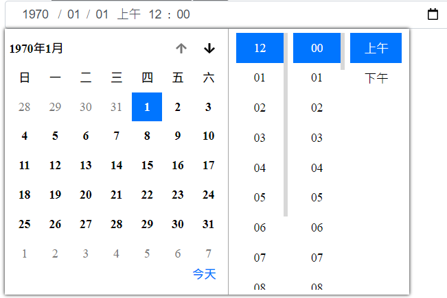
import '@iqs/datetimepicker/index.styl'<Datetimepicker>需要在<IntlProvider>之下才能運作Datetimepicker預設使用 12 小時制(AM 00:00 ~ PM 11:59,0 顯示為 12),可用use24hours切換為 24 小時制(00:00 ~ 23:59)
import React, { Component } from 'react'
import { IntlProvider } from 'react-intl'
import { Datetimepicker } from '@iqs/datetimepicker'
import '@iqs/datetimepicker/index.styl'

class AppComp extends Component {
    constructor(props) {
        super(props)
        this.state = {
            value: '2030-6-27T03:24',
        }
        this.hideInput = React.createRef()
    }

    submit(e) {
        e.preventDefault()
        this.setState({value: e.target['birth'].value})
        e.persist()
    }

    setValue = (value) => {
        this.setState({value})
    }

    render() {
        const { intl: { language } } = this.props
        const { value } = this.state
        return (
            <IntlProvider defaultLocale='zh' {...language}>
                <form onSubmit={(e) => this.submit(e)} id="datetime">
                    <Datetimepicker
                        max='+022030-05-27T03:24'
                        min='2030-07-27T03:24'
                        value={value}
                        // value='2030-06-27T03:24'
                        id="birth"
                        name="birth"
                        classname="birthinput"
                        inputRef={this.hideInput}
                        onChange={(value) => this.setValue(value)}
                        // nodate
                        // notime
                        // autofocus
                        // use24hours
                        disabled={['month','date']}
                    ></Datetimepicker>
                </form>
                <input type="submit" form="datetime"></input>
                <div>
                    {`value: ${value}`}
                    {!!this.hideInput.current && `ref: ${this.hideInput.current.value}`}
                </div>
            </IntlProvider>
        )
    }
}
Datetimepicker props
max、min: 選填,預設1970/1/1 am 00:00 ~ 275759/12/31 pm 11:59,使用解析字串的方式建立Date物件,格式依照瀏覽器不同可能會出錯,格式錯誤無法解析會使用預設值,建議格式yyyy-mm-ddThh:mm,若年大於4位數格式寫為+yyyyyy-mm-ddThh:mmmax='+022030-05-27T03:24' min='2030-07-27T03:24'value: 選填,預設為min,格式錯誤無法解析會使用預設值,( 可利用onChange取值更新,寫成Controlled Component )value='2030-06-27T03:24' value='+022030-06-27T03:24'id: 選填,預設為datetime,datetime field的idname: 選填,預設為datetime,datetime field的nameclassname: 選填,用於調整input欄位樣式,調整focus樣式使用:focus-withininputRef: 選填,當作datetime field的ref,( datetime field的value為string,e.g.2020-01-22T13:20)onChange: 選填,datetime field的值變動時會執行該function,回傳datetime field的value ( e.g.2020-10-22T13:20)nodate: 選填,是否開啟Date(年、月、日)的部分,回傳值的格式hh:mm。⚠️ 僅在未定義displayPattern時有效notime: 選填,是否開啟Time(上/下午、時、分)的部分,回傳值的格式yyyy-mm-dd或+yyyyyy-mm-dd。⚠️ 僅在未定義displayPattern時有效autofocus: 選填,focus可填的第一格inputuse24hours: 選填,使用 24 小時制顯示與輸入,true為 24 小時制,false為 12 小時制並顯示上午下午。⚠️ 僅在未定義displayPattern時有效,定義displayPattern時由HH/hh自動判定displayPattern: 選填,自訂輸入框的欄位顯示順序與分隔符號。支援的 token:| Token | 說明 | |-------|------| |
yyyy| 年 | |MM| 月 | |dd| 日 | |hh| 時(12 小時制) | |HH| 時(24 小時制) | |mm| 分 | |tt| 上午/下午 |其餘字元作為分隔符號顯示。未傳入時使用預設 pattern(
yyyy/MM/ddtthh:mm)。 當displayPattern中使用HH時,會自動視為 24 小時制,不需額外傳入use24hours。displayPattern也會影響彈出式日曆的顯示:- 當 pattern 中不包含
yyyy、MM、dd任一欄位時,整個日期選擇器(datebox)會隱藏 - 當 pattern 中不包含
HH/hh、mm、ss、tt任一欄位時,整個時間選擇器 (timebox) 會隱藏 - 當 pattern 中缺少特定欄位(如無
yyyy),該欄位會在日曆中自動被 disabled(例如年份選擇器、月份切換按鈕)
// 日/月/年 <Datetimepicker displayPattern="dd/MM/yyyy" /> // 年-月-日 時:分 上下午 <Datetimepicker displayPattern="yyyy-MM-dd hh:mm tt" /> // 24 小時制(自動判定,不需帶 use24hours) <Datetimepicker displayPattern="yyyy/MM/dd HH:mm" />- 當 pattern 中不包含
valuePattern: 選填,自訂value的解析格式以及onChange回傳值的輸出格式。支援的 token 與displayPattern相同。傳入時,value會依照此 pattern 解析,onChange也會依此格式輸出。未傳入時,value使用預設的YYYY-MM-DDTHH:MM格式解析,onChange依據nodate、notime自動判斷預設輸出格式。⚠️tt固定輸出為AM/PM,不受語系影響// 輸入框顯示 日/月/年,onChange 回傳 dd/MM/yyyy 格式 <Datetimepicker displayPattern="dd/MM/yyyy" valuePattern="dd/MM/yyyy" /> // 輸入框顯示完整格式,onChange 回傳自訂格式 <Datetimepicker displayPattern="yyyy/MM/dd HH:mm" valuePattern="yyyy-MM-dd HH:mm" />disabled: 選填,bool時禁用全部欄位,array時可禁用特定欄位disabled={['year,'month','date','ampm','hour','min']}
Dev Mode
Install
git clone https://github.com/iq-service-inc/react-datetimepicker.git
cd react-datetimepicker
npm install --save @fortawesome/react-fontawesome prop-types react-intl
npm install
npm run start
Pack Component
打包 datetimepicker
npm run umdTest Pack Component
啟動 port 999 dev server
npm run umdtestGitHub Pages
App.jsx 為 GitHub Pages Demo Page,如果有進行修改,在 commit 前先使用以下指令把更動 deploy 到 GitHub Pages 上
npm run deployLicense
Datetimepicker is MIT licensed