
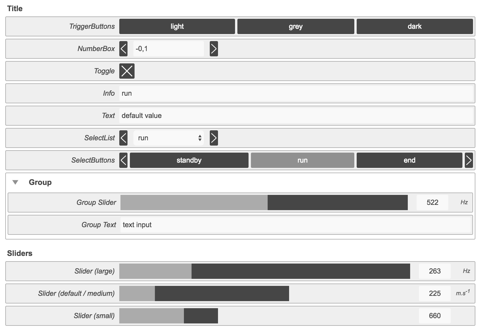
@ircam/basic-controllers
v1.0.4
Published
Set of simple controllers for rapid prototyping
Downloads
47


Readme
Basic Controllers
Set of simple controllers for rapid prototyping
Install
npm install [--save] @ircam/basic-controllersExamples
Available components
- DragAndDrop
- Group
- NumberBox
- SelectButtons
- SelectList
- Slider
- Text
- Title
- Toggle
- TriggerButtons
Usage
Controllers can be instanciated individually:
import * as controllers from '@ircam/basic-controllers';

// instanciate individual components
const slider = new controllers.Slider({
  label: 'My Slider',
  min: 20,
  max: 1000,
  step: 1,
  default: 537,
  unit: 'Hz',
  size: 'large',
  container: '#container',
  callback: (value) => console.log(value),
});
Or through a factory using a json definition:
import * as controllers from '@ircam/basic-controllers';

const definitions = [
  {
    id: 'my-slider',
    type: 'slider',
    label: 'My Slider',
    size: 'large',
    min: 0,
    max: 1000,
    step: 1,
    default: 253,
  }, {
    id: 'my-group',
    type: 'group',
    label: 'Group',
    default: 'opened',
    elements: [
      {
        id: 'my-number',
        type: 'number-box',
        default: 0.4,
        min: -1,
        max: 1,
        step: 0.01,
      }
    ],
  }
];

const controls = controllers.create('#container', definitions);
controls.addListener((id, value) => console.log(id, value));
API
basic-controllers
- basic-controllers
- static
- inner
- ~DragAndDrop
- new DragAndDrop(config)
- .value : Object.<String, (AudioBuffer|JSON)>
- ~Group
- new Group(config)
- .value : String
- .state : String
- ~NumberBox
- new NumberBox(config)
- .value : Number
- ~SelectButtons
- new SelectButtons(config)
- .value : String
- .index : Number
- ~SelectList
- new SelectList(config)
- .value : String
- .index : Number
- ~Slider
- new Slider(config)
- .value : Number
- ~Text
- new Text(config)
- .value : String
- ~Title
- ~Toggle
- new Toggle(config)
- .value : Boolean
- .active : Boolean
- ~TriggerButtons
- new TriggerButtons(config)
- .value : String
- .index : String
- ~DragAndDrop
basic-controllers.setTheme(theme)
Change the theme of the controllers, currently 3 themes are available:
'light'(default)'grey''dark'
Kind: static method of basic-controllers
| Param | Type | Description | | --- | --- | --- | | theme | String | Name of the theme. |
basic-controllers~DragAndDrop
Drag and drop zone for audio files returning AudioBuffers and/or JSON
descriptor data.
Kind: inner class of basic-controllers
- ~DragAndDrop
- new DragAndDrop(config)
- .value : Object.<String, (AudioBuffer|JSON)>
new DragAndDrop(config)
| Param | Type | Default | Description | | --- | --- | --- | --- | | config | Object | | Override default parameters. | | [config.label] | String | 'Drag and drop audio files' | Label of the controller. | | [config.labelProcess] | String | 'process...' | Label of the controller while audio files are decoded. | | [config.audioContext] | AudioContext | | Optionnal audio context to use in order to decode audio files. | | [config.container] | String | Element | basic-controller~Group | | Container of the controller. | | [config.callback] | function | | Callback to be executed when the value changes. |
Example
import * as controllers from 'basic-controllers';

const dragAndDrop = new controllers.DragAndDrop({
  container: '#container',
  callback: (results) => console.log(results),
});
dragAndDrop.value : Object.<String, (AudioBuffer|JSON)>
Get the last results
Kind: instance property of DragAndDrop
Read only: true
basic-controllers~Group
Group of controllers.
Kind: inner class of basic-controllers
- ~Group
- new Group(config)
- .value : String
- .state : String
new Group(config)
| Param | Type | Default | Description | | --- | --- | --- | --- | | config | Object | | Override default parameters. | | config.label | String | | Label of the group. | | [config.default] | 'opened' | 'closed' | 'opened' | Default state of the group. | | [config.container] | String | Element | basic-controller~Group | | Container of the controller. |
Example
import * as controllers from 'basic-controllers';

// create a group
const group = new controllers.Group({
  label: 'Group',
  default: 'opened',
  container: '#container'
});

// insert controllers in the group
const groupSlider = new controllers.Slider({
  label: 'Group Slider',
  min: 20,
  max: 1000,
  step: 1,
  default: 200,
  unit: 'Hz',
  size: 'large',
  container: group,
  callback: (value) => console.log(value),
});

const groupText = new controllers.Text({
  label: 'Group Text',
  default: 'text input',
  readonly: false,
  container: group,
  callback: (value) => console.log(value),
});
group.value : String
State of the group ('opened' or 'closed').
Kind: instance property of Group
group.state : String
Alias for value.
Kind: instance property of Group
basic-controllers~NumberBox
Number Box controller
Kind: inner class of basic-controllers
new NumberBox(config)
| Param | Type | Default | Description | | --- | --- | --- | --- | | config | Object | | Override default parameters. | | config.label | String | | Label of the controller. | | [config.min] | Number | 0 | Minimum value. | | [config.max] | Number | 1 | Maximum value. | | [config.step] | Number | 0.01 | Step between consecutive values. | | [config.default] | Number | 0 | Default value. | | [config.container] | String | Element | basic-controller~Group | | Container of the controller. | | [config.callback] | function | | Callback to be executed when the value changes. |
Example
import * as controllers from 'basic-controllers';

const numberBox = new controllers.NumberBox({
  label: 'My Number Box',
  min: 0,
  max: 10,
  step: 0.1,
  default: 5,
  container: '#container',
  callback: (value) => console.log(value),
});
numberBox.value : Number
Current value of the controller.
Kind: instance property of NumberBox
basic-controllers~SelectButtons
List of buttons with state.
Kind: inner class of basic-controllers
- ~SelectButtons
- new SelectButtons(config)
- .value : String
- .index : Number
new SelectButtons(config)
| Param | Type | Default | Description | | --- | --- | --- | --- | | config | Object | | Override default parameters. | | config.label | String | | Label of the controller. | | [config.options] | Array | | Values of the drop down list. | | [config.default] | Number | | Default value. | | [config.container] | String | Element | basic-controller~Group | | Container of the controller. | | [config.callback] | function | | Callback to be executed when the value changes. |
Example
import * as controllers from 'basic-controllers';

const selectButtons = new controllers.SelectButtons({
  label: 'SelectButtons',
  options: ['standby', 'run', 'end'],
  default: 'run',
  container: '#container',
  callback: (value, index) => console.log(value, index),
});
selectButtons.value : String
Current value.
Kind: instance property of SelectButtons
selectButtons.index : Number
Current option index.
Kind: instance property of SelectButtons
basic-controllers~SelectList
Drop-down list controller.
Kind: inner class of basic-controllers
- ~SelectList
- new SelectList(config)
- .value : String
- .index : Number
new SelectList(config)
| Param | Type | Default | Description | | --- | --- | --- | --- | | config | Object | | Override default parameters. | | config.label | String | | Label of the controller. | | [config.options] | Array | | Values of the drop down list. | | [config.default] | Number | | Default value. | | [config.container] | String | Element | basic-controller~Group | | Container of the controller. | | [config.callback] | function | | Callback to be executed when the value changes. |
Example
import * as controllers from 'basic-controllers';

const selectList = new controllers.SelectList({
  label: 'SelectList',
  options: ['standby', 'run', 'end'],
  default: 'run',
  container: '#container',
  callback: (value, index) => console.log(value, index),
});
selectList.value : String
Current value.
Kind: instance property of SelectList
selectList.index : Number
Current option index.
Kind: instance property of SelectList
basic-controllers~Slider
Slider controller.
Kind: inner class of basic-controllers
- ~Slider
- new Slider(config)
- .value : Number
new Slider(config)
| Param | Type | Default | Description | | --- | --- | --- | --- | | config | Object | | Override default parameters. | | config.label | String | | Label of the controller. | | [config.min] | Number | 0 | Minimum value. | | [config.max] | Number | 1 | Maximum value. | | [config.step] | Number | 0.01 | Step between consecutive values. | | [config.default] | Number | 0 | Default value. | | [config.unit] | String | '' | Unit of the value. | | [config.size] | 'small' | 'medium' | 'large' | 'medium' | Size of the slider. | | [config.container] | String | Element | basic-controller~Group | | Container of the controller. | | [config.callback] | function | | Callback to be executed when the value changes. |
Example
import * as controllers from 'basic-controllers';

const slider = new controllers.Slider({
  label: 'My Slider',
  min: 20,
  max: 1000,
  step: 1,
  default: 537,
  unit: 'Hz',
  size: 'large',
  container: '#container',
  callback: (value) => console.log(value),
});
slider.value : Number
Current value.
Kind: instance property of Slider
basic-controllers~Text
Text controller.
Kind: inner class of basic-controllers
- ~Text
- new Text(config)
- .value : String
new Text(config)
| Param | Type | Default | Description | | --- | --- | --- | --- | | config | Object | | Override default parameters. | | config.label | String | | Label of the controller. | | [config.default] | Array | '' | Default value of the controller. | | [config.readonly] | Array | false | Define if the controller is readonly. | | [config.container] | String | Element | basic-controller~Group | | Container of the controller. | | [config.callback] | function | | Callback to be executed when the value changes. |
Example
import * as controllers from 'basic-contollers';

const text = new controllers.Text({
  label: 'My Text',
  default: 'default value',
  readonly: false,
  container: '#container',
  callback: (value) => console.log(value),
});
text.value : String
Current value.
Kind: instance property of Text
basic-controllers~Title
Title.
Kind: inner class of basic-controllers
new Title(config)
| Param | Type | Default | Description | | --- | --- | --- | --- | | config | Object | | Override default parameters. | | config.label | String | | Label of the controller. | | [config.container] | String | Element | basic-controller~Group | | Container of the controller. |
Example
import * as controller from 'basic-controllers';

const title = new controllers.Title({
  label: 'My Title',
  container: '#container'
});
basic-controllers~Toggle
On/Off controller.
Kind: inner class of basic-controllers
- ~Toggle
- new Toggle(config)
- .value : Boolean
- .active : Boolean
new Toggle(config)
| Param | Type | Default | Description | | --- | --- | --- | --- | | config | Object | | Override default parameters. | | config.label | String | | Label of the controller. | | [config.active] | Array | false | Default state of the toggle. | | [config.container] | String | Element | basic-controller~Group | | Container of the controller. | | [config.callback] | function | | Callback to be executed when the value changes. |
Example
import * as controllers from 'basic-controllers';

const toggle = new controllers.Toggle({
  label: 'My Toggle',
  active: false,
  container: '#container',
  callback: (active) => console.log(active),
});
toggle.value : Boolean
Value of the toggle
Kind: instance property of Toggle
toggle.active : Boolean
Alias for value.
Kind: instance property of Toggle
basic-controllers~TriggerButtons
List of buttons without state.
Kind: inner class of basic-controllers
- ~TriggerButtons
- new TriggerButtons(config)
- .value : String
- .index : String
new TriggerButtons(config)
| Param | Type | Default | Description | | --- | --- | --- | --- | | config | Object | | Override default parameters. | | config.label | String | | Label of the controller. | | [config.options] | Array | | Options for each button. | | [config.container] | String | Element | basic-controller~Group | | Container of the controller. | | [config.callback] | function | | Callback to be executed when the value changes. |
Example
import * as controllers from 'basic-controllers';

const triggerButtons = new controllers.TriggerButtons({
  label: 'My Trigger Buttons',
  options: ['value 1', 'value 2', 'value 3'],
  container: '#container',
  callback: (value, index) => console.log(value, index),
});
triggerButtons.value : String
Last triggered button value.
Kind: instance property of TriggerButtons
Read only: true
triggerButtons.index : String
Last triggered button index.
Kind: instance property of TriggerButtons
Read only: true
License
BSD-3-Clause