
@jeonghan/gantt-task-react-19-korean
v1.2.0
Published
Interactive Gantt Chart for React with TypeScript - Korean localization support with extra columns and weekend colors.
Downloads
33
Maintainers
 jeonghan.yun
Readme
gantt-task-react-19-korean
Interactive Gantt Chart for React with TypeScript - Korean Localization
한국어 지원 및 추가 기능이 포함된 React용 대화형 간트 차트 라이브러리입니다.
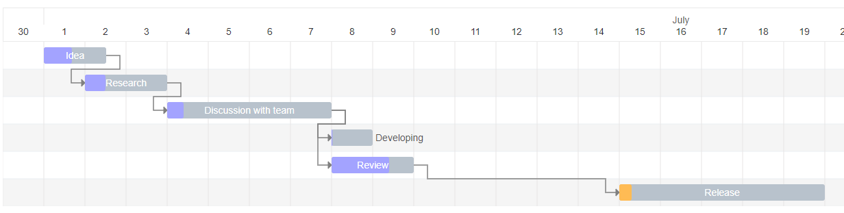
✨ 추가 기능 (Additional Features)
- 🇰🇷 Korean Date Expressions:
locale="kor"지원으로 한국어 날짜 표현 - 📊 Extra Columns: 커스텀 컬럼 추가 및 렌더링 지원
- 🎨 Weekend Colors: 주말 컬럼 하이라이트 기능
- 🎯 Jira-style Today: 개선된 Today 표시 (주황색 화살표)
Install
npm install gantt-task-react-19-korean
# or
yarn add gantt-task-react-19-korean
How to use it
import { Gantt, Task, EventOption, StylingOption, ViewMode, DisplayOption } from 'gantt-task-react-19-korean';
import "gantt-task-react-19-korean/dist/index.css";

let tasks: Task[] = [
    {
      start: new Date(2020, 1, 1),
      end: new Date(2020, 1, 2),
      name: 'Idea',
      id: 'Task 0',
      type:'task',
      progress: 45,
      isDisabled: true,
      styles: { progressColor: '#ffbb54', progressSelectedColor: '#ff9e0d' },
    },
    ...
];
<Gantt tasks={tasks} />
You may handle actions
<Gantt
  tasks={tasks}
  viewMode={view}
  onDateChange={onTaskChange}
  onTaskDelete={onTaskDelete}
  onProgressChange={onProgressChange}
  onDoubleClick={onDblClick}
  onClick={onClick}
/>
How to run example
cd ./example
npm install
npm start
Gantt Configuration
GanttProps
| Parameter Name | Type | Description | | :------------------------------ | :------------ | :------------------------------------------------- | | tasks* | Task | Tasks array. | | EventOption | interface | Specifies gantt events. | | DisplayOption | interface | Specifies view type and display timeline language. | | StylingOption | interface | Specifies chart and global tasks styles |
EventOption
| Parameter Name | Type | Description | | :----------------- | :---------------------------------------------------------------------------- | :-------------------------------------------------------------------------------------- | | onSelect | (task: Task, isSelected: boolean) => void | Specifies the function to be executed on the taskbar select or unselect event. | | onDoubleClick | (task: Task) => void | Specifies the function to be executed on the taskbar onDoubleClick event. | | onClick | (task: Task) => void | Specifies the function to be executed on the taskbar onClick event. | | onDelete* | (task: Task) => void/boolean/Promise/Promise | Specifies the function to be executed on the taskbar on Delete button press event. | | onDateChange* | (task: Task, children: Task[]) => void/boolean/Promise/Promise | Specifies the function to be executed when drag taskbar event on timeline has finished. | | onProgressChange* | (task: Task, children: Task[]) => void/boolean/Promise/Promise | Specifies the function to be executed when drag taskbar progress event has finished. | | onExpanderClick* | onExpanderClick: (task: Task) => void; | Specifies the function to be executed on the table expander click | | timeStep | number | A time step value for onDateChange. Specify in milliseconds. |
* Chart undoes operation if method return false or error. Parameter children returns one level deep records.
DisplayOption
| Parameter Name | Type | Description | | :------------- | :------ | :---------------------------------------------------------------------------------------------------------- | | viewMode | enum | Specifies the time scale. Hour, Quarter Day, Half Day, Day, Week(ISO-8601, 1st day is Monday), Month, QuarterYear, Year. | | viewDate | date | Specifies display date and time for display. | | preStepsCount | number | Specifies empty space before the fist task | | locale | string | Specifies the month name language. Able formats: ISO 639-2, Java Locale. | | rtl | boolean | Sets rtl mode. |
StylingOption
| Parameter Name | Type | Description | | :------------------------- | :----- | :--------------------------------------------------------------------------------------------- | | headerHeight | number | Specifies the header height. | | ganttHeight | number | Specifies the gantt chart height without header. Default is 0. It`s mean no height limitation. | | columnWidth | number | Specifies the time period width. | | listCellWidth | string | Specifies the task list cell width. Empty string is mean "no display". | | rowHeight | number | Specifies the task row height. | | barCornerRadius | number | Specifies the taskbar corner rounding. | | barFill | number | Specifies the taskbar occupation. Sets in percent from 0 to 100. | | handleWidth | number | Specifies width the taskbar drag event control for start and end dates. | | fontFamily | string | Specifies the application font. | | fontSize | string | Specifies the application font size. | | barProgressColor | string | Specifies the taskbar progress fill color globally. | | barProgressSelectedColor | string | Specifies the taskbar progress fill color globally on select. | | barBackgroundColor | string | Specifies the taskbar background fill color globally. | | barBackgroundSelectedColor | string | Specifies the taskbar background fill color globally on select. | | arrowColor | string | Specifies the relationship arrow fill color. | | arrowIndent | number | Specifies the relationship arrow right indent. Sets in px | | todayColor | string | Specifies the current period column fill color. | | weekendColor | string | Specifies the weekend columns fill color. | | TooltipContent | | Specifies the Tooltip view for selected taskbar. | | TaskListHeader | | Specifies the task list Header view | | TaskListTable | | Specifies the task list Table view |
- TooltipContent:
React.FC<{ task: Task; fontSize: string; fontFamily: string; }>; - TaskListHeader:
React.FC<{ headerHeight: number; rowWidth: string; fontFamily: string; fontSize: string;}>; - TaskListTable:
React.FC<{ rowHeight: number; rowWidth: string; fontFamily: string; fontSize: string; locale: string; tasks: Task[]; selectedTaskId: string; setSelectedTask: (taskId: string) => void; }>;
Task
| Parameter Name | Type | Description | | :------------- | :------- | :---------------------------------------------------------------------------------------------------- | | id* | string | Task id. | | name* | string | Task display name. | | type* | string | Task display type: task, milestone, project | | start* | Date | Task start date. | | end* | Date | Task end date. | | progress* | number | Task progress. Sets in percent from 0 to 100. | | dependencies | string[] | Specifies the parent dependencies ids. | | styles | object | Specifies the taskbar styling settings locally. Object is passed with the following attributes: | | | | - backgroundColor: String. Specifies the taskbar background fill color locally. | | | | - backgroundSelectedColor: String. Specifies the taskbar background fill color locally on select. | | | | - progressColor: String. Specifies the taskbar progress fill color locally. | | | | - progressSelectedColor: String. Specifies the taskbar progress fill color globally on select. | | isDisabled | bool | Disables all action for current task. | | fontSize | string | Specifies the taskbar font size locally. | | project | string | Task project name | | hideChildren | bool | Hide children items. Parameter works with project type only |
*Required
Extra Columns Support
You can add custom columns to the task list by using the extraColumns prop:
import { Gantt, Task, ExtraColumn, DateFormat } from 'gantt-task-react';

// Define extra columns
const extraColumns: ExtraColumn[] = [
  {
    key: "status",
    title: "Status",
    width: "100px",
  },
  {
    key: "assignee",
    title: "Assignee",
    width: "120px",
  },
  {
    key: "priority",
    title: "Priority",
    width: "80px",
    render: (task) => (
      <span className={`priority-${task.extraColumns?.priority}`}>
        {task.extraColumns?.priority}
      </span>
    ),
  },
];

// Add extra data to your tasks
const tasks: Task[] = [
  {
    id: "1",
    name: "Task 1",
    start: new Date(),
    end: new Date(),
    progress: 50,
    type: "task",
    extraColumns: {
      status: "In Progress",
      assignee: "John Doe",
      priority: "High",
    },
  },
];

<Gantt
  tasks={tasks}
  extraColumns={extraColumns}
  nameColumnWidth="200px"
  fromColumnWidth="130px"
  toColumnWidth="130px"
  dateFormat="iso8601"
/>
ExtraColumn Interface
| Parameter Name | Type | Description |
| :------------- | :-------------------------------------- | :----------------------------------------------------------------------- |
| key* | string | Unique key for the column, used to access data in task.extraColumns |
| title* | string | Column header title |
| width | string | Column width (e.g., "100px", "120px"). Defaults to listCellWidth |
| render | (task: Task) => React.ReactNode | Optional custom render function for complex column content |
Column Width Configuration
You can customize the width of the default columns:
| Parameter Name | Type | Description | | :---------------- | :----- | :----------------------------------------------- | | nameColumnWidth | string | Width of the Name column (e.g., "200px") | | fromColumnWidth | string | Width of the From/Start date column (e.g., "130px") | | toColumnWidth | string | Width of the To/End date column (e.g., "130px") |
Date Format Configuration
You can choose how dates are displayed in the From and To columns:
import { Gantt, DateFormat } from 'gantt-task-react';

<Gantt
  tasks={tasks}
  dateFormat="iso8601"  // Options: "locale" or "iso8601"
/>
| Parameter Name | Type | Description | | :------------- | :--------- | :------------------------------------------------------------------- | | dateFormat | DateFormat | Date display format. "locale" uses locale formatting (e.g., "Fri, June 15, 2025"), "iso8601" uses ISO 8601 format (YYYY-MM-DD) |
DateFormat Options:
"locale"(default): Displays dates in locale-specific format (e.g., "Fri, June 15, 2025")"iso8601": Displays dates in ISO 8601 format (e.g., "2025-06-15")
*Required