
@jfvilas/react-file-manager
v1.5.5
Published
React File Manager is an open-source, user-friendly component designed to easily manage files and folders within applications. With smooth drag-and-drop functionality, responsive design, and efficient navigation, it simplifies file handling in any React p
Maintainers
 jfvilas
Readme
RFM — React File Manager
Since version 1.2, RFM is no longer just a file manager. It has been refactored into a very flexible object manager:
- Manages a hierarchy of objects — files, Kubernetes resources, database records, or anything else with properties.
- Each object type has its own properties, icons, and actions.
- The toolbar, context menu, status bar, and list columns all adapt to the current object type.
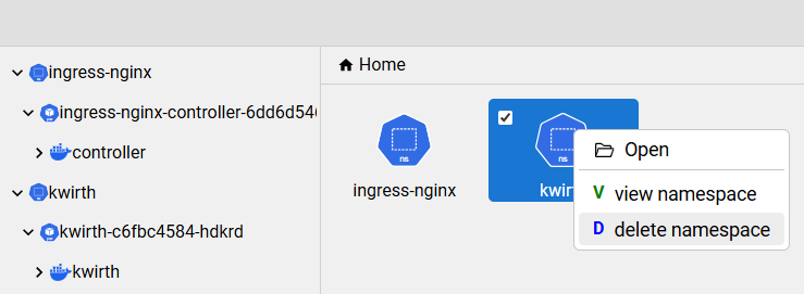
With RFM we have built a full Kubernetes manager (similar to Lens, HeadLamp or K9s):
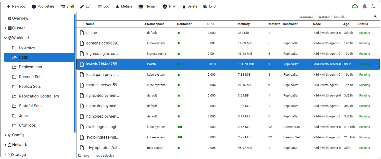
See the full Kubernetes implementation in our Kwirth project (src folder).
✨ Features
- File & Folder Management — View, upload, download, delete, copy, move, create, and rename files or folders.
- Grid & List View — Switch between grid and list views to browse files in your preferred layout.
- Configurable list columns — In list view, columns can be resized by dragging their borders, hidden with the × button, toggled from the ⋮ menu, and reset to defaults (requires
configurable: trueon the space). - Custom object types — Define your own object classes with specific icons, toolbar actions, and property columns.
- Custom layouts — Folders can render arbitrary React content instead of the standard file list.
- Search — Filter files in the current directory. Supports plain text, regex, and case-sensitive modes.
- Category filters — Multi-value filter dropdowns for slicing large lists by any property.
- Status bar — Shows item count, selection count, and total size of selected items.
- Navigation — Breadcrumb trail and collapsible sidebar navigation pane.
- Toolbar & Context Menu — All common actions are available both in the toolbar and via right-click.
- Multi-Selection — Select multiple items with
Ctrl+ClickorShift+Clickfor bulk operations. - Keyboard Shortcuts — Full keyboard support for all common actions.
- Drag-and-Drop — Move files by dragging them to a target folder.
- Imperative API — Control navigation and locking programmatically via a ref.
🚀 Installation
npm i @jfvilas/react-file-manager💻 Basic Usage
The simplest usage — a classic file manager with no configuration needed:
import { useState } from "react";
import { FileManager } from "@jfvilas/react-file-manager";
import "@jfvilas/react-file-manager/dist/style.css";

function App() {
  const [files, setFiles] = useState([
    {
      name: "Documents",
      isDirectory: true,
      path: "/Documents",
      updatedAt: "2024-09-09T10:30:00Z",
    },
    {
      name: "Pictures",
      isDirectory: true,
      path: "/Pictures",
      updatedAt: "2024-09-09T11:00:00Z",
    },
    {
      name: "Pic.png",
      isDirectory: false,
      path: "/Pictures/Pic.png",
      updatedAt: "2024-09-08T16:45:00Z",
      size: 2048,
    },
  ]);

  return <FileManager files={files} />;
}
TypeScript Usage
Download the full type declaration file and add it to your project:
jfvilas-react-file-manager.d.ts
Then reference it in your tsconfig.json or import it in a globals.d.ts file. The declaration file exports all interfaces (IFileObject, ISpace, ISpaceProperty, ISpaceMenuItem, IPermissions, ICategory, etc.) and the FileManager component with its full prop types.
📂 Object Structure
Every item in the files array follows this structure:
interface IFileObject {
  name: string;            // Internal identifier and default display name
  displayName?: string;    // Optional override for the displayed name
  isDirectory: boolean;    // true = folder/group, false = leaf item
  path: string;            // Unique full path (e.g. "/Documents/Report.pdf")
  layout?: string;         // 'list', 'grid', or 'own' — overrides the active layout for this folder
  class?: string;          // Object type key — links to icons, actions, and a space
  children?: string | ((folder: IFileObject) => React.ReactNode);
  data?: any;              // Custom properties used by space column definitions
  categories?: string[];   // Category keys this item belongs to
  features?: string[];     // Feature flags for this item
}
The data property
data is where the per-object properties live. Each field in data can be mapped to a list-view column via ISpaceProperty.source. For example:
{
  name: "nginx-pod",
  isDirectory: false,
  path: "/workloads/pods/nginx-pod",
  class: "pod",
  data: {
    namespace: "default",
    restarts: 3,
    memory: 128,
    startTime: "2024-09-09T10:30:00Z",
    node: "worker-1"
  }
}
A space property with source: 'namespace' will display file.data.namespace in its column.
The children property
On folder objects, children can be:
- A string — the name of a space to use for the items inside this folder. Overrides the top-level
spaceprop when navigating into this folder. - A function — renders fully custom content instead of the standard file list. Requires
layout: 'own'on the folder.
// String: use a different space inside this folder
{ name: "Images", isDirectory: true, path: "/cluster/images", children: "image" }

// Function: custom content
{
  name: "Overview",
  isDirectory: true,
  path: "/overview",
  layout: "own",
  children: (folder) => (
    <div style={{ padding: 16 }}>
      <h2>Cluster Overview</h2>
      <p>Path: {folder.path}</p>
    </div>
  )
}
displayName
Use displayName when the internal name must differ from what the user sees (e.g. a technical ID vs. a human-readable label):
{ name: "img-sha256-abc123", displayName: "nginx:1.25.3", isDirectory: false, ... }🗃️ Spaces
Without spaces — classic file manager
If you do not pass space or spaces, RFM behaves exactly like a traditional file manager. Objects in files are treated as files and folders: isDirectory: true items are navigable folders, the others are files. The default columns in list view are Name, Modified, and Size, and all standard toolbar actions (upload, download, rename, delete, copy, paste…) are available out of the box.
// No spaces needed — works as a standard file manager
<FileManager files={files} onDelete={handleDelete} onCreateFolder={handleCreate} />
The built-in space is called filedata. RFM adds it automatically if it is not present in the spaces map you provide.
With spaces — object manager
A space is the central configuration object that defines how a set of objects is displayed. It controls the name column, the property columns in list view, the toolbar actions, and the status bar calculation.
You create a Map of spaces and pass it to FileManager. The active space is selected by the space prop, or by the children property on a folder — when navigating into a folder whose children is 'image', the 'image' space configuration is used automatically.
Items are linked to their space via the class property on each file object. When RFM renders a row in list view, it looks up the space corresponding to currentFolder.children and reads each column's value from file.data[property.source].
┌──────────────────────────────────────────┐
│  files array                             │
│  { class: 'pod', data: { ns: 'default', restarts: 3 } }  ──┐
└──────────────────────────────────────────┘                  │
                                                              ▼
┌──────────────────────────────────────────┐      spaces.get('pod')
│  space 'pod'                             │      ┌─────────────────────────┐
│  properties: [                           │      │ property { source: 'ns' }│  → file.data.ns
│    { source: 'ns',       format: 'string'}│◄─────│ property { source: 'restarts' } → file.data.restarts
│    { source: 'restarts', format: 'number'}│      └─────────────────────────┘
│  ]                                       │
└──────────────────────────────────────────┘
const spaces = new Map();
spaces.set('image', {
text: 'Image', // Header label for the name column
source: 'name', // File property used as the primary display name
width: 40, // Name column width (percent) in list view
configurable: true, // Allow users to resize, hide, and toggle columns
// Status bar: sum the 'size' field, divide by 1024, label as bytes/KB/MB
sumSourceProperty: 'size',
sumReducer: 1024,
sumUnits: ['bytes', 'KB', 'MB'],
leftItems: [ /* toolbar buttons — see below */ ],
properties: [ /* list-view columns — see below */ ],
});
<FileManager space="image" spaces={spaces} files={files} />Property columns
Each entry in properties defines one column in list view:
properties: [
  {
    name: 'size',       // Internal identifier (must be unique within the space)
    text: 'Size',       // Column header label
    source: 'size',     // Key inside file.data to read the value from
    format: 'storage',  // How to format the value (see table below)
    width: 15,          // Column width percentage
    sortable: true,     // Click header to sort
    removable: false,   // No × button — this column is always visible
    visible: true,      // Shown by default
  },
  {
    name: 'tag',
    text: 'Tag',
    source: 'tag',
    format: 'string',
    width: 15,
    sortable: true,
    removable: true,    // User can hide this column from the ⋮ menu or with ×
    visible: true,
  },
  {
    name: 'updated',
    text: 'Updated',
    source: 'updatedAt',
    format: 'age',      // Shown as "2h 15m" relative time
    width: 15,
    sortable: true,
    removable: true,
    visible: true,
  },
  {
    name: 'thumbnail',
    text: 'Preview',
    source: (path) => <img src={`/thumbs${path}`} height={20} />,  // Custom renderer
    format: 'function',
    width: 10,
    sortable: false,
    removable: true,
    visible: true,
  },
]
Format types
| Format | Description | Example output |
|--------|-------------|----------------|
| 'string' | Plain text | nginx:latest |
| 'number' | Numeric value | 42 |
| 'date' | Formatted date from an ISO string | Sep 9, 2024 |
| 'age' | Relative duration from an ISO timestamp | 2d 3h |
| 'storage' | Byte count converted using sumReducer/sumUnits | 1.4 MB |
| 'size' | Byte count with automatic SI unit selection | 128 KiB |
| 'function' | source is a (path: string) => ReactNode render function | (custom JSX) |
Toolbar item actions (leftItems)
leftItems defines the buttons shown in the toolbar when one or more items are selected. Each button can control its own visibility and enabled state dynamically:
leftItems: [
  {
    name: 'inspect',
    icon: <FaSearch size={15} />,
    text: 'Inspect',
    permission: true,
    multi: false,   // Only shown when exactly one item is selected

    isVisible: (name, currentFolder, selectedItems) => {
      // Hide this action for items without a registry field
      return selectedItems.every(f => f.data?.registry);
    },

    isEnabled: (name, currentFolder, selectedItems) => {
      // Disable if the selected image has no tag
      return selectedItems.every(f => f.data?.tag);
    },

    onClick: (paths, buttonElement) => {
      // paths: array of selected file.path values
      console.log('Inspecting', paths);
    },
  },
  {
    name: 'pull',
    icon: <FaDownload size={15} />,
    text: 'Pull',
    permission: true,
    multi: true,    // Shown even when multiple items are selected
    onClick: (paths, buttonElement) => {
      console.log('Pulling', paths.length, 'images');
    },
  },
]
| leftItems property | Type | Description |
|---|---|---|
| name | string | Internal identifier passed to isVisible/isEnabled. |
| icon | ReactNode | Icon rendered to the left of the label. |
| text | string | Button label. |
| permission | boolean | Set to false to hide the button unconditionally (useful for role-based control). |
| multi | boolean | When false, the button is hidden if more than one item is selected. |
| isVisible | function | (name, currentFolder, selectedItems) => boolean — dynamic visibility. |
| isEnabled | function | (name, currentFolder, selectedItems) => boolean — dynamic enable state. |
| onClick | function | (paths, target) => void — paths is an array of file.path values. |
🎬 Icons & Actions
Custom icons and context-menu actions are defined as Maps and passed to FileManager independently from spaces.
Icons
const icons = new Map();

// All icon slots are optional — use only the ones you need
icons.set('pod', {
  open:   <FaCircle color="green" size={20} />,  // Open folder (grid view)
  closed: <FaCircle color="gray"  size={20} />,  // Closed folder (grid view)
  list:   <FaCircle color="green" size={16} />,  // Folder in list view
  grid:   <FaCircle color="green" size={48} />,  // Large icon in grid view
  default:<FaCircle size={16} />,                // Fallback
});

icons.set('service', { default: <FaNetworkWired size={16} /> });

<FileManager icons={icons} ... />
Actions (context menu)
const actions = new Map();

actions.set('pod', [
  {
    title: 'View logs',
    icon: <FaList />,
    onClick: (files) => openLogsPanel(files),
  },
  {
    title: 'Describe',
    icon: <FaInfo />,
    divider: true,   // Separator line after this item
    onClick: (files) => describePod(files[0]),
  },
  {
    title: 'Delete pod',
    icon: <FaTrash />,
    onClick: (files) => deletePod(files),
  },
]);

<FileManager actions={actions} ... />
The onClick handler always receives an array of IFileObject — even for single-item actions.
🔍 Search
Three props control search behaviour:
| Prop | Type | Default | Description |
|------|------|---------|-------------|
| searchMode | 'auto'\|'hidden'\|'visible' | 'auto' | 'auto' — search bar appears when the user starts typing; 'visible' — always shown; 'hidden' — disabled. |
| searchRegex | boolean | false | Enable regular expression matching. |
| searchCasing | boolean | false | Enable case-sensitive matching. |
<FileManager searchMode="visible" searchRegex={false} searchCasing={false} ... />🏷️ Category Filters
Categories add multi-value filter dropdowns to the toolbar. Each category is independent and can filter by any property:
const [namespaceFilter, setNamespaceFilter] = useState(['all']);

const categories = [
  {
    key: 'namespace',
    text: 'Namespaces',

    // All selectable values (use { key: '-' } for a separator line)
    all: [
      { key: 'all', text: 'All...' },
      { key: '-' },
      { key: 'default' },
      { key: 'kube-system' },
      { key: 'monitoring', text: 'Monitoring' },
    ],

    selected: namespaceFilter,

    onCategoryValuesChange: (categoryKey, value, newSelected) => {
      setNamespaceFilter(newSelected);
    },

    // Return true if this file passes the filter
    onCategoryFilter: (categoryKey, file) => {
      if (namespaceFilter.includes('all')) return true;
      return namespaceFilter.includes(file.data?.namespace);
    },

    // Highlight the filter button when active
    isFilterActive: (categoryKey) => {
      return !(namespaceFilter.length === 1 && namespaceFilter[0] === 'all');
    },
  },
];

<FileManager categories={categories} ... />
🪟 Custom Layouts
A folder can bypass the standard file browser and render arbitrary React content by setting layout: 'own' and providing a children function:
const files = [
  {
    name: "Dashboard",
    isDirectory: true,
    path: "/dashboard",
    layout: "own",
    children: (folder) => (
      <div style={{ padding: 24 }}>
        <h2>Welcome to {folder.name}</h2>
        <ClusterMetricsPanel />
      </div>
    ),
  },
  {
    name: "Pods",
    isDirectory: true,
    path: "/workloads/pods",
    children: "pod",   // Use the 'pod' space for items inside this folder
  },
];
When a folder with layout: 'own' is active:
- The
childrenfunction is rendered as the main content. leftItemstoolbar buttons still appear; theironClickreceives[currentFolder.path]as thepathsargument instead of selected file paths.
🔘 Right-side toolbar buttons (rightItems)
rightItems adds custom icon buttons to the right side of the toolbar, placed before the built-in View Options (⚙) and Refresh buttons.
Typical uses: notification badges, connection-status indicators, theme toggles, or any global action that is not tied to the current file selection.
const [unread, setUnread] = useState(3);
const [connected, setConnected] = useState(true);

const rightItems = [
  {
    name: 'notifications',
    title: `${unread} unread messages`,
    // Static icon — use when the icon itself does not change
    icon: <FaBell color={unread > 0 ? '#e74c3c' : '#aaa'} size={16} />,
    onClick: (name, buttonElement) => {
      openNotificationPanel(buttonElement);  // buttonElement is the DOM button
    },
  },
  {
    name: 'connection',
    title: connected ? 'Connected' : 'Disconnected — click to retry',
    // onDraw is called on every render, so it always reflects current state.
    // It takes priority over `icon` when both are provided.
    onDraw: (name) => (
      <FaCircle
        size={12}
        color={connected ? '#27ae60' : '#e74c3c'}
        title={connected ? 'Connected' : 'Disconnected'}
      />
    ),
    onClick: (name, buttonElement) => {
      if (!connected) reconnect();
    },
  },
  {
    name: 'settings',
    title: 'Settings',
    icon: <FaCog size={16} />,
    onClick: (name, buttonElement) => openSettings(),
  },
];

<FileManager rightItems={rightItems} files={files} ... />
| Property | Type | Required | Description |
|----------|------|----------|-------------|
| name | string | yes | Identifier passed to onClick and onDraw. |
| title | string | no | Tooltip shown on hover. |
| icon | ReactNode | no | Static icon. Used when onDraw is absent. |
| onDraw | (name: string) => ReactNode | no | Dynamic renderer, called on every render. Takes priority over icon. Use this when the icon must reflect live state (counters, connection status, etc.). |
| onClick | (name: string, target: HTMLElement) => void | no | Click handler. target is the DOM <button> element, useful for anchoring a popover. |
Tip — dynamic badges: Because
onDrawis called on every render, wrappingrightItemsinuseMemois not useful when you need live state. Instead, keeprightItemsas a plain array and let the state that drivesonDrawlive in the parent component's state — React re-renders will automatically update the icon.
🖊️ Imperative API (Ref Handle)
Attach a ref to drive the FileManager from outside — from a sidebar menu, a login sequence, a keyboard shortcut handler, or any external event.
import { useRef } from 'react';

const fmRef = useRef(null);

<FileManager ref={fmRef} files={files} ... />
changeFolder(path)
Navigates to any path in the files tree, exactly as if the user had clicked through the navigation pane. The path must match the path field of an isDirectory: true entry in files.
// Sidebar menu
<nav>
  <button onClick={() => fmRef.current.changeFolder('/workloads/pods')}>Pods</button>
  <button onClick={() => fmRef.current.changeFolder('/network/services')}>Services</button>
  <button onClick={() => fmRef.current.changeFolder('/config/secrets')}>Secrets</button>
</nav>

<FileManager ref={fmRef} files={files} ... />
A common pattern is a two-panel layout where a custom menu drives FileManager navigation:
function App() {
  const fmRef = useRef(null);
  const [files, setFiles] = useState([]);

  const navigate = (path) => fmRef.current?.changeFolder(path);

  return (
    <div style={{ display: 'flex' }}>
      <aside>
        <ul>
          <li onClick={() => navigate('/cluster/pods')}>Pods</li>
          <li onClick={() => navigate('/cluster/deployments')}>Deployments</li>
        </ul>
      </aside>
      <FileManager ref={fmRef} files={files} onFolderChange={setActivePath} />
    </div>
  );
}
lock() / unlock()
Show or hide a loading backdrop that blocks all user interaction. Useful during async data loads or long operations.
const refresh = async () => {
  fmRef.current.lock();
  try {
    const data = await fetchClusterState();
    setFiles(data);
  } finally {
    fmRef.current.unlock();
  }
};
| Method | Signature | Description |
|--------|-----------|-------------|
| changeFolder | (path: string) => void | Navigate to the folder at the given path. |
| lock | () => void | Show a loading backdrop — blocks all interaction. |
| unlock | () => void | Hide the loading backdrop. |
🎨 UI Customization
Override any CSS class to match your application's design:
- Create a CSS file (
my-fm.css) and import it next to your FileManager usage. - Prefix your selectors with a custom class to avoid conflicts.
- Pass that class via the
classNameprop.
/* my-fm.css */
.my-fm .toolbar {
  background-color: #1e293b;
  color: white;
}
.my-fm .file-manager-container {
  border-radius: 12px;
  box-shadow: 0 4px 24px rgba(0,0,0,0.15);
}
.my-fm .files-container {
  background-color: #f8fafc;
}
import './my-fm.css';
<FileManager className="my-fm" primaryColor="#3b82f6" fontFamily="Inter, sans-serif" ... />📐 Configurable list view columns
When a space has configurable: true, users can manage columns directly in the list view header:
| Interaction | How |
|-------------|-----|
| Resize | Drag the right border of any column header. |
| Remove | Click the × button on columns that have removable: true. |
| Toggle / Reset | Click the ⋮ button at the far right of the header row to show/hide any column or reset all to defaults. |
spaces.set('mySpace', {
  text: 'Name',
  width: 35,
  configurable: true,
  properties: [
    { name: 'owner',   text: 'Owner',   source: 'owner',   format: 'string',  width: 20, sortable: true,  removable: true,  visible: true  },
    { name: 'created', text: 'Created', source: 'created', format: 'date',    width: 15, sortable: true,  removable: true,  visible: true  },
    { name: 'size',    text: 'Size',    source: 'size',    format: 'storage', width: 10, sortable: true,  removable: false, visible: true  },
    { name: 'tags',    text: 'Tags',    source: 'tags',    format: 'string',  width: 20, sortable: false, removable: true,  visible: false }, // hidden by default
  ]
});
⚙️ Props
| Name | Type | Default | Description |
| ---- | ---- | ------- | ----------- |
| acceptedFileTypes | string | — | Comma-separated allowed extensions for uploads (e.g. .txt, .png). All types accepted if omitted. |
| actions | Map<string, IAction[]> | — | Custom context-menu actions per object class. |
| categories | ICategory[] | — | Category filter definitions shown as toolbar dropdowns. |
| className | string | '' | CSS class applied to the root element. |
| collapsibleNav | boolean | false | Show a toggle to expand/collapse the navigation pane. |
| defaultNavExpanded | boolean | true | Initial expanded state of the navigation pane. |
| enableFilePreview | boolean | true | Enable the built-in file previewer. |
| fileDownloadConfig | { url: string; headers?: object } | — | Download URL prefix and optional HTTP headers. Also used for file preview. |
| filePreviewComponent | (file: IFileObject) => ReactNode | — | Custom file preview renderer. Overrides the built-in previewer. |
| filePreviewPath | string | — | Base URL for previews; file path is appended automatically. |
| fileUploadConfig | { url: string; method?: "POST"\|"PUT"; headers?: object } | — | Upload URL, method, and optional HTTP headers. |
| files | IFileObject[] | — | Array of objects representing the directory structure. |
| fontFamily | string | 'Nunito Sans, sans-serif' | CSS font family applied throughout the component. |
| formatDate | (date: string\|Date) => string | built-in | Custom date formatter for the 'date' column format. |
| height | string\|number | '600px' | Component height. |
| icons | Map<string, IIcon> | — | Custom icons per object class. |
| initialPath | string | '' | Starting folder path. |
| isLoading | boolean | false | Shows a loading overlay when true. |
| language | string | 'en-US' | UI language code. Available: ar-SA · de-DE · en-US · es-ES · fr-FR · he-IL · hi-IN · it-IT · ja-JP · ko-KR · pt-BR · pt-PT · ru-RU · tr-TR · uk-UA · ur-UR · vi-VN · zh-CN · pl-PL |
| layout | "list"\|"grid" | 'grid' | Default layout. |
| maxFileSize | number | — | Maximum upload size in bytes. |
| maxNavigationPaneLevel | number | 2 | Maximum folder depth shown in the navigation pane tree. |
| minFileActionsLevel | number | 1 | Minimum depth at which file actions (create, upload, etc.) appear. |
| onCopy | (files: IFileObject[]) => void | — | Triggered on copy. |
| onCut | (files: IFileObject[]) => void | — | Triggered on cut. |
| onCreateFolder | (name: string, parentFolder: IFileObject) => void | — | Triggered when a new folder is created. |
| onDelete | (files: IFileObject[]) => void | — | Triggered on delete. |
| onDownload | (files: IFileObject[]) => void | — | Triggered on download. |
| onError | (error: IError, file: IFileObject) => void | — | Triggered on errors. |
| onFileOpen | (file: IFileObject) => void | — | Triggered when a file or folder is opened. |
| onFolderChange | (path: string) => void | — | Triggered when the active folder changes. |
| onFileUploaded | (response: object) => void | — | Triggered after a successful upload. |
| onFileUploading | (file: IFileObject, parentFolder: IFileObject) => object | — | Triggered during upload; returned object is appended to FormData. |
| onLayoutChange | (layout: "list"\|"grid") => void | — | Triggered when the layout is switched. |
| onPaste | (files: IFileObject[], dest: IFileObject, op: "copy"\|"move") => void | — | Triggered on paste. |
| onRefresh | () => void | — | Triggered when the refresh button is pressed. |
| onRename | (file: IFileObject, newName: string) => void | — | Triggered on rename. |
| onSelectionChange | (files: IFileObject[]) => void | — | Triggered whenever selection changes (select or deselect). |
| onSelect ⚠️ | (files: IFileObject[]) => void | — | Deprecated. Use onSelectionChange. |
| openMode | 'default'\|'none' | 'default' | 'none' hides the 'Open' option in the context menu. |
| permissions | IPermissions | all true | Enable/disable individual file actions. See Permissions. |
| primaryColor | string | '#6155b4' | Primary accent color for buttons and highlights. |
| rightItems | IFileManagerMenuItem[] | — | Custom icon buttons on the right side of the toolbar. |
| searchCasing | boolean | false | Case-sensitive search. |
| searchMode | 'auto'\|'hidden'\|'visible' | 'auto' | Search bar visibility mode. |
| searchRegex | boolean | false | Regular expression search. |
| showBreadcrumb | boolean | false | Show/hide the breadcrumb navigation bar. |
| showContextMenu | boolean | true | Enable/disable the right-click context menu. |
| showRefresh | boolean | true | Show/hide the refresh button. |
| space | string | 'filedata' | Active space name. |
| spaces | Map<string, ISpace> | — | Space definitions map. |
| style | React.CSSProperties | — | Inline styles on the root element. |
| width | string\|number | '100%' | Component width. |
🗂️ Type Reference
interface ISpace {
  text?: string               // Name column header label
  source?: string             // File property used as display name
  width?: number              // Name column width (%) in list view
  sumSourceProperty?: string  // Property to sum in the status bar
  sumReducer?: number         // Divisor for unit conversion (e.g. 1024)
  sumUnits?: string[]         // Unit labels per step (e.g. ['bytes','KB','MB'])
  leftItems?: ISpaceMenuItem[]
  configurable?: boolean      // Enable column resize/hide/toggle in list view
  properties?: ISpaceProperty[]
}

interface ISpaceProperty {
  name: string
  text: string
  source: string | ((path: string) => React.ReactNode)
  format: 'string' | 'function' | 'age' | 'number' | 'storage' | 'date' | 'size'
  sortable: boolean
  removable?: boolean
  width: number
  visible: boolean
}

interface ISpaceMenuItem {
  name?: string
  icon?: React.ReactNode
  text: string
  permission: boolean
  multi?: boolean
  onClick?: (paths: string[], currentTarget: Element) => void
  isVisible?: (name: string, currentFolder: IFileObject, selectedItems: IFileObject[]) => boolean
  isEnabled?: (name: string, currentFolder: IFileObject, selectedItems: IFileObject[]) => boolean
}

interface IFileManagerMenuItem {
  name: string
  onClick?: (name: string, target: HTMLElement) => void
  onDraw?: (name: string) => React.ReactNode
}

interface IAction {
  title: string
  icon?: React.ReactNode
  divider?: boolean
  onClick: (files: IFileObject[]) => void
}

interface IPermissions {
  create?: boolean
  delete?: boolean
  download?: boolean
  copy?: boolean
  move?: boolean
  rename?: boolean
  upload?: boolean
}

interface ICategory {
  key: string
  text: string
  all: { key: string; text?: string }[]
  selected: string[]
  onCategoryValuesChange: (categoryKey: string, value: string, selected: string[]) => void
  onCategoryFilter: (categoryKey: string, file: IFileObject) => boolean
  isFilterActive: (categoryKey: string) => boolean
}
🛡️ Permissions
Use the permissions prop to hide actions based on user roles. Omitted properties default to true.
<FileManager
  permissions={{
    create:   false,  // Hide "New Folder"
    upload:   false,  // Hide "Upload"
    rename:   true,
    copy:     true,
    move:     true,
    download: true,
    delete:   false,  // Hide "Delete"
  }}
/>
</> Custom File Preview
const MyPreviewer = ({ file }) => (
  <img src={`https://cdn.example.com${file.path}`} alt={file.name} style={{ maxWidth: '100%' }} />
);

<FileManager
  filePreviewComponent={(file) => <MyPreviewer file={file} />}
/>
🧭 Controlling the Current Path
import { useState } from "react";

function App() {
  const [currentPath, setCurrentPath] = useState("/Documents");

  return (
    <FileManager
      initialPath={currentPath}
      onFolderChange={setCurrentPath}
    />
  );
}
⌨️ Keyboard Shortcuts
| Action | Shortcut |
|--------|----------|
| New Folder | Alt + Shift + N |
| Upload Files | Ctrl + U |
| Cut | Ctrl + X |
| Copy | Ctrl + C |
| Paste | Ctrl + V |
| Rename | F2 |
| Download | Ctrl + D |
| Delete | Del |
| Select All | Ctrl + A |
| Select Multiple | Ctrl + Click |
| Select Range | Shift + Click |
| List Layout | Ctrl + Shift + 1 |
| Grid Layout | Ctrl + Shift + 2 |
| First Item | Home |
| Last Item | End |
| Refresh | F5 |
| Clear Selection | Esc |