
@jhelom/react-mui-message-dialog
v1.0.17
Published
`react-mui-message-dialog` is a simple and flexible message dialog component library for React + MUI (Material-UI) environments.

Maintainers
 jhelom
Readme
react-mui-message-dialog
Overview
react-mui-message-dialog is a simple and flexible message dialog component library for React + MUI (Material-UI) environments.
- Unified UI based on MUI's Dialog component
- Promise-based API for easy alert, confirm, and error dialogs
- Global dialog management via Context Provider
- TypeScript support
Ideal for business applications and admin dashboards where you need to display messages or confirmations to users.
Install
npm i @jhelom/react-mui-message-dialogUsage
Wrap your application with MessageDialogProvider to enable global message dialog functionality. This provider manages the dialog state and allows you to use the useMessageDialog hook anywhere in your component tree.
import { MessageDialogProvider } from "@jhelom/react-mui-message-dialog";

createRoot(document.getElementById("root")!).render(
  <StrictMode>
    <MessageDialogProvider>
      <App />
    </MessageDialogProvider>
  </StrictMode>
);
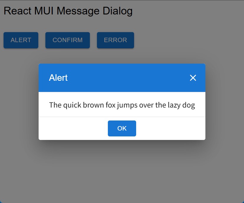
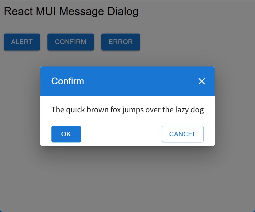
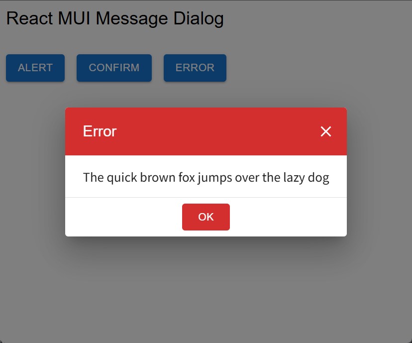
After wrapping your app with MessageDialogProvider, you can use the useMessageDialog hook in any component. This hook provides functions to show alert, confirm, and error dialogs as Promises, making it easy to handle user interactions asynchronously.
import {
  useMessageDialog,
  MessageDialogConfirmOptions,
} from "@jhelom/react-mui-message-dialog";

const messageDialog = useMessageDialog();

const confirmOptions: MessageDialogConfirmOptions = {
  title: "Delete item",
  okText: "Delete",
  cancelText: "Keep",
  closeOnBackdropClick: true,
};

// Show an alert dialog
await messageDialog.alert("Alert Message", {
  title: "Attention",
  okText: "Understood",
});

// Show a confirm dialog
const result = await messageDialog.confirm("Confirm Message", confirmOptions);
if (result) {
  // OK
} else {
  // Cancel
}

// Show an error dialog
await messageDialog.error("Error Message", {
  title: "Unexpected Error",
  okText: "Close",
  closeOnBackdropClick: false,
});
If you want to type a message dialog object explicitly, import MessageDialogType from the package root as a type-only import.
import type { MessageDialogType } from "@jhelom/react-mui-message-dialog";

function runWorkflow(messageDialog: MessageDialogType) {
  return messageDialog.confirm("Continue?");
}
If a dialog API (alert, confirm, or error) is called again before the current dialog is closed, the previous pending Promise is resolved with false, and the latest call becomes active.
Alert
Confirm
Error
Localize Text
You can localize the dialog texts (button labels and titles) and control some dialog behaviors by passing a MessageDialogSettings object to the settings prop of MessageDialogProvider. Set each property to the desired language string to customize the dialog UI for your users.
import {
  MessageDialogProvider,
  MessageDialogSettings,
} from "@jhelom/react-mui-message-dialog";

const messageDialogSettings = {
  okText: "OK",
  cancelText: "Cancel",
  alertTitle: "Alert",
  confirmTitle: "Confirm",
  errorTitle: "Error",
  closeOnBackdropClick: true,
} as MessageDialogSettings;

createRoot(document.getElementById("root")!).render(
  <StrictMode>
    <MessageDialogProvider settings={messageDialogSettings}>
      <App />
    </MessageDialogProvider>
  </StrictMode>
);
closeOnBackdropClick: trueenables closing the dialog when the user clicks the gray overlay outside the dialog.closeOnBackdropClick: falsekeeps the current behavior and ignores backdrop clicks.- You can override
title,okText, andcloseOnBackdropClickper dialog call by passing the second argument toalertorerror. - You can also override
cancelTextin the second argument toconfirm.