
@johankladder/react-native-collapsible-header-components
v0.2.2
Published
A React Native package that contains the sources for Collapsible Header Components
Maintainers
 johankladder
Readme
react-native-collapsible-header-components
https://www.npmjs.com/package/@johankladder/react-native-collapsible-header-components
This package contains a <CollapsibleScrollView/> and a
<CollapsibleFlatList/> component. These components can be used as
a 'normal' ScrollView/FlatList, but can have collapsible headers.
What are 'collapsible headers' ?
Collapsible headers are bars that are in top of scroll-views. Most of the time these bars contain controllers, like: a channel selector or a search-bar. The point is, they make up space on the top space of a view and should collapse when the user scrolls down.
When do I need 'collapsible headers' ?
Collapsible headers can be used when your header takes up a lot of space in the UI. With a collapsible header it is possible to automatically remove the header when scrolling down and show it again when scrolling up.
Additional properties of the 'scroll-views'.
Both the <CollapsibleScrollView/> and the <CollapsibleFlatList/>
contain the following additional props (next to the default props of the given
component):
Property | Default | Description
---------|---------|------------
collapsibleHeaderHeight | Required | The height of the header. (integer)
collapsibleHeader | Required | The actual header component (React.Component)
statusBarHeight | 0 | The height that the logic should always remain. So when given 100, the lower 100 pixels is always visible. (integer)
Example code:
import {CollapisbleScrollView} from '@johankladder/react-native-collapsible-header-components'
[...]
renderCollapsibleScrollView = () => {
return (
<CollapsibleScrollView
ref={ref => this.collapsibleScrollView = ref}
collapsibleHeader={this.renderHeaderWithMarkers()}
collapsibleHeaderHeight={225}
statusBarHeight={75}
>
{this.renderItemsForScrollView()}
</CollapsibleScrollView>
)
};
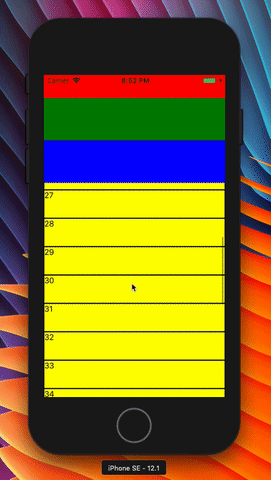
renderHeaderWithMarkers = () => {
return (
<View style={{}}>
<View style={{height: 75, backgroundColor: 'red'}}/>
<View style={{height: 75, backgroundColor: 'green'}}/>
<View style={{height: 75, backgroundColor: 'blue'}}/>
</View>
)
};
renderItemsForScrollView = () => {
let items = [];
for (let i = 0; i < 50; i++) {
items.push(
<View key={'test-' + i}
style={{flex: 1, height: 50, backgroundColor: 'yellow', borderWidth: 1, borderColor: 'black'}}>
<Text>{i}</Text>
</View>
)
}
return items;
};
[...]To access to reference of the actual inner ScrollView (for performing scroll actions on the component), you can reference it in the above shown way. But you need to access the inner ref by calling:
this.collapsableScrollView.reference.getNode().scrollToEnd() where scrollToEnd() can be any supported
function you would like to use.
How It looks:
Installation:
npm i @johankladder/react-native-collapsible-header-componentsyarn add @johankladder/react-native-collapsible-header-components
Known bugs:
- Currently the RefreshControl of iOS is not visible. This is because a
offset can not be set. On iOS make sure you set the
progressViewOffsetproperty according to you need. Most of the time I set it to the height of the header.
Contribution:
Feel free to contribute and open pull-requests!