
@josueavalosjim/panelware
v1.0.0
Published
An accessible component kit with a chrome-and-LCD skin. Radix UI does the interaction; this does the surface. Stacked inset bevels, Web 2.0 gloss, and a sprite-sheet segment readout. Skins are data-attribute swaps, not separate installs. No runtime depend

Maintainers
 josueavalosjim
Readme
panelware
An accessible component kit with four skins on one set of components.
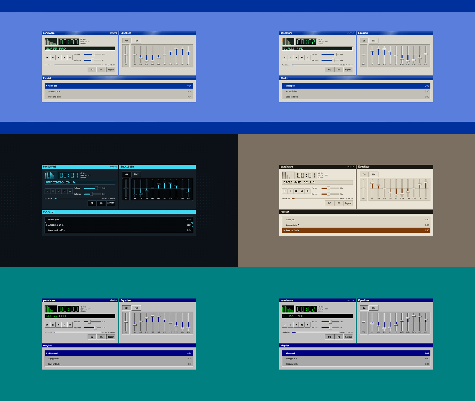
Try the player. It plays music, and every control in it is a panelware component.
Most kits in this genre are decorative. They ship a convincing surface over a div with a click handler, and the keyboard, the screen reader and the contrast ratio are somebody else's problem. Most accessible primitive libraries are the other half of that trade: the interaction is correct and the surface is a neutral grey rectangle you are expected to design yourself.
panelware is the two halves put together on purpose. Radix UI owns the interaction, the ARIA and the focus management, because owning those from scratch is years of work that has already been done twice. This owns the surface: stacked inset bevels, a Web 2.0 gloss, a sprite-sheet segment readout, and a token contract another skin replaces without touching a component. Four of them do: a chrome and LCD chassis, a cyber terminal, a dithered duotone whose depth is not a shadow at all, and a 1998 bitmap skin.
The palette is not asserted to be accessible. It is measured, in CI, by
taste-check, and there is a fixture in the repo whose whole job is to fail
so the gate is known to be working.
npm i @josueavalosjim/panelwareimport "@josueavalosjim/panelware/css";<button class="pw-button">Open</button>
<button class="pw-button" data-variant="primary" data-gloss>Save</button>One class per element. No treatment classes in the markup, and nothing to memorise: a component is styled by the class it already has, and restyling is a token change rather than a find and replace.
That is the whole CSS-only install. The stylesheet has no dependencies and no build step, and nothing above this line involves React.
CLASSES.md is the reference for that path: every class
the stylesheet ships, what it is, and the element it goes on. It is generated
from the stylesheet, so it cannot be short, and a test holds each element claim
to what the components actually render.
The package ships demo/states.html, which renders every component in every
state an attribute can reach with no JavaScript at all, so it is both the
standing proof the CSS does not need React and the working version of the
reference:
open node_modules/@josueavalosjim/panelware/demo/states.htmlOne thing that path hands you which the components otherwise handle: the ARIA
and data-state attributes the CSS keys off. Icons name themselves, so
<span class="pw-icon" data-icon="check"> is the whole of it and no sprite
coordinate appears in markup. Both are covered in the reference.
Two things about the JavaScript entry
The React layer is a peer, and it is not installed for you. react and
radix-ui are optional peers so the stylesheet can be used on its own, which
means importing the module without them gives you this:
Error [ERR_MODULE_NOT_FOUND]: Cannot find package 'react'
  imported from node_modules/@josueavalosjim/panelware/dist/button.js
That is the package working as intended and saying so badly. Install the peers if you want the components:
npm i react@^19 radix-ui@^1.6The package is ESM only. "type": "module", and the . export declares
types and import with no require condition, so a CommonJS consumer gets:
Error [ERR_PACKAGE_PATH_NOT_EXPORTED]There is no CJS build and there is not going to be one in v1. The React layer
targets React 19, which is ESM in every environment worth supporting, and a
second build exists to be forgotten and drift. The CSS entries are plain files
and are unaffected by any of this: @josueavalosjim/panelware/css works from
a bundler, a <link>, or an @import, with or without React.
Status
The components are built and gated, and the demo is live:
josueavalosjim.github.io/panelware
That page runs the components for real, and
demo/states.html
renders every component in every state with no JavaScript at all, which is the
standing proof that the CSS does not need React.
The case study is the long version: why the equaliser is ten sliders rather than one with ten thumbs, what a skin moves besides colour, and how the palette is measured rather than asserted. The player and the static sheet both run inside that page.
Those two pages render the same DOM, deliberately, and a check compares their geometry. A static page that positioned things more simply than the real component would be verifying a shape that never ships.
What is in it
Button, toggle, toggle group, tabs, dialog, window chrome, menu bar, toolbar, transport, seek, slider, equaliser, visualiser, list, collapsible, separator, tooltip, status badge, metadata, icon, segment readout, and the form controls: text field, textarea, switch, checkbox, radio group, select, and the label they share.
A switch is not a toggle, and the kit ships both on purpose. A toggle is a
button that stays pressed: it answers "is this mode on", it carries its label
inside itself, and aria-pressed is what a screen reader announces. A switch
is a thing you throw: the label sits beside it, the state is where the thumb
is, and aria-checked makes it "on" rather than "pressed". If it belongs in a
toolbar it is a toggle; if it belongs in a settings list it is a switch.
Four skins, three of them with a preset, each in light and dark, at two densities. Fourteen looks on one set of components and one set of markup.
| Skin | | Preset | |
| --- | --- | --- | --- |
| chrome | the bevelled chassis | deck | smaller, plainer, no gloss |
| cyber | a squared terminal in one accent | redline | the same, as signage |
| paper | graphite and one spot, screened | newsprint | one plate, coarser |
| dialup | a 1998 bitmap skin: silver, navy, and a green readout | | no preset |
A note on cyber. It is documented in places as "accessible cyberpunk" and
it is not one: it is a terminal, which is what its own reference set says in its
first line. That restraint is the right default and is what makes it usable for
hours, so it stays. redline is where the name gets cashed instead, in
near-black and one hot ink with the raster and the glow pushed. If you came for
cyberpunk, that is the one.
They differ in more than palette, deliberately: type, padding, gaps, timing, corner geometry, and what carries elevation. A skin that moves all of its colour and none of its rhythm reads as the same design twice.
comfortable (44px targets) and compact (32px) are the densities, and no
skin moves the 44. Skin, theme and density are three independent
attributes on any element, not just the root, so a dark toolbar inside a light
page is one data-theme away.
One deliberate break from the kit's own rules is worth knowing before you find it: the radio is round, and it is the only round thing here. The shape is what tells you a control is choose-one before you have read a word or clicked twice, which is a convention doing semantic work rather than decoration.
There is an equaliser, and it is deliberately not a multi-thumb slider.
That was going to be the reason to leave it out: the WAI-ARIA APG flags unresolved gaps in its own multi-thumb reference pattern. Building it found a better reason to build it differently. A multi-thumb slider is a range — its thumbs are the two ends of one span, and they are ordered. Give Radix three thumbs at 20, 60 and 40 and drive the middle one up: it returns 20, 40, 100. It re-sorted. The thumb being driven is now at a different index, and the focused element reports a value belonging to a band nobody touched.
For a price filter that is correct, because "the low end" and "the high end" are what the thumbs mean. For an equaliser it is unfixable, because 3kHz is 3kHz permanently and driving it up must not silently reassign it to 6kHz.
So the bands are separate sliders sharing a scale, a zero line and a frame. Each keeps its own name and value, and none can renumber another.
Two costs, stated rather than hidden. Ten bands are ten tab stops, which is the APG's own model and still a lot of stops. And on touch a vertical slider captures vertical drag, which is also how a page scrolls, so the equaliser is a region a finger cannot scroll through. No arrangement gives both gestures to one area; keep it narrow and leave scrollable page either side.
One trap the primitives set for you
Put no padding and no margin on <body>. Put them on a child.
Radix locks scroll with react-remove-scroll, and the moment a dialog or a
select opens it injects this:
body[data-scroll-locked] {
  overflow: hidden !important;  overscroll-behavior: contain;
  position: relative !important;
  padding-left: 0px;  padding-top: 0px;  padding-right: 0px;
  margin-left: 0;  margin-top: 0;  margin-right: 0px !important;
}
Those zeroes are not a mistake. They are values computed to hold the layout
still where a classic scrollbar has just been taken away, and they are correct
when there is a scrollbar to make room for. With the overlay scrollbars that
macOS and iOS use there is nothing to compensate for, every value computes to
zero, and a page whose insets live on <body> loses them for as long as the
popup is open.
Three paddings and three margins. padding-bottom and margin-bottom are the
only sides the rule leaves alone.
This demo had 24px of horizontal and 32px of vertical padding on <body>.
Opening the select moved the page up 32px and left 24px, and made it 48px
wider. Above about 1072px a max-width absorbed the horizontal half, which is
what made it look intermittent. There is a lint for it in this repo's own
tests, because the failure only exists while something is open.
The token contract
A skin is a treatment. A preset is a palette inside one.
data-theme, data-density and data-skin are orthogonal: every combination
of them means something, and each is an attribute you can set on any element
rather than only on the root. data-preset is not orthogonal, and it is
deliberately not a fourth axis. The deck preset is a palette for the chrome skin; asking
for it under the cyber skin is not a combination that exists.
So a preset is scoped under its skin:
[data-skin="chrome"][data-preset="deck"] { /* ... */ }which means an incoherent pairing simply matches nothing and the page falls back to that skin's own palette. No validation, no runtime check, no way to ask for something that should not render.
A preset may move a knob, not only a colour. The deck preset sets
--pw-gloss-opacity to 0, which silences every [data-gloss] in a consumer's
markup at once and leaves the markup honest, because the Web 2.0 highlight is a
2005-and-after artefact and a late-nineties audio deck predates it. That is what
the knob being a token rather than a class buys.
A preset may also move rhythm. The deck preset sets its own type size, control padding and panel padding, because a late-nineties audio deck is a smaller instrument than an XP-era chassis and a palette alone left it a recolour.
What a preset may not move is the treatment. That is the whole line.
--pw-bevel-depth, the shadow pair, the fill pair and the --pw-elev slots
are a skin's, and a preset filling one would be shipping a treatment without a
treatment file, which is exactly what its name promises it does not do. A test
reads every file under css/tokens/presets/ and fails on any of them, because
prose does not fail a build.
So deck is a preset: chrome's bevel still paints its depth, chrome's easing
still lets its plastic settle, and it is the same chassis built smaller and
plainer. The cyber
skin ships css/treatment/glow.css and replaces what goes in the elevation
slot. The deck preset ships no CSS at all beyond its own values: it takes the
stacked bevel by simply not being cyber. A preset is one file, and that file is
the whole of it, ramp and roles and any knob it wants moved.
Five layers, in one cascade layer each, in this order:
pw.reset pw.tokens pw.treatment pw.components pw.overridespw.overrides is last and ships empty. It is yours:
@layer pw.overrides {
  .pw-button { --pw-elev: none; }
}
Later layers win regardless of specificity, so that wins with one class and no
!important. There is no !important anywhere in this kit.
Colour roles borrow DaisyUI v5's names behind a --pw- prefix, so anyone who
has themed DaisyUI already knows what base-200 means. The prefix is not
optional: DaisyUI and Tailwind both own the bare --color-* namespace, and a
kit meant to be dropped into either cannot squat it too. Everything that is
not a colour follows a plainer vocabulary instead, --pw-space-lg,
--pw-duration-fast, --pw-radius-control.
Every colour in the kit is a literal. None is derived with color-mix(), and
that is a constraint rather than a preference: the contrast gate cannot parse
a mixed colour, an unparseable pair is skipped, and a skipped pair reports as
a pass. DaisyUI derives its entire button treatment that way. This cannot.
The bevel
The pattern is 98.css's, read from its source: two stacked inset box-shadows
as a raised and sunken pair, swapped on press. No backdrop-filter anywhere
near it. That is the documented jank primitive, it is worst on exactly the
fixed full-viewport element a dialog overlay is, and stacked shadows are cheap
precisely because they never touch the live-sampling blur path.
98.css writes its offsets as literals. Here they are multiplied by
--pw-bevel-depth, so one number flattens the whole kit:
:root { --pw-bevel-depth: 0; }At zero, every offset computes to 0px with no blur and no spread, and the
stack paints nothing. demo/states.html has a panel that renders the kit at
depth 0 for exactly this reason, and it is the reason that panel exists: the
knob had been "verified" by reading the calc(), and it did not work at all.
Components never name the bevel. They assign one role-neutral slot:
.pw-button        { --pw-elev: var(--pw-shadow-raised); }
.pw-button:active { --pw-elev: var(--pw-shadow-sunken); }
The slot is --pw-elev and not --pw-bevel because a skin with no bevel puts
something else in it, and a component file describing a treatment that is not
there is a rename that costs a major version.
Contrast, and the one pair that is exempt
Body text holds 4.5:1. Control boundaries and the filled part of a slider hold 3:1.
The focus indicator is two rings in opposite values, drawn adjacent, and
that is not decoration. A single ring is only ever as visible as the surface
behind it happens to allow, and this kit puts controls on a title bar painted
in the very accent the ring is drawn with. --pw-color-focus on
--pw-color-primary measured 1.00:1 in both themes: keyboard focus on a
window's close button was invisible.
Making the ring aware of what is behind it is not available to CSS. The ring
is offset outward, so it lands on the parent's surface rather than the
control's, and currentColor would give the control's own ink. Two rings
sidestep the question rather than answering it: whatever they land on, one of
the pair separates from it, and the two contrast with each other at better
than 9:1 so the boundary between them is an edge on any ground.
One of the bevel's four edges is the control boundary and holds 3:1, and
which one differs by theme. In light it is the dark bottom-right line; in
dark it is the light top-left one. --pw-bevel-boundary names whichever
edge carries it, and the gate checks that role rather than a fixed token.
That role exists because getting it wrong is invisible to a contrast checker. The dark theme originally pointed the bottom-right edge at a light value so it would clear 3:1 against a dark page. Every pair still passed, and the light source had flipped to below the object: the shadow was the brightest line on the control, so a raised control in dark and a sunken one in light shared a signature. Only the ordering of the five values says it, so there is a test for the ordering.
--pw-color-divider is the tier below that: a line that groups rather than
bounds, for a table rule or a section break. It exists because an audit
measured every token against the ground it actually lands on and found a hole.
Ranked by their weaker theme against the page, the set went from 1.24:1
straight to 4.29:1, so a soft line had a choice of invisible or full control
weight, and two stylesheets here had taken a third option and reached for a
bevel ink, which reads in light and vanishes in dark. The rung was in the ramp
already; only the role was missing. Light takes 3.05:1 on the page, dark
2.79:1, and the gate holds the tier to 2:1, which is this tier's own contract
rather than a WCAG number: 1.4.11 does not reach a line whose removal
identifies nothing.
The bevel's white inner highlight does not hold 3:1. It measures 1.47:1, and
that is deliberate. It is a shading cue on an interior edge, it identifies
nothing on its own, the control stays fully identifiable without it, and
raising it to 3:1 would mean a grey highlight, which is not a highlight.
test/fixture/fail.tastecheck.json is a config that checks that exact pair
and is expected to fail, so the exemption is recorded somewhere the build
would notice if it were quietly deleted.
Colour is never the only carrier of a state. A pressed control moves a pixel and flips its bevel; a badge renders a glyph and a word rather than a coloured dot; a hover moves opacity.
What Radix owns, and what this had to add
Radix supplies the tabs' roving tabindex, both aria references and the arrow keys; the dialog's focus trap, focus return and Escape; the slider's arrow keys, Home, End and value clamping. None of it is re-implemented.
One thing Radix does differently from what an audit usually asks for, worth
knowing before you look for it: the dialog carries no aria-modal. Radix
marks the rest of the page aria-hidden instead, which achieves the same
containment with better support than aria-modal has ever had.
The text field, which has no primitive under it
<Input> and <Textarea> wrap nothing. There is no Radix primitive here and
there is not meant to be: an input is an input, the interaction is the
platform's, and neither Radix nor shadcn wraps one either. All the components
add is a class name, which is why the same control is available with no React
at all.
// Field's label goes AFTER the control by default, which is right for a
// checkbox and backwards for this
<Field label="Server" labelFirst><Input value={host} onChange={…} /></Field>
<Field label="Notes" labelFirst><Textarea rows={3} /></Field>
<input class="pw-input" type="text">
<textarea class="pw-textarea" rows="3"></textarea>It is the same sunken well as the combo box's field half, on purpose: the two sit in the same form, and a raised text field beside a sunken select is two vocabularies in one row.
The placeholder is italic rather than dimmed, and that is a measurement
rather than a preference. A placeholder is text in an enabled control, so
1.4.3 asks 4.5:1 of it and the disabled tier's 3.0 does not apply. The kit's
own quiet ink, --pw-color-disabled-content, clears 4.5 against a field's
ground in three of the six palettes here and misses in the other three, at
4.29, 4.44 and 3.83. Adding a seventh rung to six palettes to land just over
the floor is a trade this kit has refused once already, for the metadata ink.
So the placeholder takes the body ink at full strength and says what it is by
its shape.
Invalid draws a ring, not a tint, and the ring is thicker than the resting
edge. --pw-invalid-ring is a separate token from --pw-border for one
reason: the cyber skin resolves error, success and warning to a single cyan
pair on purpose, so under that skin colour carries nothing at all and the only
thing separating an invalid field from a valid one is weight.
<Field label="Port" labelFirst><Input aria-invalid={!valid} /></Field>Nothing here validates for you. aria-invalid is the consumer's to set,
because the kit has no idea what a valid port is.
Three other things Radix does not cover, which this owns.
The marquee ships a real pause button. WCAG 2.2.2 asks for a mechanism to pause anything moving for more than five seconds, and pausing on hover is not one: a keyboard, switch or touch user cannot trigger it. The paused state is a three-value attribute rather than a boolean, because "running" and "nobody has decided" have to be different: a viewer who presses resume while the pointer is still over the readout, which is every mouse user who presses it, would otherwise see nothing happen.
The dialog body takes a tabIndex when, and only when, it actually scrolls.
Chrome does not make scroll containers focusable on its own, so a long dialog
has content below the fold a keyboard user cannot reach. It is measured
rather than set unconditionally, which would add a dead tab stop to every
short dialog.
The slider takes a format function and turns it into aria-valuetext.
aria-valuenow alone is adequate only for a bare number: a screen reader
reading "70" for a gain in decibels has said nothing.
One deliberate trade rather than an oversight. A disabled slider follows the
platform and leaves the tab sequence, because that is what Radix's disabled
does and what a disabled native control does. The alternative, aria-disabled
with a read-only handler, keeps the control discoverable to someone tabbing a
panel, and an audit will usually prefer it. WCAG requires neither. If you want
the second, pass aria-disabled and handle the value yourself rather than
disabled.
Writing a skin
The kit's whole claim is that a skin is a set of token values rather than a
fork, so here is the actual procedure. Three files of tokens carry it:
primitive.<name>.css, semantic.<name>.css, and skin.<name>.css. Nothing
under css/components/ should need touching, and if you find yourself editing
something there, the token you needed is missing and that is a bug worth
reporting.
Two more files exist for the cases tokens cannot reach, and a skin takes them
only if it needs them. css/skins/<name>/*.css is where a skin's pw.skin
layer rules live, and where its generated icon bearings land if it ships its
own sheet: see When tokens are not enough below, and the icon section for
the sheet. Both shipped non-chrome skins have one, so "three files" is the
floor rather than the usual count.
1. Ship a complete set, not a diff. Copy css/tokens/semantic.chrome.css
and css/tokens/skin.chrome.css and change the values. Every skin x theme
block declares every token, and that is not tidiness: [data-theme="dark"]
and [data-skin="yours"] are both (0,1,0), so a block that only carries
differences loses a specificity tie to whichever came later in the bundle,
silently, and only for the tokens it left out.
2. Use literals. No color-mix(), no oklch(from …). The contrast gate
cannot parse either, an unparseable pair is skipped, and a skipped pair
reports as a pass. This is the constraint most likely to be violated by
someone helpful, because it is DaisyUI's idiom and what most autocomplete
suggests.
3. Put your elevation in --pw-elev, or in --pw-fill-* if it is not a
shadow. Components read those slots and never --pw-shadow-raised. If your
skin has no bevel, set --pw-bevel-depth: 0 and every offset collapses to
nothing, then assign whatever you do have to the right slot.
--pw-elev is consumed as a box-shadow, so it carries outer shadows as
happily as insets, and every shipped skin answers with one. A skin whose raised
and sunken states differ by dither density, hatch pitch, or any other
pattern cannot: that is a background-image, and no custom property feeds
two different properties. Fill --pw-fill-raised and --pw-fill-sunken
instead, with --pw-fill-size for the tile. Both pairs exist and a skin may
use either or both.
A fill-based skin has a second ground, and the gate cannot see it. The
contrast check reads a computed background-color, which on a halftone surface
is the stock and not the dot, so text sitting on the dots is measured against a
ground it only partly sits on.
The fix is not a pair in tastecheck.config.json, and it is worth saying why,
because that was the obvious answer and the prose here claimed it for three
releases. A contrast pair is two resolved colours, and the gate rejects a
translucent bg outright: a ground with alpha is not a ground, and there is no
DOM in that check to composite it against. A screen is translucent by
definition, since that is what makes its local contrast constant on every
surface it is printed on. So the pair cannot be written.
What holds it instead is a bespoke test, test/css.test.mjs, which composites
--pw-dither-ink over each of the skin's grounds and measures
--pw-color-base-content against the result, at the same 4.5 the stock is held
to, in both themes. Give your ink a token, keep it translucent, and add your
skin to that test's looks list.
There is one more background layer above those, --pw-ornament with
--pw-ornament-size, for a mark no component draws: corner ticks, a bracketed
frame, a hatched border. A treatment cannot add elements, because
pw.components sorts after pw.treatment, so a slot is the only way a skin
puts something new on a surface. The order is ornament, then fill, then
texture.
4. Turn off what you do not want with tokens, not markup.
--pw-gloss-opacity: 0 silences every [data-gloss] in every consumer's
markup at once. Removing the rule instead would leave a dead attribute
scattered through code you do not own.
5. The rest of the knobs. A skin file declares every one of these, and a skin that declares fewer makes the missing ones a fact about the consumer's markup rather than a fact about the skin. Grouped by what turning one does.
Elevation and shade
| Token | What it does |
| --- | --- |
| --pw-bevel-depth | multiplies every bevel offset; 0 collapses the stack to nothing |
| --pw-lcd-depth | how deep the readout is set, separately from everything else. Chrome sinks it to 2, because a segment display is a window into a box rather than a face on one. A flat skin sets 0, and until this was a token it could not: lcd.css wrote the number on the element, in a later layer than any skin, so cyber and paper flattened the whole kit and kept a bevelled well around their readout |
| --pw-press-travel | how far a pressed control moves down. 1px on chrome, because its controls are objects you push. 0 on both other skins: a mark on glass does not depress and ink has nowhere to travel to |
| --pw-badge-text-drop, --pw-badge-mark-drop | whole-pixel optical corrections inside a badge, measured per skin: how far the label's capitals drop to sit on the badge's centre, and how far the mark moves relative to them. A face's caps and a glyph's ink do not sit where flex centring puts the line box, and each skin's face sits differently |
| --pw-range-inset | how far a slider's range and an equaliser's fill stand off the track's edge. The edge is an inset shadow, which paints under the fill, so a fill flush to it hides it. 1px on cyber, whose track edge is a 1px line; 0 where the edge is a bevel the fill can sit over |
| --pw-shadow-outer-color | the cast shadow's colour. Its geometry is derived per element in bevel.css. Fully transparent means a skin whose surfaces are not objects sitting on anything |
| --pw-glass-blur | the one place backdrop-filter is allowed, and it is 0 in every shipped skin. See the perf note below |
Gloss
| Token | What it does |
| --- | --- |
| --pw-gloss-opacity | the whole Web 2.0 highlight, per skin. 0 silences every [data-gloss] at once |
| --pw-gloss-glare-alpha | the 120deg diagonal sweep, at its brightest stop |
| --pw-gloss-cap-alpha | the inset top-highlight capsule |
| --pw-gloss-cap-height | how far down the face that capsule reaches |
The three alphas are separate because they are the period values rather than one number scaled: the tutorials this is traced from set the glare, the capsule, and the ellipse independently, and dark needs a dimmer glare than light does at the same apparent brightness.
Glow
| Token | What it does |
| --- | --- |
| --pw-glow-color | what glows |
| --pw-glow-radius | how far |
| --pw-glow-intensity | how much; 0 turns it off everywhere |
Only the readout glows in either shipped skin. The tokens are at skin level rather than inside the readout's own rules so a skin that wants glowing buttons does not need a new token to say so.
Selection
A selected list row and a highlighted menu item are painted by the skin, not
by the component, for the same reason --pw-elev is a slot.
| Token | What it does |
| --- | --- |
| --pw-selected-bg | the ground under a selected row |
| --pw-selected-content | its text colour |
| --pw-selected-mark | a background shorthand painted on top, for a skin that draws selection rather than tinting it |
The chrome skin inverts the row: the accent as a ground, its content colour on
top, and --pw-selected-mark: none. The cyber skin does the opposite, setting
the first two to transparent and inherit and putting four corner brackets
in the mark. That is the second worked example of the rule the cascade layers
set up, after --pw-elev: a treatment can never win a declaration a
component already made, so replacing what a component paints means the
component has to leave a slot.
Marking with shape rather than colour also keeps the state cheaper to measure. A bracketed row is the same text on the same ground it already was, instead of a second foreground on a second ground that the contrast gate has to check.
The bracket geometry is declared in structural.css rather than in the cyber
skin, so a skin that wants bracketed selection switches it on rather than
reinventing it:
| Token | What it does |
| --- | --- |
| --pw-bracket-inset | how far inside the row's box the marks sit |
| --pw-bracket-arm | how long each arm runs |
| --pw-bracket-weight | how thick it is |
Type
Type is a skin axis, and for three releases it was not: the paper skin never
answered --pw-font-ui, so a printed sheet was set in the operating system's
UI sans because nobody had decided it would be. Every skin declares both
of these now, and a contract test fails if a knob resolves to the same value
under every skin, which is what "a skin is a set of token values" has to mean
to be worth saying.
| Token | What it does |
| --- | --- |
| --pw-font-ui | the face the controls are set in |
| --pw-tracking-ui | the tracking that face wants |
These are the two that stop another skin reading as the first one recoloured.
The cyber skin points --pw-font-ui at the mono stack, and a fixed pitch is
what makes a row of controls read as an instrument rather than as a web page.
A skin that differs only by hue is a theme.
Proportion and timing
The knobs most skins forget, and the reason two skins can share a palette philosophy and still read as one design. A skin that moves all of its colour and none of its rhythm is a theme.
| Token | What it does |
| --- | --- |
| --pw-text-ui, --pw-text-micro | the two rungs every control reads through --pw-control-text |
| --pw-leading-ui | how tight a control's line is set |
| --pw-control-pad-x, --pw-control-gap | a control's inner rhythm |
| --pw-panel-pad, --pw-badge-h | the same for a panel and a chip |
| --pw-duration-hover, --pw-duration-enter, --pw-duration-exit | how quick |
| --pw-ease-press, --pw-ease-enter, --pw-ease-state | and how it arrives |
Three rules on those, each of which cost something to learn.
--pw-control-h is not yours. It is 44px because WCAG 2.5.8 and this kit's
own floor say so, and check:a11y hit-tests it. Density is padding, gaps, and
type, none of which anybody has to hit.
Restate anything density.css owns at both densities. [data-skin="x"]
and [data-density="compact"] are both (0,1,0) and the skin files import
later, so a skin setting --pw-control-pad-x wins at both densities and the
compact axis quietly stops existing under it. Declare
[data-skin="x"][data-density="compact"] as well, which is (0,2,0) and beats
both. A test enforces this. The type scale is exempt and deliberately so:
--pw-control-text aliases to the rungs, so moving a rung flows through both.
Take a value off the scale rather than inventing one. The cyber skin drops the type one rung, the paddings one rung of the space scale, and aliases its durations to the snap end of the scale that already exists. Fewer decisions, not smaller numbers.
The analyser
A skin owns the visualiser's whole palette, and it should take it. The default ramp is green, amber, red, which is the chrome skin's status vocabulary, so a skin with a different one has to say so or it paints hues it does not otherwise own.
| Token | What it does |
| --- | --- |
| --pw-color-vis-bg | the analyser's face |
| --pw-color-vis-grid | its dot grid |
| --pw-color-vis-low | the ramp at the floor |
| --pw-color-vis-mid | the ramp's middle anchor |
| --pw-color-vis-high | the ramp at the ceiling |
| --pw-color-vis-peak | the held peak marker |
The cyber skin is the worked example: it collapses success, warning and error
to a single accent, so its analyser carries magnitude by brightness in one hue
instead of by three. Its face moves with the ramp, which is why the face is a
token of its own rather than the readout's --pw-color-lcd. The readout keeps
its green phosphor under both skins, deliberately: a segment display reading a
time is a different object from a spectrum.
Scrollbar
Five surfaces in this kit scroll: a list, a panel body, a window body, an open select, and the equaliser sideways. Every one of them showed the host OS's own scrollbar under every skin, which is the loudest place a skin used to stop at the edge of the component.
| Token | What it does |
| --- | --- |
| --pw-scrollbar-width | auto or thin, the two values the standard property takes. Chrome takes auto, because a period scrollbar is a wide one; the other two take thin |
| --pw-scrollbar-thumb | the bar you drag |
| --pw-scrollbar-track | the channel behind it |
These are scrollbar-width and scrollbar-color, the CSS Scrollbars
properties, and not ::-webkit-scrollbar. The prefixed pseudo-elements are
richer, and a bevelled thumb is genuinely tempting for the chrome skin, but
Firefox will never implement them, so drawing it that way means a period
scrollbar in one engine and the host OS's in another. Two scrollbars is worse
than one. What the slot therefore cannot express is a bevel on the thumb.
Icons
| Token | What it does |
| --- | --- |
| --pw-icon-sheet | the sprite sheet every mark in the kit is masked out of |
| --pw-icon-bearing | 1 on a context where an icon sits inline beside a word, so the mark's own blank margins are subtracted and the optical gap comes out even. 0 everywhere else, which is the default |
The sheet is the cheapest large change available to a skin, and for three
releases nothing used it. The sheet is a mask-image painted in currentColor, so pointing it
somewhere else costs one token and inherits every ink colour you already set.
What a second sheet may not change: the cell stays 16x16, the sheet stays eight
columns, and the order stays ICON_ORDER, because the cell a name resolves to
is computed from its index in that order and a reordered sheet paints every
name as its neighbour. Only the pixels inside a cell change. assets/icon-lattice.mjs
holds all three and a test compares them to what icon.css declares.
Draw it as a second data file next to assets/icon-font.mjs, hand-draw the
twenty-three glyphs and let derive() compute the other nine, and
npm run generate writes both the sheet and the bearing overrides your
drawings imply. The bearings are the part worth knowing about: they measure the
blank either side of the ink, a badge subtracts them to get an even optical
gap, and a sheet drawn thinner than the first one needs its own or its marks
sit wrong beside a word. The generator emits a rule only for the names whose
ink actually moved.
Subtracting them is opt-in, through --pw-icon-bearing, and the default is
off. It is right beside a word and wrong nearly everywhere else in this kit: a
menu's check and a list's play marker sit in a fixed gutter, and pulling each
one in by its own ink stops the column being a column; an icon-only control
centres its mark, and the two bearings differ, so subtracting both shifts it
off centre; a chevron that rotates has ink where its bearings say it does not.
If you wrap an icon and a label in a component of your own, set
--pw-icon-bearing: 1 on the wrapper.
Two worked examples, and they differ in weight rather than in hue. The cyber
set in assets/icon-font.cyber.mjs is drawn open: outlines where the chrome
set fills, and a square where it draws a circle, because a HUD's dot is a cell
on a grid. The paper set in assets/icon-font.paper.mjs is the heaviest of the
three, three-pixel strokes and round bullets, because print has no elevation
and no glow and a mark carries entirely by weight.
One rule shapes any thin set you draw. A one-pixel diagonal is not a stroke on this lattice, it is a column of pixels touching at their corners: it survives at 11x and renders as a dotted line at 1x. Every diagonal has to be a staircase whose steps share an edge, and a test rejects the alternative.
Geometry and surface
| Token | What it does |
| --- | --- |
| --pw-radius-control | how round a control's corners are |
| --pw-radius-box | the same, on panels and windows |
| --pw-clip-control | corner geometry a scalar radius cannot express, on controls |
| --pw-clip-box | the same, on panels and wells |
| --pw-texture | a surface pattern, as a background-image |
| --pw-texture-opacity | how strong, read from inside the pattern so it can be turned down without being replaced |
The clip pair was the kit's answer to "is a notched or textured skin really a token change", and until the cyber skin they were an unexercised claim. They are now what draws its cut corners and its scanlines, which is the first time the claim was actually tested rather than asserted.
Set the radius as well as the clip. --pw-clip-control reaches only the
surfaces that do not draw a focus ring, because clip-path clips an outline
and the ring is an outline. A skin that sets the clip and leaves the radius
alone therefore gets notched panels and rounded buttons: measured on the cyber
skin, eleven surfaces notched and twenty still carrying chrome's 2px. Both
tokens or neither.
The radio is the one thing a skin cannot square, and that is deliberate rather
than an oversight. field.css writes its 50% as a literal instead of reading
the token, because the roundness is what says choose-one before a word has been
read. That is semantics, and it does not stop being true under a different
frame.
--pw-clip-control does not reach the slider thumb, the checkbox, or the
radio, and that exemption is measured rather than promised. clip-path clips
an element's outline and its pseudo-elements along with its corners, and all
three of those draw their hit area as a centred ::after and their focus ring
as an outline, so the hook collapsed each target back to its ink: 20×20 for
the checkbox and the radio, under WCAG 2.5.8's 24×24 and well under the 44
this kit asks for. check:a11y sets a notched polygon and hit-tests each one,
and a test holds any control built the same way to the same exemption. If you
add a control whose target is larger than its box, it belongs in that list.
Then check it. Add your theme to tastecheck.config.json's themes array
and run npm run check. Every pair is measured against your values, and a
token your skin forgot to declare is a hard failure rather than a silent
fallback. npm test will also hold your blocks to declaring the same token
set as every other, and will tell you if your bevel ends up lit from below.
When tokens are not enough
Every component in this kit was drawn for the chrome skin. field.css says so
in its own header: the select is "a sunken field with a raised drop button on
its right edge", which is a period combo box. It is correct for chrome and it
is a thing a HUD has never had. Recolouring it does not fix that, and neither
does another token, because the difference is shape.
So there is a fifth layer, pw.skin, sorting after pw.components. A file
under css/skins/<your skin>/ may restyle what a component painted rather than
only fill what it left blank: an element's box, its order within a flex or grid
parent, its background, its border, its visibility. Components never learn a
skin's name, the DOM stays single, and a skin's whole surface area is one
directory.
The worked example is the select, in css/skins/cyber/field.css and
css/skins/paper/field.css. Under cyber the drop button loses its elevation
and becomes a bracketed caret drawn on the field; under paper the well becomes
a value on a ruled line. Same markup, same roles, same tab order.
What a skin file may not do, all of it enforced by npm test rather than
asked for politely:
| Rule | Why |
| --- | --- |
| Not hide or unhide anything focusable | The first thing anyone tries is hiding the window's minimise, maximise, and close cluster under a skin with no title bar. Those are real buttons with real accessible names, so hiding them leaves three named controls in the tab order and invisible on screen. Replacing them with a corner label needs an element, and a skin does not get one. That case is why the rule exists |
| Not write background, background-image, or box-shadow | Those three carry the ornament, the elevation fill, the texture, and the focus halo as single lists, so writing one replaces the whole list. Assign --pw-elev, --pw-elev-fill, --pw-ornament, or --pw-texture instead |
| Not reach below --pw-control-h, or clip a focus ring | Both are measured by check:a11y, not promised |
| Not name a class no component renders | A skin file is the one place a typo is completely silent: the rule parses, matches nothing, and the skin looks like it did before |
Borders, radii, colours, and layout are yours. If you want a mark no component
draws, --pw-ornament is a background layer the shared slot already
composites, which costs no width and survives whatever you do to elevation.
Both shipped skin files use it in preference to a border for exactly that
reason.
Motion
Only transform and opacity. The bevel flip is not transitioned at all,
which is both correct (box-shadow is a paint property) and accurate to what
a real bevelled button did: it snapped.
Under prefers-reduced-motion, durations drop to 1ms and the state changes
stay. The press still moves a pixel, because that pixel is the affordance.
Only continuous motion, the readout's marquee, stops outright; a marquee at
1ms is not a reduced marquee, it is a strobe.
DaisyUI transitions background-color, border-color, box-shadow and
transform together for 0.2s. This does not, and someone diffing the two
deserves to know it was a decision.
The readout
The obvious modern assumption about Winamp's display is wrong, and it is worth
saying because it changes the implementation. It was never per-segment
rendering. It was a bitmap sprite font: Strider's 1998 skin specification
documents numbers.bmp at 9x13 pixel digit cells and text.bmp at 5x6 glyph
cells, and the player stepped an offset across one image.
So this steps an offset across one sheet. The sheets are generated from
assets/lcd-font.mjs rather than drawn, so the letterforms stay editable, and
they are applied as a mask-image rather than a background image, so the ink
is --pw-color-lcd-content and the contrast gate can measure it.
The visible readout is a picture of text and gives assistive technology
nothing, so the element that is the picture carries role="img" and the real
string as its name. One name for the whole readout, never one per character.
This described a visually hidden span beside the sheet, which is what the
component used to do and what axe found wrong with it. role="img" prunes
everything inside the element from the accessibility tree, so putting it on
the host also hid the marquee's own pause button: a focusable control that a
screen reader could not see. It sits on the thing that is the image now, and
the controls are outside it.
The live region is off by default, because a clock announcing itself once a second makes the rest of a page unusable.
Development
npm run generate      # sheets, icon index, stylesheet bundle, docs data
npm run build         # generate, then tsc
npm test              # compile and check, WITHOUT regenerating
npm run check         # the palette gate: contrast, tokens, one-off values
npm run check:gate    # the fixture that must fail, so the gate above is real
npm run check:runtime # the same, measured off the rendered page
npm run check:pages   # overflow, parity, colour, CSSOM, axe, interaction
npm run serve         # the demo, on 4173, with Cache-Control: no-store
npm test deliberately does not regenerate. Several tests compare a
committed artifact against what its source produces, and running the
generators first would rewrite the artifact immediately before the
comparison, which is how every one of those tests silently stopped being able
to fail for one commit.
demo/index.html is the documentation: live components, a switcher for all
three axes built out of the kit's own ToggleGroup, the copy-paste source for
every example, the full token table, and every contrast pair with the ratio
the gate measured. demo/states.html is the same components with no
JavaScript at all.
Only states.html is published. index.html boots React from bundles in
demo/vendor/, and putting half a megabyte of React in this package for a page
nobody is told to open from node_modules is a poor trade. Read it at
the hosted demo.
npm run check reads files and takes about half a second. check:runtime
needs a Chromium and refuses to run without one, rather than skipping quietly.
Releasing
Set the version by hand in package.json, write the matching ## x.y.z
section in CHANGELOG.md, commit, push. Then:
npm run releaseThat runs the whole gate and, if it passes, tags and pushes. It does not bump
the version, and that is deliberate: you cannot write ## 0.2.0 in a changelog
without having already decided on 0.2.0, and a script that bumped afterwards
fought the test holding those two together. What it does instead is refuse to
tag unless the version, the changelog heading, the branch, the working tree
and the remote all already agree, and it names which one does not.
The tag is what publishes. publish.yml calls the same workflow a pull request
runs, on the tagged commit, and npm publish is gated behind it: a red check
means nothing reaches the registry.
check:pages is the six checks that need the pages rather than the files:
nothing scrolls sideways at 320 and up, the static and live pages still render
the same shapes, every colour actually painted clears its floor against the
ground it actually lands on, every class the kit renders matches a rule the
browser kept, axe finds nothing across both pages in both themes, and the
components still tell the truth after a keypress. They serve demo/ themselves on an ephemeral
port and each counts the controls it found before trusting a green result,
because a page that never rendered passes every check that measures it.
check:a11y does one thing axe cannot. A <section> with no accessible name
is not a landmark axe can fault, because it is not a landmark: the browser
drops it to role="generic" and there is nothing left to report. <Window>
shipped that way while its own prop doc promised "an unlabelled region". So
the check reads the computed role and name out of the browser's accessibility
tree for the elements the kit claims are named regions. Reading the
attributes back would not do it, because aria-labelledby pointing at an id
that is not on the page looks perfectly correct in the markup and resolves to
no name at all.
check:interaction is the newest. Everything else measures a component at
rest, which is how an uncontrolled slider shipped announcing the value it
mounted with on every arrow press: aria-valuenow moved, the formatted
aria-valuetext did not, and aria-valuetext is the one a screen reader
reads. It drives the pages from the keyboard and asserts that the text follows
the value rather than the presses, and that a list's focus ring is absent at
rest and present once the list has focus. Both halves, because deleting a rule
satisfies the first half of that and removes the feature.
Parity counts one thing more. A shape it names and cannot find is a failure rather than a match: it compared sizes as strings, an element that is not on the page measured as nothing, and two nothings agreed, so a component deleted from both demo pages left the check green while it claimed to be comparing it.
Serve the demo with npm run serve rather than any other static server. The
one thing it does that matters is send Cache-Control: no-store, and it was
added after a fixed layout bug was reported as still broken: the file on disk
was right, a fetch of the same URL returned the fix, and the browser was
painting a stylesheet from before it. Nothing else in this repo can see that,
because every other check reads the file or drives a fresh browser.
Several tests guard things that fail silently rather than loudly: a theme
missing a token, a bevel offset written as a literal, a color-mix() the gate
cannot parse, a bevel lit from the wrong side, a visual state with no ARIA
twin. Each was checked by planting the exact mistake it claims to catch and
confirming the suite goes red, because a guard that cannot be made to fail is
not a guard.
Prior art
98.css and NES.css are where the bevel technique comes from, and 98.css's source is the direct reference for the shadow pairs. DaisyUI is the precedent for splitting structural tokens out of the palette rather than folding shape into colour. 8bitcn and RetroUI are the proof that genuinely different visual languages ship on Radix's primitive layer rather than only palette recolours.
Windows, Winamp, Aqua, Aero and Luna are cited here as sources and prior art. None of them is affiliated with this, in the same way NES.css cites Nintendo without being Nintendo.
Licence
MIT