
@jsfe/core
v0.0.5
Published
Effortless forms, with standards.

Readme
📝 JSON Schema Form Element
Effortless forms, with standards.
Features:
- Instant form generation based on your JSON schemas
- Light, and interoperable, by design
- Integrate seamlessly with your OpenAPI / JSON schema stack
- Comes with sensible defaults, but aims for extensibility
Why?
While there is a handful of project for major frontend frameworks, there wasn't any Web Component packing all the features above.
See also the inspirations for this project.
Warning
Not for production


Jump to implementations:
TypeScript only
• Astro (SSR)
• Lit
• Solid
• Vue
• Svelte
• React
- Field types
- Subschemas
- Conditionals
- Miscellaneous - References - Recursivity - Nullable values
- User Interface
- Usage
- Component libraries
- Validation
- Schema massaging
- Custom Elements Manifests
- Experimental features
- Improvements
- Acknowledgements
Field types
Primitives
String
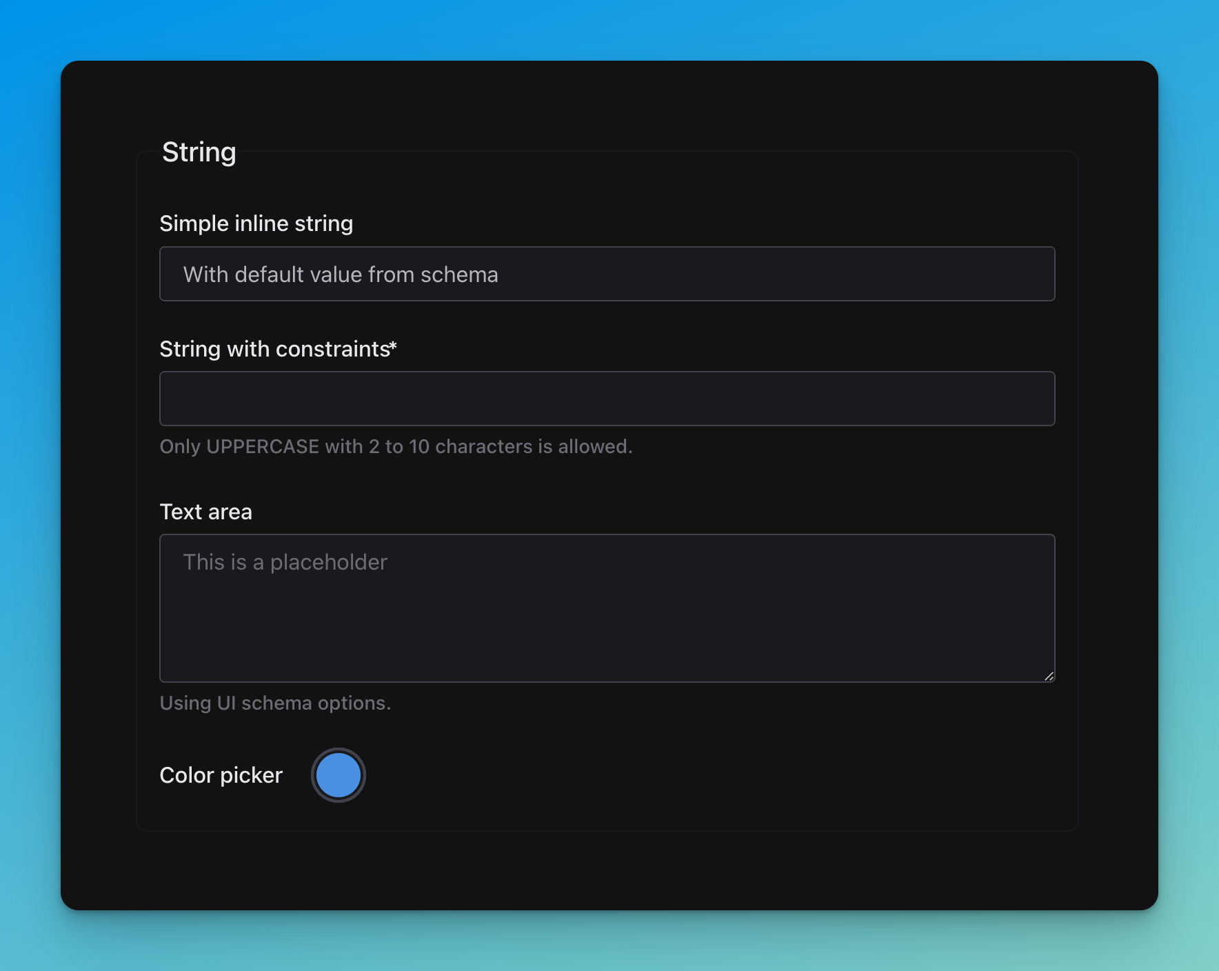
title: String
required:
  - stringConstrained

properties:
  simpleString:
    title: Simple inline string
    type: string
    default: With default value from schema

  stringConstrained:
    title: String with constraints
    type: string
    pattern: '^[A-Z \d\W]+$'
    minLength: 2
    maxLength: 10
    description: Only UPPERCASE with 2 to 10 characters is allowed.

  textArea:
    title: Text area
    description: Using UI schema options.
    type: string

  color:
    title: Color picker
    type: string
    default: '#4a90e2'
# UI schema
textArea:
'ui:widget': textarea
'ui:placeholder': This is a placeholder
color:
'ui:widget': colorNumber
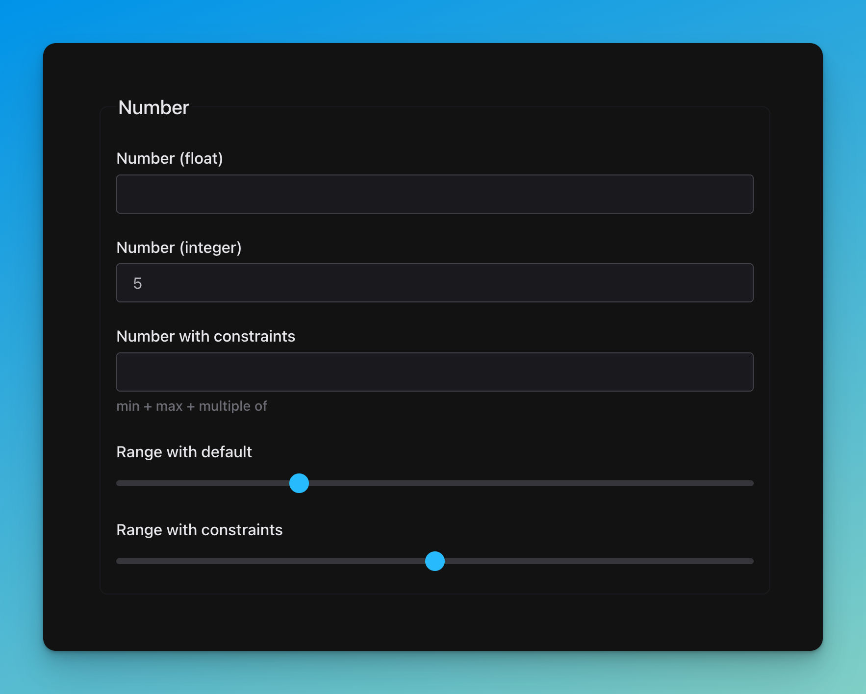
title: Number

properties:
  float:
    title: Number (float)
    type: number

  integer:
    default: 5
    title: Number (integer)
    type: integer

  numberConstrained:
    title: Number with constraints
    description: min + max + multiple of
    type: integer
    minimum: 50
    maximum: 100
    multipleOf: 10

  range:
    title: Range with default
    default: 28
    type: integer

  rangeConstrained:
    title: Range  with constraints
    type: integer
    minimum: -50
    maximum: 50
    multipleOf: 25
# UI schema
range:
'ui:widget': range
rangeConstrained:
'ui:widget': rangeBoolean
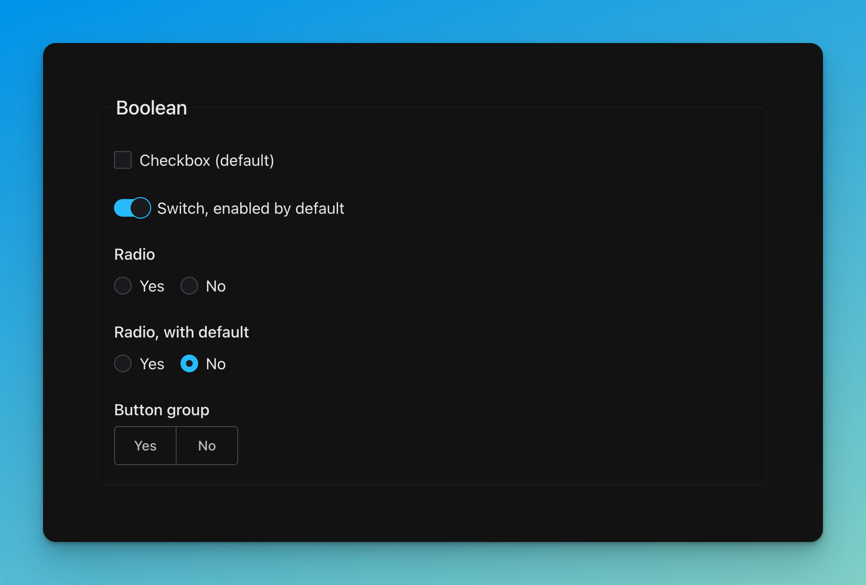
title: Boolean

properties:
  checkbox:
    title: Checkbox (default)
    type: boolean

  switch:
    title: 'Switch, enabled by default'
    type: boolean
    default: true

  radio:
    title: Radio
    type: boolean

  radioWithDefault:
    title: 'Radio, with default'
    type: boolean
    default: false

  buttonGroup:
    title: Button group
    type: boolean
# UI schema
switch:
'ui:widget': switch
radio:
'ui:widget': radio
radioWithDefault:
'ui:widget': radio
buttonGroup:
'ui:widget': button-groupEnumeration
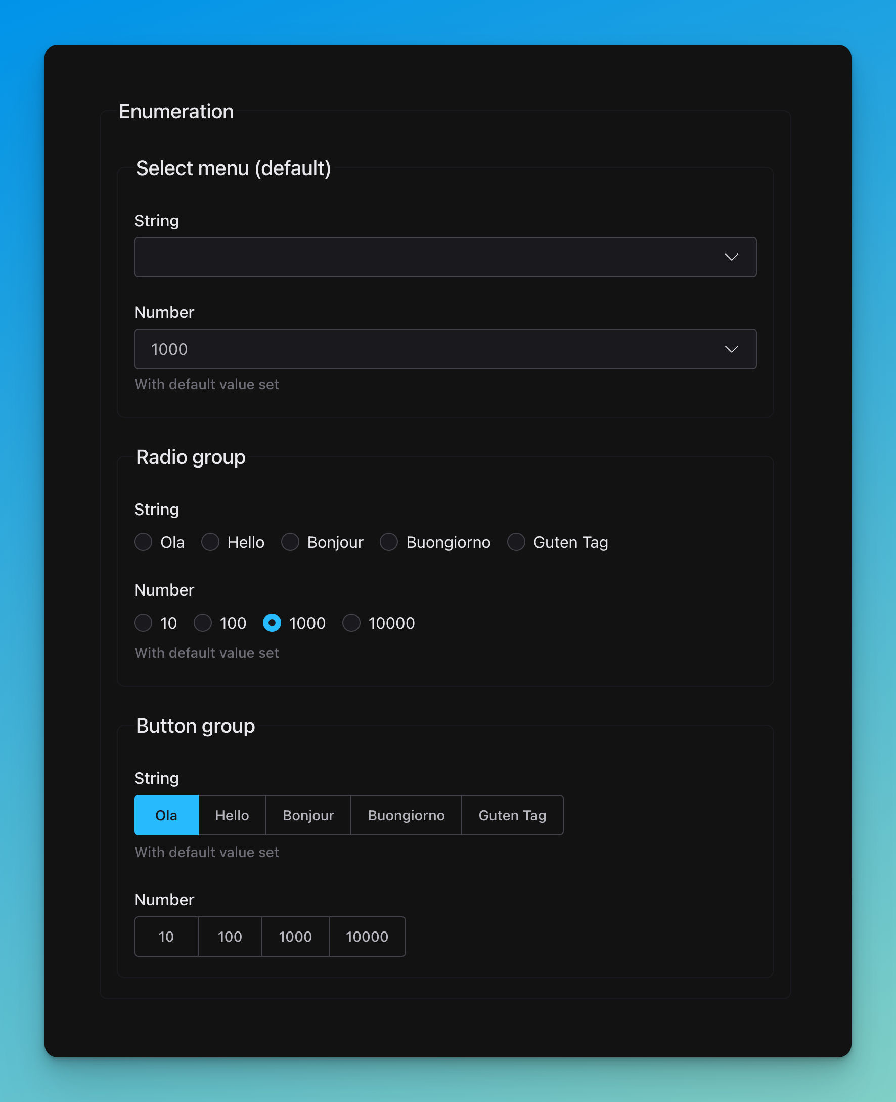
title: Enumeration

properties:
  select:
    title: Select menu (default)
    properties:
      string:
        title: String
        type: string
        enum: [Ola, Hello, Bonjour, Buongiorno, Guten Tag]
      number:
        title: Number
        type: number
        enum: [10, 100, 1000, 10000]
        description: With default value set
        default: 1000

  radio:
    title: Radio group
    properties:
      string:
        title: String
        type: string
        enum: [Ola, Hello, Bonjour, Buongiorno, Guten Tag]
      number:
        title: Number
        type: number
        enum: [10, 100, 1000, 10000]
        description: With default value set
        default: 1000

  buttonGroup:
    title: Button group
    properties:
      string:
        title: String
        type: string
        enum: [Ola, Hello, Bonjour, Buongiorno, Guten Tag]
        default: Ola
        description: With default value set
      number:
        title: Number
        type: number
        enum: [10, 100, 1000, 10000]
# UI schema
radio:
string:
'ui:widget': radio
number:
'ui:widget': radio
buttonGroup:
string:
'ui:widget': button-group
number:
'ui:widget': button-groupDate
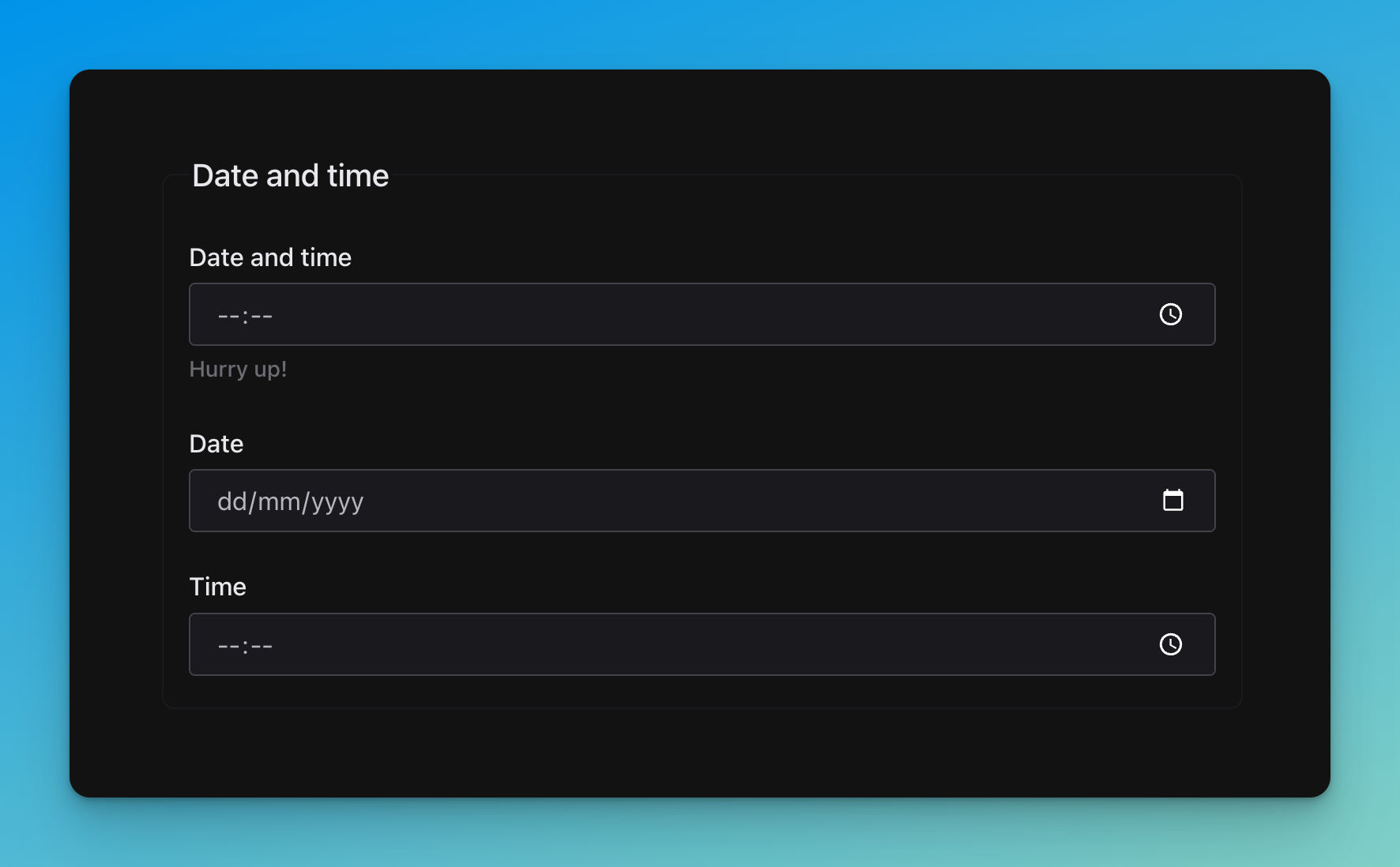
title: Date and time

properties:
  datetime:
    title: Date and time
    description: Hurry up!
    type: string
    format: date-time

  date:
    title: Date
    type: string
    format: date

  time:
    title: Time
    type: string
    format: time
Object
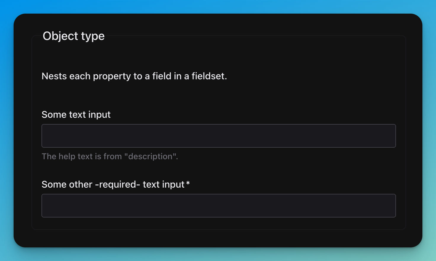
title: Object type
description: Nests each property to a field in a fieldset.
required:
  - textBar

properties:
  textFoo:
    title: Some text input
    type: string
    description: The help text is from "description".

  textBar:
    title: Some other -required- text input
    type: string
Additional properties
🚧……🚧
Arrays
Basic
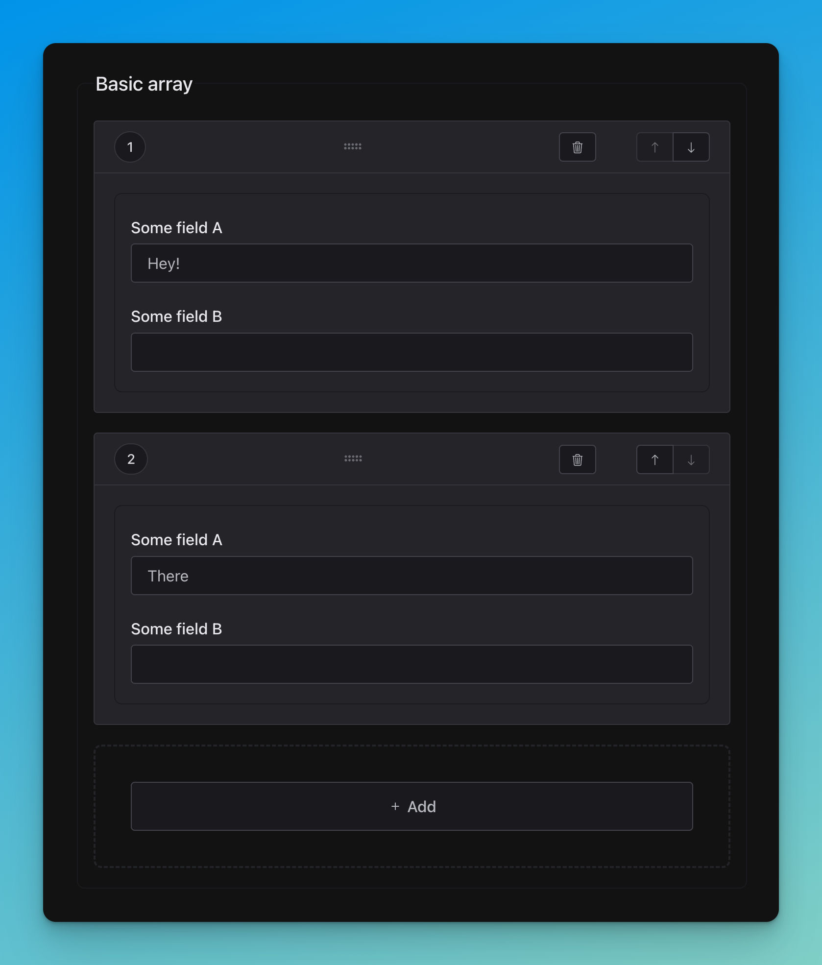
title: Basic array
type: array

items:
  properties:
    textA:
      title: Some field A
      type: string
    textB:
      title: Some field B
      type: string
Fixed
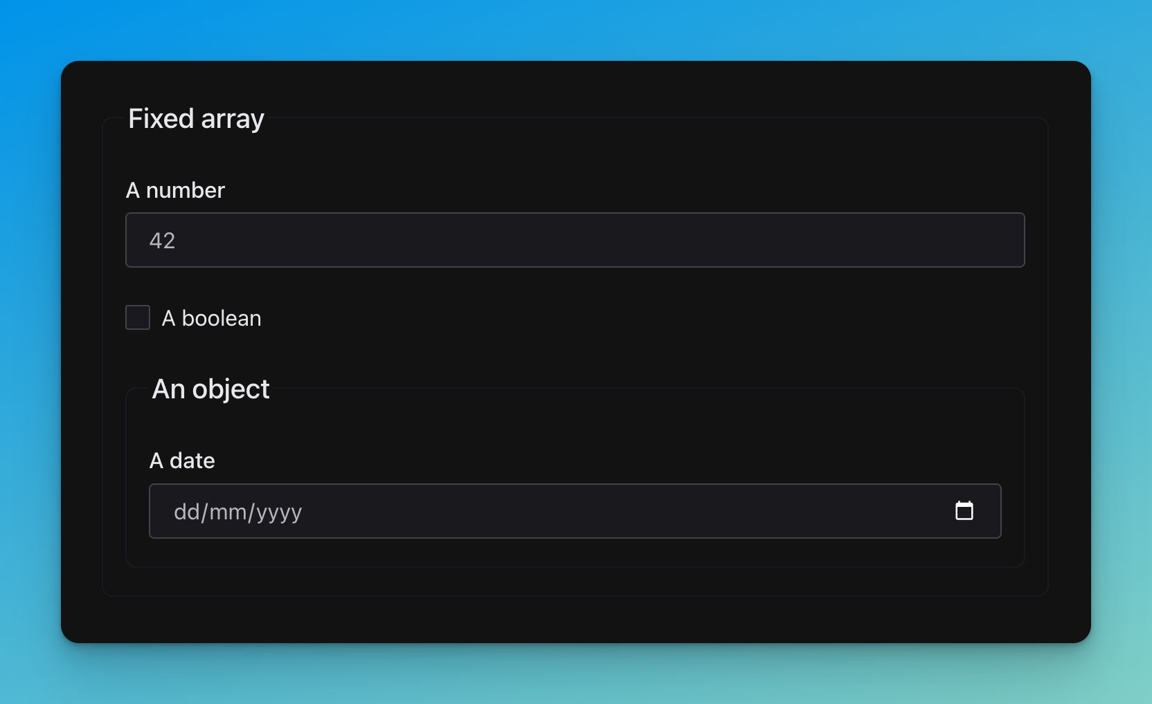
title: Fixed array
type: array

items:
  - title: A number
    type: number
    default: 42
  - title: A boolean
    type: boolean
    default: false
  - title: An object
    properties:
      when:
        title: A date
        type: string
        format: date
Nested
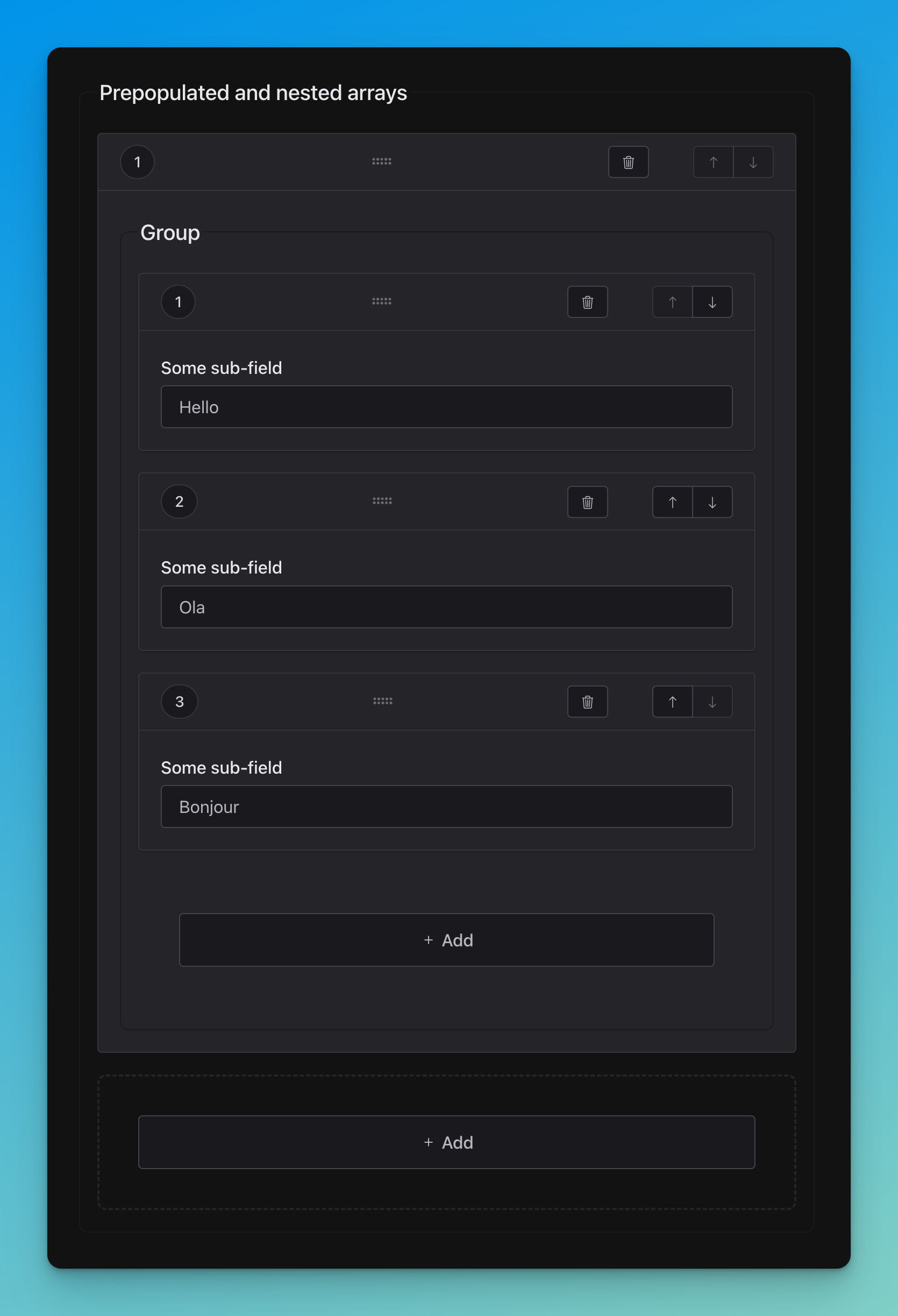
title: Prepopulated and nested arrays
type: array

items:
  title: Group
  type: array

  items:
    title: Some sub-field
    type: string
# Data
prepopulatedNested:
- - Hello
- OlaMultiple choices (enums.)
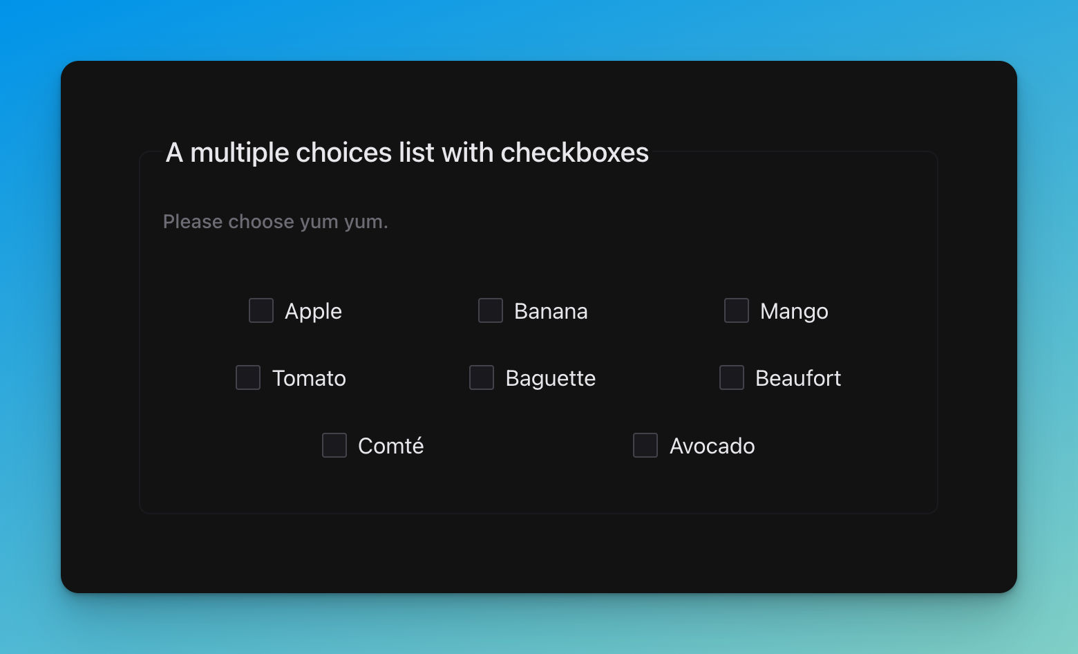
title: A multiple choices list with checkboxes
description: Please choose yum yum.
type: array
uniqueItems: true

items:
  type: string
  enum:
    - Apple
    - Banana
    - Mango
    - Tomato
    - Baguette
    - Beaufort
    - Comté
    - Avocado
Additional items
🚧……🚧
Subschemas
allOf
🚧……🚧
oneOf
🚧……🚧
anyOf
🚧……🚧
Conditionals
Dependencies
🚧……🚧
If, then, else
🚧……🚧
Miscellaneous
References
🚧……🚧
Recursivity
🚧……🚧
Nullable values
🚧……🚧
User Interface
Schema
🚧……🚧
Usage
Installation
npm i @jsfe/core
# or
pnpm i @jsfe/core
# or
yarn add @jsfe/core
import '@jsfe/core';import '@shoelace-style/shoelace/dist/themes/light.css';
import '@shoelace-style/shoelace/dist/themes/dark.css';See also the CSS section.
Implementation
Note
This project is new, API is subject to changes
All examples
You can try the multi-frameworks examples like this:
npx degit https://github.com/json-schema-form-element/examples jsfe-examples

cd jsfe-examples

npm i
npm run dev
Pure HTML with CDN
See examples/src/pages/pure-html.html
-OR-
-OR-
TypeScript (no framework)
See examples/src/components/TypeScriptOnly.ts
-OR-
Astro (SSR)
See examples/src/components/AstroJs.astro
-OR-
Lit
See examples/src/components/LitJs.ts
-OR-
Solid
See examples/src/components/SolidJs.tsx
-OR-
Vue
See examples/src/components/VueJs.vue
-OR-
Svelte
See examples/src/components/SvelteJs.svelte
-OR-
React
See examples/src/components/ReactJs18.tsx
-OR-
CSS
Nowadays, there are many different strategies for CSS loading / bundling. JSFE is embedding its own style in its shadow, but for components libraries (here Shoelace) you should act depending on your current workflow.
References:
- https://lit.dev/docs/components/styles
- https://vitejs.dev/guide/features.html#css
- https://shoelace.style/getting-started/installation#light-and-dark-theme
Shoelace is embedding styles chunks accross components, however CSS custom properties are injected globally.
TypeScript
Support for each implementation
| API | No framework | Astro (SSR) | Lit | Solid | Vue | React / Preact | Svelte |
| ------------------------- | ----------------- | ----------------- | ----------------- | -------------- | ------------ | -------------- | ----------------- |
| Declarative control | ✅ | ✅ | ✅ | ✅ via prop: | ✅ | ❌ | ❌ (4) |
| Declarative inference | ❌ (1) | ❌ (2) | ❌ (3) | ✅ via prop: | ❌ | ❌ | ❌ |
| Declarative type-checking | ❌ (1) | ❌ (2) | ✅ | ✅ via prop: | ❌ | ❌ | ❌ |
| Imperative control | ✅ via DOM | - | ✅ via ref | ✅ via ref | ✅ via ref | ✅ via ref | ✅ via use: |
| Imperative inference | ✅ via DOM | - | ✅ via ref | ✅ via ref | ✅ via ref | ✅ via ref | ✅ via use: |
| Imperative type-checking | ✅ via DOM | - | ✅ via ref | ✅ via ref | ✅ via ref | ✅ via ref | ✅ via use: |
- HTML language servers can't support TypeScript obviously. But IDE can leverage Custom Element metadata.
- Astro JSX namespace / LSP are not handling
HTMLElementTagNameMapor Custom Element metadata, yet. - Template literals are preventing automatic properties inference, but at least, you can't assign wrong argument types without knowing it.
- Svelte heuristics are not clear regarding attributes versus properties handling. Better be safe than sorry. Also the
use:directive is neat.
There might be changes regarding support for Web Components accross various the various UI frameworks above. Please file an issue if an info is wrong or missing.
Each implementation examples are trying to show off the most type-safe way to use JSFE, with the least trade-offs.
Using it more declaratively or imperatively is up to you, your framework ability and you coding style.
Bot usages are valid and can be mixed. Typically when you want to use the schema elsewhere in your app., or
when your callbacks are getting too beefy, you'll better extract them from templates.
Generally, imperative usage get perfect TypeScript support (you just handle the class), whereas declaratively, you'll have to deal with various template languages limitations (this is an universal problem).
Component libraries
Shoelace
Shoelace is the UI component library of choice for rendering fields, and as a
general design system backbone for JSFE.
It's beautiful, aims for simplicity, is not too opinionated, while still having character.
That's why it's the very first library implemented in JSFE.
Custom widgets
🚧……🚧
It's totally doable to swap some or all components for another
system, thanks to the very Custom Element flexible nature.
First step would be to create a generic interface
for communicating with individual fields, starting with the raw system browser ones as a reference. That might add a fair amount of complexity and some (negligible?) performance impact though.
Main benefit could be to add some “missing” components in Shoelace, like
combobox, complex date-time ranges, or whatever fancy widget your dreaming of.
For example, React JSON Schema Form does support a handful of different UI libraries maintained by the community,
but AFAIK, in the Web Component space only Shoelace is on par, thanks its Lit backbone, all while beeing totally FLOSS.
Things are changing fast though, thanks to a growing WC ecosystem, with big names backing it up (Adobe, MS, Google, IBM, SpaceX… basically everyone).
For now, the JSFE component is one Lit Element monolith. All sub-parts are “partials“,
not individual Web Components. Those snippets are wrapping the Shoelace
components and make them aware and alive.
The validation logic / UI options are mostly happening there.
Choice has been made to tie the logic closely with the component.
While this practice should be avoided generally, here we have a fully declarative / programmatic UI, so no need to create more levels of indirection than needed.
Mapping between schema and “real” fields happens at the HTMLElement level, same as all validation stuff, though you got hooks / bypasses for custom behaviors (see below).
Validation
You're responsible to hook-up additional / more advanced validation with, e.g, AJV.
HTML native validation is already quite powerful, but you might want to do
your own wizardry.
Note that client-validation is more for user experience,
while server validation is here to ensure data integrity, provide context aware round-trips…
JSON schemas are easing up the constraints enforcement for moving data around, but you'll still have to manage traditional chores.
Good news is that they give you more time to take care of business related operations, UX…
Schema massaging
Same as advanced validation handling above,
JSFE doesn't bundle, dereference, nor it is fetching remote
schemas.
Doing so would add a huge payload to the library, and you might certainly have already those tools at hand somewhere in your stack.
Only thing it does is resolving JSON references, pointing to local definitions only.
Implementation is quite simple, and because this is a much needed feature for DRY-ness, recursivity…
Hopefully it's easy to bring in an advanced parser along, like the json-schema-ref-parser.
Custom Elements Manifests
See ./custom-elements.json & ./custom-elements.md
Experimental features
To activate experimental features preview flags, just pass the experimental property.
E.g. with Lit:
html`<json-schema-form
	otherProps="..."
	.experimental=${{
		'<flag>': true,
		// ...
	}}
></json-schema-form>`;
Actual features flags list:
allOfoneOf
Improvements
- BYOC (bring your own components).
- Extensive and modern JSON Schema support (identify Draft 4 / 7 / 2020 subtleties).
- Nice file uploaders for the
data-urlformat. - Layout customizations
- Tests, browser based (due to the WC nature).
- Tests, tests, even more tests in the field to reveal shortcomings.
- Support for other UI library (MWC? FAST?)
- Drag and drop for array items, using native API.
- Autofocuses (for added array item, etc.)
- …
- Have an idea? Discussions are open!
Acknowledgements
The Web Component and JSON Schema communities, the Lit team, the Shoelace maintainers,…
As a workhorse for many projects of mine for a long time, I'm grateful for all the ideas RSJF creators brought.
Similar projects:
See also:
- remark-lint-frontmatter-schema: Validate your Markdown frontmatter data against a JSON schema.
- retext-case-police: Check popular names casing. Example: ⚠️
github→ ✅GitHub. - astro-openapi: An Astro toolset for building full-stack operations easily, with type-safety and documentation as first-class citizens.