
@jugaaadi/advance-scroll-input
v0.0.3
Published
A touch-friendly number input with a vertical roller scrubber and unit-aware parsing (10ft, 100in, 123mm, 123", 5' 6").

Maintainers
 mateen_ai
Readme
@jugaaadi/advance-scroll-input
👉 Live demo & docs — scroll-input.jugaaadi.com
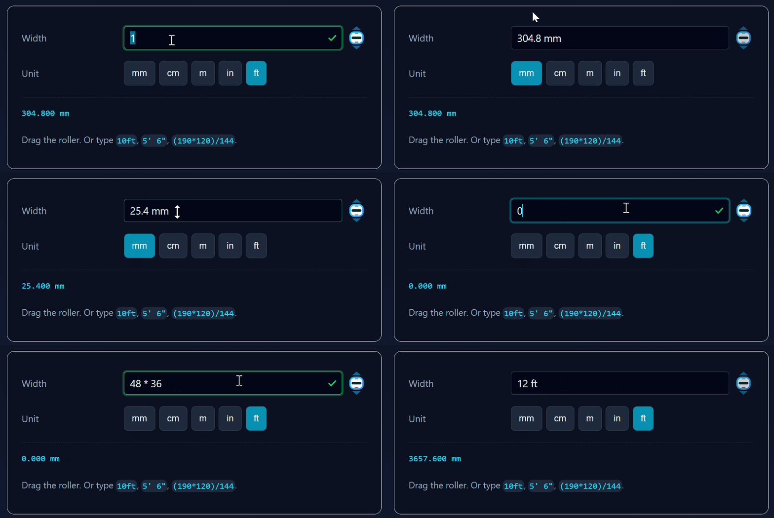
A touch-friendly number input with a vertical roller scrubber and unit-aware parsing.
Drag the field or the roller up/down to scrub the value. Tap an arrow to step by one. Click to type — and type it however you like: 10ft, 100in, 123mm, 123", 123', 5' 6", 1 1/2 in. The value is stored canonically in millimetres, so switching display units never loses precision.
It's also a formula field: type (190*120)/144, 100 * length, or 1m+500mm and it evaluates — with live validity feedback, syntax highlighting, and a revert button when an entry is rejected. No eval(); a real parser with real operator precedence.
Extracted from the Open CNC Forge CAD app and made standalone: zero runtime dependencies, React 17+, ships in both a plain-CSS and a Tailwind build.
Install
npm install @jugaaadi/advance-scroll-inputPeer dependencies are react and react-dom (>= 17) — the package doesn't bundle them.
Quick start
CSS build (default — works anywhere)
import { DimensionInput, Unit } from '@jugaaadi/advance-scroll-input';
import '@jugaaadi/advance-scroll-input/styles.css'; // once, anywhere in your app

function Panel() {
  const [widthMm, setWidthMm] = useState(304.8);

  return (
    <DimensionInput
      valueMm={widthMm}
      onChangeMm={setWidthMm}
      unit={Unit.MM}
      min={0}
    />
  );
}
Tailwind build
Same API, styled with utility classes instead of a stylesheet.
import { DimensionInputTw, Unit } from '@jugaaadi/advance-scroll-input/tailwind';Add the package to your Tailwind content globs or the classes get purged:
// tailwind.config.js
content: [
  './src/**/*.{ts,tsx}',
  './node_modules/@jugaaadi/advance-scroll-input/dist/**/*.js',
];
The Tailwind build assumes the default slate / cyan palette.
Plain number, no units
import { DraggableNumberInput } from '@jugaaadi/advance-scroll-input';

<DraggableNumberInput
  value={count}
  onChange={(e) => setCount(parseFloat(e.target.value) || 0)}
  min={0}
  max={99}
  unit="pcs"
/>;
Run the demo
npm install
npm run dev
Opens a page with live inputs, a unit switcher, and a scrolling log of every event the component fires — the fastest way to see the API in action.
Accepted input formats
Anything in this table can be typed into a DimensionInput, whatever unit it's currently displaying. A bare number is read as the current display unit.
| You type | Meaning | Result |
| -------------- | ---------------------- | ------------ |
| 123 | bare number | 123 × unit |
| 123mm | explicit millimetres | 123 mm |
| 45 cm | space is optional | 450 mm |
| 1m | metres | 1000 mm |
| 10ft | feet | 3048 mm |
| 100in | inches | 2540 mm |
| 123" | inch mark | 3124.2 mm |
| 123' | foot mark | 37490.4 mm |
| 5' 6" | compound feet + inches | 1676.4 mm |
| 5ft 6in | same, worded | 1676.4 mm |
| 1 1/2 in | mixed fraction | 38.1 mm |
| 3/4" | bare fraction | 19.05 mm |
| 10 feet | spelled out | 3048 mm |
| 2 inches | spelled out, plural | 50.8 mm |
| 96px | CSS pixels @ 96 DPI | 25.4 mm |
| 12,5cm | comma decimal | 125 mm |
Supported units: mm, cm, dm, m, in, ft, px.
Interaction model
| Gesture | Result |
| -------------------------------- | --------------------------------------------- |
| Drag up/down on the field | Scrub the value; one detent = one step |
| Drag up/down on the roller | Same, and blurs the field first |
| Tap (no movement) on the field | Focus and select all, ready to type |
| Tap an arrow | Step by step — up lights green, down orange |
| Hold and drag from an arrow | Scrub, same as the roller |
| ArrowUp / ArrowDown | Step by step |
| Shift + arrow | Step ×10 |
| Alt + arrow | Step ×0.1 |
| Enter | Commit and blur |
| Escape | Revert and blur |
| Wheel over the control | Step — opt in via enableWheel |
The roller's knurling lines rotate with the drag and snap into detents, so the value always lands on a whole step — never a floating-point remainder.
Formulas
→ Full reference: FORMULAS.md
Click a field showing 100, type *2, click away — it's 200. Refocus and it shows 100*2 again, so you can edit the formula instead of reverse-engineering it.
<DimensionInput
  valueMm={v}
  onChangeMm={setV}
  unit={unit}
  variables={{ qty: 4 }}                        // unitless scalars
  variablesMm={{ length: 1000, width: 600 }}    // dimensions, in mm
/>- Full precedence:
1+2*3is7,(1+2)*3is9 - Arithmetic, comparison, logical, ternary, 24 functions,
pi/tau/e - Mixed units:
1m+500mm,2ft*3,(3+2)mm - Live green tick / red no-entry while typing, plus a matching border
- Rejected entries keep their text and get a revert button
- Rainbow parens with match highlighting, coloured operator families
- No bitwise and no
^/**— programmer-only operators are rejected outright, so a stray character is a visible error rather than a wrong number. Usepow(2,10)for powers.
Disable per instance with formula={false}.
Negative values
Positive-only by default. With no configuration the value is floored at 0 however it arrives — typed, pasted, scrubbed, stepped with the arrows, or nudged with the keyboard. Attempts to go lower clamp to 0 and fire onClamp.
Opt in per instance:
<DimensionInput valueMm={offsetMm} onChangeMm={setOffsetMm} unit={unit} allowNegative />Then -5, -10ft, and -3/4" all parse and stick, and scrubbing passes through zero.
min interacts with it deliberately: while allowNegative is false, a negative min is ignored and treated as 0, so the flag is the single switch that governs sign. A positive min is always honoured. With allowNegative set, min is used exactly as given.
| Config | Effective floor |
| --- | --- |
| (nothing) | 0 |
| min={10} | 10 |
| min={-50} | 0 — negative min ignored |
| allowNegative | unbounded below |
| allowNegative min={-50} | -50 |
Direction feedback
While the roller is travelling, its rim, glow, knurling lines and active arrow all take the direction's colour — green going up, orange going down — and revert to the resting cyan when it settles. You can tell which way a value is moving without reading the number. Every one of those colours is a separate token, so you can retune or disable the effect entirely.
Touch & responsiveness
Both builds are touch-first:
touch-action: noneon the field and roller, so a vertical drag scrubs instead of scrolling the page.- Pointer capture, so the drag survives your finger leaving the element.
- Arrow hit areas are deliberately larger than the arrows themselves.
- On coarse pointers (
@media (pointer: coarse)) the control grows to a 44px target, and the font goes to 16px so iOS Safari doesn't zoom on focus. min-width: 0throughout, so the control shrinks correctly inside flex and grid parents.- A
@containerquery tightens spacing under 180px. prefers-reduced-motiondisables the transitions.
Theming (CSS build)
Every colour and size is a custom property. Override them on :root, a wrapper, or a single instance — no selector fights.
.my-panel {
  --sc-bg: #0b1020;
  --sc-border: #2a3550;
  --sc-accent: #a78bfa;
  --sc-height: 2.25rem;
  --sc-roller-idle: #a78bfa;
  --sc-roller-active: #c4b5fd;
}
Or per instance:
<DimensionInput
  valueMm={v}
  onChangeMm={setV}
  unit={unit}
  style={{ '--sc-accent': '#a78bfa', '--sc-radius': '9px' } as React.CSSProperties}
/>
Every colour, size, weight, opacity, cursor, and timing is a token — you should never need to override a selector.
Layout
| Token | Default | Controls |
| --- | --- | --- |
| --sc-height | 2rem | Input height |
| --sc-radius | 4px | Field corner radius |
| --sc-gap | 0.375rem | Gap between field and roller |
| --sc-padding-x | 0.5rem | Field horizontal padding |
| --sc-roller-width | 1.75rem | Roller column width |
| --sc-roller-height | var(--sc-height) | Roller height, independently of the input |
| --sc-roller-arrow-scale | 1 | Step-arrow size, relative to the roller |
| --sc-roller-overflow | hidden | Whether the roller may paint outside its box |
| --sc-width | 100% | Root width |
Sizing the roller
The roller graphic is fitted to its box — --sc-roller-width and
--sc-roller-height bound it in both directions, and it never paints outside
them. So the two halves of "make the roller smaller" and "make the input
bigger" are separate knobs:
/* a shorter roller beside an unchanged input */
.dense .sc-root { --sc-roller-height: 1.25rem; }

/* or a taller input beside an unchanged roller */
.roomy .sc-root { --sc-height: 3rem; --sc-roller-height: 2rem; }
The step arrows are the top and bottom 9 of the 32 view units, so one
arrow's tap target is 0.28 × h tall and 0.75 × h wide, where h is the
roller's fitted size — min(--sc-roller-height, --sc-roller-width ÷ 0.75).
Choose the height for the target you want: 2rem gives 24 × 9 px, the
2.75rem coarse-pointer default gives 33 × 12.4 px.
--sc-roller-arrow-scale above 1 is clipped at the box unless you also set
--sc-roller-overflow: visible. That is deliberate — a component that paints
outside its bounds cannot be laid out next to anything.
Typography
| Token | Default | Controls |
| --- | --- | --- |
| --sc-font-size | 0.875rem | Field text size |
| --sc-font-family | inherit | Field font |
| --sc-font-weight | 400 | Idle weight |
| --sc-font-weight-dragging | 700 | Weight while scrubbing |
| --sc-letter-spacing | normal | Idle tracking |
| --sc-letter-spacing-dragging | 0.025em | Tracking while scrubbing |
| --sc-text-align | left | Text alignment |
Surface, border and text — per state
Each of these has idle / hover / focus / dragging / disabled variants, so you can style any state independently.
| Token | Default | Controls |
| --- | --- | --- |
| --sc-bg | #020617 | Field background |
| --sc-bg-hover / -focus / -dragging / -disabled | inherit --sc-bg | Per-state background |
| --sc-border-width | 1px | Border thickness |
| --sc-border-style | solid | Border style |
| --sc-border | #334155 | Border colour |
| --sc-border-hover | #475569 | Border on hover |
| --sc-border-focus / -dragging | --sc-accent | Border when focused / scrubbing |
| --sc-border-disabled | --sc-border | Border when disabled |
| --sc-text | #e2e8f0 | Text colour |
| --sc-text-hover / -focus / -disabled | inherit --sc-text | Per-state text |
| --sc-text-dragging | #ffffff | Text while scrubbing |
| --sc-placeholder | #64748b | Placeholder |
| --sc-selection-bg / --sc-selection-text | #0e7490 / #fff | Text selection |
| --sc-caret | --sc-accent | Caret colour |
Accent, focus and shadow
| Token | Default | Controls |
| --- | --- | --- |
| --sc-accent | #06b6d4 | Base accent |
| --sc-focus-ring-width | 2px | Focus ring thickness |
| --sc-focus-ring-color | 40% accent | Focus ring colour |
| --sc-shadow | none | Idle shadow |
| --sc-shadow-dragging | inset | Shadow while scrubbing |
Roller
| Token | Default | Controls |
| --- | --- | --- |
| --sc-roller-idle | #0ea5e9 | Rim + arrows at rest |
| --sc-roller-active | #22d3ee | Rim while dragging |
| --sc-roller-face / -active | #f8fafc / #fff | Inner face |
| --sc-roller-grad-from / -to | #22d3ee / #3b82f6 | Rim gradient at rest |
| --sc-roller-grad-from-up / -to-up | #4ade80 / #16a34a | Rim gradient travelling up |
| --sc-roller-grad-from-down / -to-down | #fb923c / #ea580c | Rim gradient travelling down |
| --sc-roller-border-width | 2 | Rim thickness (unitless) |
| --sc-roller-glow | #22d3ee | Glow at rest |
| --sc-roller-glow-up / -down | #22c55e / #f97316 | Glow per direction |
| --sc-roller-glow-opacity | 0.4 | Glow strength |
| --sc-roller-opacity | 0.8 | Idle opacity |
| --sc-roller-opacity-hover / -focus / -dragging | 1 / 0.6 / 1 | Per-state opacity |
| --sc-roller-scale-dragging | 1.05 | Scale while dragging |
Knurling lines
Dark shades, because the roller face is light. They switch to greens going up and oranges going down.
| Token | Default | Controls |
| --- | --- | --- |
| --sc-line-1 / -2 / -3 | #172554 / #022c22 / #4c0519 | At rest (jewel tones) |
| --sc-line-up-1 / -2 / -3 | #14532d / #166534 / #15803d | Travelling up (green 900/800/700) |
| --sc-line-down-1 / -2 / -3 | #7c2d12 / #9a3412 / #c2410c | Travelling down (orange 900/800/700) |
Arrows
The active up arrow is green and the active down arrow orange. Both hues sit far from the roller's own cyan, so the active arrow reads instantly at 12px.
| Token | Default | Controls |
| --- | --- | --- |
| --sc-arrow-up-active | #22c55e | Up arrow fill when hot (green-500) |
| --sc-arrow-up-active-stroke | #14532d | Up arrow outline (green-900) |
| --sc-arrow-down-active | #f97316 | Down arrow fill when hot (orange-500) |
| --sc-arrow-down-active-stroke | #7c2d12 | Down arrow outline (orange-900) |
| --sc-arrow-opacity | 0.6 | At rest |
| --sc-arrow-opacity-dim | 0.3 | Other arrow while dragging |
| --sc-arrow-opacity-active | 1 | Hovered or active |
| --sc-arrow-transition | 0.15s | Arrow animation |
Motion, cursors, disabled
| Token | Default | Controls |
| --- | --- | --- |
| --sc-transition | 150ms | Field transitions |
| --sc-transition-roller | 300ms | Roller transitions |
| --sc-easing | ease | Easing curve |
| --sc-cursor-scrub | ns-resize | Cursor over field/roller |
| --sc-cursor-text | text | Cursor when typing |
| --sc-cursor-disabled | not-allowed | Cursor when disabled |
| --sc-opacity-disabled | 0.5 | Disabled opacity |
Touch overrides
The coarse-pointer and narrow-container breakpoints are themeable too: --sc-height-coarse, --sc-roller-height-coarse, --sc-roller-width-coarse, --sc-font-size-coarse, --sc-gap-coarse, --sc-gap-narrow, --sc-roller-width-narrow.
--sc-roller-scale-coarseis gone. It scaled the<svg>itself by 1.15, which grew the tap target by pushing the graphic ~3px outside its own box on every side. The coarse block grows--sc-roller-heightinstead, which produces a larger target (33 × 12.4 px against the old 27.6 × 10.4 px) and stays inside the layout.
A light preset ships as a modifier: <DimensionInput className="sc-root--light" />.
Tokens are consumed by the roller SVG through
style, not through SVG presentation attributes —fill="var(--x)"is not resolved by browsers, so the component never uses that form.
Props
DimensionInput / DimensionInputTw
| Prop | Type | Default | Description |
| ------------------ | -------------------------------------- | ------- | ---------------------------------------- |
| valueMm | number | — | Required. Value in millimetres. |
| onChangeMm | (mm: number) => void | — | Required. New value in millimetres. |
| unit | Unit | — | Required. Display/parse unit. |
| onCommitMm | (mm, source) => void | — | Fires when a value is finalised. |
| displayDecimals | number | 4 | Precision kept when converting from mm. |
| hideUnitSuffix | boolean | false | Hide the trailing unit label. |
Plus everything below.
DraggableNumberInput / DraggableNumberInputTw
| Prop | Type | Default | Description |
| -------------------- | ------------------------------------- | ------- | -------------------------------------------------- |
| value | number \| string \| '' | — | Required. |
| onChange | (e: {target:{value:string}}) => void| — | Required. Native-input-shaped change. |
| step | number | 1 | One detent, one arrow tap, one arrow key. |
| min | number | 0 | Lower bound; fires onClamp. |
| max | number | 9999999 | Upper bound — a CAD-friendly cap. |
| allowNegative | boolean | false | Permit values below zero. Off by default — see below. |
| integerOnly | boolean | false | Reject fractional results. |
| validate | (v) => true \| string | — | Custom validation; return a message to reject. |
| formula | boolean | true | Accept arithmetic, not just numbers. |
| variables | Record<string, number> | — | Unitless scalars usable in formulas. |
| variablesMm | Record<string, number> | — | Dimension variables in mm (DimensionInput only). |
| angleMode | 'rad' \| 'deg' | 'rad' | Units for sin/cos/tan (DimensionInput only). |
| feedback | 'both' \| 'icon' \| 'border' \| 'none' | 'both' | How live validity is shown. |
| showRevert | boolean | true | Revert button after a rejected entry. |
| highlight | boolean | true | Syntax-colour formulas while editing. |
| selectOnFocus | boolean | false | Select all on focus instead of caret-at-end. |
| resizable | boolean \| 'horizontal' \| 'vertical' \| 'both' | false | Let the user drag-resize the field. |
| pixelsPerTick | number | 6 | Drag px per step. Lower = more sensitive. |
| unit | string | — | Idle-state suffix. |
| disabled | boolean | false | |
| readOnly | boolean | false | Typing allowed, scrubbing disabled. |
| hideRoller | boolean | false | Field only. |
| showArrows | boolean | true | Tap-to-step arrows. |
| enableWheel | boolean | false | Wheel changes value. Off by default so the control never hijacks page scroll. |
| enableKeyboardStep | boolean | true | ArrowUp/ArrowDown stepping. |
| format | (v) => string | 2dp | Display formatter. |
| className / style| — | — | Root element. |
| inputClassName / inputStyle | — | — | The <input>. |
| rollerClassName | string | — | The roller column. |
| inputProps | InputHTMLAttributes | — | Escape hatch for any native attribute. |
Also passed through: id, name, placeholder, title, tabIndex, autoFocus, aria-label, aria-labelledby, data-testid, data-feature-id.
Imperative handle
const ref = useRef<ScrollComponentHandle>(null);

<DimensionInput ref={ref} ... />

ref.current?.focus();
ref.current?.blur();
ref.current?.select();
ref.current?.stepUp();   // returns the new value
ref.current?.stepDown();
ref.current?.revert();   // roll a rejected entry back to the last good value
ref.current?.input;      // the raw HTMLInputElement
Events
→ Full reference: EVENTS.md
Every native DOM handler is composed with the component's own logic — attaching one never disables built-in behaviour. Summary:
- Value —
onValueChange,onInput,onCommit,onParseError,onUnitDetected,onClamp,onRevert,onDraftValidityChange - Keyboard —
onKeyDown,onKeyUp,onKeyPress,onEnter,onEscape,onArrowKey - Focus —
onFocus,onBlur,onSelect - Mouse —
onClick,onDoubleClick,onContextMenu,onMouseDown,onMouseUp,onMouseMove,onMouseEnter,onMouseLeave,onMouseOver,onMouseOut,onHoverChange - Pointer —
onPointerDown,onPointerMove,onPointerUp,onPointerCancel,onPointerEnter,onPointerLeave - Touch —
onTouchStart,onTouchMove,onTouchEnd,onTouchCancel - Wheel —
onWheel - Scrub gesture —
onScrubStart,onScrub,onScrubEnd,onArrowClick,onDraggingChange
Headless usage
All the physics, pointer capture, and event plumbing live in a hook. Build your own shell if neither style suits you:
import { useScrubber, RollerIcon } from '@jugaaadi/advance-scroll-input';

function MyInput({ value, onChange }) {
  const { state, getInputProps, getRollerProps, getArrowProps } = useScrubber({ value, onChange });

  return (
    <div className="my-wrapper">
      <input {...getInputProps()} className="my-input" />
      <div {...getRollerProps()} className="my-roller">
        <RollerIcon state={state} getArrowProps={getArrowProps} />
      </div>
    </div>
  );
}
createDimensionInput(Base, displayName) wraps any such base with the millimetre/unit logic.
Utilities
import {
  Unit,
  toMm,
  fromMm,
  parseDimensionToMm,
  parseUnitFromString,
  isParsableDimension,
  formatFromMm,
  MM_PER_UNIT,
} from '@jugaaadi/advance-scroll-input';

parseDimensionToMm("5' 6\"", Unit.MM); // 1676.4
parseUnitFromString('10ft'); // Unit.FEET
fromMm(304.8, Unit.FEET); // 1
Package layout
scroll_component/
├── src/
│   ├── index.ts                    # CSS build entry
│   ├── tailwind.ts                 # Tailwind build entry
│   ├── useScrubber.ts              # headless engine — physics + events
│   ├── events.ts                   # the event surface, fully typed
│   ├── RollerIcon.tsx              # the roller SVG (shared)
│   ├── DraggableNumberInput.tsx    # CSS variant
│   ├── DraggableNumberInput.tw.tsx # Tailwind variant
│   ├── createDimensionInput.tsx    # shared mm/unit wrapper factory
│   ├── DimensionInput.tsx          # CSS variant
│   ├── DimensionInput.tw.tsx       # Tailwind variant
│   ├── units.ts                    # conversion + parsing
│   └── scroll-component.css        # themable stylesheet
├── demo/                           # Vite playground with a live event log
├── EVENTS.md                       # full event reference
└── tsup.config.ts                  # builds ESM + CJS + .d.ts
Scripts
| Script | Does |
| ------------------- | --------------------------------------- |
| npm run dev | Vite demo at http://localhost:5178 |
| npm run build | ESM + CJS + types + CSS into dist/ |
| npm run typecheck | tsc --noEmit |
Links
- Demo & docs — https://scroll-input.jugaaadi.com
- npm — https://www.npmjs.com/package/@jugaaadi/advance-scroll-input
- GitHub — https://github.com/MateenKhan/advance-scroll-input
Contributing
Pull requests are welcome. If you think a feature is genuinely needed in this input — something you actually hit while building with it — please open a PR or an issue at github.com/MateenKhan/advance-scroll-input.
Two things worth knowing before you propose a feature:
- The audience is designers, carpenters and CAD operators, not programmers. Features whose behaviour only a software engineer would predict get rejected — that is why there are no bitwise operators and no
^. A visible error always beats a plausible-but-wrong number, because someone will trust a bad dimension and cut material to it. - The engine has tests. Run
npm testbefore opening a PR; add assertions intest/engine.test.mjsfor anything you change in the parser.
git clone https://github.com/MateenKhan/advance-scroll-input.git
cd advance-scroll-input
npm install
npm run dev     # demo at http://localhost:5178
npm test        # build + engine test suite
Disclaimer
This software is provided as is, without warranty of any kind, express or implied. The author is not responsible for how you use it, or for any loss, damage, defect, cost or liability arising from its use — including, but not limited to, incorrect measurements, miscalculated dimensions, wasted material, machining errors, or any downstream consequence of a value this component produced.
Verify your own numbers. This is a UI input, not a certified measurement or engineering tool. If a value matters — if something gets cut, machined, ordered or built from it — check it independently before relying on it.
Use at your own risk.
License
MIT © jugaaadi
The full text is in LICENSE. In short: do what you like with it, keep the copyright notice, and it comes with no warranty and no liability.