
@jugaaadi/folder-tree
v0.0.1
Published
A dark-first, dependency-free React tree view with drag-and-drop reordering, search that auto-expands, multi/range select and full keyboard navigation.
Downloads
63

Maintainers
 mateen_ai
Readme
@jugaaadi/folder-tree
👉 Live demo & docs — folder-tree.jugaaadi.com
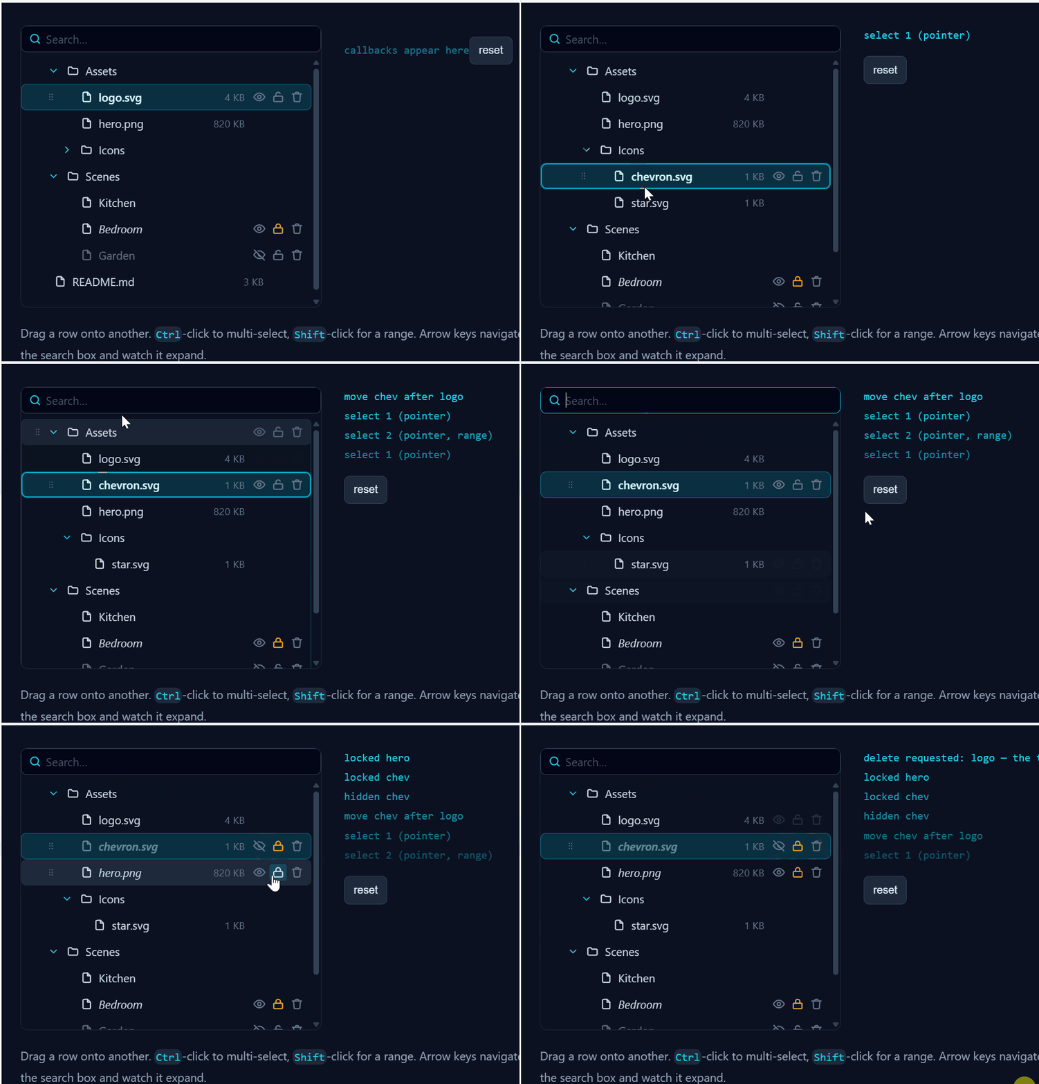
A dark-first React tree view with drag-and-drop reordering, search that auto-expands, multi/range select and full keyboard navigation.
Hand it a nested array and it renders. Every interaction is a callback you opt into — and a capability you don't wire up doesn't render its control. No dead eye icons, no inert drag handles, no "coming soon" affordances your users can click.
It is generic over your own node payload, so data comes back typed on the other side. The package knows nothing about layers, files, CAD or furniture.
Extracted from the Open CNC Forge layer panel and made standalone: zero runtime dependencies, React 17+, icons inline as SVG.
Install
npm install @jugaaadi/folder-treeOr straight from disk:
npm install file:../folder-tree/jugaaadi-folder-tree-0.0.1.tgzQuick start
import { useState } from 'react';
import { FolderTree, moveNodes } from '@jugaaadi/folder-tree';
import type { TreeNode, TreeNodeId } from '@jugaaadi/folder-tree';
import '@jugaaadi/folder-tree/styles.css'; // once, anywhere in your app

type Part = { sku: string; qty: number };

const initial: TreeNode<Part>[] = [
  {
    id: 'cupboard',
    label: 'Cupboard 900',
    children: [
      { id: 'side-l', label: 'Side · left', hint: '580 × 2100', data: { sku: 'P-1', qty: 1 } },
      { id: 'side-r', label: 'Side · right', hint: '580 × 2100', data: { sku: 'P-2', qty: 1 } },
      { id: 'door', label: 'Door', hint: '894 × 2094', data: { sku: 'D-1', qty: 1 } },
    ],
  },
];

function Panel() {
  const [nodes, setNodes] = useState(initial);
  const [selectedIds, setSelectedIds] = useState<TreeNodeId[]>([]);

  return (
    <FolderTree<Part>
      nodes={nodes}
      selectedIds={selectedIds}
      onSelect={setSelectedIds}
      onMove={(moved, target, position) =>
        setNodes((prev) => moveNodes(prev, moved, target, position))
      }
      onToggleHidden={(id) => togglePartVisibility(id)}
    />
  );
}
That renders rows with a disclosure triangle, an icon, a name, a right-aligned hint, a drag handle and an eye. It does not render a lock or a delete button, because onToggleLocked and onDelete were not passed.
Run the demo
npm install
npm run dev
A cupboard assembly on a dark panel, a live event log, and checkboxes that unwire each callback one at a time so you can watch its control disappear.
The node
type TreeNode<T = unknown> = {
  id: TreeNodeId; // string, unique across the whole tree
  label: string;
  children?: TreeNode<T>[];
  icon?: React.ReactNode; // inline SVG, an <img>, a colour chip — your choice
  hint?: string; // right-aligned muted text: a size, a count, a value
  keywords?: string; // extra searchable text that is never rendered
  hidden?: boolean;
  locked?: boolean;
  disabled?: boolean;
  readOnly?: boolean; // yours to show, but never reorderable or deletable
  data?: T; // your payload; the package never looks inside
};
Three details worth knowing:
| Field | What it actually controls |
| -------------------------- | --------------------------------------------------------------------------------------------------------------------- |
| children: [] vs no field | An empty array means "I am a container" — it can be dropped into. A node with no children field can only be reordered against, never opened up. |
| keywords | Searched, never drawn. Put synonyms here ('hinge handle front' on a door) so a search for hinge finds it. |
| readOnly | The row loses its drag handle and its delete button, refuses to be dragged, and refuses inside drops. It still selects, expands and renames. |
icon and hint are per-node, not per-tree — the tree does no icon mapping of its own. If you omit icon, a folder or file glyph is used depending on whether the row has children. Both are exported (FolderIcon, FileIcon) if you want to reuse them.
Props
Everything except nodes, selectedIds and onSelect is optional.
Data and selection
| Prop | Type | Notes |
| ------------- | ------------------------------------------------ | ------------------------------------------------------------------------ |
| nodes | TreeNode<T>[] | Required. The tree, as deep as you like. |
| selectedIds | TreeNodeId[] | Required. Fully controlled — the tree never holds selection itself. |
| onSelect | (ids, meta: SelectMeta) => void | Required. Fires with the complete next selection, never a delta. |
SelectMeta is { multi: boolean; range: boolean; via: 'pointer' | 'keyboard' }. Ctrl/Cmd sets multi, Shift sets range; the tree has already resolved both into the ids it hands you, so meta is only there if you want to react differently (e.g. skip an expensive 3D re-highlight during a keyboard sweep).
Search
| Prop | Type | Default | Notes |
| ------------------- | ------------------------- | ----------- | ----------------------------------------------------------------- |
| search | string | uncontrolled | Pass it to control the query yourself. |
| onSearchChange | (value: string) => void | — | Fires on every keystroke and on clear. |
| showSearch | boolean | true | Set false to supply your own field and drive search. |
| searchPlaceholder | string | 'Search…' | |
Search matches label and keywords, case-insensitively. Matching rows get a highlight ring; non-matching rows disappear unless they are an ancestor of a match (kept so the hierarchy still reads) or a descendant of a match (so opening a folder that matched shows what is in it).
Expansion
| Prop | Type | Notes |
| -------------------- | ----------------------- | ----------------------------------------------------------- |
| expandedIds | TreeNodeId[] | Pass to control expansion; omit and the tree holds its own. |
| onExpandedChange | (ids) => void | |
| defaultExpandedIds | TreeNodeId[] | First-render expansion when uncontrolled. |
Capabilities — omit to remove the control
| Prop | Type | What appears when you pass it |
| ---------------- | --------------------------------------------- | -------------------------------------------------------------------- |
| onRename | (id, name) => void | Double-click and Enter open an inline field. |
| onToggleHidden | (id) => void | An eye button on every row. |
| onToggleLocked | (id) => void | A padlock button on every row. |
| onDelete | (ids) => void | A trash button, and Delete/Backspace. |
| onMove | (moved, target, position) => void | Drag handles, draggable rows, drop indicators, the whole DnD layer. |
Omit onMove and no row carries a draggable attribute, no grip renders, and no drop listener is attached — not a disabled handle, no handle.
Everything else
| Prop | Type | Default | Notes |
| ----------------- | --------------------------------- | ---------------- | ----------------------------------------------------------------- |
| onHoverNode | (id \| null) => void | — | For linking the tree to a canvas or 3D viewport. |
| onContextMenu | (id, e) => void | — | The row is selected first, unless it is already in the selection. |
| emptyMessage | React.ReactNode | 'Nothing here.' | Shown when the tree is empty or search matched nothing. |
| virtualiseAfter | number | 200 | Above this many visible rows, rendering windows to the viewport. |
| ariaLabel | string | 'Tree' | Accessible name for the role="tree" element. |
| className | string | — | Added alongside ft-root. |
| style | React.CSSProperties | — | Handy for per-instance CSS custom properties. |
Drag and drop
Rows drop before, inside or after the row under the cursor:
| Cursor is in the row's… | Result |
| ----------------------- | ----------------------------------------------------------- |
| top 28 % | before — a cyan line above the row |
| middle | inside — the row highlights, if it has a children array |
| bottom 28 % | after — a cyan line below the row |
A leaf with no children array never yields inside; the middle band falls back to after.
Dragging a row that is part of the current selection drags the whole selection; dragging an unselected row drags just that row. readOnly rows are silently dropped from the payload. There is a strip below the last row that means "move to the end of the top level".
A node can never be dropped into its own descendant
This is the one rule that can corrupt a tree, so it is enforced in three places:
dragovernever callspreventDefault()for an illegal target. The browser therefore refuses the drop outright — nodropevent is dispatched, andonMovecannot fire.- The row shows a rejection state (
.ft-row--drop-rejected, a red inset ring and anot-allowedcursor) instead of a drop line, so the refusal is visible before the user lets go. canDrop()runs again inside thedrophandler, and a third time insidemoveNodes().
before and after are checked exactly as strictly as inside — landing beside a descendant still means landing inside the moved node's own subtree. Multi-drags are refused if any dragged node is an ancestor of the target.
If you apply moves yourself instead of using moveNodes, call canDrop first:
import { canDrop } from '@jugaaadi/folder-tree';

onMove={(moved, target, position) => {
  if (!canDrop(nodes, moved, target, position)) return; // belt and braces
  setNodes(applyMyOwnMove(nodes, moved, target, position));
}}
Keyboard
Focus lives on the role="tree" element and moves with aria-activedescendant, so a single Tab stop covers the whole tree.
| Key | Action |
| -------------------------------------- | ------------------------------------------------------------ |
| ↓ / ↑ | Move to the next / previous visible row and select it |
| Shift + ↓/↑ | Extend the selection from the anchor |
| → | Expand a collapsed row; on an open row, move to its first child |
| ← | Collapse an open row; on a leaf, move to its parent |
| Home / End | Jump to the first / last visible row |
| Space | Add or remove the focused row from the selection |
| Ctrl/Cmd + A | Select every visible row |
| Enter | Rename (needs onRename) |
| Delete / Backspace | Delete the selection (needs onDelete) |
| Escape | Cancel a rename; in the search field, clear it |
Keys with no wired callback do nothing at all — Delete is inert without onDelete.
Accessibility
role="tree"witharia-label,aria-multiselectableandaria-activedescendant- every row is
role="treeitem"witharia-level,aria-selected,aria-setsize,aria-posinset, andaria-expandedon rows that have children - action buttons carry
aria-labelandaria-pressed, and sit attabIndex={-1}so they never break the single tab stop @media (prefers-reduced-motion: reduce)disables every transition
Search that puts expansion back
Type into the search field and the ancestors of every match open up. Clear it and the tree returns to exactly the expansion you had before you typed — including rows you had deliberately collapsed.
That works because the auto-expansion is derived, never committed: the query's expansion set is unioned with yours at render time and thrown away when the query empties. Nothing is written back to expandedIds, so onExpandedChange stays quiet while you search. If you close one of the auto-opened rows by hand, it stays closed until the query changes.
Large trees
Above virtualiseAfter visible rows (default 200) the tree switches to windowed rendering: rows are absolutely positioned inside a spacer of the full height, and only the viewport's worth plus a small overscan is in the DOM. Row height is measured from the first rendered row, so changing --ft-row-height needs no configuration.
Selection, keyboard navigation and scroll-to-selection all address rows by index, so they work identically whether or not the row is currently mounted.
Styling
One stylesheet, everything scoped under .ft-root, and every value a CSS custom property with a literal fallback baked into the var(). You should never need to override a selector.
.my-panel {
  --ft-accent: #a78bfa;
  --ft-row-height: 32px;
  --ft-row-bg-selected: rgba(167, 139, 250, 0.18);
}
<FolderTree style={{ '--ft-indent': '20px' } as React.CSSProperties} … />Main tokens:
| Group | Tokens |
| ------ | --------------------------------------------------------------------------------------------------- |
| Layout | --ft-row-height --ft-indent --ft-gap --ft-padding-x --ft-radius --ft-icon-size |
| Type | --ft-font-family --ft-font-size --ft-font-weight --ft-font-weight-selected --ft-hint-font-size |
| Colour | --ft-bg --ft-row-bg --ft-row-bg-hover --ft-row-bg-selected --ft-row-border-selected --ft-text --ft-text-selected --ft-text-muted --ft-hint |
| Accent | --ft-accent --ft-accent-soft --ft-danger --ft-warn --ft-match-ring |
| DnD | --ft-drop-line --ft-drop-line-width --ft-drop-inside-bg --ft-drop-inside-border --ft-drop-reject |
| Search | --ft-search-bg --ft-search-border --ft-search-border-focus --ft-search-text --ft-search-placeholder --ft-search-height |
| Motion | --ft-transition --ft-hidden-opacity --ft-disabled-opacity |
The defaults are tuned for a dark slate panel. .ft-root fills its parent's height and scrolls internally, so give the parent a height and stop worrying about it.
Exported helpers
Pure functions, no React, safe to use on a server.
| Function | Returns |
| ---------------------------------------------------- | -------------------------------------------------------------------------- |
| moveNodes(nodes, movedIds, targetId, position) | A new tree with the move applied — or the same array if canDrop says no. Untouched branches keep their object identity. |
| canDrop(nodes, movedIds, targetId, position) | false for self-drops, own-subtree drops, readOnly sources, readOnly inside targets and unknown ids. |
| findNode(nodes, id) / findNodePath(nodes, id) | The node, or the root-to-node chain. |
| ancestorIds(nodes, id) | Ancestor ids, nearest last. |
| collectDescendantIds(node) | A Set of every id below a node. |
| isDescendantOf(nodes, ancestorId, candidateId) | A node is never its own descendant. |
| walkTree(nodes, visit) | Depth-first walk; return false from visit to skip a subtree. |
| searchTree(nodes, query) | { visible, matched, expand } id sets. |
| nodeMatches(node, query) | Label + keywords, case-insensitive. |
| flattenVisible(nodes, expanded, filter) | The on-screen rows in visual order, with depth and parent resolved. |
Also exported: FolderIcon, FileIcon, and DRAG_MIME (the extra MIME type set on dataTransfer alongside text/plain, if you need to tell this tree's drags apart from other drag sources).
What is deliberately not in here
- No tree mutation.
nodesis yours.moveNodesis a helper you may ignore. - No icon set. Rows render whatever
iconyou give them. - No context menu.
onContextMenuhands you the event and gets out of the way. - No async loading. Give it the tree you have.
Testing
npm run build && npm test25 assertions over the pure logic — the descendant guard, multi-move payloads, structural sharing, search sets and flattening.
Links
- Demo & docs — https://folder-tree.jugaaadi.com
- npm — https://www.npmjs.com/package/@jugaaadi/folder-tree
- GitHub — https://github.com/MateenKhan/folder-tree
Contributing
Pull requests are welcome. If you think a feature is genuinely needed in this tree — something you actually hit while building with it — please open a PR or an issue at github.com/MateenKhan/folder-tree.
Two things worth knowing before proposing a feature:
- A capability you don't wire up doesn't render its control. That's the design, not an oversight. Proposals that add always-visible chrome, or a control that appears without a handler behind it, will be pushed back on — a dead eye icon is worse than no eye icon.
- The tree is yours. This component never mutates
nodes.moveNodesis a helper you may ignore. Anything that makes the package own your state is out of scope.
git clone https://github.com/MateenKhan/folder-tree.git
cd folder-tree
npm install
npm run dev                 # demo
npm run build && npm test   # 25 assertions over the pure logic
Disclaimer
This software is provided as is, without warranty of any kind, express or implied. The author is not responsible for how you use it, or for any loss, damage, cost or liability arising from its use — including, but not limited to, data loss from a move or delete, an incorrect hierarchy, or any downstream consequence of a callback this component fired.
onDelete and onMove hand you intent, not action — what happens to your data is your code's decision. If deletions are destructive, confirm them and back them up on your side.
Use at your own risk.
License
MIT © jugaaadi
Full text in LICENSE. In short: do what you like with it, keep the copyright notice, and it comes with no warranty and no liability.