
@julescript/nested-tab-bar
v0.2.1
Published
A tab bar whose selected tab can grow a panel, joined to its own tab by a stem, so the parent-to-child relationship is visible instead of learned.

Maintainers
 julescript
Readme
@julescript/nested-tab-bar
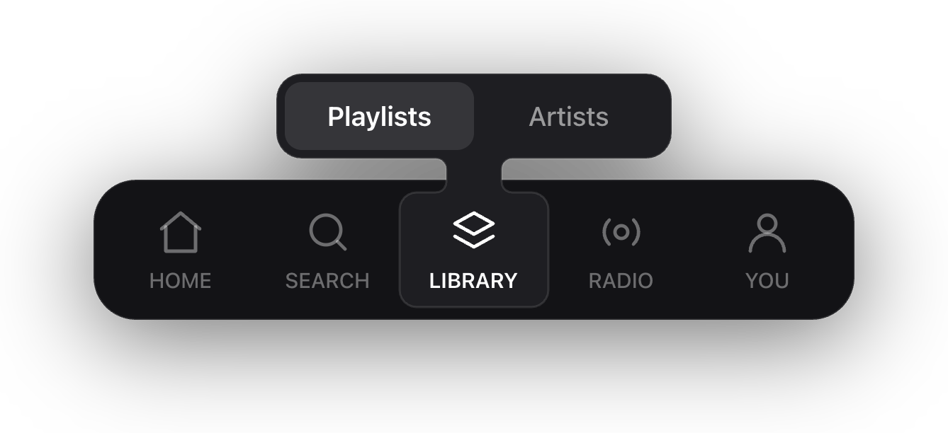
A tab bar whose selected tab can grow a panel, joined to its own tab by a stem. The stem is the whole idea: it says which tab the panel belongs to without a word of explanation.
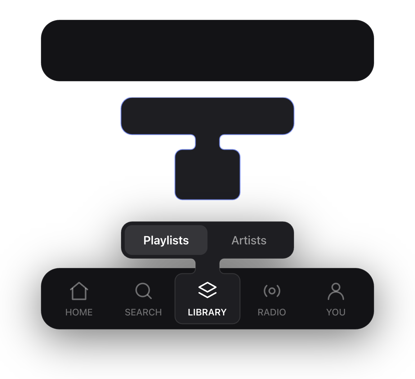
The bar is a plain rounded rectangle that never changes shape. The branch, panel and stem and pill in one continuous outline, is drawn over it. Nothing is ever carved out of the bar.
npm install @julescript/nested-tab-barReact 18 or 19, as a peer dependency. No other runtime dependencies.
Use
import { NestedTabBar } from "@julescript/nested-tab-bar";
import "@julescript/nested-tab-bar/styles.css";

<NestedTabBar
  items={[
    { key: "home", children: <Tab icon={<Home />} label="HOME" /> },
    { key: "search", children: <Tab icon={<Search />} label="SEARCH" /> },
    { key: "library", children: <Tab icon={<Layers />} label="LIBRARY" /> },
  ]}
  activeKey="library"
  placement="bottom"
  panel={{
    anchorKey: "library",
    label: "Library pages",
    content: <Pages />,
  }}
/>;
The component owns layout, geometry, the silhouette and the motion. It does not
own your tabs. Every item's children is whatever element you want, a link, a
button, a logo, so you keep your own router, your own icons and your own type.
What goes in the panel
The panel is a slot. Two shapes of content are common and the width follows from which one you use.

A control wants the room, so leave width at its default and the panel
spans the bar.
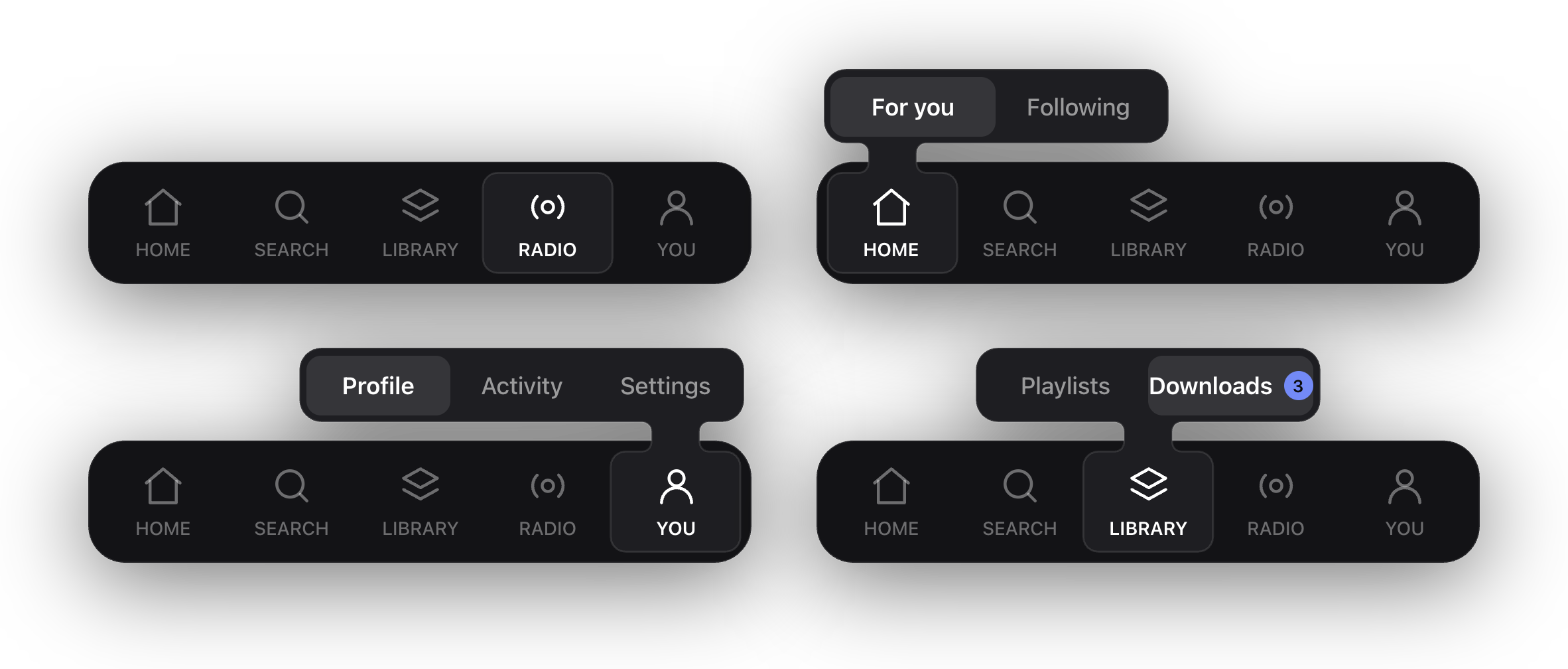
panel={{ anchorKey: "home", label: "Search", content: <SearchInput /> }}A short list of sibling pages wants to sit over its own tab, so give it a fixed width. It is centred on the anchor tab, then clamped so it stays inside the bar. Near an end the panel stops moving and the stem sits off centre within it, which is right: the stem points at its tab, not at the middle of itself.
panel={{ anchorKey: "library", label: "Library pages", width: 186, content: <Pages /> }}Two or three pages, no more. Past three the labels fall below reading size, so scroll the panel instead, or give the tab a real screen.
Props
NestedTabBar
| Prop | Type | Default | |
|---|---|---|---|
| items | NestedTabBarItem[] | required | The tabs, in order |
| activeKey | string \| null | null | Which tab reads as current. Null highlights nothing |
| placement | "top" \| "bottom" | "top" | A bottom bar grows its panel upward |
| panel | NestedTabBarPanel \| null | null | Omit and the bar is just a bar |
| barHeight | number | 66 | |
| barRadius | number | 20 | |
| padding | number | 6 | Between the bar's edge and its tabs |
| tabRadius | number | 8 | |
| panelMetrics | Partial<PanelMetrics> | | Overrides any geometry number |
| label | string | | Names the bar for assistive technology |
| className | string | | The root carries this and nothing else |
NestedTabBarItem
| Field | Type | |
|---|---|---|
| key | string | Unique, and what activeKey and anchorKey refer to |
| children | ReactNode | The whole interactive element |
| width | number | Fixed slot width. Omit and the slot shares the leftover space |
| selectable | boolean | False for anything that never reads as current |
NestedTabBarDivider
A rule between two groups. Pass it in items like anything else.
| Field | Type | Default | |
|---|---|---|---|
| key | string | required | |
| divider | true | required | |
| width | number | 11 | The slot, including the space either side of the rule |
| height | number | 28 | The rule itself |
NestedTabBarPanel
| Field | Type | |
|---|---|---|
| anchorKey | string | The item the panel grows out of |
| content | ReactNode | |
| width | number \| "fill" | Defaults to "fill" |
| height | number | Defaults to 40 |
| label | string | Names the panel for assistive technology |
More than one kind of item
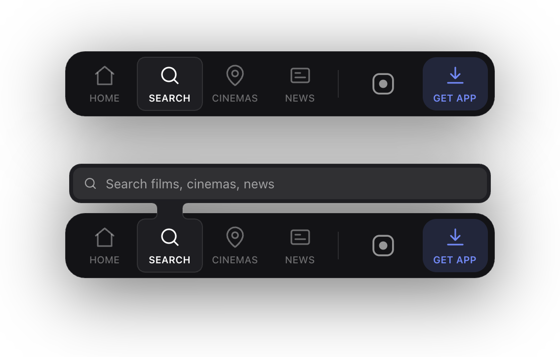
A bar does not have to be five equal tabs. Items can be any width, some of them need never read as current, and a divider separates one group from another. That is enough to build a toolbar: navigation at the start, a rule, then whatever else belongs in the corner.
<NestedTabBar
  className="my-bar"          // position it yourself: fixed, in a header, anywhere
  activeKey={active}
  items={[
    { key: "now", width: 66, children: <Tab .../> },
    { key: "shows", width: 66, children: <Tab .../> },
    { key: "news", width: 66, children: <Tab .../> },
    { key: "rule", divider: true },
    { key: "brand", width: 80, selectable: false, children: <Logo /> },
    { key: "get", width: 66, selectable: false, children: <AccentButton /> },
  ]}
/>
An item with selectable: false still sits in the bar and is still clickable.
It just never takes the highlight and never carries the panel, which is what you
want for a logo, an external link, or a call to action that is not one of the
tabs.
The component never positions itself. It fills the width it is given, so where
the bar lives is entirely up to the className you pass: fixed to the bottom of
a phone screen, or in the corner of a desktop header.
Theming
Six custom properties, set on the bar or on any ancestor. There are no colours in the component itself, so it takes your design system rather than bringing one.
| Property | | Default |
|---|---|---|
| --nb-surface | The bar | rgba(20,20,24,.9) |
| --nb-branch | Panel, stem and pill, one shade up from the bar | rgba(31,31,35,.95) |
| --nb-line | Hairline around both | rgba(255,255,255,.11) |
| --nb-divider | The rule between groups | falls back to --nb-line |
| --nb-active | The highlight when no panel is open | rgba(255,255,255,.1) |
| --nb-shadow | A filter, since the silhouette is drawn rather than boxed | drop-shadow(0 14px 34px rgba(0,0,0,.55)) |
.my-bar {
  --nb-surface: rgb(18 18 20 / 0.92);
  --nb-branch: rgb(30 30 34 / 0.96);
}
Every property has the same value baked in as a fallback, so importing
styles.css is genuinely optional: skip it and you get the defaults above,
import it to have them as real declarations you can inspect and override in one
place. Setting some and not others is safe.
Motion
The highlight follows the active tab with a critically damped spring, so moving between tabs is a glide rather than a jump. The first render is not animated: a page that loads with the third tab active shows it highlighted rather than sliding in from the first. Anyone who has asked for reduced motion gets the target immediately.
The spring runs on requestAnimationFrame and stops itself once it settles, so
an idle bar costs nothing.
Right to left
Nothing to configure. Slot positions are measured from the container's own
leading edge, so a bar inside dir="rtl" mirrors along with everything else.
Geometry
Every path is generated by pure functions you can use directly, which is how the component is tested and how a non-React renderer would be built.
import { barPath, fusedPath, panelBox, panelContentBox } from "@julescript/nested-tab-bar";The drawing is always generated for a bar at the top with its panel below. A bottom bar renders the same path mirrored vertically, so there is one set of maths to reason about and one set of tests.
The rule that matters most
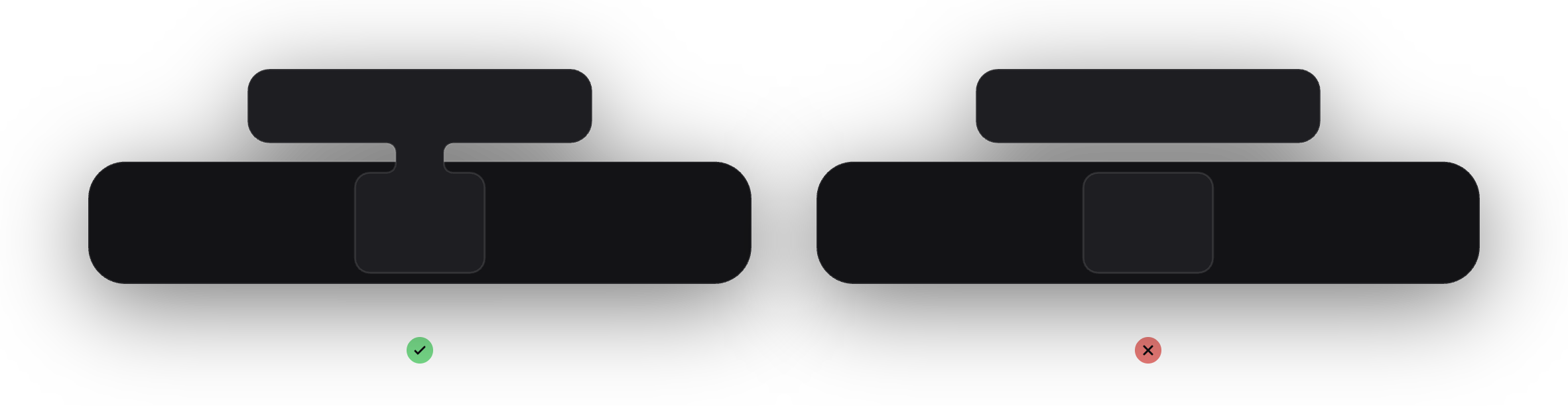
The stem must have a straight run between its two fillets. If the fillets meet with no straight section the tangents disagree at the join, and a visible corner appears where the curve should be continuous. That single detail is the difference between the shape reading as one body and reading as three parts glued together. The generator shrinks the fillet before it lets the straight run reach zero, so this holds at any gap.
Guidelines
Contributing
See CONTRIBUTING.md. The short version: the geometry is pure and fully tested, nothing product specific may enter the package, and every change lands here rather than being patched around in a consumer.