
@kamod-ch/ui
v0.2.1
Published
Lightweight Preact + Tailwind UI components: composable primitives you can customize, extend, and ship without a heavy runtime.
Maintainers
 kzahirag
Readme
Lightweight UI components for Preact and Tailwind: composable primitives you can customize, extend, and ship without a heavy runtime. Open source; source is meant to be read and adapted.
Demo · Component docs · npm · GitHub · Issues
If Kamod UI saves you time, star the repo — it helps others discover the project.
Why Kamod UI?
Many UI kits are heavier than necessary, overly opinionated, or tied to React. Kamod UI targets a smaller stack instead:
- Preact-first — tiny runtime and familiar patterns if you already use React-like APIs.
- Tailwind-native — style with utilities instead of a separate theme layer.
- Composable — build UIs from small pieces without extra abstraction.
- Practical — ship only what you need; the codebase stays easy to follow.
When to use Kamod UI
| | Kamod UI | Radix UI / shadcn | Heavy design systems | | -------------- | --------------------------------------------- | ----------------------- | ---------------------------- | | Preact | Yes | React only | Varies | | Tailwind-first | Yes | Partial / yes | Often custom tokens | | Bundle weight | Per-component, typically 0.4–10 KB gzip | Larger runtime | Platform overhead | | Best for | Preact + Tailwind apps you can read and adapt | React + Tailwind stacks | Org-wide token/CMS platforms |
Choose Kamod UI when you want Preact, Tailwind CSS v4, composable primitives, and source you can fork or extend without a heavy runtime.
Choose something else when you need React-only ecosystems (Radix/shadcn), no Tailwind, or a full design-system platform with CMS-driven tokens.
Quick start
pnpm add @kamod-ch/ui preact @preact/signals tailwindcss/* app.css */
@import "tailwindcss";
@import "@kamod-ch/ui/theme.css";import { Button } from "@kamod-ch/ui";
export function App() {
return <Button>Click me</Button>;
}Browse the live component docs for variants, composition, and RTL examples.
Using Kamod UI
Requirements
- Preact
>= 10.26 @preact/signals>= 2.0(required peer dependency — see below)- Tailwind CSS v4 (v3 is not supported)
- An ESM-friendly bundler (Vite, Rolldown, esbuild, Next.js, …). Kamod UI is ESM-only; it does not ship a CommonJS build.
- SSR: client components guard
typeof document/windowaccess and re-render safely on the client.
Install
pnpm add @kamod-ch/ui preact @preact/signalsThe published library on npm is @kamod-ch/ui. This monorepo root and apps/demo are not published. The former package @kamod-ui/core and the unscoped kamod-ui name are legacy — install @kamod-ch/ui instead.
Import the default theme once so Tailwind compiles component classes and semantic CSS tokens:
@import "tailwindcss";
@import "@kamod-ch/ui/theme.css";@preact/signals
@preact/signals is a required peer dependency — install it in every app, even when you only use presentational components like Button. That keeps a single signal runtime and avoids duplicate instances when you add interactive components later.
In your app code, you usually do not import signals yourself. Components manage open state, selection, and stores internally.
Import signals yourself when you use Kamod's lower-level helpers:
| Use case | Import |
| ----------------------------------- | -------------------------------------------------------------------------------- |
| Custom controlled primitives | @kamod-ch/ui/lib/signals → createControllableSignal |
| Overlay dismiss / roving focus | @kamod-ch/ui/lib/interactive → createDismissableLayer, createRovingFocus |
| Advanced toast / sonner integration | @kamod-ch/ui/toast or @kamod-ch/ui/sonner stores |
See the Signals column in the component reference for which exports use signals internally (direct, indirect via Dialog/Popover, or none).
Per-component imports (tree-shaking)
Both styles are supported:
import { Button } from "@kamod-ch/ui"; // root barrel
import { Button } from "@kamod-ch/ui/button"; // per-component subpath
The package ships a minimal sideEffects list (progress indeterminate keyframes and CSS only), so modern bundlers tree-shake the root barrel reliably.
Component sizes
Each @kamod-ch/ui/<name> subpath is a separate export. Typical gzip size is 0.4–10 KB (Kamod JS only; excludes preact, @preact/signals, and CSS).
See Component sizes & signals reference for all 65 exports with min/gzip sizes and signal usage. Regenerate after core changes:
pnpm docs:componentsCustomize the theme
Override semantic tokens after importing the default theme:
@import "tailwindcss";
@import "@kamod-ch/ui/theme.css";

:root {
  --primary: var(--color-fuchsia-700);
  --primary-foreground: var(--color-white);
  --radius: 0.75rem;
}

.dark {
  --primary: var(--color-fuchsia-400);
  --primary-foreground: var(--color-neutral-950);
}
For full control, copy from packages/core/src/theme.css or see the demo's foundation.css and themes.css.
Documentation
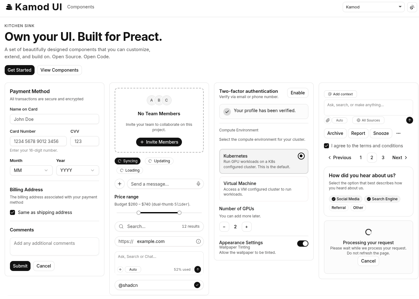
Live demo: ui.kamod.ch (custom domain; same deploy as GitHub Pages)
Interactive API docs live under /docs/* in the demo app (e.g. /docs/button).
Run locally from the repo root:
pnpm install
pnpm dev
Open the URL printed in the terminal for the kitchen sink and component docs. Quality gates: pnpm test, pnpm test:e2e, pnpm check.
Contributing
| Workspace | Path | Role |
| ---------------- | ---------------- | ---------------------------------------- |
| @kamod-ch/ui | packages/core/ | Published library (65 component exports) |
| demo | apps/demo/ | Kitchen sink + interactive docs |
- Open issues for bugs and ideas; PRs welcome for components, docs, and examples.
- Key scripts:
pnpm dev,pnpm check,pnpm fmt,pnpm lint,pnpm docs:components - Tooling details:
.docs/interna.md
Maintainers: see .docs/MAINTAINERS.md for npm release workflow.
Support
- Star the repository — improves visibility in search and community lists.
- Share the project with others who use Preact or Tailwind.
- Watch the repo for release notifications (optional).