
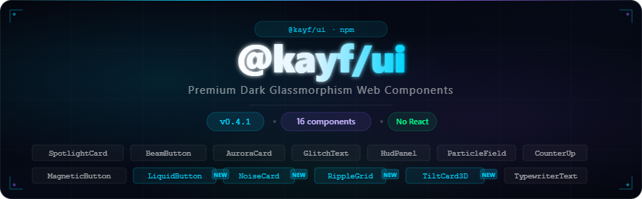
@kayf/ui
v0.4.2
Published
Premium dark glassmorphism Web Components. No React. No dependencies.
Maintainers
 kayf
kayfReadme


Premium Dark Glassmorphism Web Components
Native · No React · TypeScript · 16 Components
✨ What is @kayf/ui?
@kayf/ui is a premium Web Components library built for developers who demand exceptional UI without framework lock-in. Inspired by game interfaces and modern dashboards, every component is crafted with:
- 🌑 Dark glassmorphism aesthetic — backdrop-blur, noise textures, glow effects
- ⚡ Native Web Components — no React, no Vue, works everywhere
- 🎮 Game-ready — perfect for dashboards, Electron apps, game UIs
- 🔷 TypeScript — full type safety and intellisense
- 🎭 Zero dependencies — only native browser APIs
🚀 Install
npm install @kayf/ui📦 Usage
<!-- CDN (UMD) -->
<script src="https://unpkg.com/@kayf/ui/dist/kayf-ui.umd.js"></script>
// ESM
import '@kayf/ui';
// Individual components
import '@kayf/ui/components/spotlight-card';<kayf-spotlight-card>
<h2>Hello World</h2>
</kayf-spotlight-card>🧩 Components
v0.1.0 — Core
| Component | Description |
|-----------|-------------|
| <kayf-spotlight-card> | Mouse-tracking spotlight glow effect |
| <kayf-beam-button> | Hover beam sweep with ripple animation |
| <kayf-aurora-card> | Canvas 2D animated aurora background |
v0.2.0 — Expansion
| Component | Description |
|-----------|-------------|
| <kayf-glitch-text> | Cyberpunk glitch text animation |
| <kayf-hud-panel> | HUD-style interface panel with scan lines |
| <kayf-particle-field> | Interactive canvas particle system |
| <kayf-counter-up> | Animated number counter with easing |
| <kayf-magnetic-button> | Cursor-attracted magnetic button |
v0.3.0 — Premium
| Component | Description |
|-----------|-------------|
| <kayf-holographic-card> | 3D tilt with rainbow holographic shine |
| <kayf-neon-border> | Animated rotating neon border |
| <kayf-typewriter-text> | Organic multi-line typewriter effect |
| <kayf-command-palette> | Full-screen ⌘K command search interface |
v0.4.0 — New ✨
| Component | Description |
|-----------|-------------|
| <kayf-liquid-button> | Physics-based liquid blob button with mouse interaction |
| <kayf-noise-card> | Premium noise texture card with glow variants |
| <kayf-ripple-grid> | Interactive dot grid with click/hover ripple waves |
| <kayf-3d-tilt-card> | Smooth 3D perspective tilt with shine overlay |
🎨 Component Showcase
<kayf-liquid-button> — Physics Blob Button
<kayf-liquid-button label="Launch" color="#00d4ff" size="md"></kayf-liquid-button>
<kayf-liquid-button label="Danger" color="#ff3366" size="lg"></kayf-liquid-button>
<kayf-liquid-button label="Go" color="#00ff88" size="sm" disabled></kayf-liquid-button>
Attributes:
| Attribute | Type | Default | Description |
|-----------|------|---------|-------------|
| label | string | 'Click me' | Button text |
| color | string | '#00d4ff' | Blob/glow color |
| size | 'sm' \| 'md' \| 'lg' | 'md' | Button size |
| disabled | boolean | false | Disabled state |
Events: kayf-click
<kayf-noise-card> — Textured Glass Card
<kayf-noise-card variant="elevated" glow="cyan" padding="24px">
  <h3>Card Title</h3>
  <p>Content with noise texture.</p>
</kayf-noise-card>
Attributes:
| Attribute | Type | Default | Description |
|-----------|------|---------|-------------|
| variant | 'default' \| 'elevated' \| 'flat' \| 'glass' | 'default' | Visual style |
| glow | string | 'blue' | Glow accent color |
| noise-opacity | number | 0.04 | Noise intensity (0–0.15) |
| padding | string | '24px' | Inner padding |
<kayf-ripple-grid> — Interactive Dot Matrix
<kayf-ripple-grid
  color="#00d4ff"
  grid-size="30"
  width="500"
  height="300"
  auto-ripple
></kayf-ripple-grid>
Attributes:
| Attribute | Type | Default | Description |
|-----------|------|---------|-------------|
| color | string | '#00d4ff' | Dot/ripple color |
| grid-size | number | 30 | Dot spacing in px |
| width | number | 400 | Canvas width |
| height | number | 300 | Canvas height |
| auto-ripple | boolean | false | Auto-fire ripples |
Events: kayf-ripple → { x, y }
<kayf-3d-tilt-card> — Perspective Tilt
<kayf-3d-tilt-card max-tilt="15" scale="1.05" glow="#00d4ff">
  <div class="my-card-content">...</div>
</kayf-3d-tilt-card>
Attributes:
| Attribute | Type | Default | Description |
|-----------|------|---------|-------------|
| max-tilt | number | 15 | Max tilt degrees |
| scale | number | 1.05 | Scale on hover |
| perspective | number | 1000 | CSS perspective px |
| glow | string | '#ffffff' | Edge glow color |
| no-shine | boolean | false | Disable shine effect |
Events: kayf-tilt → { rotateX, rotateY }
🔧 Framework Integration
React
import '@kayf/ui';
import { useRef } from 'react';

export function App() {
  return (
    <kayf-3d-tilt-card max-tilt="15" glow="#00d4ff">
      <div className="card-content">...</div>
    </kayf-3d-tilt-card>
  );
}
Vue 3
<template>
  <kayf-ripple-grid
    color="#8b5cf6"
    :width="500"
    :height="300"
    auto-ripple
  />
</template>

<script setup>
import '@kayf/ui';
</script>
Vanilla JS
<kayf-liquid-button label="Submit" color="#00ff88" size="lg"></kayf-liquid-button>

<script type="module">
  import '@kayf/ui';

  document.querySelector('kayf-liquid-button')
    .addEventListener('kayf-click', () => console.log('Clicked!'));
</script>
📖 Documentation & Live Demos
All components have live interactive stories with controls for every prop.
🛠 TypeScript
import type { LiquidButton, NoiseCard, RippleGrid, TiltCard3D } from '@kayf/ui';

const btn = document.querySelector<LiquidButton>('kayf-liquid-button')!;
btn.setAttribute('color', '#ff3366');

const grid = document.querySelector<RippleGrid>('kayf-ripple-grid')!;
grid.addEventListener('kayf-ripple', (e: CustomEvent<{ x: number; y: number }>) => {
  console.log('Ripple at', e.detail);
});
📄 License
MIT © KAYF