
@kvnchn/vue-advanced-cropper
v0.1.0
Published
The advanced library to create your own croppers suited for any website design
Downloads
5
Maintainers
 kvnchn
Readme
:fire: HEADS UP! You're currently looking at the branch for Vue 2. For the Vue 3 branch, please check out the vue-next branch.
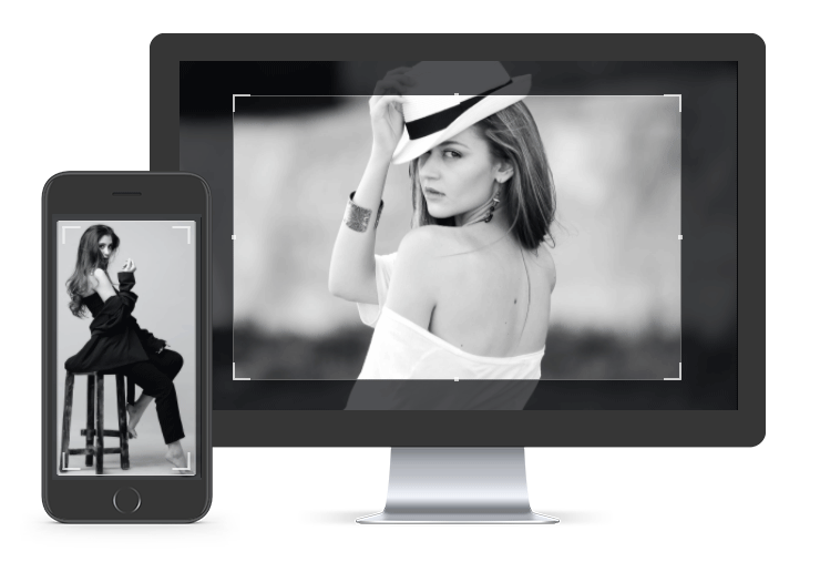
Vue Advanced Cropper is the advanced library that allows you to create custom croppers suited for any website design. It means that you can change not only the cropper's appearance but also its behavior.
Features:
- full mobile/desktop support
- support all three main types of croppers right out of the box
- support both canvas and coordinates modes, minimum and maximum aspect ratios, custom size restrictions
- zoom, rotate, resize image
- auto-zoom, transitions
The codesandbox for mobile / desktop examples above.
Install
Vue 3.0
npm install --save vue-advanced-cropperyarn add vue-advanced-cropperVue 2.0
npm install --save vue-advanced-cropper@vue-2yarn add vue-advanced-cropper@vue-2If you would like to use a CDN, please read the corresponding documentation section
Usage
import Vue from 'vue'
import { Cropper } from 'vue-advanced-cropper'
import 'vue-advanced-cropper/dist/style.css';

new Vue({
  el: '#app',
  data: {
    img: 'https://images.pexels.com/photos/226746/pexels-photo-226746.jpeg'
  },
  methods: {
    change({coordinates, canvas}) {
      console.log(coordinates, canvas)
    }
  },
  components: {
    Cropper
  }
})
<div id="app">
<cropper
class="cropper"
:src="img"
:stencil-props="{
aspectRatio: 10/12
}"
@change="change"
></cropper>
</div>/*
You may need to set the limits for the cropper sizes or container sizes,
otherwise, a cropping image will try to fill all available space
*/
.cropper {
height: 600px;
background: #DDD;
}Cropper
| Prop | Type | Description | Default
| ------------------------- | ------------------ | --------------------------------------------------------------------------- | ---------------
| src | String | The cropping image (link / base64) |
| stencilComponent | String, Object | The stencil component | RectangleStencil
| stencilProps | Object | The props for the stencil component | {}
| class | String | The optional class for the root cropper block |
| imageClass | String | The optional class for the cropping image |
| boundariesClass | String | The optional class for the area. |
| backgroundClass | String | The optional class for the background under the image |
| autoZoom | Boolean | Enable / disable transitions | false
| transitions | Boolean | Enable / disable auto zoom | true
| stencilSize | Object | The size of the stencil in pixels |
| debounce | String, Number | The time before the change event will be emitted after changes (ms) | 500
| canvas | Boolean | The flag that indicates if canvas should be used | true
| minWidth | String, Number | The minimum width of the stencil (percents) |
| minHeight | String, Number | The minimum height of the stencil (percents) |
| maxWidth | String, Number | The maximum width of the stencil (percents) |
| maxHeight | String, Number | The maximum height of the stencil (percents) |
| checkOrientation | Boolean | Check if EXIF orientation should be checked | true
| resizeImage | Boolean, Object | The options for the image resizing (details) | true
| moveImage | Boolean, Object | The options for the image moving (details) | true
| imageRestriction | String | Set restrictions for image position ('fill-area' 'fit-area', 'stencil', 'none') | 'fill-area'
| defaultSize | Object, Function | The function that returns the default size of the stencil or object | core.defaultSize
| defaultPosition | Object, Function | The function that returns the default position of the stencil or object | core.defaultPosition
| defaultBoundaries | String, Function | The function that determines the boundaries size or string ('fill', 'fit') | 'fill'
| sizeRestrictionsAlgorithm | Function | The function that returns the restrictions object |
| Event | Description | ------------------------ | -------------------------------------------------------------- | change | Invoked on the changing of a stencil's position/size after mounting the component and on an image change | ready | Invoked on the success of an image loading | error | Invoked on an error of an image loading
RectangleStencil
| Prop | Type | Description | Default
| ------------------------ | ------------------- | -------------------------------------------------------------- | ---------------
| aspectRatio | Number | The aspect ratio |
| minAspectRatio | Number | The minimum aspect ratio |
| maxAspectRatio | Number | The maximum aspect ratio |
| class | String | The class for the root block of the stencil component |
| previewClass | String | The class for the preview component |
| movingClass | String | The class applied when the user drags the stencil |
| resizingClass | String | The class applied when the user resizes the stencil |
| boundingBoxClass | String | The class for the bounding box component |
| handlerComponent | String,Object | The handler component |
| handlers | Object | The object of handlers that should be visible or hidden. |
| handlersClasses | Object | The object of custom handler classes |
| handlersWrappersClasses | Object | The object of custom handler wrapper classes |
| lineComponent | String,Object | The handler component |
| lines | Object | The object of the lines that should be visible or hidden. |
| linesClasses | Object | The object of custom line classes |
| linesWrappersClasses | Object | The object of custom line wrapper classes |
License
The source code of this library is licensed under the MIT license, and the documentation and photos belong to their respective owners.