
@leracherry/chartmd
v0.5.0
Published
Markdown-native charts for React, styled by your Markdown theme.

Maintainers
 leracherry
Readme
chart.md
Markdown-native charts for React. Write data as a Markdown table and render a responsive chart that automatically matches the surrounding document.
Install
npm install @leracherry/chartmd react-markdownReact is a peer dependency. No browser charting library is required.
Appearance
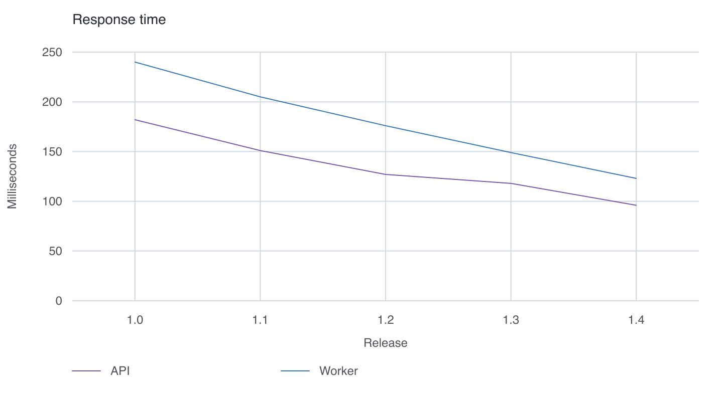
Version 0.5 uses plain 1 px lines, automatically assigned muted colours, inherited typography, and readable numeric ticks. The chart background is transparent. No point symbols or dash patterns are added by default.
The default grid has horizontal value guides and vertical guides aligned to
visible X-axis labels. All guides use the same 1 px neutral grey as GitHub-style
Markdown table borders, with no left or right border enclosing the plot.
Markdown itself does not define colours: set --chartmd-grid-color to match
your renderer's table border if it uses a different theme.
Automatic series colours
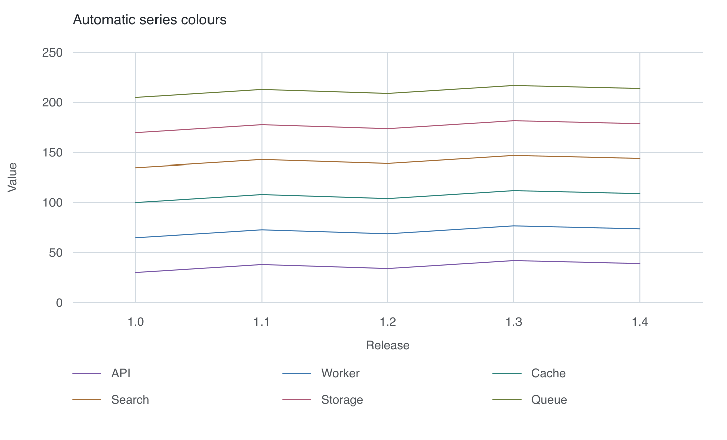
The engine assigns purple, blue, teal, ochre, rose, and olive in table-column
order. Additional series receive generated hues instead of repeating those six.
Legends use the same colours as their lines; text and guides stay neutral.
Dark mode uses lighter shades. Two to six series are easiest to read; for dense
or overlapping data, use separate charts or enable patterns on the direct React component.
Accessible descriptions retain series names and exact values.
Grid options
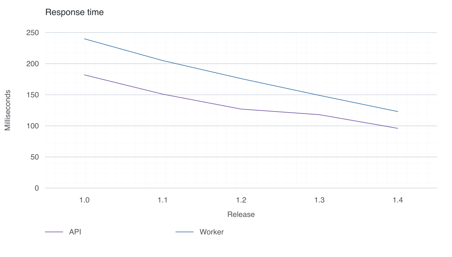
Add grid: paper inside the chart fence for a faint square grid. The squares
are decorative; axis labels define the measurement scale. Use grid: none for
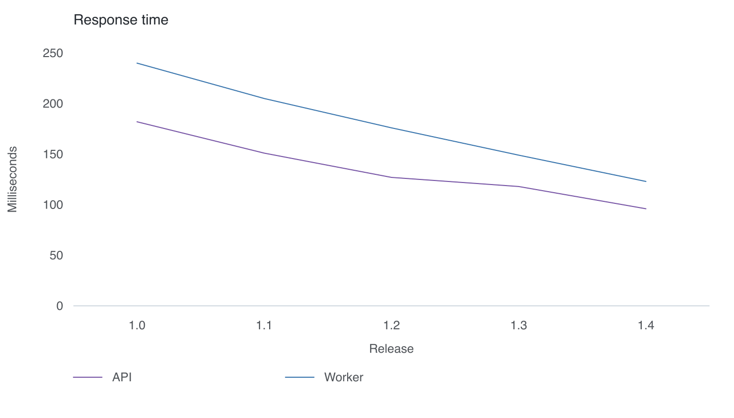
an uncluttered plot, or grid: horizontal for horizontal guides only.
Omit grid or write grid: both for the default open-sided, two-axis grid.
Dark documents
The same component follows the document's text colour for labels and guides.
Series colours adapt to the system theme or an ancestor's data-theme="dark"
or data-theme="light" attribute. No filled chart background is needed.
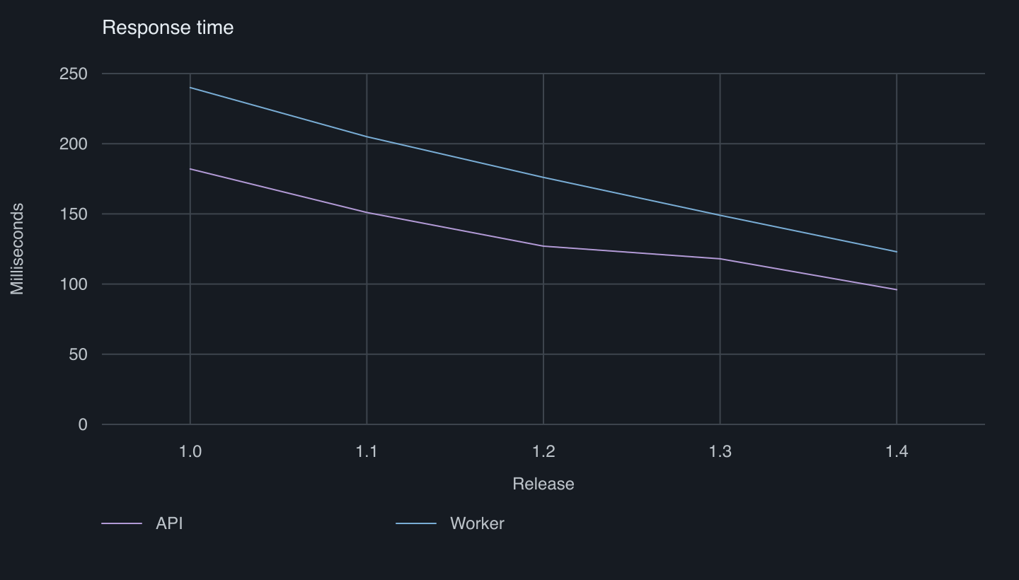
The previews above are rasterized output from the package's actual React component and stylesheet. The white/dark page backgrounds belong to the previews.
Quick start
Write a fenced chart block anywhere in your Markdown:
```chart
type: line
title: Response time
x: Release
y: Milliseconds

| Release | API | Worker |
| --- | ---: | ---: |
| 1.0 | 182 | 240 |
| 1.1 | 151 | 205 |
| 1.2 | 127 | 176 |
```
Add the plugin and component map to react-markdown:
import Markdown from 'react-markdown';
import { chartComponents, remarkChart } from '@leracherry/chartmd';
import '@leracherry/chartmd/style.css';

export function Article({ source }: { source: string }) {
  return (
    <Markdown remarkPlugins={[remarkChart]} components={chartComponents}>
      {source}
    </Markdown>
  );
}
remarkChart parses and validates chart fences. chartComponents renders the
result as accessible, server-renderable SVG.
See examples/chart-page.md for a complete Markdown page with prose, a chart, and follow-up notes.
Syntax
The first table column supplies the labels. Every remaining column becomes a numeric series.
| Property | Required | Description |
| -------- | -------- | -------------------------------------------------- |
| type | Yes | bar or line |
| title | No | Accessible chart title and visible heading |
| x | No | Horizontal-axis label |
| y | No | Vertical-axis label |
| grid | No | both (default), horizontal, paper, or none |
Values may be positive, negative, or zero. Table rows require the same number of cells as the header, and series names must be unique. Invalid input fails during Markdown processing instead of silently producing a broken chart.
Here is a bar chart with two series:
```chart
type: bar
title: Sign-ups
x: Month
y: People

| Month | Free | Pro |
| --- | ---: | ---: |
| Jan | 120 | 32 |
| Feb | 168 | 48 |
| Mar | 210 | 67 |
```
Both backtick and tilde Markdown fences are supported.
Theme inheritance
Labels use currentColor to follow the surrounding Markdown theme. Grid rules
use light grey (#d1d9e0) or dark grey (#3d444d) according to the theme.
Series colours are automatic and can be overridden with --chartmd-series-1,
--chartmd-series-2, and so on, set on .chartmd.
.markdown-body {
  color: #24292f;
  --chartmd-color: currentColor;
  --chartmd-grid-width: 1;
  --chartmd-grid-opacity: 1;
  --chartmd-muted-opacity: 0.8;
  --chartmd-paper-opacity: 0.07;
  --chartmd-line-width: 1;
}

@media (prefers-color-scheme: dark) {
  .markdown-body {
    color: #f0f6fc;
  }
}
The CSS variables are optional. Importing @leracherry/chartmd/style.css is
enough for the default presentation.
Direct component use
The parser and React component are public when Markdown is handled elsewhere:
import { Chart, parseChart } from '@leracherry/chartmd';
import '@leracherry/chartmd/style.css';

const definition = parseChart(chartSource);
return <Chart definition={definition} />;
Use locale and standard Intl.NumberFormat options for number presentation:
<Chart
  definition={definition}
  locale="en-GB"
  numberFormat={{ style: 'percent', maximumFractionDigits: 1 }}
/>
Percentage formatting expects fractions (0.25 becomes 25%). Accessible
descriptions retain exact source values. Rendered values must be finite and
within ±1e12; nonzero magnitudes must be at least 1e-12. Small default values use
scientific notation. Labels are plain text; Markdown emphasis inside cells is not parsed.
API
remarkChart— Remark-compatible Markdown AST plugin.chartComponents— component map forreact-markdown.Chart— responsive and accessible React SVG component.parseChart— parser for a chart fence body.lineStyles— optional legacy dash and marker combinations used by<Chart patterns />.ChartDefinition,ChartSeries, andChartType— TypeScript types.
The renderer uses no canvas, network request, generated image, or client-side effect. It works with server rendering and hydration.
Development
Publishing
The Publish release workflow validates and builds the package once, then
publishes the same archive to npm and GitHub Packages and attaches it to a
GitHub Release. It runs when a v* tag is pushed, or manually with dry_run
disabled. Tag versions must match package.json; release notes come from
CHANGELOG.md. Existing registry versions are skipped so partial releases can
be retried. Dry runs only validate and upload a workflow artifact.
The workflow uses NPM_TOKEN for npm and the repository's automatic
GITHUB_TOKEN for GitHub Packages and Releases. GitHub Packages installation
requires GitHub authentication and the @leracherry scope configured for
https://npm.pkg.github.com; npm remains the default installation route above.
Local checks
Run pnpm demo and open http://127.0.0.1:4173 for a real React Markdown page
with editable chart source and a light/dark switch. The demo renders through the
package's own plugin and component on the server.
The product direction and release milestones are documented in ROADMAP.md.
pnpm install
pnpm check
Generate previews with the real renderer (PNG conversion requires rsvg-convert):
pnpm build
node scripts/render-readme-preview.mjs /tmp/chart.svg paper
rsvg-convert --width 1440 --background-color white /tmp/chart.svg -o docs/chart-paper.png
Available preview variants: both (default), horizontal, paper, none, styles, and dark.