
@liiift-studio/fit-flush
v1.0.9
Published
Binary-search font-size fitting — lock any text to its container width, height, or both, with variable-font axis safety


Readme
fit-flush

Fit text to its container. Binary-search sizing with variable-font axis safety, for when neither clamp() nor container-query units will do the job.
TypeScript · Zero runtime dependencies · React + Vanilla JS
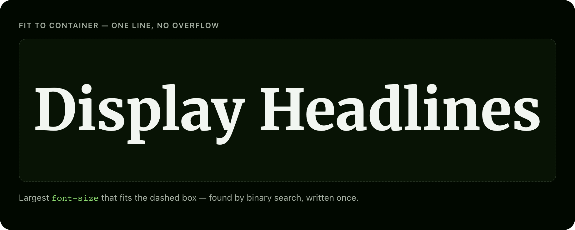
Use it when a headline must be as large as possible inside a box of unknown size — a hero, a card title, a poster, an editorial layout — and CSS alone can't guarantee it fits. Skip it if plain clamp() or cqw units already look fine; this is for the cases they can't reach.
The problem
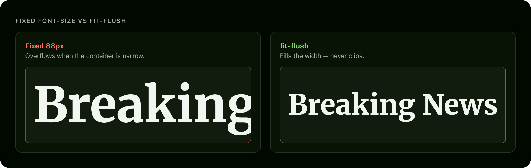
CSS has no way to say "size this text exactly as large as possible without overflowing its container."
clamp()is viewport-linear, not container-aware.- Container-query units (
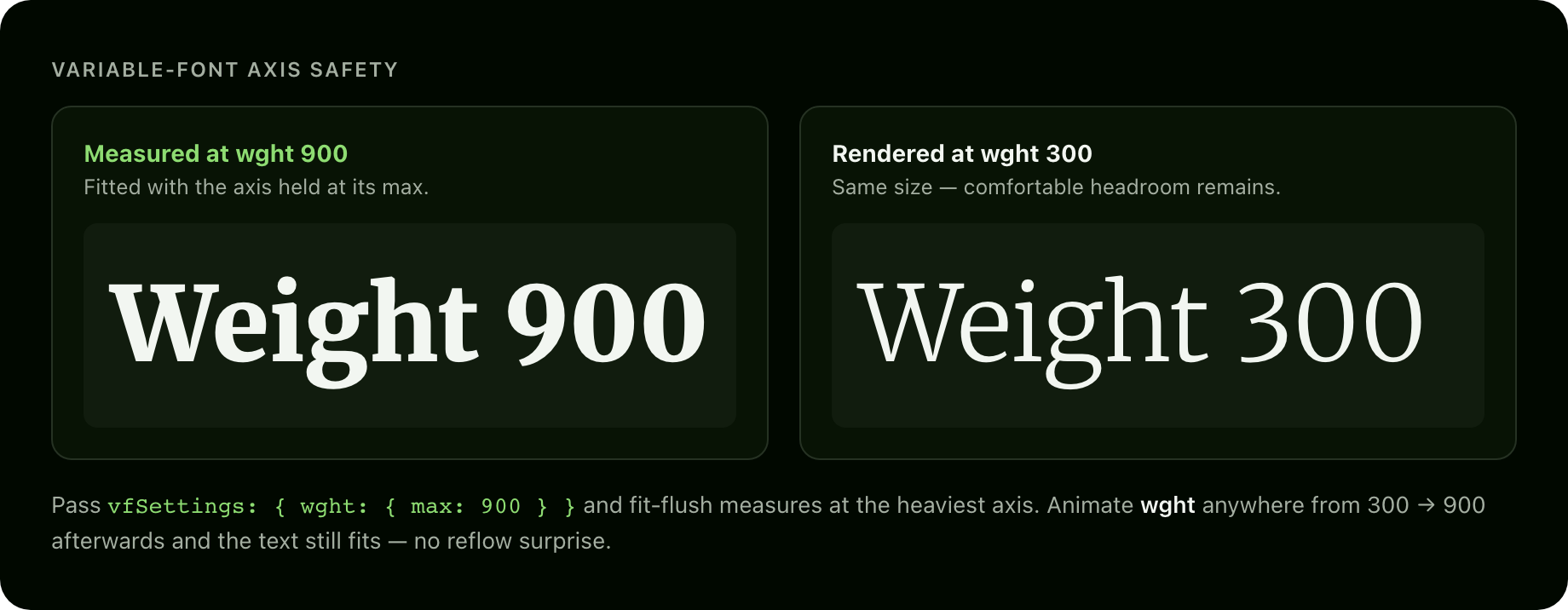
cqw,cqh) give coarse scaling, not precise text-fit. - Neither is aware of variable-font axis travel — with a variable font you can animate an axis like weight (
wght) from light to heavy, and heavier glyphs are wider, so text that fits atwght 300can overflow once it animates towght 900.
fit-flush solves all three: it measures the text off-screen, searches for the largest font-size that fits width and/or height, and — if you pass vfSettings — holds every axis at its max during measurement so the fit survives future axis animation.
Install
npm install @liiift-studio/fit-flushUsage
Next.js App Router: add
"use client"at the top of any file using the hook or component — fit-flush toucheswindowandResizeObserver.
Import paths: vanilla functions (
fitFlush,fitFlushLive) come from the package root; the React layer (useFitFlush,FitFlushText) lives on the@liiift-studio/fit-flush/reactsubpath, so vanilla-JS bundles stay free of any React import.
React component
"use client"
import { FitFlushText } from "@liiift-studio/fit-flush/react"

export default function Hero() {
	return (
		<section style={{ width: "100%", height: "60vh" }}>
			<FitFlushText as="h1" mode="both" max={320}>
				Headline
			</FitFlushText>
		</section>
	)
}
<FitFlushText> accepts every option as a prop, plus as (the rendered element — default span), className, style, and any ARIA / data-* / event-handler attribute, all forwarded to the DOM node. It forwards ref to that node. children is text-only — inline markup is flattened during measurement (see Future improvements).
React hook
"use client"
import { useFitFlush } from "@liiift-studio/fit-flush/react"

// Inside a React component:
export function Title() {
	const { ref } = useFitFlush<HTMLHeadingElement>({ mode: "width" })
	return <h1 ref={ref}>Resizing headline</h1>
}
The hook returns { ref, size } — attach ref to the element and read size for the last computed font-size in px (0 before first measurement). The hook re-runs on container resize (ResizeObserver, width + height dedup) and after web fonts load (document.fonts.ready). It cleans up on unmount.
Vanilla JS — one-shot
import { fitFlush } from "@liiift-studio/fit-flush"

const target = document.querySelector<HTMLElement>("h1")!
const size = fitFlush(target, { mode: "both", max: 240 })
Vanilla JS — live handle
import { fitFlushLive } from "@liiift-studio/fit-flush"

const target = document.querySelector<HTMLElement>("h1")!
const handle = fitFlushLive(target, { mode: "both", max: 240 })

// Later — clean up:
// handle.dispose()
fitFlushLive attaches a ResizeObserver to the container and re-fits after document.fonts.ready. Call handle.refit() to re-run manually after changing the text, and handle.dispose() to stop observing and restore the original fontSize.
Variable-font worst-case safety
If you animate variable-font axes elsewhere on the page, pass the full axis ranges so fit-flush measures at the worst case:
fitFlush(target, {
	mode: "width",
	vfSettings: {
		wght: { max: 900 },
		wdth: { max: 125 },
	},
})
Both lines below were fitted with wght held at 900. The heavy text fills its box exactly; the same size at wght 300 leaves headroom — so animating weight up to 900 later never overflows.
TypeScript
import { fitFlush, type FitFlushOptions } from "@liiift-studio/fit-flush"

const options: FitFlushOptions = { mode: "both", min: 12, max: 320, precision: 0.25 }
const size: number = fitFlush(document.querySelector<HTMLElement>("h1")!, options)
Options
| Option | Type | Default | Description |
|---|---|---|---|
| mode | 'width' \| 'height' \| 'both' | 'both' | Which container dimension(s) to fit. 'width' uses an analytical fast path (no-wrap single line). 'height' reflows normally. 'both' takes the stricter of the two. |
| min | number | 8 | Minimum font-size in px. |
| max | number | 400 | Maximum font-size in px. |
| precision | number | 0.5 | Binary-search convergence precision in px. |
| padding | number \| { x?, y? } | 0 | Inset from container edges in px. A single number insets both axes. |
| vfSettings | Record<string, { max: number }> | — | Variable-font axis ranges. When present, measurement runs at every axis' max for worst-case safety. |
| container | HTMLElement | target.parentElement | Override the container used for measurement. |
| onFit | (size: number) => void | — | Callback fired after each fit calculation, receiving the resolved font-size in px. |
How it works
- Snapshot container — reads container dimensions in a single batch, subtracts
padding. - Clone probe — creates a
position: fixed; left: -99999px; visibility: hiddenmeasurement span, style-copied from the target viagetComputedStyle. The probe isaria-hiddenand appended todocument.body— never injected into the target's subtree, so there is zero visible layout disruption during measurement. - Apply max VF axis — if
vfSettingsis present, the probe'sfont-variation-settingsis set to the maximum of every axis before the search begins. - Search for size
mode: 'width'uses an analytical fast path: measure at 100 px, linearly predict the target size, verify in one write. Typically one or two measurements.mode: 'height'and'both'use binary search: ~10 iterations to converge over[8, 400]at0.5 pxprecision.
- Write — sets
target.style.fontSizeto the computed size and removes the probe. - Restore scroll — saves
window.scrollYbefore mutation and restores viarequestAnimationFrame(iOS Safari does not honouroverflow-anchor: none, so height mutations can trigger scroll jumps).
Line break safety
For mode: 'height' and 'both', the probe is measured with the same inner width and white-space: normal as the target. Line breaks are whatever the browser produces at the fitted size — the tool never rewrites word breaks or injects spans into your live DOM.
SSR
fitFlush and fitFlushLive are SSR-safe. On the server, fitFlush returns 0 and fitFlushLive returns a no-op handle.
prefers-reduced-motion
fit-flush is a one-shot size — no animation, nothing to honour. A future animated-transition mode will gate on prefers-reduced-motion.
Requirements
Browser APIs: ResizeObserver, document.fonts.ready, and getBoundingClientRect — available in all evergreen browsers. No polyfills are bundled. React is an optional peer dependency (>=17); the vanilla functions need no React at all. The package ships ESM only, with zero runtime dependencies and "sideEffects": false for clean tree-shaking. For the exact install footprint see Bundlephobia.
Future improvements
- Animated transitions between target sizes on resize (gated by
prefers-reduced-motion) sharedoption — fit a group of elements to a common size for headline grids- Rich inline HTML preservation in the probe (currently text-only)
- Measurement caching — skip re-measurement when text, container size, and options are unchanged
License
MIT © Liiift Studio. Part of the type-tools suite.
The root package.json lists next in devDependencies. This is intentional — Vercel inspects the root package.json to detect the framework for the site/ subdirectory deploy. Removing next causes Vercel to fall back to a static build and skip the Next.js pipeline.