
@liiift-studio/opszstepper
v1.0.16
Published
Multi-cut optical family hot-swap by font-size — automatically applies Micro, Text, or Display cuts based on the element's computed font-size


Readme
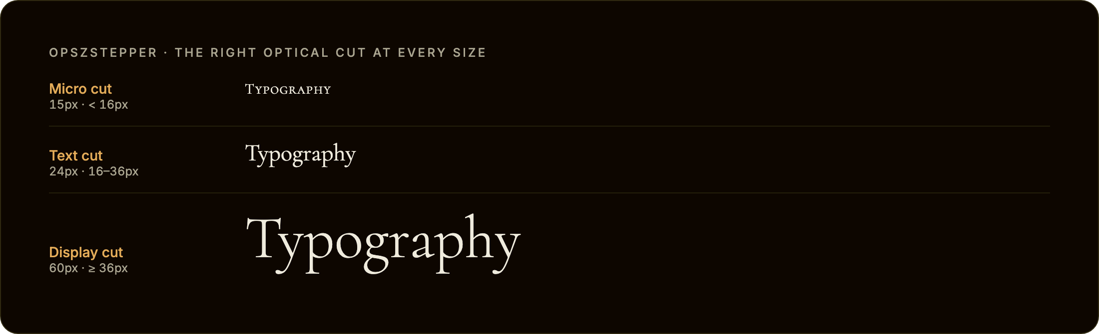
opszStepper

font-optical-sizing: auto only works for variable fonts with an opsz axis. opszStepper solves the other case: professional typeface families that ship separate font files for each optical size cut (Micro, Text, Display) with no axis at all. It automatically swaps the correct cut onto an element as its font-size changes.
opszstepper.com · npm · GitHub
TypeScript · Zero dependencies · React + Vanilla JS
Install
npm install @liiift-studio/opszstepperUsage
Next.js App Router: this library uses browser APIs. Add
"use client"to any component file that imports from it.
What are optical cuts?
Many professional editorial typefaces ship as a family of separate font files — each drawn specifically for a different size range. Halyard has Halyard Micro (captions and footnotes), Halyard Text (body), and Halyard Display (headlines). Tiempos has Tiempos Fine, Tiempos Text, and Tiempos Headline. Each cut has different contrast, spacing, and stroke weight tuned for its intended size. CSS has no mechanism to switch between them automatically — font-optical-sizing: auto only controls the opsz axis of a single variable font file. opszStepper fills that gap.
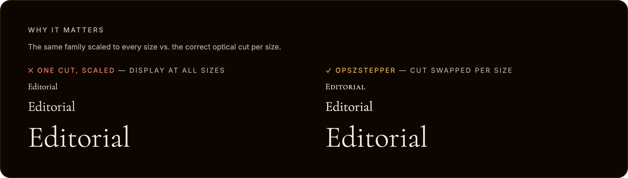
Scaling one cut to every size is the problem opszStepper avoids. On the left, a single Display cut is used at all sizes — fine when large, but its high contrast and tight spacing turn spindly and fragile when shrunk. On the right, opszStepper swaps in the cut drawn for each size:
Two modes: family hot-swap or opsz axis
opszStepper covers both ways type families ship optical sizes:
- Multi-family hot-swap (the primary case) — separate font files per cut (Halyard Micro / Text / Display). Give each cut a different
family; opszStepper setsfont-familyto the matching cut asfont-sizecrosses each threshold. Every example below uses this mode. - Single variable font,
opszaxis — one variable font with anopszaxis (Fraunces, Recursive, Amstelvar). Use the samefamilyin every cut and add anopszValueper cut; opszStepper writesfont-variation-settings: "opsz" <value>instead of swapping files. OptionalopszMin/opszMaxclamp the value to the font's fvar range:
cuts: [
  { family: 'Fraunces, serif', maxSize: 13,              opszValue: 9,  opszMin: 9, opszMax: 144 },
  { family: 'Fraunces, serif', minSize: 13, maxSize: 28, opszValue: 24, opszMin: 9, opszMax: 144 },
  { family: 'Fraunces, serif', minSize: 28,              opszValue: 72, opszMin: 9, opszMax: 144 },
]
This steps the axis at discrete thresholds with hysteresis, which is useful when you want explicit control over the opsz value per size band rather than the browser's continuous font-optical-sizing: auto.
React component
import { OpszStepperText } from '@liiift-studio/opszstepper'

<OpszStepperText
  cuts={[
    { family: 'Halyard Micro, sans-serif', maxSize: 13 },
    { family: 'Halyard Text, sans-serif', minSize: 13, maxSize: 28 },
    { family: 'Halyard Display, sans-serif', minSize: 28 },
  ]}
>
  Your paragraph text here...
</OpszStepperText>
React hook
import { useOpszStepper } from '@liiift-studio/opszstepper'

// Inside a React component:
const ref = useOpszStepper({
  cuts: [
    { family: 'Halyard Micro, sans-serif', maxSize: 13 },
    { family: 'Halyard Text, sans-serif', minSize: 13, maxSize: 28 },
    { family: 'Halyard Display, sans-serif', minSize: 28 },
  ],
})
return <p ref={ref}>{children}</p>
The hook starts a ResizeObserver on the element and re-evaluates the active cut each time the element's size changes (which triggers a re-read of font-size). It restarts automatically when cuts.length or hysteresis changes, and cleans up on unmount.
Vanilla JS — with ResizeObserver
import { startOpszStepper } from '@liiift-studio/opszstepper'

const el = document.querySelector('p')

const cuts = [
  { family: 'Halyard Micro, sans-serif', maxSize: 13 },
  { family: 'Halyard Text, sans-serif', minSize: 13, maxSize: 28 },
  { family: 'Halyard Display, sans-serif', minSize: 28 },
]

let stop = startOpszStepper(el, { cuts })

// Later — stop the observer and restore original fontFamily:
// stop()
Vanilla JS — one-shot
import { applyOpszStepper } from '@liiift-studio/opszstepper'

const el = document.querySelector('p')

applyOpszStepper(el, {
  cuts: [
    { family: 'Halyard Micro, sans-serif', maxSize: 13 },
    { family: 'Halyard Text, sans-serif', minSize: 13, maxSize: 28 },
    { family: 'Halyard Display, sans-serif', minSize: 28 },
  ],
})

// Later — restore original fontFamily:
// removeOpszStepper(el)
TypeScript
import type { OpszStepperCut, OpszStepperOptions } from '@liiift-studio/opszstepper'

const cuts: OpszStepperCut[] = [
  { family: 'Tiempos Fine, serif', maxSize: 13 },
  { family: 'Tiempos Text, serif', minSize: 13, maxSize: 28 },
  { family: 'Tiempos Headline, serif', minSize: 28 },
]

const opts: OpszStepperOptions = { cuts, hysteresis: 2 }
Options
| Option | Default | Description |
|--------|---------|-------------|
| cuts | (required) | Array of OpszStepperCut objects defining each optical size cut and the font-size range it applies to. Each cut has a family string (CSS font-family value), an optional minSize in px (inclusive, default 0), and an optional maxSize in px (exclusive, default Infinity). Ranges should be contiguous and non-overlapping — see the cuts configuration guide below |
| cut.opszValue | undefined | (per-cut, opsz-axis mode only) When set, opszStepper writes font-variation-settings: "opsz" <value> on the element instead of swapping family. Use with a single variable font shared across all cuts — see Two modes |
| cut.opszMin / cut.opszMax | undefined | (per-cut, opsz-axis mode only) Clamp the written opszValue to the font's fvar opsz axis range. Ignored unless opszValue is set |
| hysteresis | 1 | Dead zone in px around each cut boundary. When font-size sits within hysteresis px of a threshold, the current cut is held rather than switching. Prevents oscillation when font-size is computed to hover right at a boundary due to sub-pixel rendering or responsive scaling. Increase to 2–4 if you observe rapid toggling |
| onCutChange | undefined | Callback fired each time the active cut changes. Receives the newly applied OpszStepperCut. Useful for logging, analytics, or synchronising sibling elements |
| as | 'p' | HTML element to render. Accepts any valid React element type, e.g. 'h1', 'div', 'span'. (React component only) |
Cuts configuration guide
A cut is active when the element's computed font-size satisfies minSize <= fontSize < maxSize. The bounds are in CSS pixels as returned by getComputedStyle(el).fontSize.
Structure cuts as contiguous ranges — each maxSize should equal the next cut's minSize:
cuts: [
  { family: 'Halyard Micro, sans-serif',   maxSize: 13       },  // 0px – 13px
  { family: 'Halyard Text, sans-serif',    minSize: 13, maxSize: 28 },  // 13px – 28px
  { family: 'Halyard Display, sans-serif', minSize: 28       },  // 28px – ∞
]
You can omit the smallest cut's minSize (defaults to 0) and the largest cut's maxSize (defaults to Infinity). If font-size falls outside all defined ranges — which should not happen with a complete contiguous set — the active cut is left unchanged.
Hysteresis at boundaries: if font-size is 13.4px and the active cut was Halyard Text (minSize: 13), the tool will not switch to Halyard Micro until fontSize < 13 - hysteresis (i.e. < 12 with the default hysteresis: 1). Moving in the other direction — Text to Display — requires fontSize > 28 + hysteresis (i.e. > 29). This prevents flicker when a responsive layout computes font-size to a value that oscillates across a boundary.
How it works
startOpszStepper reads the element's computed font-size via getComputedStyle(el).fontSize and finds the matching cut. It then sets el.style.fontFamily to that cut's family string, overriding whatever the stylesheet specifies. The original fontFamily value is stored in a WeakMap keyed by element so it can be restored exactly when removeOpszStepper or the stop function is called.
A ResizeObserver watches the element for size changes. In responsive layouts, font-size is typically driven by clamp(), viewport units, or container queries — all of which can change as the element or viewport resizes. Each observer callback re-reads font-size and applies hysteresis logic before switching cuts, so a cut swap only fires when the size has moved clearly past a threshold.
document.fonts.load() is not awaited. The cut swap is immediate — opszStepper sets font-family and the browser handles the font load. If a cut's font file has not yet loaded, the browser will show a fallback until it arrives (standard FOUT behaviour). If you need to eliminate FOUT, preload each cut's font file in the document <head> using <link rel="preload" as="font">. opszStepper does not manage font loading.
Original fontFamily is saved and restored. When removeOpszStepper(el) or the stop function from startOpszStepper is called, the element's style.fontFamily is reset to exactly the value it had before the first call. If the element had no inline fontFamily, it is restored to an empty string (clearing the inline property, deferring to the stylesheet).
Dev notes
next in root devDependencies
package.json at the repo root lists next as a devDependency. This is a Vercel detection workaround — not a real dependency of the npm package. Vercel's build system inspects the root package.json to detect the framework; without next present it falls back to a static build and skips the Next.js pipeline, breaking the /site subdirectory deploy.
The package itself has zero runtime dependencies. Do not remove this entry.
Regenerating the README visuals
The hero and comparison images live in assets/ and are produced by a committed, re-runnable harness in scripts/ (it renders the three real Cormorant optical cuts in headless Chromium and screenshots each scene). assets/ and scripts/ are kept out of the npm tarball — the package ships dist only.
npm i -D playwright && npx playwright install chromium
node scripts/capture.mjs   # writes assets/hero.png and assets/compare.png
Bump the ?v=N cache-buster on the image URLs in this README after regenerating.
Future improvements
- Container query support — re-evaluate cuts in response to
@containersize changes, not just element resize, for components embedded in container-query layouts wherefont-sizeis driven by container width - Smooth crossfade — optionally apply a short CSS
transition: font-familyequivalent using a brief opacity fade between cuts to soften the swap on large editorial pages - Multi-element sync — a
syncGroupoption to tie multiple elements to the same active cut, so a heading and its pull-quote always use the same optical cut at all times - Font preload hints — automatically inject
<link rel="preload">tags for all cut font files on first call, so the browser can fetch them before they are needed - SSR hydration — detect the correct cut server-side via a CSS custom property or data attribute so the initial render uses the right
font-familywithout a post-hydration swap
Current version: 1.0.16