
@lngmtri/react-table-craft
v0.1.17
Published
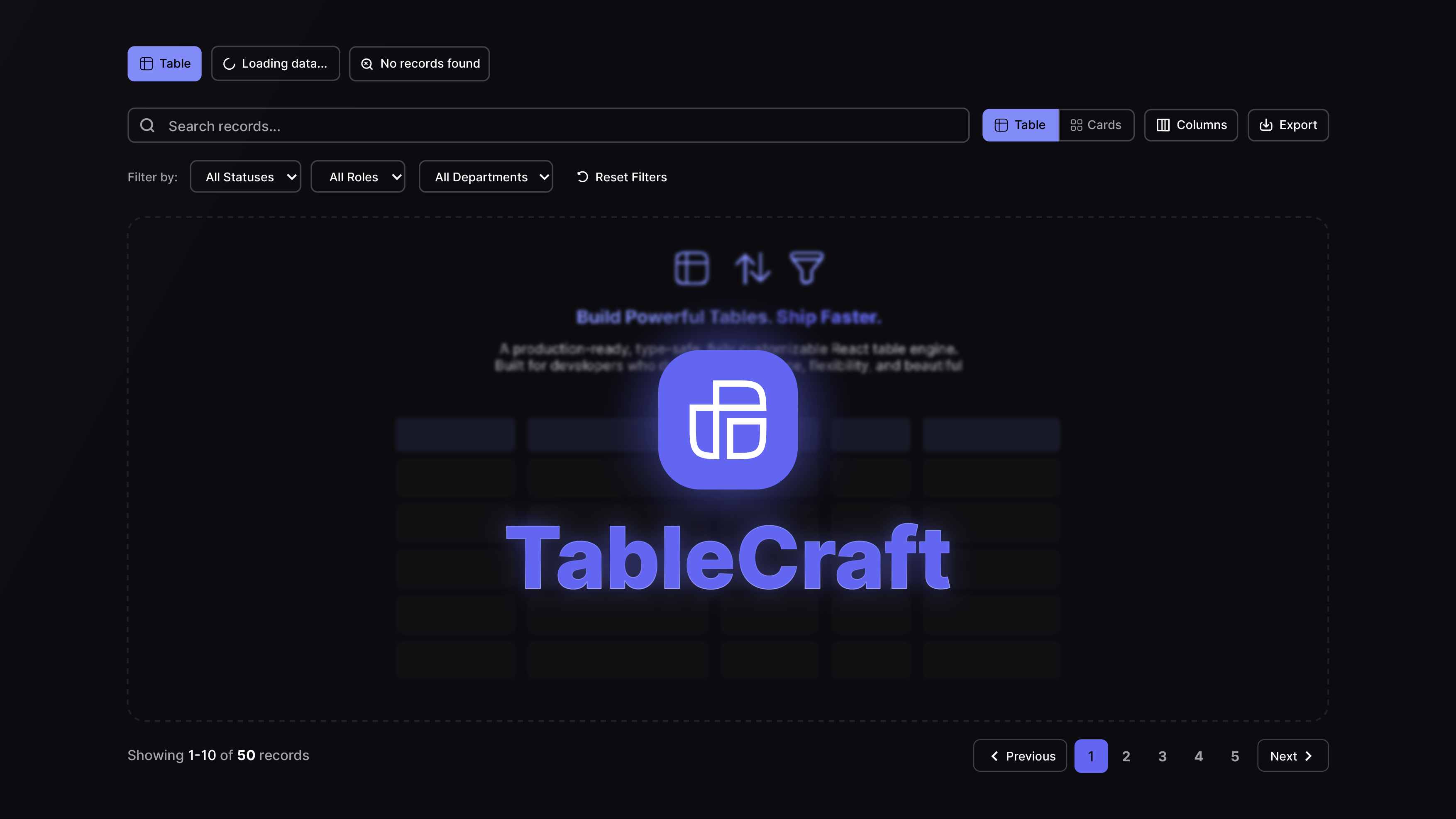
A production-ready, framework-agnostic React data table system built on TanStack Table. Fully typed, tree-shakeable, and feature-rich.
Downloads
487
Maintainers
 lngmtri
Readme
react-table-craft
This package is a fork of react-table-craft with some changes to make it more compatible with my personal projects.


A production-ready, framework-agnostic React data table system built on TanStack Table. Fully typed, tree-shakeable, and feature-rich.
Features
- Framework-Agnostic — Works with Next.js, React Router, Remix, or any React setup
- Full TypeScript Support — Generics, strict types, and exported type definitions
- Tree-Shakeable — ESM + CJS dual output with
sideEffects: false - Built-in Pagination — Client-side, server-side, and cursor-based pagination with URL sync
- Advanced Filtering — Faceted filters, multi-filters, text search, date range, single-select
- Sorting — Column header sorting with multi-sort support
- Column Visibility — Toggle columns on/off with persistent state
- Row Selection — Checkbox-based row selection with bulk actions
- Card View — Switch between table and card layouts
- Floating Action Bar — Contextual actions for selected rows
- CSV Export — Export selected rows or all data to CSV
- RTL Support — Full right-to-left layout support
- i18n Ready — Plug in any translation system or use built-in English defaults
- Responsive — Desktop toolbar + mobile toolbar with drawer-based filters
- Configurable — 4-layer config system (defaults → provider → instance → plugins)
- Plugin Architecture — Extend behavior with priority-based plugins
- Configurable Filter Serialization — Per-column and global URL array formats: dot, comma, pipe, multi-key, or fully custom
Installation
npm install react-table-craft
# or
pnpm add react-table-craft
# or
yarn add react-table-craft
Peer Dependencies
npm install react react-domTailwind CSS
react-table-craft uses Tailwind CSS classes for styling. You must have Tailwind CSS configured in your project. Add the package to your Tailwind content paths:
// tailwind.config.js
module.exports = {
  content: [
    // ... your paths
    './node_modules/react-table-craft/dist/**/*.{js,mjs}',
  ],
}
Quick Start
import { DataTable } from 'react-table-craft'
import type { ColumnDef } from '@tanstack/react-table'

interface User {
  id: string
  name: string
  email: string
}

const columns: ColumnDef<User>[] = [
  { accessorKey: 'name', header: 'Name' },
  { accessorKey: 'email', header: 'Email' },
]

function UsersTable({ data }: { data: User[] }) {
  return (
    <DataTable
      columns={columns}
      data={data}
      pagination={{ pageCount: 1, page: 1, pageSize: 10 }}
    />
  )
}
Client-Side Table
For simpler use cases with client-side pagination, sorting, and filtering:
import { ClientSideTable } from 'react-table-craft'

function UsersTable({ data }: { data: User[] }) {
  return (
    <ClientSideTable
      columns={columns}
      data={data}
      searchableColumns={[{ id: 'name', title: 'Name' }]}
      filterableColumns={[
        {
          id: 'role',
          title: 'Role',
          options: [
            { label: 'Admin', value: 'admin' },
            { label: 'User', value: 'user' },
          ],
        },
      ]}
    />
  )
}
Cursor-Based Pagination
For APIs that use cursor-based pagination (GraphQL Relay, Stripe, etc.):
import { DataTable } from 'react-table-craft'
import type { CursorPaginationData } from 'react-table-craft'

function UsersTable({ data, pageInfo, fetchMore }) {
  const cursorPaginationData: CursorPaginationData = {
    pageInfo: {
      hasNextPage: pageInfo.hasNextPage,
      hasPreviousPage: pageInfo.hasPreviousPage,
      startCursor: pageInfo.startCursor,
      endCursor: pageInfo.endCursor,
      totalCount: pageInfo.totalCount, // optional
    },
    onNextPage: () => fetchMore({ after: pageInfo.endCursor }),
    onPreviousPage: () => fetchMore({ before: pageInfo.startCursor }),
    onPageSizeChange: (size) => fetchMore({ first: size }),
    pageSize: 10,
  }

  return (
    <DataTable
      columns={columns}
      data={data}
      isCursorPagination={true}
      cursorPaginationData={cursorPaginationData}
    />
  )
}
This renders only Prev/Next buttons (no numbered pages), an optional total count, and a page size selector.
Configuration
TableProvider
Wrap your app (or a subtree) with TableProvider to set global defaults:
import { TableProvider, createTableConfig } from 'react-table-craft'

const config = createTableConfig({
  features: {
    enableColumnVisibility: true,
    enableRowSelection: true,
    enablePagination: true,
  },
  pagination: {
    defaultPageSize: 25,
    pageSizeOptions: [10, 25, 50, 100],
  },
})

function App() {
  return (
    <TableProvider config={config}>
      <YourApp />
    </TableProvider>
  )
}
Per-Table Config
Override global config on individual tables:
<DataTable
  columns={columns}
  data={data}
  config={{
    features: { enableRowSelection: false },
    pagination: { defaultPageSize: 50 },
  }}
/>
Config Layers
Configuration is resolved in this order (later layers override earlier ones):
- Defaults — Built-in
DEFAULT_TABLE_CONFIG - Provider — Global config from
TableProvider - Instance — Per-table
configprop - Plugins — Plugin-provided config (priority-ordered)
Router Adapter
react-table-craft does not depend on any specific router. To enable URL-synced pagination, sorting, and filtering, provide a router adapter:
Next.js (App Router)
'use client'
import { useRouter, useSearchParams, usePathname } from 'next/navigation'
import { TableProvider, createTableConfig } from 'react-table-craft'

function Providers({ children }: { children: React.ReactNode }) {
  const router = useRouter()
  const searchParams = useSearchParams()
  const pathname = usePathname()

  const config = createTableConfig({
    router: {
      push: (url) => router.push(url),
      replace: (url) => router.replace(url),
      getSearchParams: () => new URLSearchParams(searchParams.toString()),
      getPathname: () => pathname,
    },
  })

  return <TableProvider config={config}>{children}</TableProvider>
}
React Router
import { useNavigate, useSearchParams, useLocation } from 'react-router-dom'
import { TableProvider, createTableConfig } from 'react-table-craft'

function Providers({ children }: { children: React.ReactNode }) {
  const navigate = useNavigate()
  const [searchParams] = useSearchParams()
  const location = useLocation()

  const config = createTableConfig({
    router: {
      push: (url) => navigate(url),
      replace: (url) => navigate(url, { replace: true }),
      getSearchParams: () => searchParams,
      getPathname: () => location.pathname,
    },
  })

  return <TableProvider config={config}>{children}</TableProvider>
}
No Router (Default)
If no router adapter is provided, URL sync is silently disabled. Pagination, sorting, and filtering still work — they just manage state internally without updating the URL.
Internationalization (i18n)
Built-in English
By default, react-table-craft uses built-in English strings. No configuration needed.
Custom Translations
Provide a translationFn in the config to integrate your own i18n system:
import { useTranslations } from 'next-intl' // or any i18n library

function Providers({ children }) {
  const t = useTranslations('table')

  const config = createTableConfig({
    i18n: {
      translationFn: (key) => t(key),
    },
  })

  return <TableProvider config={config}>{children}</TableProvider>
}
Available Translation Keys
Filter, filter-by, Reset, add, add-filter, columns, showing, rows, previous, next, first, last, no-records-found, records, selected, selected-count, delete, export, view, edit, actions, more-actions, search, clear, apply, cancel, confirm, close, open, save, loading, error, success, warning, info, page, of, per-page, go-to-page, sort-ascending, sort-descending, no-sorting, hide-column, show-all, toggle-columns, row-actions, bulk-actions, select-all, deselect-all, rows-per-page, card-view, table-view
Feature Flags
Control which features are enabled:
const config = createTableConfig({
  features: {
    enablePagination: true,
    enableSorting: true,
    enableFiltering: true,
    enableColumnVisibility: true,
    enableRowSelection: true,
    enableMultiSort: false,
    enableGlobalFilter: false,
    enableColumnResizing: false,
    enableColumnReordering: false,
    enableExport: true,
    enableCardView: true,
    enableFloatingBar: true,
    enableAdvancedFilter: false,
  },
})
RTL Support
Enable RTL layout via config:
const config = createTableConfig({
  i18n: {
    direction: 'rtl',
  },
})
Components automatically adjust padding, alignment, and icon positioning for RTL layouts.
Filter Serialization
When using URL-synced filterable columns, filter values are serialized as URL query parameters. Different backends expect different array formats. react-table-craft lets you configure this format globally or per-column.
Built-in Serializers
| Serializer | URL format | Import |
|---|---|---|
| dotSeparated | ?status=a.b.c | import { dotSeparated } from 'react-table-craft' |
| commaSeparated | ?status=a,b,c | import { commaSeparated } from 'react-table-craft' |
| pipeSeparated | ?status=a\|b\|c | import { pipeSeparated } from 'react-table-craft' |
| multiKey | ?status=a&status=b&status=c | import { multiKey } from 'react-table-craft' |
dotSeparated is the default (backward compatible with previous versions).
Per-Column Override
Add a serializer field to any DataTableFilterableColumn to override the format for that specific column:
import { DataTable, commaSeparated, multiKey } from 'react-table-craft'

<DataTable
  filterableColumns={[
    {
      id: 'status',
      title: 'Status',
      options: statusOptions,
      serializer: commaSeparated,   // ?status=active,pending
    },
    {
      id: 'tags',
      title: 'Tags',
      options: tagOptions,
      serializer: multiKey,         // ?tags=react&tags=typescript
    },
    {
      id: 'priority',
      title: 'Priority',
      options: priorityOptions,
      // no serializer → uses global default (dotSeparated unless overridden)
    },
  ]}
/>
Global Default
Override the default serializer for all columns via the 4-layer config system.
Via TableProvider (Layer 2 — applies to all tables in the subtree):
import { TableProvider, createTableConfig, commaSeparated } from 'react-table-craft'

const config = createTableConfig({
  filter: {
    defaultSerializer: commaSeparated,
  },
})

function App() {
  return (
    <TableProvider config={config}>
      <YourApp />
    </TableProvider>
  )
}
Via per-table config prop (Layer 3 — applies to one table only):
import { DataTable, multiKey } from 'react-table-craft'

<DataTable
  config={{ filter: { defaultSerializer: multiKey } }}
  filterableColumns={[...]}
/>
Via plugin (Layer 4 — useful for backend compatibility presets):
import type { TablePlugin } from 'react-table-craft'
import { commaSeparated } from 'react-table-craft'

const djangoRestPlugin: TablePlugin = {
  name: 'django-rest-compat',
  priority: 10,
  config: {
    filter: { defaultSerializer: commaSeparated },
  },
}
Custom Serializer
Implement the FilterSerializer interface to create any custom format:
import type { FilterSerializer } from 'react-table-craft'

// Factory for any delimiter
import { createDelimited } from 'react-table-craft'

const semicolonSeparated = createDelimited(';')  // ?key=a;b;c

// Or fully custom from scratch
const base64Serializer: FilterSerializer = {
  parse: (raw) => raw ? JSON.parse(atob(raw)) : [],
  serialize: (values) => ({
    type: 'single',
    value: btoa(JSON.stringify(values)),
  }),
}
Resolution Priority
When rendering a filter, the serializer is resolved in this order:
column.serializer               ← highest priority (per-column prop)
    │
    └─ config.filter.defaultSerializer   ← resolved from all 4 config layers
           │
           └─ dotSeparated               ← built-in default (Layer 1)
Plugins
Extend table behavior with plugins:
import type { TablePlugin } from 'react-table-craft'

const auditPlugin: TablePlugin = {
  name: 'audit-logging',
  priority: 10,
  config: {
    features: {
      enableRowSelection: true,
    },
  },
}

const config = createTableConfig({
  plugins: [auditPlugin],
})
Plugins are merged in priority order (lower numbers merge first, higher numbers override).
Exported Serializers
| Export | Type | Description |
|---|---|---|
| dotSeparated | FilterSerializer | ?key=a.b.c (default) |
| commaSeparated | FilterSerializer | ?key=a,b,c |
| pipeSeparated | FilterSerializer | ?key=a\|b\|c |
| multiKey | FilterSerializer | ?key=a&key=b&key=c |
| createDelimited(sep) | (string) => FilterSerializer | Factory for any single-character delimiter |
Exported Components
| Component | Description |
|-----------|-------------|
| DataTable | Core table with server-side pagination support |
| ClientSideTable | High-level wrapper with client-side pagination |
| DataTableToolbar | Desktop toolbar with search, filters, view options |
| DataTableMobileToolbar | Mobile-responsive toolbar with drawer |
| DataTablePagination | Pagination controls |
| DataTableColumnHeader | Sortable column header |
| DataTableViewOptions | Column visibility toggle |
| DataTableCardView | Card layout renderer |
| DataTableFloatingBar | Floating action bar for selections |
| DataTableFacetedFilter | Multi-select faceted filter |
| DataTableSingleSelectFilter | Single-select filter |
| DataTableRoleFilter | Role-based filter with URL sync |
| DataTableLoading | Loading skeleton |
| TableActionsRow | Row-level action buttons |
| SearchableSelect | Standalone searchable combobox for filter dropdowns |
| DataTableAdvancedToolbar | Advanced toolbar with multi-filter |
| DataTableAdvancedFilter | Advanced filter command palette |
| DataTableAdvancedFilterItem | Individual advanced filter chip |
| DataTableMultiFilter | Multi-rule filter popover |
| TableProvider | Config context provider |
Exported Types
import type {
  // Table types
  Option,
  DataTableSearchableColumn,
  DataTableQuerySearchable,
  DataTableFilterableColumn,
  DataTableFilterOption,
  FilterOptions,
  CustomButtonProps,
  SearchableSelectProps,

  // Filter serialization types
  FilterSerializer,
  SerializedResult,
  SerializedSingleKey,
  SerializedMultiKey,

  // Config types
  TableConfig,
  TableConfigInput,
  TableRouterAdapter,
  TableFeatureFlags,
  TableFilterConfig,
  TablePaginationConfig,
  TableSearchConfig,
  TableI18nConfig,
  TablePerformanceConfig,
  TableEnterpriseConfig,
  TableDevConfig,
  TablePlugin,
  DeepPartial,

  // Pagination types
  Pagination,
  BackendPagination,
  PaginationMeta,
  PaginationLinks,
  CursorPaginationInfo,
  CursorPaginationData,
} from 'react-table-craft'
TypeScript
react-table-craft is written in TypeScript and ships type declarations. All components are generic:
// Column definitions are fully typed
const columns: ColumnDef<User>[] = [
  {
    accessorKey: 'name',
    header: ({ column }) => (
      <DataTableColumnHeader column={column} title="Name" />
    ),
  },
]

// Table instance is typed
<DataTable<User>
  columns={columns}
  data={users}
  pagination={pagination}
/>
Loading State
Show skeleton placeholders while data is being fetched:
<DataTable
  columns={columns}
  data={data}
  isLoading={isLoading}
/>
When isLoading is true, the table renders animated skeleton rows (table view) or skeleton cards (card view) matching the current page size. Pagination and toolbar remain interactive.
Toolbar Customization
Action Buttons vs Filter Buttons
The toolbar supports two categories of custom buttons with distinct mobile behavior:
| Prop / Field | Desktop | Mobile |
|---|---|---|
| actionButtons prop | Inline in toolbar | Always visible outside the filter drawer |
| customButtons (array, mobileGroup: 'filter' or unset) | Inline in toolbar | Inside the Filter drawer |
| customButtons (array, mobileGroup: 'action') | Inline in toolbar | Always visible outside the filter drawer |
| customButtons (ReactNode) | Inline in toolbar | Inside the Filter drawer |
Use actionButtons for buttons that are unrelated to filtering (e.g. Add, Import). Use customButtons for filter controls (e.g. SearchableSelect dropdowns).
actionButtons prop
A ReactNode rendered inline on desktop and outside the mobile filter drawer — always reachable on mobile without opening the drawer.
import { ClientSideTable, SearchableSelect } from 'react-table-craft'
import { Button } from './ui/button'
import { Plus } from 'lucide-react'

<ClientSideTable
  columns={columns}
  data={data}
  // Filter dropdowns — go inside the mobile Filter drawer
  customButtons={
    <div className="flex items-center gap-2">
      <SearchableSelect
        value={status}
        onValueChange={setStatus}
        options={statusOptions}
        placeholder="Filter status"
      />
    </div>
  }
  // Add button — always visible on mobile, never hidden in the drawer
  actionButtons={
    <Button onClick={openCreateDialog}>
      <Plus className="size-4" />
      Add
    </Button>
  }
/>
mobileGroup on CustomButtonProps
For array-form customButtons, set mobileGroup: 'action' on any button that should stay visible on mobile outside the filter drawer.
<ClientSideTable
  columns={columns}
  data={data}
  customButtons={[
    {
      text: 'Add Item',
      icon: <Plus className="size-4" />,
      function: openCreateDialog,
      className: 'bg-blue-600 text-white hover:bg-blue-700',
      mobileGroup: 'action',  // renders outside the Filter drawer on mobile
    },
    {
      text: 'Export',
      icon: <Download className="size-4" />,
      function: handleExport,
      // mobileGroup not set → defaults to 'filter', renders inside the drawer
    },
  ]}
/>
Filter Drawer Visibility
The mobile Filter button and drawer are automatically hidden when there is no filter content — i.e. no searchableColumns, filterableColumns, advanced filters, or mobileGroup: 'filter' custom buttons. Tables that have only action buttons show those directly with no Filter button.
SearchableSelect
A standalone searchable combobox (Popover + Command) for filter dropdowns, usable in customButtons without any TanStack Table column coupling.
import { SearchableSelect } from 'react-table-craft'

<SearchableSelect
  value={currentStatus}
  onValueChange={(v) => setStatus(v)}
  options={[
    { label: 'Active', value: 'active' },
    { label: 'Inactive', value: 'inactive' },
  ]}
  placeholder="Filter status"
  allLabel="All statuses"
  className="w-40"
/>
| Prop | Type | Description |
|---|---|---|
| value | string | Currently selected value |
| onValueChange | (value: string) => void | Called when selection changes; empty string means "All" |
| options | { label: string; value: string }[] | List of options |
| placeholder | string | Trigger button label when nothing is selected |
| allLabel | string | Label for the "show all" option (clears selection) |
| className | string | Additional classes applied to the trigger button |
Contributing
Contributions are welcome! Please read the Contributing Guide before submitting a pull request.
For major features, we use an RFC process to discuss design before implementation.
Community
License
This project is licensed under the MIT License. See the LICENSE file for details.
Made with ❤️ by Ahmed Elkhdrawy.