@lumber_devs/react-snackbar
v0.0.4
Published
Easy to use plug and play light snackbar and notification system for react projects
Readme
lumber-react-snackbar
Easy to use, tiny, plug and play light snackbar and notification system for react projects
Install
npm install --save @lumber_devs/react-snackbarQuickstart
The useNotificationBar hook returns the array of current notifications notifications and a function called pushNotification that can be used to push up a new notification to the provider.
pushNotification('This is a message!', 1)import React, { Component } from 'react'
import { useNotificationBar, NotificationBarProvider } from '@lumber_devs/react-snackbar'
import '@lumber_devs/react-snackbar/dist/index.css'
const App = () => {
// Wrap App or parent component in NotificationBarProvider and set positioning.
return (<NotificationBarProvider
col='start'
row='end'>
<Components/>
</NotificationBarProvider>)
}
...
-----
const Components = () => {
const { pushNotification } = useNotificationBar()
return (<div>
{/* Pass new notifications to provider */}
<button onClick={() => pushNotification("message", 1)}> This is a test.
</div>)
}Pass a custom Notification
const App = () => {
  // Pass custom component to render props and pass down notification into custom component
  return (
    <NotificationBarProvider
      render={({ notification }) => <TestNotification {...notification} />}
    >
      <Components />
    </NotificationBarProvider>
  )
}

...
Positioning of Snackbar
The NotificationBarProvider accepts a col and row. col controls the alignItems, row controls the justifyContent. flex-start, start, center, end, flex-end, are all accepted.
<NotificationBarProvider col='start' row='end'>Types of Animations
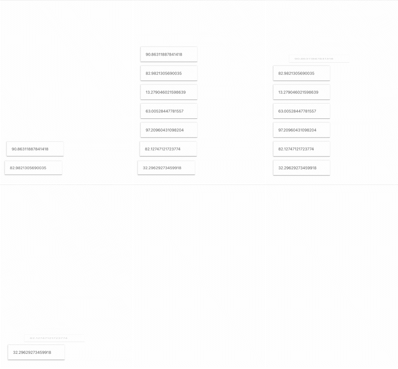
Out of the box, there are a few simple animations included. These are left, right, default, leftRight. If nothing is passed to the animationDirection, it will default to default
left:

right:

leftRight:

default:

<NotificationBarProvider animationDirection='left'>Notification Object
The notification prop returned by the NotificationBarProvider render props includes a message(string) and a severity(number). Use them as you see fit. For example, you can pass a severity level to pushNotification(message, number) and render different colors based on severity.
More Control
If you're unsatisfied with the provided animation types, you can override your own.
Beware of removing animation alltogether as this will affect notification removals. Notifications are removed on onAnimationEnd events. Keep animation direction forwards, or you might have some buggy visuals
/* For reference here's the current default animation */

@keyframes showHideVertical {
  0% {
    opacity: 0;
    transform: translateY(-10px);
    max-height: 0px;
  }
  20%,
  80% {
    opacity: 1;
    transform: translateY(0);
    max-height: 100px;
  }

  100% {
    opacity: 0;
    transform: translateY(-10px);
    max-height: 0px;
  }
}
/* Create a custom animation and override class, this may break the animation smoothness */
@keyframes animate {
0% {
opacity: 0;
max-height: 0;
}
20%,
80% {
opacity: 1;
max-height: 500px;
}
100% {
opacity: 0;
max-height: 0px;
}
}
/* Override notification wrapper with this class, and set animation direction to 'forwards'. Beware of removing animation. onAnimationEnd removes notification */
.custom-notification-properties {
transition: 1s ease;
animation: animate 3s ease-in-out forwards !important;
}License
MIT © MaiaS
TO DO:
- Check performance and rerenders
- Fix auto typing/autofill


