
@luu-truong/react-native-reaction-button
v2.0.6
Published
Reactions like Facebook does

Maintainers
 truonglv9x
Readme
Reaction Button
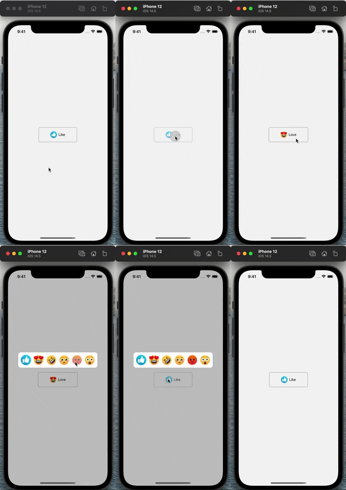
Reactions button like Facebook does. Native-driven animations via react-native-reanimated and gestures via react-native-gesture-handler.
Installation
yarn add @luu-truong/react-native-reaction-button react-native-reanimated react-native-gesture-handlerRequired setup
Add the Reanimated Babel plugin to your project's
babel.config.js(must be last):module.exports = { presets: ['module:@react-native/babel-preset'], plugins: ['react-native-reanimated/plugin'], };Wrap your app root with
GestureHandlerRootView:import {GestureHandlerRootView} from 'react-native-gesture-handler'; export default function App() { return ( <GestureHandlerRootView style={{flex: 1}}> {/* ... */} </GestureHandlerRootView> ); }iOS:
cd ios && pod install.
Usage
import ReactionButton from '@luu-truong/react-native-reaction-button';

function Demo() {
  const [value, setValue] = React.useState(-1);

  const onChange = (index: number) => {
    setValue(value === index ? -1 : index);
  };

  const reactions = [
    {source: require('./like.png'), title: 'Like'},
    {source: require('./haha.png'), title: 'Haha'},
  ];

  return (
    <ReactionButton
      reactions={reactions}
      defaultIndex={0}
      value={value}
      onChange={onChange}
    />
  );
}
Properties
| Name | Type | Required | Description | | --- | --- | --- | --- | | reactions | ReactionItem[] | yes | List reactions | | value | number | yes | Selected reaction index | | onChange | (index: number) => void | yes | Callback when a reaction pressed | | defaultIndex | number | no | Default reaction | | debug | boolean | no | Debug message. Default: false | | reactionSize | number | no | Render reaction image size in popover. Default: 40 | | reactionSmallSize | number | no | Render reaction image size in button. Default: 20 | | textProps | object | no | Props passed to button reaction text | | DefaultImage | (props) => Element | no | Default image component when value is unspecified | | reactionContainerStyle | ViewStyle | no | Style applied to popover container | | imageProps | {renderImage: (props) => Element} | no | Custom image renderer | | style | ViewStyle | no | Button style | | hitSlop | {top, left, right, bottom} | no | Hit slop of the button | | longPressDuration | number | no | Long-press activation delay in ms. Default: 300 | | animationDuration | number | no | Open/close animation duration in ms. Default: 150 |
ReactionItem:
| Name | Type | Required | Description | | --- | --- | --- | --- | | source | ImageSource | yes | Image source | | title | string | yes | Reaction title |
React Native support
| Library version | React Native | | --- | --- | | 2.x.x | >= 0.76 (New Architecture) | | 1.x.x | 0.64 – 0.75 |
Migrating from 1.x to 2.x
- Minimum React Native version is 0.76.
- Adds peer dependencies on
react-native-reanimated >= 3.16andreact-native-gesture-handler >= 2.20. Install them and apply the setup steps above. - Animations now run on the UI thread (Reanimated v3 worklets) instead of the JS-thread
AnimatedAPI. - The long-press / tap gesture is handled by
react-native-gesture-handler— your app root must be wrapped inGestureHandlerRootView. - Public component props are unchanged; two optional props were added (
longPressDuration,animationDuration).