
@mantic-ui/semantic-ui-angular
v22.16.1
Published
Semantic UI theme for mantic UI Angular components. Requires @mantic-ui/angular

Maintainers
 ky-one
Readme
mantic UI
| Documentation | Github Repository | Support |
Semantic UI theme for mantic UI Angular components
Requires @mantic-ui/angular
Example
A common button with some styling
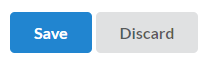
<m-button primary (click)="...">
  Save
</m-button>
<m-button (click)="...">
  Discard
</m-button>
Getting Started with Semantic UI Theme
Install base package for angular and Semantic UI theme
npm i @mantic-ui/angular @mantic-ui/semantic-ui-angular Import the theme components in your AppComponent
All components are standalone, import them where you use them.
app.component.ts
import { SemanticUiIconsLocalComponent, SemanticUiLatoLocalComponent, SemanticUiResetComponent, SemanticUiSiteComponent, SemanticUiThemeComponent } from '@mantic-ui/semantic-ui-angular';

@Component({
    selector: 'app-root',
    imports: [SemanticUiThemeComponent, SemanticUiSiteComponent, SemanticUiResetComponent, SemanticUiLatoLocalComponent, SemanticUiIconsLocalComponent],
    templateUrl: './app.component.html'
})
export class AppComponent {}
Apply the style in your AppComponent
app.component.html
<m-semantic-ui-theme>
    <!-- Import common styles for site -->
    <m-semantic-ui-site />
    <!-- Import reset to normalize values for CSS properties -->
    <m-semantic-ui-reset />
    <!-- Import local hosted lato font -->
    <m-semantic-ui-lato-local />
    <!-- Import local hosted Semantic UI icons (not needed when you only use Font Awesome) -->
    <m-semantic-ui-icons-local />
</m-semantic-ui-theme>
<m-semantic-ui-theme dark> switches the components to their inverted variants, <m-semantic-ui-theme auto> follows the
dark mode setting of the operating system.
The theme is Semantic UI 2.5.0 compiled from its LESS sources, plus the adjustments the mantic components need (icons
rendered by m-icon, Font Awesome support, the check mark of m-checkbox). The plain Semantic UI CSS from a CDN lacks
those, so icons in buttons and inputs and the check mark of a checkbox are not styled with it.
Configure package assets usage
angular.json
 "projects": {
    "<your-project-name>": {
      "architect": {
        "build": {
          "options": {
            "assets": [
              // Copy all package assets to app asset folder on build
              {
                "glob": "**/*",
                "input": "./node_modules/@mantic-ui/semantic-ui-angular/assets",
                "output": "/assets/"
              }
            }
          }
        }
      }
    }
  }
Credits
Original css from Semantic UI
Work-in-progress
Currently we are not yet done. So please do not expect a perfect framework
If you have a issue, look in our issue tracker on github
To support us fork our github repository
Direct contact (German, English) via email, WhatsApp or join our Discord server