
@marco.colia/react-fast-scheduler
v3.2.0
Published
A lightweight React scheduling library.
Downloads
126
Maintainers
 marco.colia
Readme
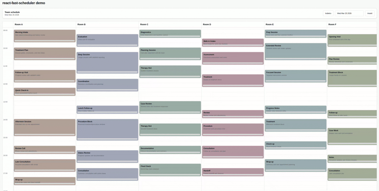
react-fast-scheduler
A lightweight React day scheduler for resource-based booking UIs.
react-fast-scheduler gives you a controlled day view with:
- resource columns for staff, rooms, or assets
- drag and resize interactions
- date navigation with a built-in toolbar and date picker
- customizable appointment rendering
- a simple field adapter layer for your backend data
Install
npm install @marco.colia/react-fast-schedulerPeer dependencies:
react^18 || ^19react-dom^18 || ^19
Import the packaged styles once in your app:
import "@marco.colia/react-fast-scheduler/styles.css";The packaged stylesheet is scoped to the scheduler wrapper, so it does not write theme tokens to your app :root or reuse unprefixed Tailwind utility names.
When you pass your own class strings through props like resourceAppointmentClassMap, appointmentColorTokenClassMap, or a custom renderAppointment, those classes belong to your app and can use your own Tailwind setup.
Quick Start
The scheduler is a controlled component:
- your app owns
selectedDate - your app fetches appointments for that date
- the scheduler calls
onSelectedDateChangewhen the user navigates - your app updates
appointmentsand passes the new data back in
import { useEffect, useState } from "react";
import {
  Scheduler,
  applySchedulerAppointmentChange,
  type BaseSchedulerResource,
  type SchedulerAppointmentChangeEvent,
} from "@marco.colia/react-fast-scheduler";
import "@marco.colia/react-fast-scheduler/styles.css";

type Staff = BaseSchedulerResource<number> & {
  firstName: string;
  lastName: string;
};

type Appointment = {
  id: number;
  staffId: number;
  customerName: string;
  title: string;
  description?: string;
  start: string;
  end: string;
};

const formatLocalDate = (date: Date) => {
  const year = date.getFullYear();
  const month = String(date.getMonth() + 1).padStart(2, "0");
  const day = String(date.getDate()).padStart(2, "0");
  return `${year}-${month}-${day}`;
};

export const SchedulerExample = () => {
  const [staff, setStaff] = useState<Staff[]>([]);
  const [appointments, setAppointments] = useState<Appointment[]>([]);
  const [selectedDate, setSelectedDate] = useState(() => new Date());

  const loadStaff = async () => {
    const response = await fetch("/api/staff");
    const data = (await response.json()) as Staff[];
    setStaff(data);
  };

  const loadAppointments = async (date: Date) => {
    const response = await fetch(`/api/appointments?date=${formatLocalDate(date)}`);
    const data = (await response.json()) as Appointment[];
    setAppointments(data);
  };

  const persistAppointment = async (
    appointmentId: number,
    nextAppointment: Appointment
  ) => {
    await fetch(`/api/appointments/${appointmentId}`, {
      method: "PATCH",
      headers: { "Content-Type": "application/json" },
      body: JSON.stringify(nextAppointment),
    });
  };

  const handleAppointmentChange = async (
    change: SchedulerAppointmentChangeEvent<Appointment, number>
  ) => {
    const optimisticAppointments = applySchedulerAppointmentChange(appointments, change, {
      id: "id",
      resourceId: "staffId",
      start: "start",
      end: "end",
      dateValue: (date) => date.toISOString(),
    });

    setAppointments(optimisticAppointments);

    const nextAppointment = optimisticAppointments.find(
      (item) => item.id === change.appointment.id
    );

    if (!nextAppointment) {
      return;
    }

    try {
      await persistAppointment(change.appointment.id, nextAppointment);
    } catch {
      await loadAppointments(selectedDate);
    }
  };

  useEffect(() => {
    void loadStaff();
  }, []);

  useEffect(() => {
    void loadAppointments(selectedDate);
  }, [selectedDate]);

  return (
    <Scheduler<Appointment, Staff, number>
      resources={staff}
      appointments={appointments}
      selectedDate={selectedDate}
      onSelectedDateChange={setSelectedDate}
      adapter={{
        id: "id",
        resourceId: "staffId",
        start: "start",
        end: "end",
        title: (item) => `${item.customerName} - ${item.title}`,
      }}
      onAppointmentChange={handleAppointmentChange}
      dayStart="09:00"
      dayEnd="18:00"
    />
  );
};
How Data Flow Works
When the user changes the day from the built-in toolbar or date picker:
- the scheduler calls
onSelectedDateChange(nextDate) - your state updates
selectedDate - your
useEffectruns again - your app fetches appointments for the new date
- you pass the fetched appointments back into
appointments
This is the intended integration pattern:
useEffect(() => {
  void loadAppointments(selectedDate);
}, [selectedDate]);

<Scheduler
  selectedDate={selectedDate}
  onSelectedDateChange={setSelectedDate}
  appointments={appointments}
  resources={resources}
  adapter={adapter}
/>
Core Concepts
resources
Each column in the scheduler is a resource. A resource must have at least:
type BaseSchedulerResource<TId> = {
  id: TId;
  label: string;
};
Typical resources:
- staff members
- rooms
- desks
- service stations
appointments
Appointments stay in your own shape. The scheduler reads them through the adapter.
adapter
The simplest adapter maps appointment object fields by key:
adapter={{
  id: "id",
  resourceId: "staffId",
  start: "start",
  end: "end",
  title: "title",
}}
Each field can also be a function when you need to derive a value:
adapter={{
  id: "id",
  resourceId: "staffId",
  start: "start",
  end: "end",
  title: (item) => `${item.customerName} - ${item.title}`,
}}
Start and end fields can resolve to either a Date or a date string.
The older getter adapter is still supported:
adapter={{
  getId: (item) => item.id,
  getResourceId: (item) => item.staffId,
  getStart: (item) => item.start,
  getEnd: (item) => item.end,
  getTitle: (item) => item.title,
}}
Drag, Resize, and Persistence
Use onAppointmentChange as the main integration point for move and resize operations.
It receives:
appointment: the original raw appointmentresourceId,start, andend: the new values after droppreviousResourceId,previousStart, andpreviousEnd: the values before drag or resizeprevious: the previous resource and time rangenext: the new resource and time range after dropkind:"move"or"resize"
Example:
<Scheduler
  // ...other props
  onAppointmentChange={async ({ appointment, resourceId, start, end }) => {
    const nextAppointment = {
      ...appointment,
      staffId: resourceId,
      start: start.toISOString(),
      end: end.toISOString(),
    };

    await fetch(`/api/appointments/${appointment.id}`, {
      method: "PATCH",
      headers: { "Content-Type": "application/json" },
      body: JSON.stringify(nextAppointment),
    });
  }}
/>
If you want a small helper for optimistic local state updates, use applySchedulerAppointmentChange:
const nextAppointments = applySchedulerAppointmentChange(appointments, change, {
  id: "id",
  resourceId: "staffId",
  start: "start",
  end: "end",
  dateValue: (date) => date.toISOString(),
});
The previous setter-based helper options are still supported for non-object data or custom immutable updates.
onPersistMoveResize is still available as a legacy callback, but onAppointmentChange is the recommended API.
If you want to render the scheduler in read-only mode, use editable={false}:
<Scheduler
  // ...other props
  editable={false}
/>
When editable is false, move and resize interactions are disabled.
Styling
The package ships precompiled CSS:
import "@marco.colia/react-fast-scheduler/styles.css";You can override the exposed CSS variables on the scheduler wrapper:
.rfs-root {
  --rfs-bg: #f8fafc;
  --rfs-surface: #ffffff;
  --rfs-border: #e2e8f0;
  --rfs-text: #0f172a;
  --rfs-muted: #64748b;
}
If you want a dark override, target .dark .rfs-root.
Resource-based colors
The simplest option is resourceAppointmentClassMap:
<Scheduler
  // ...other props
  resourceAppointmentClassMap={{
    "1": "bg-amber-100 dark:bg-amber-950/40",
    "2": "bg-blue-100 dark:bg-blue-950/40",
  }}
/>
Those class names are consumer-provided and are expected to come from your app stylesheet or Tailwind build.
If you want semantic mapping, use getResourceAppointmentColorToken plus appointmentColorTokenClassMap:
<Scheduler
  // ...other props
  getResourceAppointmentColorToken={(resource) => resource.category}
  appointmentColorTokenClassMap={{
    vip: "bg-yellow-100 dark:bg-yellow-950/40",
    urgent: "bg-rose-100 dark:bg-rose-950/40",
  }}
/>
For full control, use getResourceAppointmentAppearance.
Custom Rendering
Custom appointment card
renderAppointment lets you fully replace the built-in card.
The appointment passed to your renderer also includes:
visualState:"normal" | "ghost" | "dragging"renderKey: an internal render key
The renderer also receives:
isDropInvalid:truewhen the current drag position overlaps another appointmentonPointerDown: attach this to your appointment root for move interactionsonResizePointerDown: attach this to your resize handle
<Scheduler
  // ...other props
  renderAppointment={({
    appointment,
    isDropInvalid,
    onPointerDown,
    onResizePointerDown,
    appointmentAppearance,
    appointmentBackgroundColor,
  }) => (
    <div
      onPointerDown={onPointerDown}
      className={`relative h-full overflow-hidden rounded-md p-2 pb-5 ${
        appointment.visualState === "ghost"
          ? "cursor-grab opacity-55"
          : appointment.visualState === "dragging"
            ? "cursor-grabbing opacity-55 shadow-sm"
            : "cursor-grab"
      } ${
        isDropInvalid
          ? "bg-red-100/80 text-red-950"
          : appointmentAppearance?.className ?? appointmentBackgroundColor ?? "bg-slate-100"
      }`}
    >
      <div className="text-xs font-semibold">{appointment.title}</div>
      {appointment.raw.description ? (
        <div className="mt-1 text-[10px] font-medium text-slate-500">
          {appointment.raw.description}
        </div>
      ) : null}
      <div
        role="button"
        aria-label="Resize appointment"
        onPointerDown={(event) => {
          if (appointment.visualState === "ghost") {
            return;
          }
          event.stopPropagation();
          onResizePointerDown(event);
        }}
        className="absolute inset-x-1 bottom-1 h-2 cursor-ns-resize rounded-full bg-slate-300/90 hover:bg-slate-400"
      />
    </div>
  )}
/>
Custom toolbar
If you omit renderToolbar, the scheduler renders a built-in toolbar with previous/next navigation and a date picker.
Use renderToolbar when you want to replace the whole header:
<Scheduler
  // ...other props
  renderToolbar={({ selectedDate, goToPreviousDay, goToNextDay, defaultDatePicker }) => (
    <div className="mb-4 flex items-center justify-between gap-3 rounded-xl border border-border bg-card px-4 py-3">
      <div>
        <div className="text-sm font-medium">{selectedDate.toDateString()}</div>
        <div className="text-xs text-muted-foreground">Team schedule</div>
      </div>
      <div className="flex items-center gap-2">
        <button type="button" className="rounded-md border px-3 py-2 text-sm" onClick={goToPreviousDay}>
          Previous
        </button>
        {defaultDatePicker}
        <button type="button" className="rounded-md border px-3 py-2 text-sm" onClick={goToNextDay}>
          Next
        </button>
      </div>
    </div>
  )}
/>
Custom date picker slot
If you want to keep the default toolbar but swap the date picker UI, use renderDatePicker.
<Scheduler
  // ...other props
  renderDatePicker={({ selectedDate, onSelectedDateChange }) => (
    <button type="button" onClick={() => onSelectedDateChange(new Date())}>
      {selectedDate.toDateString()}
    </button>
  )}
/>
Props Reference
Required props
resources: array of resource objectsappointments: array of raw appointment objectsselectedDate: currently visible dayonSelectedDateChange: controlled date change handleradapter: key-based or getter-based mapper between your appointment shape and scheduler fields
Common optional props
onAppointmentChange: async or sync handler for move and resize persistence; receives both flat next values and the nestedprevious/nextobjectseditable: enables or disables move and resize interactions, defaults totruerenderToolbar: replace the full toolbarrenderDatePicker: replace only the date picker slot used by the default toolbarrenderResourceHeader: custom resource header rendererrenderAppointment: custom appointment rendererresourceAppointmentClassMap: per-resource class namesgetResourceAppointmentColorToken: semantic color token selectorappointmentColorTokenClassMap: token-to-class mapgetResourceAppointmentAppearance: low-level class name appearance mappinggetResourceAppointmentBackground: legacy background string hookprevButtonLabel: custom previous button labelnextButtonLabel: custom next button labeldayStart: visible schedule start time, for example"09:00"dayEnd: visible schedule end time, for example"18:00"
Production Notes
- Keep
selectedDatein application state and fetch data when it changes. - Prefer formatting dates in local time for day-based API queries.
toISOString().slice(0, 10)can shift the day around midnight because it uses UTC. - If persistence fails after a drag or resize, either roll back local state or refetch the visible day.
- For large schedules, keep
resources,appointments, adapter objects, and render callbacks stable when their data has not changed so React can reuse scheduler calculations. - Import the package CSS once at app startup.
Development
Repo-specific development notes, local demo usage, and release workflow are in DEVELOPMENT.md.