
@martintrajanovski/dynamic-mat-table
v1.6.2
Published
dynamic-mat-table is an Angular component for presenting large and complex data with a lightning fast performance (at least 10x faster) and excellent level of control over the presentation.
Downloads
41
Maintainers
 martintrajanovski
Readme
Dynamic Table for Angular
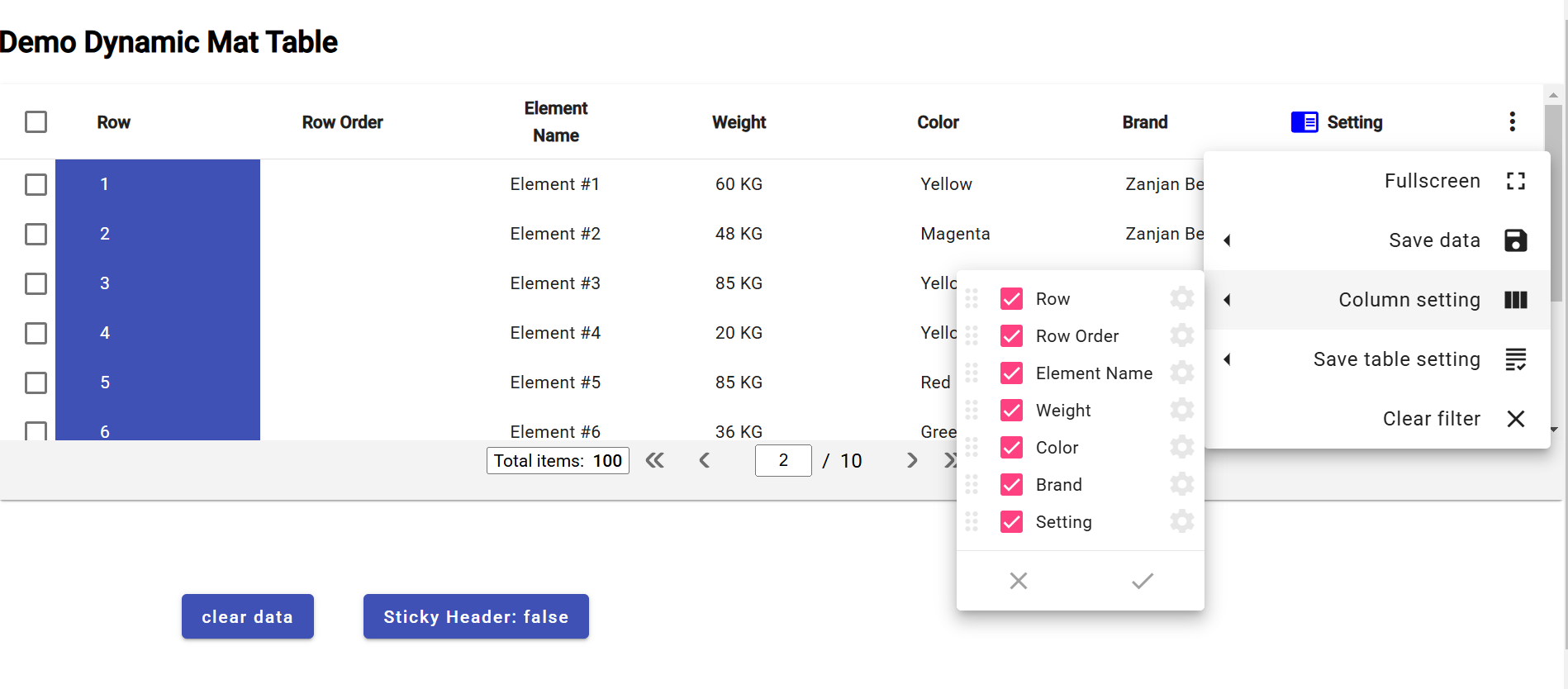
Online Demo
You can view the table in stackblitz here:
https://stackblitz.com/edit/angular-ivy-wge9lp
version (1.3.2):
https://stackblitz.com/edit/angular-ivy-s4ne42
A full demo can be found on the github repository.
Getting Started
1. First you need to install with npm:
Write npm i @martintrajanovski/dynamic-mat-table in your terminal to install the package
2. After installation you need to include DynamicMatTableModule in your module imports:
import { DynamicMatTableModule } from '@martintrajanovski/dynamic-mat-table';
...
imports: [
    DynamicMatTableModule
  ],
...
How Use The Table
Creating the table html element
first you need to write the html element like so:
<dynamic-mat-table tableName="my-table" [columns]="columns" [setting]="setting" [dataSource]="dataSource$"></dynamic-mat-table>Full Specification:
<dynamic-mat-table tableName="demo_table" [scrollStrategyType]="scrollStrategyType" [contextMenuItems]="contextMenuItems" [showReload]="showReloadData" [direction]="direction" [expandComponent]="expandComponent" [rowHeight]="rowHeight" [columns]="fields" [pending]="pending" [setting]="setting" [sticky]="stickyHeader" [dataSource]="dataSource$" [pagingMode]="paginationMode" [pagination]="pagination" [showNoData]="showNoData" [printConfig]="printConfig" [rowSelectionMode]="rowSelectionMode" [rowSelectionModel]="selectionModel" [showProgress]="showProgress" [rowContextMenuItems]="contextMenuItems" (onTableEvent)="tableEvent_onClick($event)" (onRowEvent)="rowEvent_onClick($event)" [class.conditional-class]="conditinalClass" (settingChange)="table_onChangeSetting($event)" (rowSelectionChange)="table_onRowSelectionChange($event)"> </dynamic-mat-table>by binding the properties you can set columns, set the table settings , set a datasource and more to the table
Setting the columns
to set the columns you first need to import TableField and creat a porpery that takes this type as an arry like so:
import { TableField } from '@martintrajanovski/dynamic-mat-table'
...
export class MyTable {
  columns:TableField<any>[] = [];
}
then you can set each column as an object of this arry
...
const colusmnsConfig:TableField<any>[] = [
  {
    name: 'column-one',  //this is a key for data
    header: 'column-one', //this is the name displayed
    type:'number', //type of the data
  },
  {
    name:'column-two',
    header:'column-two',
    type:'number',
  },
  ...
];
The full column type is defined as follow:
export interface TableField<R extends TableRow> extends AbstractField {
  classNames?: string;
  rowClass?: string | AtClassFunc;
  customSortFunction?: AtSortFunc<R>;
  customFilterFunction?: AtSortFunc<R>;
  toPrint?: ToPrint;
  toExport?: ToExport;
}
export interface AbstractField {
  index?: number;
  name: string; //data  key
  type?: FieldType; //data type
  width?: number; //width of the column
  header?: string; //displayed name of the column
  isKey?: boolean; // turn column in to unique key column
  inlineEdit?: boolean; // allows column to have inline edit
  display?: FieldDisplay; // allow column to be hidden or visible
  sticky?: FieldSticky; // allow column to stick in horizontal scrolling
  filter?: FieldFilter; // sets data filtering mode(none: hidden filter button)
  sort?: FieldSort; // set data sorting mode( none: hidden sort button)
  cellClass?: string; // set a class for column cells
  cellStyle?: any; //set a style for column cells
  icon?: string; // displays a mat-icon in column header
  iconColor?: string; // set a color for column header icon
  dynamicCellComponent?: any; // set the component used in column cells
  draggable?: boolean; // allows column to be rearranged with drag and drop
  // filterable?: boolean; // allows column to filter its data (shows filter button)
  clickable?: boolean; // allows column to have a function when clicked
  clickType?: "cell" | "label" | "custom"; // sets the click ability region
  printable?: boolean; // allows column to print its data
  exportable?: boolean; // allows column data to be exported
  enableContextMenu?: boolean; // enables context menu in columns
  rowSelectable?: boolean; // Coming soon...
  footer?: FooterCell[]; // creates footers for column
  cellEllipsisRow?: number; // maximum number of cells shown before ellipses
  cellTooltipEnable?: boolean; // allows column cell to have a tooltip
  headerEllipsisRow?: number; // maximum number of rows shown in column before ellipses
  headerTooltipEnable?: boolean; // allows column header to have a tooltip
  option?: any; // a spacial object for storing data state (like saving in inline edit)
  categoryData?: any[]; // Coming soon...
  toString?: (column: TableField<any>, row: TableRow) => string; // turns column data to a string (used mostly for exporting data)
  customSort?: (column: TableField<any>, row: any) => string; // allows you customize data sorting in column
}
Ceateing a data source
after setting the columns you need to set the data you want to use in your table.
Your data source must be a BehaviourSubject<any[]>
so in order to creat a data source you must do so like wise:
import { BehaviourSubject } from 'rx-js';
...
type dataType = {...};

const data:dataType[] = [
  { "row": 1, "name": "Element #4", "weight": "65 KG", "color": "Magenta", "brand": "Zanjan Benz", "type": "Van" }, ...];
...
export class MyTable implements OnInit {

  public dataSource$: BehaviorSubject<any[]>;

  constructor(){}

  ngOnInit(){
    this.dataSource$.next(data);
  }

}
Configureing the table settings
next thing is configuring the table settings.
to do so we need to create a property that takes the TableSetting type like so:
import { TableSetting } from '@martintrajanovski/dynamic-mat-table';
...
export class MyTable {
  settings:TableSettings = {};
}
then we can set the values of this object to customize our table.
For Exmaple:
const tableSettinsConfig: TableSetting = {
  direction: "ltr",
  visibleActionMenu: actionMenu,
  rowStyle: {
    "background-color": "#70e181",
    color: "ffffff",
  },
  alternativeRowStyle: {
    "background-color": "afafaf",
    color: "55fab3",
  },
  autoHeight: true,
};
the full interface is described below:
export interface TableSetting {
  direction?: Direction; // sets the directopn of the table
  columnSetting?: AbstractField[]; //
  visibleActionMenu?: VisibleActionMenu; // configures the actoin menu
  visibleTableMenu?: boolean; // controls the table men's visablity
  alternativeRowStyle?: any; // sets a style for the odd rows
  normalRowStyle?: any; // sets a style for the even rows
  scrollStrategy?: TableScrollStrategy; // sets a scroll strategy
  rowStyle?: any; //
  enableContextMenu?: boolean; // controls the context menu visablity
  autoHeight?: boolean; // allows the table to automaticly controls its height
  saveSettingMode?: "simple" | "multi" | "none"; // controls the saving mode
  settingName?: string; // name for the setting
  settingList?: TableSetting[]; //
  currentSetting?: string; //
}
Adding a paginator
adding a paginator is just like columns and setting.
first we add the Property with the TablePagination type then we configure it like so:
import { TablePagination } from '@martintrajanovski/dynamic-mat-table';
...
export class MyTable {
  pagination:TablePagination = {};
}
the full description for the TablePagination is as below:
export interface TablePagination {
  length?: number; // total number of data records
  pageIndex?: number; // initial page
  pageSize?: number; // number of rows in each page
  pageSizeOptions?: number[]; // page ination options
  showFirstLastButtons?: boolean; // controls the first/last button display
}