
@mchlmshrsh/ui-polish
v0.5.1
Published
Development-only visual editing for React and Vite apps, with CSS Modules and opt-in plain CSS source saving.


Readme
UI Polish
Click an element, tweak its styles, and save the changes to your code.
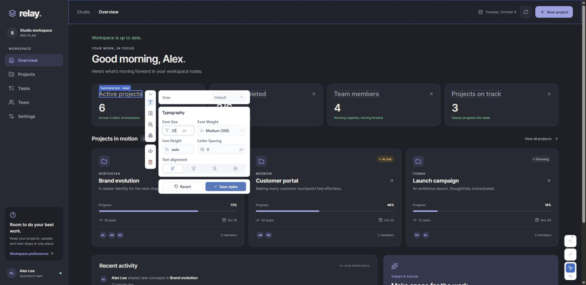
Shared previews · Save to CSS · Undo/Redo
React 19 · Vite 7/8 · CSS Modules or configured plain CSS. Development only; excluded from production builds. Compatibility
Get started
Open a prompt below and copy it into your coding agent. It will handle setup and tell you how to start your app. Then turn on the inspector and click an element to edit.
Replace the app description with your own:
Build [describe the app, its features, and design preferences] as a new
React + TypeScript + Vite app that I can edit visually with UI Polish.

Install @mchlmshrsh/ui-polish as a development dependency using the project's
package manager. Before implementation, read the installed package's README
and skills/editable-ui/SKILL.md under node_modules/@mchlmshrsh/ui-polish.
Follow its relevant references and verify the installed peer dependencies.

Use semantic design tokens, adjacent CSS Modules, directly mapped editable
classes, and clear ownership for each property and state. Use Flexbox for
new layouts. Prefer native headings, paragraphs and containers for ordinary
content; use shared components for behavior or deliberate typed variants.
Configure visualEditor() alongside the React plugin and use
automatic mounting. Keep normal app behavior independent of the inspector.

Merge concise maintenance guidance into AGENTS.md without replacing existing
instructions. Add check:ui using ui-polish check --strict. Run it alongside
the app's normal checks, report initial diagnostics, and repair scoped issues.

Verify representative selection, shared preview, Revert, Save styles, Undo,
state editing, hot reload, and production exclusion. Restore your test edits.
If browser access is unavailable, report those checks as unverified. Summarize
how to run the app, what you tested, and any limitations.
Use this prompt in the app's repository:
Integrate @mchlmshrsh/ui-polish into this existing app so I can edit supported
styles visually. Inspect its framework versions, Vite plugins, styling,
design tokens, and normal checks before changing anything.

Install UI Polish as a development dependency using the project's package
manager. Read the installed package's README and
skills/ui-polish-repair/SKILL.md under node_modules/@mchlmshrsh/ui-polish,
including its existing-project adoption reference and relevant repair references.
Verify the installed peer dependencies;
report incompatible versions before attempting a framework upgrade.

Preserve appearance, responsive behavior, accessibility, routing, component
APIs, and the existing design system. Reuse its tokens. Configure visualEditor()
alongside existing Vite plugins with automatic mounting; keep the app root
unchanged. Repair only the affected source mappings and rule ownership.
Do not patch node_modules or migrate unrelated styling. If Tailwind or another
styling system prevents source editing, explain the affected scope and agree
on a CSS Modules migration before doing it. Use Flexbox for new layouts.

Merge concise maintenance guidance into AGENTS.md, preserving existing
instructions. Add check:ui using ui-polish check --strict for adopted source
paths. Report initial diagnostics before repairs. Run targeted compatibility
checks and the app's normal checks. Verify representative preview, Revert,
Save styles, Undo, hot reload, normal interactions, and production exclusion.
Restore your test edits and identify any browser checks you could not run.
Report what is editable, what remains unsupported, and how to start the app.
No separate skill installation is needed. Prefer to configure it yourself? See manual setup.
Use the inspector
- Start the app's Vite development server normally.
- Click the inspector trigger or press Ctrl+Shift+E (Cmd+Shift+E on macOS).
- Select an element and open a tool. Inspector mode selects elements without activating app controls.
- Adjust values or choose a named token. Dashed outlines identify other visible elements sharing the mapped CSS source.
- Choose Save styles to write supported edits to source, or Revert to discard the preview.
Adjust text, spacing, colors, and corners in your running app. For example, select a card title and make its text larger. If other titles share that CSS rule, you can see them update together before saving. Save styles updates the owning rule; Revert discards the preview without writing files. A preview can fall back to the selected element if the shared browser rule cannot be resolved safely.
Use the State control for supported default, interaction, and application states. Save or revert pending styles before switching states. Token choices preserve their var(...) references; typing or scrubbing creates a custom value without rewriting the token definition.
From 0.5.1: the file tool beside eye/trash offers Open source for the selected JSX location and Open styles for its CSS class rule in the chosen state/context. No VS Code extension is required. See source navigation for editor setup and limits.
Supported deletion hides affected elements immediately and queues validated JSX source writes, so you can continue inspecting and deleting. Undo cancels an uncommitted deletion immediately; committed actions can require hot reload. Styles and element actions share up to 50 locally persisted history transactions with conflict checks and interrupted-write recovery.
The development server warms deletion validation in the background and reuses compiler work. Source saving can still take time in larger apps; optimistic removal and Undo remain available while validation runs. Supported local native-root render callbacks can resolve to their component placement, affecting every rendering of that placement. Required or referenced output stays protected. See capabilities and limits.
Supported projects
| Area | Supported path | | ---------------------------------- | --------------------------------------------------------------------------------------------- | | Framework | React 19 + ReactDOM 19 | | Build tool | Vite 7 or 8 | | Source styling | CSS Modules; opt-in plain CSS with an explicit stylesheet list and unique class ownership | | Language | TypeScript/TSX is the setup skill's tested path | | Design system | CSS custom properties for discoverable font-size, color, and radius tokens | | Tailwind and other styling systems | Utility-class source editing is unsupported; adopt CSS Modules for the areas you want to edit |
An existing app can adopt CSS Modules incrementally. Integrating the inspector does not require replacing its entire design system or migrating unrelated styles. Other bundlers and styling systems do not have a supported source writer.
Keep the app editable
The package includes two agent skills:
| Skill | Use it for | | ---------------------------------------------------- | --------------------------------------------------------------- | | editable-ui | Creating a new compatible project | | ui-polish-repair | Existing-project adoption, agreed styling migration, and mapping repair |
Installing the package does not automatically install skills into your agent or enforce project conventions. The setup prompts ask the agent to read the bundled files directly. For reusable skill installation, copy the complete skill folder, including references/, into your agent's supported skill directory.
The repair skill's adoption workflow, expanded in 0.5.1, establishes a baseline, migrates one agreed slice, verifies design and behavior, and records maintenance guidance before expanding scope.
After JSX/CSS structural changes, have your agent run the compatibility check alongside the app's normal checks. For a fully adopted project, add this script to package.json:
{
  "scripts": {
    "check:ui": "ui-polish check --strict"
  }
}
Then run npm run check:ui, or the equivalent for your package manager. For mixed-styling apps, scope the script to adopted paths, for example ui-polish check src/components/cards --strict.
Before component extraction or file moves, Save or Revert pending edits and checkpoint the source in Git. Preserve saved CSS, then reselect and verify the moved targets. Hot reload refreshes supported mappings, but older Undo history does not automatically follow renamed files.
Manual setup
If you prefer to configure the integration yourself:
npm install -D @mchlmshrsh/ui-polishAdd the plugin alongside your existing React plugin in vite.config.ts. Preserve any other plugins and configuration:
import { defineConfig } from 'vite';
import react from '@vitejs/plugin-react';
import { visualEditor } from '@mchlmshrsh/ui-polish/vite';

export default defineConfig({
  plugins: [react(), visualEditor()],
});
Start Vite normally. The inspector mounts automatically; no changes to main.tsx or your app's React root are needed. Do not also mount an inspector manually.
Editable elements need direct CSS Module mappings, such as className={styles.title}, and safely owned source rules. Installation alone does not make every existing element editable. See the source editing reference for examples and supported patterns.
Options:
visualEditor({ enabled: false })disables the tooling.visualEditor({ autoMount: false })keeps source mapping and saving available for a manually mountedInspector. Use a development-only dynamic import for the manual mount.visualEditor({ plainCss: ['src/app.css'] })enables supported literal classes from explicitly registered global stylesheets. Import those files normally and use matchingui-polish check --plain-css src/app.css --strictflags.visualEditor({ tokenFamilies: { colors: ['--mf-color-'], fontSizes: ['--mf-type-size-'], radii: ['--mf-radius-'] } })discovers existing token namespaces without redundant aliases.
Version 0.4.0 adds named layers, full media/supports contexts, configurable token families, and opt-in plain CSS. Choose the context to edit; its browser condition still controls visibility. See adoption capabilities and limits for supported contracts, including optional decorative callback removal. Earlier releases do not include all these capabilities.
Limits and troubleshooting
| Situation | What to do |
| ----------------------------------- | ------------------------------------------------------------------------------------------------------------------------------------------------------------- |
| AMBIGUOUS_CLASS | Ask the repair skill to trace duplicate owning rules, including responsive rules, while preserving appearance. UI Polish does not choose a rule by guesswork. |
| UNSUPPORTED_SELECTOR | The selector structure cannot be safely targeted. Preserve the app's behavior and review the affected target with the repair skill. |
| An element selects but cannot save | Check its direct CSS Module mapping and property ownership. Opaque class composition, caller overrides, or unsupported styling can limit editing. |
| Shared elements change together | They consume the same owning CSS rule. Give independently styled elements separate owners. CSS scope and JSX deletion scope are different. |
| An icon cannot be edited or deleted | Check its mapped class and SVG forwarding contract. Generic imported SVG components require a runtime ownership check. |
Deleting UI removes supported JSX source. It does not delete server records or automatically stop related hooks, fetching, or other logic. Review related cleanup separately and preserve code shared elsewhere.
The compatibility checker is read-only and available from version 0.3.0. A passing source check does not prove browser behavior or replace TypeScript/build checks. Flexbox is the setup skill's convention; CSS Grid itself is not an inspector incompatibility.
For detailed selector support, token naming, states, SVG ownership, CLI options, and refactoring behavior, read the source editing reference. The file is also included at node_modules/@mchlmshrsh/ui-polish/docs/source-editing.md.
See the changelog for release-specific changes. Licensed under MIT.