
@meistudioli/msc-switch
v1.0.0
Published
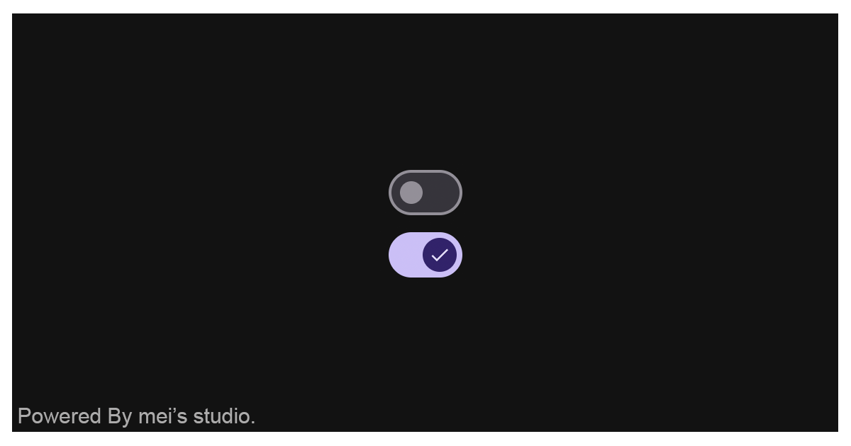
<msc-switch /> is a web component designed in accordance with Material Design principles. By simply wrapping an input[type=checkbox][switch] element within it, developers can instantly implement the corresponding user interface and interactions. This comp


Readme
msc-switch


<msc-switch /> is a web component designed in accordance with Material Design principles.
By simply wrapping an input[type=checkbox][switch] element within it, developers can instantly implement the corresponding user interface and interactions. This component plays a vital role in ensuring a unified appearance and consistent behavior across elements.
Basic Usage
<msc-switch /> is a web component. All we need to do is put the required script into your HTML document. Then follow <msc-switch />'s html structure and everything will be all set.
Required Script
<script
  type="module"
  src="https://unpkg.com/@meistudioli/msc-switch/mjs/wc-msc-switch.js">
</script>
Structure
Put <msc-switch /> into HTML document. It will have different functions and looks with attribute mutation.
<msc-switch appearance="none">
  <input
    type="checkbox"
    slot="switch"
    switch
    value="y"
    tabindex="0"
  />
</msc-switch>
<msc-switch /> dynamically adjusts its user interface and core functionality by strictly adhering to the attributes of the encapsulated input[type-checkbox][switch] element. Developers can leverage these capabilities and observe the corresponding behavioral shifts by modifying the standard disabled attribute directly on the input element.
<msc-switch appearance="none">
  <input
    type="checkbox"
    slot="switch"
    switch
    value="y"
    tabindex="0"
    disabled
  />
</msc-switch>
JavaScript Instantiation
<msc-switch /> could also use JavaScript to create DOM element. Here comes some examples.
<script type="module">
import { MscSwitch } from 'https://unpkg.com/@meistudioli/msc-switch/mjs/wc-msc-switch.js';

const checkboxTemplate = document.querySelector('.my-checkbox-template');

// use DOM api
const nodeA = document.createElement('msc-switch');
nodeA.appendChild(checkboxTemplate.content.cloneNode(true));
document.body.appendChild(nodeA);

// new instance with Class
const nodeB = new MscSwitch();
nodeB.appendChild(checkboxTemplate.content.cloneNode(true));
document.body.appendChild(nodeB);
nodeB.appearance = 'none';

// new instance with Class & default config
const config = {
  appearance: 'always'
};
const nodeC = new MscSwitch(config);
nodeC.appendChild(checkboxTemplate.content.cloneNode(true));
document.body.appendChild(nodeC);
</script>
Style Customization
Developers could apply styles to decorate <msc-switch />'s looking.
<style>
msc-switch {
  /* normal */
  --msc-switch-outline-color: rgba(97 91 112);

  --msc-switch-background-color-normal: rgba(229 224 233);
  --msc-switch-background-color-disabled: rgba(244 240 248);

  --msc-switch-border-color-normal: rgba(120 116 125);
  --msc-switch-border-color-disabled: rgba(218 214 222);

  --msc-switch-dot-color-normal: rgba(120 116 125);
  --msc-switch-dot-color-active: rgba(73 69 78);
  --msc-switch-dot-color-disabled: rgba(163 159 166);

  --msc-switch-icon-color-normal: rgba(229 224 233);
  --msc-switch-icon-color-disabled: rgba(163 159 166);

  /* checked */
  --msc-switch-outline-color-checked: rgba(97 91 112);

  --msc-switch-background-color-checked-normal: rgba(99 86 139);
  --msc-switch-background-color-checked-disabled: rgba(220 216 224);

  --msc-switch-border-color-checked-normal: rgba(99 86 139);
  --msc-switch-border-color-checked-disabled: rgba(220 216 224);

  --msc-switch-dot-color-checked-normal: rgba(255 255 255);
  --msc-switch-dot-color-checked-active: rgba(232 222 253);
  --msc-switch-dot-color-checked-disabled: rgba(253 247 255);

  --msc-switch-icon-color-checked-normal: rgba(80 61 137);
  --msc-switch-icon-color-checked-disabled: rgba(169 165 172);
}
</style>
Attribute
<msc-switch /> component exposes a curated set of attributes, enabling developers to dynamically adjust the user interface. This provides the flexibility to tailor the component’s appearance to seamlessly adapt to any given context.
appearance
The appearance of <msc-switch /> can be customized using the appearance attribute. The component currently supports the following three options:
none:Hides the icon display. This is the default setting.selectedonly:Displays the icon only when the <msc-switch /> is in the selected state.always:Displays the icon at all times, regardless of the selected state.
<msc-switch
  appearance="always"
>
  <input
    type="checkbox"
    slot="switch"
    switch
    value="y"
    tabindex="0"
  />
</msc-switch>
Property
| Property Name | Type | Description |
| ----------- | ----------- | ----------- |
| appearance | String | Getter / Setter for appearance. The <msc-switch /> can be customized using this property. It supports three values—none, selectedonly, and always—aligning directly with the behavior of the corresponding attribute. The default value is none. |