
@meksiabdou/react-native-switch
v1.1.1
Published
Customizable switch component for React Native

Readme
@meksiabdou/react-native-switch
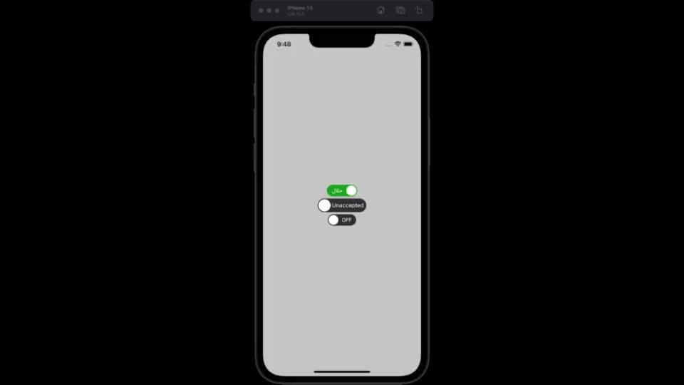
Customisable switch component for React Native
Requirements
Installation
npm install @meksiabdou/react-native-switchyarn add @meksiabdou/react-native-switchUsage
import * as React from 'react';
import { StyleSheet, View } from 'react-native';
import Switch from '@meksiabdou/react-native-switch';

export default function App() {
  const [value, setValue] = React.useState(false);
  return (
    <View style={styles.container}>
      <View>
        <Switch
          value={value}
          width={70}
          onValueChange={() => setValue(!value)}
          activeText="ON"
          inActiveText="OFF"
          circleSize={24}
          textStyle={{ fontSize: 13 }}
          disabled={false}
        />
      </View>
    </View>
  );
}

const styles = StyleSheet.create({
  container: {
    flex: 1,
    alignItems: 'center',
    justifyContent: 'center',
    backgroundColor: '#ccc',
  },
});
Switch Props
| name | type | default | | ------------------- | --------- | --------- | | width | number | 100 | | value | boolean | false | | onValueChange | function | undefined | | onAnimationEnd | function | undefined | | disabled | boolean | false | | activeText | string | ON | | inActiveText | string | OFF | | circleSize | number | 30 | | switchBorderRadius | number | 30 | | switchPaddingRight | number | 2 | | switchPaddingLeft | number | 2 | | backgroundActive | string | #249c00 | | backgroundInActive | string | #333 | | circleActiveColor | string | #fff | | circleInActiveColor | string | #fff | | textStyle | TextStyle | undefined | | switchStyle | ViewStyle | undefined | | circleChildrenActive| ReactElement | undefined | | circleChildrenInActive| ReactElement | undefined |
Contributing
See the contributing guide to learn how to contribute to the repository and the development workflow.
License
MIT
Made with create-react-native-library