
@meteor-icons/svelte
v4.5.0
Published
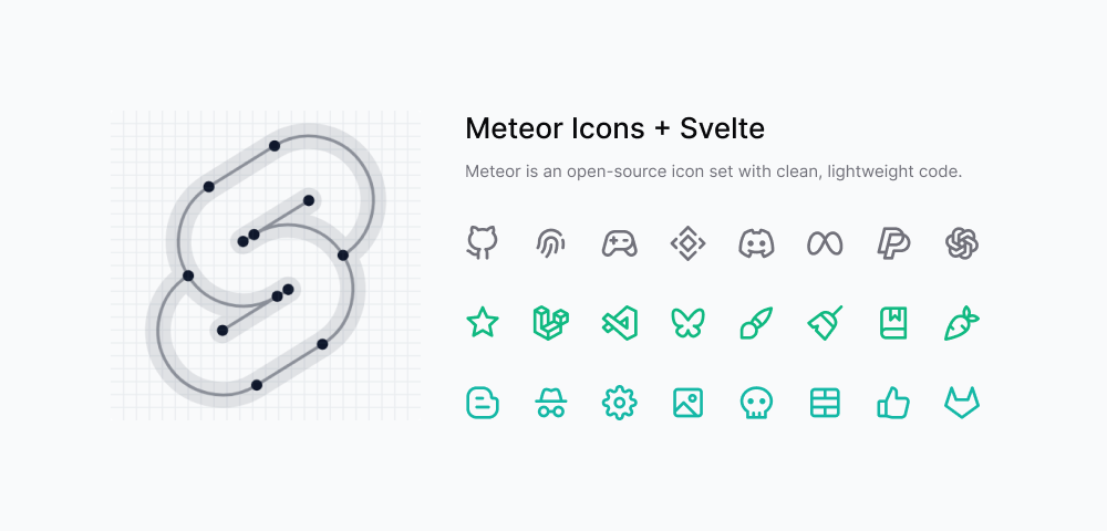
Meteor is an open-source icon set with ultra-lightweight, performance-focused code, crafted through human reasoning.

Maintainers
 zkreations
Readme
About
A lightweight, tree-shakeable icon library for Svelte applications based on Meteor Icons.
Features
- Tree-shakeable: import only what you use
- Designed for Svelte
- Fully customizable through props
- Inline SVG rendering
- Optional minimal SVG attributes mode
- Optimized for performance
Installation
npm install @meteor-icons/svelteUsage
Use named imports for a compact developer experience.
<script>
  import { Code, Star } from '@meteor-icons/svelte'
</script>

<Code />
You can also import by subpath if you prefer explicit per-file imports.
<script>
  import Code from '@meteor-icons/svelte/icons/code'
</script>
Both styles are tree-shakeable in modern production bundlers.
Props
All icons share the same props:
| Prop | Type | Default | Description |
| --- | --- | --- | --- |
| size | string | number | 24 | Sets width and height |
| color | string | currentColor | Defines the stroke color |
| strokeWidth | string | number | 2 | Controls stroke thickness |
| minimal | boolean | false | Renders only essential SVG attributes (class and viewBox) |
| class | string | '' | Additional CSS classes |
| ...$$restProps | SVG attrs | - | Any valid SVG attribute |
Minimal mode
Use the minimal prop to keep only essential attributes in the generated SVG root (class and viewBox).
<script>
  import { Star } from '@meteor-icons/svelte'
</script>

<Star minimal />
<Star minimal class='icon-lg text-blue-500' />
If you use minimal mode, you should add the following CSS to your styles for proper icon rendering:
.i {
  stroke-width: var(--i-stroke, 2);
  width: var(--i-size, 24px);
  height: var(--i-size, 24px);
  stroke: var(--i-color, currentColor);
  stroke-linecap: round;
  stroke-linejoin: round;
  fill: none;
}
Example
<script>
  import { Code } from '@meteor-icons/svelte'
</script>

<Code size={48} color='red' strokeWidth={1} class='icon-large' aria-label='code icon' />
Best Practices
- Import only the icons you need
- Use currentColor to inherit color from parent elements
- Prefer CSS classes over inline styles for consistency
Contributing
All icons are created by Daniel Abel, but contributions are welcome.
Guidelines
- Ensure visual consistency across icons
- Keep SVG code clean and optimized
- Provide clear references when requesting new icons
- Contributions must be original work
Support
For more information, see CONTRIBUTING.md. You can also support the project by buying a coffee.
License
Meteor Icons is licensed under the MIT License.