
@minxs33/glassify-ui
v1.0.7
Published
A React component library for creating glassmorphism UI effects.
Maintainers
 minxs33
Readme
Glassify UI
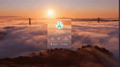
A sleek, lightweight React component library for effortlessly applying stunning glassmorphism UI effects to your elements.
Getting Started
# npm
npm install @minxs33/glassify-ui

# yarn
yarn add @minxs33/glassify-ui

# pnpm
pnpm add @minxs33/glassify-ui
Usage
The core functionality is provided by the Glassify component.
Basic Example
Wrap any content with the Glassify component and use its props to control the look and feel of the glass effect.
import { Glassify } from "@minxs33/glassify-ui";

export default function Example() {
  return (
    <Glassify
      className="p-6 max-w-sm mx-auto"
      borderRadius="lg"
      tint="glass"
      shine="top-left-md-strong"
      turbulence='base'
      displacement='base'
    >
      {/* ... content ... */}
    </Glassify>
  );
}
Using an Effect Preset
Use the effectPreset prop to apply a predefined combination of blur, tint, turbulence, and displacement.
import { Glassify } from '@minxs33/glassify-ui';

function PresetExample() {
  return (
    <Glassify
      effectPreset="frosted"
      className="p-8"
    >
     {/* ... content ... */}
    </Glassify>
  );
}
Effect Presets List
| Preset | Description |
|---------------|-------------|
| frosted | Light and diffused, like softened daylight on cool glass. |
| crystal | Clear and balanced, with gentle warmth and sharp definition. |
| misted | Calm and hazy, blending softly into its surroundings. |
| smoked | Muted and deep, with a quiet sense of contrast. |
| arctic | Cool and desaturated, evoking stillness and open air. |
| amber | Warm and inviting, touched with soft evening light. |
| opal | Muted lavender undertones with a calm, reflective surface. |
| subtle | Barely tinted, understated, and harmoniously neutral. |
| bold | Dark and grounded, with a confident visual weight. |
| vibrant | Rich and saturated, standing out with smooth intensity. |
| monochrome | Neutral and minimal, focused purely on light and form. |
Customizing Effects
You can override or set individual effects by using their respective props.
import { Glassify } from '@minxs33/glassify-ui';

function CustomExample() {
  return (
    <Glassify
      // Effect preset for base settings
      effectPreset="frosted"
      // Custom blur value (CSS-compatible string)
      blur="16px"
      // Tint using a color preset
      tint="blue"
      // Custom shine effect (direction-size-intensity)
      shine="bottom-md-strong"
    >
      {/* ... content ... */}
    </Glassify>
  );
}
Props Reference
| Prop | Type | Default | Description |
|------|------|----------|-------------|
| children | React.ReactNode | — | Content inside the glass container |
| className | string | — | Wrapper class names (e.g. Tailwind utilities) |
| contentClassName | string | — | Custom classes for the content container |
| zIndex | string | "0" | Accepts Tailwind-like z-10, z-[999], or raw numeric string |
| borderRadius | BorderRadiusOption | "none" | Accepts Tailwind-style presets (sm, lg, full) or custom CSS values like "12px" or "50%" |
| tint | TintOption | "none" | Supports presets (frosted, smoke, any color name) or custom RGBA string such as "255,255,255,0.15" |
| blur | BlurOption | "base" | Accepts presets (sm, md, xl) or custom blur size like "8px" or "12px" |
| shine | ShineOption | "top-left-base-base" | Multi-part string defining direction, size, intensity, and color (e.g. "top-left-lg-soft-blue") |
| turbulence | TurbulenceOption | "none" | Use a preset (sm, md, lg) or a custom object { numOctaves: number, baseFreq: number } |
| displacement | DisplacementOption | "none" | Accepts presets (sm, md, lg) or custom numeric string ("45", "100") |
| effectPreset | EffectPresetOption | "none" | Apply built-in presets (frosted, crystal, etc.) or provide an override object { preset, overrides } |
| theme | "light" \| "dark" | "light" | Determines color theme; can be forced manually |
Props Options
This section lists the possible values and accepted formats for customizable props.
borderRadius
Controls the corner rounding of the glass container.
Formats:
- Preset:
sm,md,lg,xl,2xl,full - Custom: Any valid CSS value such as
12pxor50%
Examples:
<Glassify borderRadius="xl" />
<Glassify borderRadius="16px" />
tint
Applies a semi-transparent overlay to the glass surface.
Formats:
- Preset: frosted, smoke, or any
colorpreset name (sky,neutral, etc.) - Custom RGBA string:
255,255,255,0.2
Examples:
<Glassify tint="frosted" />
<Glassify tint="sky" />
<Glassify tint="255,255,255,0.15" />
blur
Defines the blur intensity of the background layer.
Formats:
- Preset:
sm,base,md,lg,xl - Custom CSS value:
8px,12px
Examples:
<Glassify blur="lg" />
<Glassify blur="10px" />
shine
Adds directional highlights to the glass edges.
Formats:
<direction>-<size>-<intensity>-<color>Here's the list for each possible segment value:
| Part | Options | Description |
| ----------- | ------------------------------------------------------------------ | ------------------------- |
| direction | top, bottom, left, right, top-left, bottom-right, etc. | Direction of light source |
| size | sm, base, md, lg, xl | Spread and blur amount |
| intensity | soft, base, strong, hard | Brightness strength |
| color | color preset or RGB value "255,255,255" | Optional shine tone |
Examples:
<Glassify shine="top-left-lg-soft" />
<Glassify shine="bottom-right-md-strong-blue" />
<Glassify shine="top-left-md-soft-152,22,118/>
turbulence
Controls the distortion of the background texture generated from noise.
Formats:
- Preset:
sm,base,md,lg - Custom object:
{ baseFreq: number, numOctaves: number }
Examples:
<Glassify turbulence="md" />
<Glassify turbulence={{ baseFreq: 0.03, numOctaves: 2 }} />
displacement
Defines the displacement mapping strength for turbulence effects.
Formats:
- Preset:
sm,base,md,lg - Custom numeric value (as string):
"25","50","100"
Examples:
<Glassify displacement="lg" />
<Glassify displacement="60" />
effectPreset
Applies a curated combination of blur, tint, turbulence, and displacement.
See the Effect Presets section for the full list of available presets and their visual descriptions.
Formats:
- Preset name:
"frosted","crystal", etc. - Object form with overrides:
{ preset: "frosted", overrides: { blur: "12px", tint: "sky" } }
You can also override preset values directly through props. When both effectPreset and individual props are provided, the explicit props always take priority.
Examples:
// Using a preset directly
<Glassify effectPreset="frosted" />

// Using a preset with inline overrides
<Glassify
  effectPreset={{
    preset: "frosted",
    overrides: { blur: "12px", tint: "sky" }
  }}
/>

// Using a preset but overriding prop values directly
<Glassify
  effectPreset="frosted"
  tint="amber"
  blur="xl"
  displacement="80"
/>
color and theme
These props control how color behaves across light and dark modes.
color defines the base tone that other color-aware props (tint, shine) can reference.theme determines which color variant to apply when themed values are provided to the corresponding mode.
Formats:
- Preset color:
"sky","amber","slate", etc. - Custom RGB:
"255,200,150" - Theme mode:
"light:"or"dark:" - Themed color:
"sky dark:slate" - Mixed value:
"255,200,150 dark:sky"or"sky dark:255,200,150"
By default, the theme is light, so you don’t need to set theme="light" unless you’re manually toggling themes in your app.
Examples:
1. Using light and dark variants
<Glassify
  tint="sky dark:slate"
  shine="top-left-md-soft-sky dark:bottom-right-md-soft-slate"
  theme="dark"
/>
2. Using custom RGB colors
<Glassify
  tint="255,200,150"
  shine="top-left-md-soft-255,200,150"
  //theme counts as light
/>
3. Custom RGB with theme variants
<Glassify
  tint="255,200,150 dark:150,180,255"
  shine="top-left-md-soft-255,200,150 dark:bottom-right-md-soft-150,180,255"
  theme="dark"
/>
4. Mixing RGB and preset colors
<Glassify
  tint="255,200,150 dark:sky"
  shine="top-left-md-soft-255,200,150 dark:bottom-right-md-soft-sky"
  theme="dark"
/>
Supported color names:
Neutral
slate, gray, zinc, neutral, stone
Warm
red, orange, amber, yellow, rose
Fresh
lime, green, emerald, teal, cyan
Cool
sky, blue, indigo
Expressive
violet, purple, fuchsia, pink