
@momo_vision/dental-chart-angular
v0.1.0
Published
Angular 10 compatible dental chart component for adult FDI tooth selection.
Downloads
8

Maintainers
 momo_vision
Readme
@momo_vision/dental-chart-angular
Angular 10 compatible dental chart component for adult FDI tooth selection.
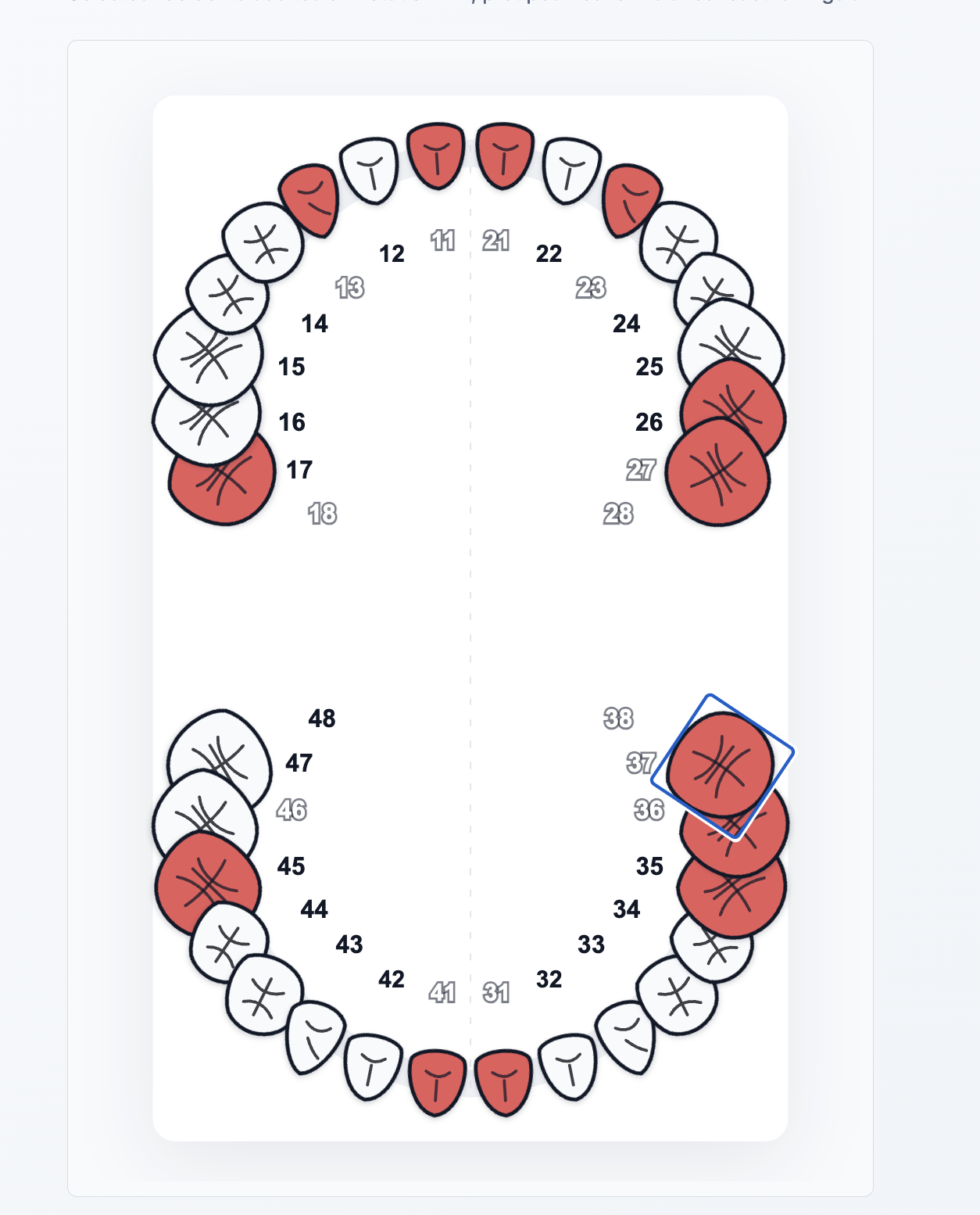
Use this package when your Angular application still uses classic NgModule architecture.
Install
npm install @momo_vision/dental-chart-angularAngular Module Usage
import { NgModule } from '@angular/core';
import { CommonModule } from '@angular/common';
import { ReactiveFormsModule } from '@angular/forms';
import { MomoDentalChartModule } from '@momo_vision/dental-chart-angular';

import { DentalActFormComponent } from './dental-act-form.component';

@NgModule({
  declarations: [DentalActFormComponent],
  imports: [
    CommonModule,
    ReactiveFormsModule,
    MomoDentalChartModule,
  ],
})
export class DentalActModule {}
Reactive Forms
import { Component } from '@angular/core';
import { FormControl } from '@angular/forms';

@Component({
  selector: 'app-dental-act-form',
  template: `
    <momo-dental-chart
      [formControl]="dentalTeeth"
      [disabledTeeth]="disabledTeeth"
      ariaLabel="Selection des dents"
    ></momo-dental-chart>
  `,
})
export class DentalActFormComponent {
  dentalTeeth = new FormControl([]);
  disabledTeeth = ['18', '28'];
}
The value is a string[] of FDI tooth codes:
['11', '12', '46']Supported Angular Versions
This legacy package targets Angular >=10 <16.
For Angular 20+, use the modern package instead:
npm install @momo_vision/dental-chartStyling
The component ships with default styles and exposes CSS variables:
momo-dental-chart {
  --momo-dental-tooth-selected-fill: #e85b5b;
  --momo-dental-tooth-disabled-fill: #d9d9d9;
  --momo-dental-focus-ring: #16a34a;
}