
@mozeyinedu/react-lab
v1.0.2
Published
Contains 3 react components, these will grow in the future
Maintainers
 mozeyinedu
Readme
Rreact-lab
React-lab contains Stackable Dialogs, Switch, WhatsAppBtn and Modal components
StackableDialogs
StackableDialogs allows you to display multiple dialogs stack on each other at the same time, it allows dragging, resizing, minimizing, maximizing, etc. It can be used in a solution where you do several taxt concurrently (multitasking solution such as Hospital management solution, Bank app etcs). Text typed in the dialogs also persist, reloading the browser does not wip off the data
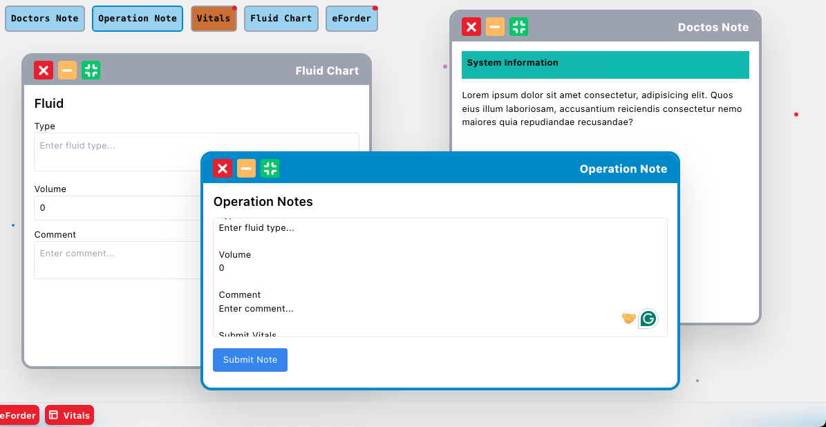
See implementation example below
"use client";

import React, { useState, useCallback, ReactNode } from "react";
import { StackableDialogs, DialogButtons } from "@mozeyinedu/react-lab";
import { useAppContext } from "../context";

// All components returned by getContentForModal must accept these props
interface ModalContentProps {
  data: any; // The persistent data slice for this specific modal
  updateData: (data: any) => void; // The function to update and persist the data
}

const buttons = [
  {
    id: "Doctos Note",
    title: "Doctos Note",
    jsx: <div className="p-2 bg-active-nav font-bold">Doctors Note</div>,
  },
  {
    id: "Operation Note",
    title: "Operation Note",
    jsx: <div className="p-2 bg-active-nav font-bold">Operation Note</div>,
  },
  {
    id: "Vitals",
    title: "Vitals",
    jsx: <div className="p-2 bg-yellow font-bold">Vitals</div>,
  },
  {
    id: "Fluid Chart",
    title: "Fluid Chart",
    jsx: <div className="p-2 bg-active-nav font-bold">Fluid Chart</div>,
  },
  {
    id: "eForder",
    title: "eForder",
    jsx: <div className="p-2 bg-active-nav font-bold">eForder</div>,
  },
];

const Index = () => {
  const { modal_data, modal_label, global_modals, set_global_modals } =
    useAppContext();
  const [requestedModalId, setRequestedModalId] = useState<string | null>(null);
  const [requestedModalTitle, setRequestedModalTitle] = useState<string | null>(
    null
  );
  const [activationKey, setActivationKey] = useState(0);
  // Helper function to open or activate a modal (passed to IndexButtons)
  const openModal = (id: string, title: string) => {
    setRequestedModalId(id);
    setRequestedModalTitle(title);
    setActivationKey((prev) => prev + 1);
  };

  // Helper function to handle closure notification from StackableModal
  const handleModalClose = useCallback(
    (closedId: string) => {
      if (requestedModalId === closedId) {
        setRequestedModalId(null);
        setRequestedModalTitle(null);
      }
    },
    [requestedModalId]
  );

  // This function now receives the data and the updater function from StackableModal.
  const getContentForModal = useCallback(
    (id: string, data: any, updateData: (data: any) => void): ReactNode => {
      const contentProps: ModalContentProps = { data, updateData };

      switch (id) {
        case "Doctos Note":
          return <DoctorsNote {...contentProps} />;
        case "Operation Note":
          return <OperationNote {...contentProps} />;
        case "Vitals":
          return <VitalsContent {...contentProps} />;
        case "Fluid Chart":
          return <FluidChart {...contentProps} />;
        case "eForder":
          return <EForder {...contentProps} />;
        default:
          return <div>Content Not Found for ID: {id}</div>;
      }
    },
    []
  );

  return (
    <div className="app-container">
      <ModalButtons
        openModal={openModal} // not optional
        buttons={buttons} // not optional
        global_modals={global_modals} // not optional, it has all the open modals (dialogs) that lives in local storage
        closed_border_color="red" // defualt is white
        active_border_color="green" // default is #1987cf
        inactive_border_color="#cccccc" // default is #9ca3af
        borderWidth="2px" // default is 2px
      />

      <StackableModal
        activationKey={activationKey} // not optional
        set_global_modals={set_global_modals} // not optional, a state that gets all the open modals (dialogs) that lives in local storage
        id={requestedModalId} // not optional
        title={requestedModalTitle} // not optional
        modal_data={modal_data} // not optional, it has all the persistent data for all modals (dialogs) that lives in local storage. to make the data specific to the logged in user, pass user unique id or email or username here, e.g const modal_label = modal-${user.id} )
        modal_label={modal_label} // not optional, it is just a string label for dialog, to make the open dialogs specific to the logged in user, pass user unique id or email or username here, e.g const modal_label = modal-${user.id} )`
        onClose={handleModalClose} // optional. it fires and returns the closed dialog id
        getContent={getContentForModal} // it get the content for the modal based on id, data and updateData function (this allows persistent data)
        title_active_bg_color="" // default is #1987cf
        title_inactive_bg_color="" // default is #9ca3af
        title_active_text_color="" // default is white
        title_inactive_text_color="" // default is white
        title_position="left" // default is left. if left the title is aligned to left, and the action buttons (close, maximize, minimize) are aligned to right and vice versa for right
      ></StackableModal>
    </div>
  );
};

export default Index;

function OperationNote({ data, updateData }: ModalContentProps) {
  // Read value from persistent data, default to empty string
  const note = data.note || "";

  // Instead of using useState, update the persistent store immediately
  const handleChange = (e: React.ChangeEvent<HTMLTextAreaElement>) => {
    updateData({ note: e.target.value });
  };

  const handleSubmit = () => {
    console.log(note);
    // Add logic here to send data to a real API/store

    // emtpy the data from localstorage after submission
    updateData({ note: "" });
  };

  return (
    <div className="p-4 overflow-auto bg-card h-full">
      <h3 className="text-xl font-semibold mb-3">Operation Notes</h3>
      <textarea
        className="w-full h-48 p-2 border rounded resize-none focus:outline-none focus:ring-2 focus:ring-blue-500 drag-exempt"
        placeholder="Type in your operation notes here..."
        value={note}
        onChange={handleChange} // Use the updater function
      />
      <button
        onClick={handleSubmit}
        className="mt-3 px-4 py-2 bg-blue-500 text-white rounded hover:bg-blue-600 drag-exempt"
      >
        Submit Note
      </button>
    </div>
  );
}

function VitalsContent({ data, updateData }: ModalContentProps) {
  // Read values from persistent data, default to empty strings
  const vitals = data.vitals || { temp: "", bp: "", hr: "" };

  const handleChange = (
    e:
      | React.ChangeEvent<HTMLInputElement>
      | React.ChangeEvent<HTMLTextAreaElement>
  ) => {
    const { name, value } = e.target;

    // Update the entire vitals object in the persistent store
    const newVitals = { ...vitals, [name]: value };
    updateData({ vitals: newVitals }); // Save the updated slice
  };

  const handleSubmit = () => {
    console.log(vitals);
    // Add logic here to send data to a real API/store
  };

  return (
    <div className="p-4 overflow-auto bg-card h-full">
      <h3 className="text-xl font-semibold mb-3">Vitals Input Form</h3>
      <form
        onSubmit={(e) => {
          e.preventDefault();
          handleSubmit();
        }}
      >
        <div className="space-y-3">
          <input
            type="number"
            name="temp"
            placeholder="Temperature (°C)"
            value={vitals.temp}
            onChange={handleChange}
            className="w-full p-2 border rounded drag-exempt"
          />
          <textarea
            name="bp"
            placeholder="Blood Pressure (e.g., 120/80)"
            value={vitals.bp}
            onChange={handleChange}
            className="w-full p-2 border rounded drag-exempt"
          />

          <input
            type="number"
            name="hr"
            placeholder="Heart Rate (bpm)"
            value={vitals.hr}
            onChange={handleChange}
            className="w-full p-2 border rounded drag-exempt"
          />
        </div>
        <button
          type="submit"
          className="mt-4 px-4 py-2 bg-green-500 text-white rounded hover:bg-green-600 drag-exempt"
        >
          Submit Vitals
        </button>
      </form>
    </div>
  );
}

function FluidChart({ data, updateData }: ModalContentProps) {
  // Read values from persistent data, default to empty strings
  const fluid = data.fluid || { type: "", volume: 0, comment: "" };

  const handleChange = (
    e:
      | React.ChangeEvent<HTMLInputElement>
      | React.ChangeEvent<HTMLTextAreaElement>
  ) => {
    const { name, value } = e.target;

    // Update the entire vitals object in the persistent store
    const newFluids = { ...fluid, [name]: value };
    updateData({ vitals: newFluids });
  };

  const handleSubmit = () => {
    console.log({ fluid });
  };

  return (
    <div className="p-4 overflow-auto bg-card h-full">
      <h3 className="text-xl font-semibold mb-3">Fluid</h3>
      <div>
        <div className="space-y-3">
          <p>
            <label>Type</label>
            <textarea
              name="type"
              placeholder="Enter fluid type..."
              value={fluid.type}
              onChange={handleChange}
              className="w-full p-2 border rounded drag-exempt"
            />
          </p>

          <p>
            <label>Volume</label>
            <input
              type="number"
              name="volume"
              placeholder="Fluid volume"
              value={fluid.volume}
              onChange={handleChange}
              className="w-full p-2 border rounded drag-exempt"
            />
          </p>

          <p>
            <label>Comment</label>
            <textarea
              name="comment"
              placeholder="Enter comment..."
              value={fluid.comment}
              onChange={handleChange}
              className="w-full p-2 border rounded drag-exempt"
            />
          </p>
        </div>
        <button
          onClick={handleSubmit}
          type="submit"
          className="mt-4 px-4 py-2 bg-green-500 text-white rounded hover:bg-green-600 drag-exempt"
        >
          Submit Vitals
        </button>
      </div>
    </div>
  );
}

function DoctorsNote({ data, updateData }: ModalContentProps) {
  return (
    <div className="p-4 bg-card h-full">
      <h1 className="bg-sec p-2 h-[40px] font-bold">System Information</h1>
      <div className="overflow-auto h-[calc(100%-40px)] pt-4 pb-[40px]">
        Lorem ipsum dolor sit amet consectetur, adipisicing elit. Quos eius
        illum laboriosam, accusantium reiciendis consectetur nemo maiores quia
        repudiandae recusandae?
      </div>
    </div>
  );
}

function EForder({ data, updateData }: ModalContentProps) {
  return <div className="p-4 overflow-auto bg-card h-full">e folder here</div>;
}
Switch Components
It is a toggle button (switch) react component library
- It receives 3 props; value, thumbColor and tractColor
- value is either true or false
- thembColor is the background color of the thumb
- tractColor is the background color of the tract
installation
npm install @mozeyinedu/switch
Usage
import React, {useState} from 'react';
import {Switch} from '@mozeyinedu/switch';

function App() {
    const [val, setVal] = useState(false);

    return (
    <>
        <div onClick={()=>setVal(!val)} >
            <Switch
                value={val}
                tractColor={val ? "red" : "black"}
                thumbColor={val ? "black" : "red"}
            />
        </div>
    </>
    );
}

export default App;- You can then dynamically change the background color of a container uisng a tenary operator
function App() {
    const [val, setVal] = useState(false);

    return (
    <>
        <div
            style={{
                margin: '20px',
                width:'200px',
                height:'100px',
                background: val ? "#cdc" : '#444',
                display: 'flex',
                justifyContent: 'center',
                alignItems: 'center'
            }}
        >
            <div
                onClick={()=>setVal(!val)}
            >
                <Switch
                    value={val}
                    tractColor={val ? "red" : "black"}
                    thumbColor={val ? "black" : "red"}
                />
            </div>
        </div>
    </>
    );
}

export default App;
WhatsAppBtn Components
It is a whatsApp button that allow when clicked, redirects to open whatsApp app/web
- It receives optional 6 props; mobileNumber, size, animate, position, groupChatLink and style
- mobileNumber Is the whatsApp mobile number (e.g. 2348033333333 and not +2348033333333 or 08033333333 for a Nigeria mobile number)
- size: Is the size of the button, it can be any of css dimensional unit (e.g. px, rem, em, % etc). default is 50px
- animate: true or false to either set or remove the pinging animation, default is set to true
- position: position in the window's bottom (right, center or left), default is right
- style: Any other style
- groupChatLink: link for group chat. If set, link to individual chat is deactivated
import {WhatsAppBtn} from '@mozeyinedu/react-lab';

function App() {
    return <WhatsAppBtn mobileNumber="2348033333333" size="50px" animate={true} style={{...}} />
}

export default App;
The default props position is fixed and placed 10px from right and bottom of the webpage mobileNumber is empty size is 70px and animate is true style={{position: 'fixed', right: '15px', bottom: '15px', zIndex: '1000'}}
<WhatsAppBtn mobileNumber="2348033333333" />Customization
By default, the position is fixed and placed 10px from right and bottom of the webpage, this can be changed. For example, you want to place the button in a div in a contact page, it should be within the flow of the containing div and not the entire document, hence you change the position from fixed to absolute and set the position of the containing div relative, tuerk the position (left, right, top and bottom)
<div style={{ width: "200px", height: "80px", border: "1px solid red", position: 'relative' }}>
    <WhatsAppBtn mobileNumber="2348033333333" size="50px" animate={false} style={{ position: 'absolute', left: "50%", top: "50%", transform: "translate(-50%, -50%)" }} />
</div>
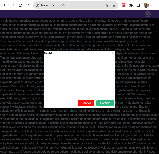
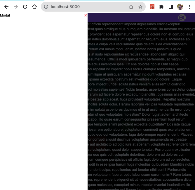
Modal
Usage
import {Modal} from "@mozeyinedu/react-lab"
<Modal props={...}>...</Modal>
Props
- show: It's required. It toggles the modal. It accepts boolean:
trueorfalse - position: Where to set the modal. It accepts
'center','top','right','bottom'and'left'(default is'left'). Default is set to'left' - fromToCenter: This only works when position is set to
'center'. It accepts string:'top'and'bottom'. This tells where the modal comes from. Default is set to'top - children: child prop. It is required
- overlayClose: It accepts boolean:
trueorfalse. It tells whether the modal should be closed when the overlay is clicked. Default is set to betrue - showActions: It accepts boolean:
trueorfalse. It tells whether to show'Cancel ButtonandConfirm Buttonbuttons. This only works when position is set to'center'Default is set to befalse - onClosed: A callback function, it is called back when the modal is closed
- onConfirmed: A callback funtion, it is called back when
Cancel Buttonis clicked - onCancelled: A callback funtion, it is called back when
Cancel Buttonis clicked - background: Background of the modal. Default is white
- iconColor: Close icon background. Default is #aaa
- cancelBtnColor: Cancelled Button background color. Default is
'red' - confirmBtnColor: Confirmed Button background color. Default is
'#10b981'(Emerald green) - ActionButtonTextColor: Action buttons (
'Cancelled Button&'Confirmed Button) text color: Default is'#fff. - opacity: accept 0, 0.1, 0.2 ..., 1. Default is
'0.6
    import React, { useState } from 'react'
    import Modal from '@/components/Modal';

    export default function SideNav() {
        const [openModal, setOpenModal] = useState(false)

        function handleOpenModal() {
            setOpenModal(true)
        }

        return (
            <div>
                <button onClick={handleOpenModal}>Open modal</button>

                <Modal
                    show={openModal} // toggles the modal, accepts true or false
                    iconColor="red" // close icon color (default is #aaa)
                    fromToCenter="bottom" // accepts only top or bottom, only works when position is set to center
                    background="#fff" // bg color, it does not affect the children background's color
                    position='center' // other options are top, right, bottom and left (default is left)
                    showActions={true} // to show cancel and confirm buttons, only works when position is set to center, top or bottom
                    onClosed={(e) => { setOpenModal(false); console.log(e) }} // callback when modal is closed, returns true
                    onConfirmed={(status) => {
                        if (status == true) {
                            setOpenModal(false)
                        }
                    }}
                    onCancelled={(status) => {
                        if (status == true) {
                            setOpenModal(false)
                        }
                    }}
                >
                    <div className='w-[300px] h-[200px]'>Modal Children</div>
                </Modal>
            </div >
        )
    }
    import React, { useState } from 'react'
    import Modal from '@/components/Modal';

    export default function SideNav() {
        const [openModal, setOpenModal] = useState(false)

        function handleOpenModal() {
            setOpenModal(true)
        }

        return (
            <div>
                <button onClick={handleOpenModal}>Open modal</button>

                <Modal
                    show={openModal}
                    iconColor="red"
                    background="#fff"
                    position='left'
                    onClosed={(e) => { setOpenModal(false); console.log(e) }} // callback when modal is closed, returns true
                >
                    <div className='w-[300px] h-[200px]'>Modal Children</div>
                </Modal>
            </div >
        )
    }
Modal
Usage
import {Alert} from "@mozeyinedu/react-lab"
<Alert props={...}>...</Alert>
Props
- show: It's required. It toggles the Alert. It accepts boolean:
trueorfalse - type:
'success,'warning,'error. Default is'success - onClosed: A callback function, it is called back when the alert is closed
    import React from 'react'
    type TMsg = {
        type: string,
        isMsg: boolean,
        msg: string
    }

    export default function Component() {

        return (
            <Alert
                show={true}
                type={'error'} // success or false
                onClosed={(e) => { console.log(e)}} // fires when Alert is closed
                float={true} // or true, default is false
                border={false} // or false
                shadow={true} // or true
                position='top-right' // or top left, bottom right or bottom right. this only works when float is set to true, default is top-right
                width='400px' // default is 100% of its containter
            >
                error occured
            </Alert>
        )
    }