
@mreyesh85/apple-rings
v0.1.4
Published
Apple Activity-style rings for React Native and Expo apps.
Maintainers
 mreyesh85
Readme
@mreyesh85/apple-rings
Apple Activity-style animated rings for React Native and Expo apps.
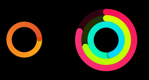
Visual Examples
| Bright Activity Rings | Balance Ring With Arc Labels |
| --- | --- |
|  |
| 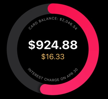 |
| Build bold Apple Activity-inspired progress views with one or many rings. | Promote focused metrics with center content, curved labels, and smooth progress. |
|
| Build bold Apple Activity-inspired progress views with one or many rings. | Promote focused metrics with center content, curved labels, and smooth progress. |
Installation
pnpm add @mreyesh85/apple-rings @shopify/react-native-skia react-native-reanimated react-native-svgFor Expo apps, install native peer dependencies with Expo so versions match your SDK:
npx expo install @shopify/react-native-skia react-native-reanimated react-native-svg
pnpm add @mreyesh85/apple-rings
Make sure Reanimated is configured in the consuming app.
Usage
import { Rings } from '@mreyesh85/apple-rings';
import { Text, View } from 'react-native';

export function BalanceRing() {
  return (
    <Rings
      backgroundColor='transparent'
      size={320}
      strokeWidth={36}
      top='CARD BALANCE: $2,046.54'
      bottom='INTEREST CHARGE ON APR 30'
      arcTextColor='#000'
      arcTextSize={12}
      rings={[
        {
          background: 'gray',
          progress: 53,
          start: 'rgb(249, 18, 78)',
          end: 'rgb(249, 56, 133)',
        },
      ]}
    >
      <View>
        <Text style={{ color: '#000', fontSize: 42, fontWeight: 'bold' }}>
          $924.88
        </Text>
        <Text style={{ color: '#f5bf55', textAlign: 'center', fontSize: 26 }}>
          $16.33
        </Text>
      </View>
    </Rings>
  );
}
More Examples
Render the default activity rings at a larger display size:
<Rings size={320} backgroundColor='transparent' strokeWidth={32} />Render a compact custom ring with a pink gradient:
<Rings
  size={160}
  rings={[
    {
      progress: 90,
      start: 'rgb(249, 18, 78)',
      end: 'rgb(249, 56, 133)',
    },
  ]}
/>
Props
| Prop | Type | Default | Description |
| --- | --- | --- | --- |
| ring | 'red' \| 'yellow' \| 'green' | undefined | Render one default ring instead of all default rings. |
| rings | RingInput[] | default activity rings | Custom ring definitions. |
| size | number | 80 | Overall square size. |
| strokeWidth | number | responsive | Ring thickness. |
| ringGap | number | 0 | Gap between multiple rings. |
| backgroundColor | string | 'black' | Canvas/container background. |
| duration | number | 3000 | Animation duration in milliseconds. |
| animated | boolean | true | Enables or disables the draw animation. |
| top | ReactNode | undefined | Top arc text or custom slot. |
| bottom | ReactNode | undefined | Bottom arc text or custom slot. |
| arcTextColor | string | 'rgba(255, 255, 255, 0.55)' | Color for arc text. |
| arcTextSize | number | responsive | Font size for arc text. |
| arcInset | number | 20 | Distance from ring edge to arc text. |
| arcSweep | number | 145 | Arc text sweep in degrees. |
| children | ReactNode | undefined | Center content. |
RingInput
| Field | Type | Description |
| --- | --- | --- |
| name | string | Ring name used for React keys and defaults. |
| colors | [string, string] | Start and end gradient colors. |
| start | string | Start color shortcut. |
| end | string | End color shortcut. |
| background | string | Track/background color. |
| progress | number | Percent progress, where 53 means 53%. |
| totalProgress | number | Raw progress revolutions, where 1.25 means one full loop plus 25%. |
| size | number | Override this ring's diameter. |