@murasoftware/react-loading-overlay
v1.0.3
Published
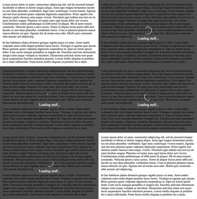
Loading overlays with fade, spinner, message support.
Readme
React-Loading-Overlay
A customizable, simple loading overlay with spinner and transitions.

- Changes in version 1.x
- Quick start :running_woman:
- Props :hammer_and_wrench:
- Custom Spinner :recycle:
- Custom styling :nail_care:
Changes in version 1.x
v1.x is a rewrite focused on flexibility. Customization is no longer driven by convenience props, but instead by a more comprehensive styles interface. The intention is to provide an interface that is a bit more tailored to composition and creating your own loader rather than just dropping an instance in place.
Quick start :running_woman:
Wrap your components in it and toggle the active prop as necessary.
import LoadingOverlay from 'react-loading-overlay';

<LoadingOverlay
  active={isActive}
  spinner
  text='Loading your content...'
  >
  <p>Some content or children or something.</p>
</LoadingOverlay>
Props :hammer_and_wrench:
active(boolean)- default:
true- whether the loader is visible.
- default:
fadeSpeed(milliseconds)- default:
500- the transition speed for fading out the overlay.
- default:
onClick(function)- default:
undefined- click handler for the overlay when active.
- default:
className(string)- default:
undefined- the className for the wrapping<div />that is present whether active or not.
- default:
classNamePrefix(string)- default:
_loading_overlay_- the prefix for all classNames on the generated elements. see Styling for more info.
- default:
spinner(boolean OR node)- default:
false- renders the default spinner whentrue(and when the loader isactive). Otherwise you can provide any valid react node to use your own spinner.
- default:
text(node)- default:
undefined- the text or react node to render in the loader overlay when active.
- default:
styles(object)- default:
undefined- see Styling for more info.
- default:
Custom Spinner :recycle:
Adding a custom spinner is super easy, here's an example:
Acquire the spinner you want to use. Doesn't matter where you get it, as long as you're rendering a valid React node. It can be a custom svg in your codebase if you want. For this example let's use react-spinners.
npm install react-spinnersThen simply provide it to the spinner prop for your loader.
import LoadingOverlay from 'react-loading-overlay'
import BounceLoader from 'react-spinners/BounceLoader'

export default function MyLoader({ active, children }) {
  return (
    <LoadingOverlay
      active={active}
      spinner={<BounceLoader />}
    >
      {children}
    </LoadingOverlay>
  )
}
Custom styling :nail_care:
Previous versions were difficult to customize because of limited configuration props. This iteration uses a form of styling heavily inspired by Style configuration was inspired by react-select. Internally using emotion to style elements and providing a styles interface to either extend the base styling or completely overwrite it. Additionally, a classNamePrefix prop is available to customize the classNames used on each element, allowing you to define your own styles with your own regular css setup.
Keep reading for details on each option.
Styles with emotion :woman_singer:
The styles prop accepts an object where each key represents one of the following elements:
wrapper- main wrapping element, always present.overlay- the overlay positioned over top of the children.content- element inside the overlay containing the spinner and text.spinner- default spinner element.
Each value must be an object or a function (where the first parameter is the base default styles) that returns an object. In either case, the resulting object will be applied as the final set of styles via emotion.css. See examples below.
export default function MyLoader({ active, children }) {
  return (
    <LoadingOverlay
      active={active}
      styles={{
        overlay: (base) => ({
          ...base,
          background: 'rgba(255, 0, 0, 0.5)'
        })
      }}
    >
      {children}
    </LoadingOverlay>
  )
}
export default function MyLoader({ active, children }) { return ( <LoadingOverlay active={active} styles={{ spinner: (base) => ({ ...base, width: '100px', '& svg circle': { stroke: 'rgba(255, 0, 0, 0.5)' } }) }} > {children} </LoadingOverlay> ) }export default function MyLoader({ active, children }) { return ( <LoadingOverlay active={active} styles={{ wrapper: { width: '400px', height: '400px', overflow: active ? 'hidden' : 'scroll' } }} > {children} </LoadingOverlay> ) }
Styles with css
Every element has a classname you can target via your own css configuration.
_loading_overlay_wrapper_loading_overlay_overlay_loading_overlay_content_loading_overlay_spinner
You can also specify your own classNamePrefix if you wish. For example, if using: classNamePrefix="MyLoader_":
MyLoader_wrapperMyLoader_overlayMyLoader_contentMyLoader_spinner
The base styles will still be applied, but you could negate all of these using the styles prop:
export default function MyLoader({ active, children }) {
  return (
    <LoadingOverlay
      active={active}
      styles={{
        wrapper: {},
        overlay: {},
        content: {},
        spinner: {}
      }}
      classNamePrefix='MyLoader_'
    >
      {children}
    </LoadingOverlay>
  )
}
Styles with styled-components :nail_care:
You can style the loader using styled-component as you might expect.
Simply include the nested elements in your style definition:
import styled from 'styled-components'

const StyledLoader = styled(LoadingOverlay)`
  width: 250px;
  height: 400px;
  overflow: scroll;
  .MyLoader_overlay {
    background: rgba(255, 0, 0, 0.5);
  }
  &.MyLoader_wrapper--active {
    overflow: hidden;
  }
`

export default function MyLoader({ active, children }) {
  return (
    <StyledLoader
      active={active}
      classNamePrefix='MyLoader_'
    >
      {children}
    </StyledLoader>
  )
}
