@mvd/table
v0.2.0
Published
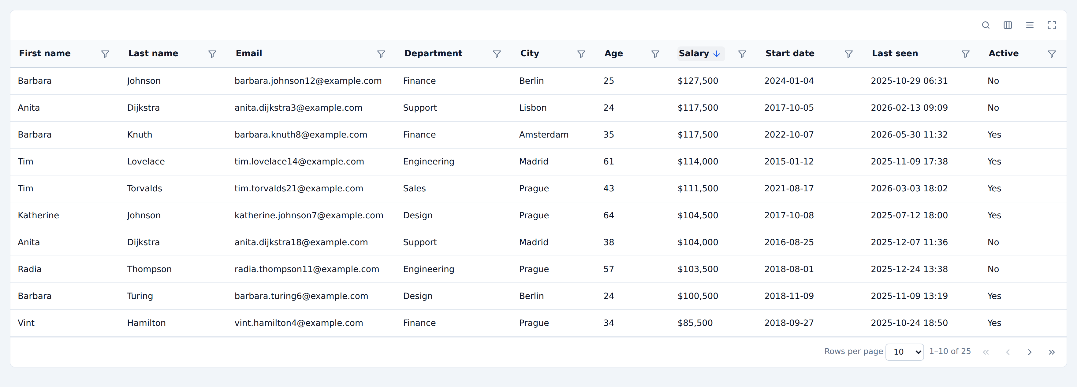
A fully-featured, CSS-variable-themable React table component built on TanStack Table v9.
Maintainers
Readme
@mvd/table
A batteries-included, CSS-variable-themable React table component built on TanStack Table v9 (beta).
TanStack Table is headless — it gives you state and row models and leaves the
markup to you. This package is the other half: a single <DataTable /> that
renders all of it, exposes every v9 feature behind an enable* prop, and is
styled entirely through CSS custom properties so it can be made to look like
Material, shadcn/ui, Ant, Linear, or a spreadsheet without overriding a single
selector.
import { DataTable, createDataTableColumnHelper } from '@mvd/table'
import '@mvd/table/styles.css'
type Person = { id: string; name: string; age: number }
const helper = createDataTableColumnHelper<Person>()
const columns = helper.columns([
helper.accessor('name', { header: 'Name' }),
helper.accessor('age', { header: 'Age', meta: { align: 'right' } }),
])
export function People({ data }: { data: Person[] }) {
return <DataTable columns={columns} data={data} getRowId={(row) => row.id} />
}Keep
columnsanddatastable. TanStack v9 requires it. The component defensively stabilizes arrays whose contents have not changed, but defining them outside render (or inuseMemo) is still the right thing to do.
Contents
- Install
- Features
- Bring your own components
- Filtering
- Filter data types
- Grouping
- Theming
- Server-side data
- Editing
- Controlling state
- Accessibility
- Development
Install
pnpm add @mvd/table # or npm install / yarn addreact and react-dom (>= 18) are peer dependencies. @tanstack/react-table
and @tanstack/react-virtual are direct dependencies, so a plain install is
enough.
Import the stylesheet once, anywhere in your app:
import '@mvd/table/styles.css'Features
Each of these has a dedicated Storybook story.
| Area | Options |
| --- | --- |
| Sorting | enableSorting¹, enableMultiSort¹, enableSortingRemoval¹, sortDescFirst, maxMultiSortColCount, manualSorting, per-column sortFn |
| Column filtering | enableColumnFilters¹, filterDisplayMode (popover | panel | popover-and-panel | none), filterPanelPosition, enableFilterModes, showActiveFilterChips¹, manualFiltering, enableMultipleFilterConditions, dataTypes, filterNow, 9 built-in data types |
| Global filtering | enableGlobalFilter¹, globalFilterFn, enableGlobalFilterToggle¹ |
| Faceting | enableFaceting¹ — auto-populates select/autocomplete/checkbox filter options |
| Pagination | enablePagination¹, paginationDisplayMode, paginationPosition, pageSizeOptions, manualPagination, rowCount, pageCount, autoResetPageIndex |
| Row selection | enableRowSelection (bool or predicate), enableMultiRowSelection¹, enableSubRowSelection¹, enableSelectAll¹, selectDisplayMode (checkbox | radio | switch), enableClickToSelect |
| Cell selection | enableCellSelection, enableCellRangeSelection, enableMultiCellRangeSelection |
| Column visibility | enableColumnVisibility¹, enableHiding¹ |
| Column ordering | enableColumnOrdering, enableColumnDragging |
| Column pinning | enableColumnPinning — start/end, sticky with an edge shadow |
| Row pinning | enableRowPinning, rowPinningDisplayMode (sticky | top | bottom | top-and-bottom) |
| Column resizing | enableColumnResizing, columnResizeMode, columnResizeDirection, keyboard-operable grips |
| Grouping | enableGrouping, enableGroupingChips (drag-to-group), groupedColumnMode |
| Aggregation | enableAggregation¹, per-column aggregationFn + aggregatedCell |
| Expanding | enableExpanding, enableExpandAll¹, getRowCanExpand, paginateExpandedRows¹, renderDetailPanel |
| Row utilities | enableRowNumbers, rowNumberDisplayMode, enableRowActions, renderRowActions, rowActionMenuItems, positionActionsColumn, enableRowOrdering |
| Editing | enableEditing (bool or predicate), editMode (cell | row | table | modal), 5 editor variants, onEditingRowSave, onCellEditComplete, onDataChange |
| Virtualization | enableRowVirtualization, rowVirtualizerOptions |
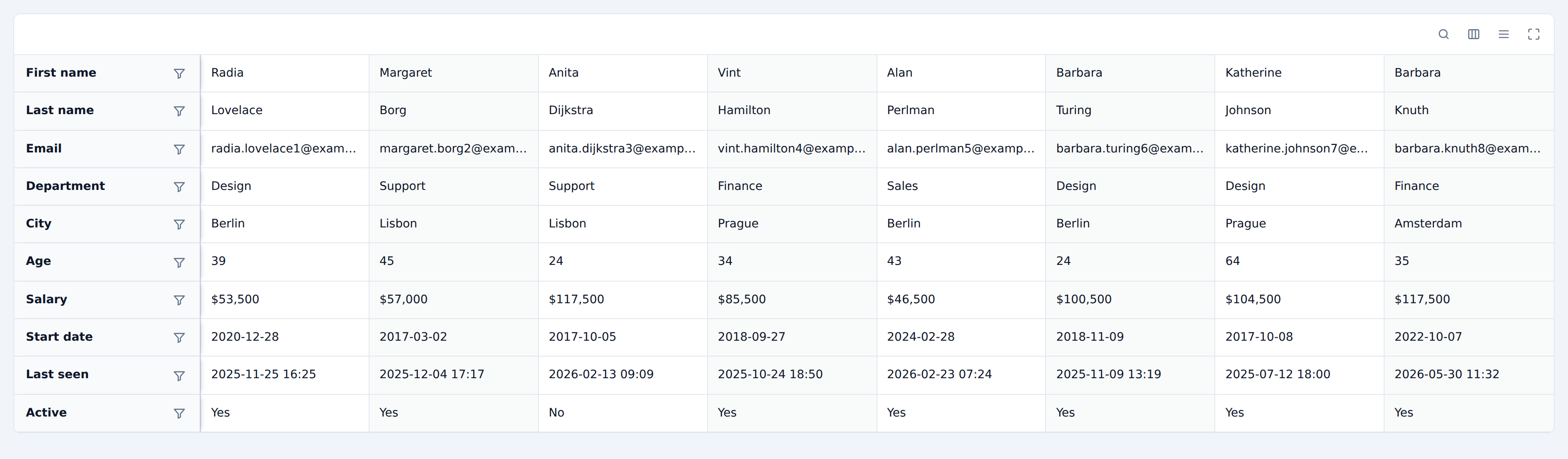
| Layout | layoutMode (semantic | grid | grid-no-grow), density, height, maxHeight, direction (LTR/RTL) |
| Header sizing | enableHeaderContentFit¹ — a column is never narrower than its own header |
| Chrome | enableTopToolbar¹, enableBottomToolbar¹, enableToolbarInternalActions¹, enableDensityToggle¹, enableFullScreenToggle¹, enableColumnActions, enableStickyHeader, enableStickyFooter, enableStripes, enableRowHover¹, enableBorders |
| States | isLoading, showProgressBars, isSaving, isLoadingError, errorMessage, skeletonRowCount, renderEmptyState |
| i18n | localization — every string, including filter operator names |
| Escape hatches | components, classNames, cssVars, tableProps, containerProps, rowProps, cellProps, headCellProps, renderTopToolbarActions, renderBottomToolbarActions, renderToolbarInternalActions, renderCaption |
¹ on by default; everything else is opt-in.
Feature registration
v9 gates state and instance APIs on an explicitly registered feature list. This
component registers the whole stock set once, in dataTableFeatures, and gates
behaviour with enable* props instead. That trades v9's per-feature
tree-shaking for one stable table type and a single prop surface — if you need
a minimal bundle for one narrow table, build your own tableFeatures({ … })
and use useTable directly.
Bring your own components
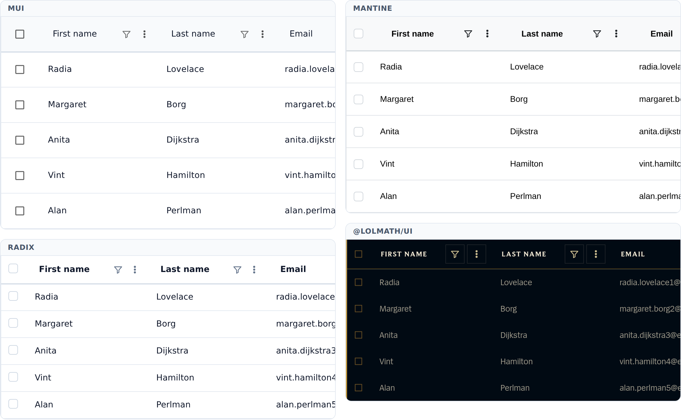
Every interactive control the table renders — buttons, inputs, selects, popovers, menus, the modal editor — comes from a component registry. Supply your design system once and the whole table adopts it:
import { DataTable, defaultComponents } from '@mvd/table'
<DataTable columns={columns} data={data} components={myComponents} />components is a partial override: anything omitted keeps its built-in
implementation, so replacing one control is as valid as replacing all of them.
Three constraints shaped the contract, each learned from making a real library satisfy it:
- Overlays take a rendered
triggerelement, not a render prop. Radix clones it withasChild, MUI anchors to it, Mantine'sPopover.Targetclones it. A render prop would suit none of them. - Lists are data, not children. Mantine's
SelectandMultiSelecttake adataarray; a children-based option API simply cannot be backed by them. SoMenutakesRtcMenuItem[]andSelecttakes options. - Overlays own their open state by default. Each library manages focus,
dismissal and portalling differently;
open/onOpenChangeexist only for when the table genuinely needs control.
Structural markup — table, tr, th, td — is deliberately not in the
registry. Column pinning, resizing and virtualization all depend on the exact
DOM and data attributes the table emits, so those stay ours and are styled
with CSS variables instead.
Working adapters for MUI, Radix/shadcn and Mantine live in
stories/adapters/ and are exercised by both Storybook (15 UI Libraries) and
the Playwright suite, which runs the same interaction tests against all three.
import type { DataTableComponents } from '@mvd/table'
const myComponents: Partial<DataTableComponents> = {
// `...rest` is not optional. See below.
Button: ({ children, onClick, variant, disabled, ...rest }) => (
<MyButton kind={variant} onPress={onClick} isDisabled={disabled} {...rest}>
{children}
</MyButton>
),
}The one hard rule
Button and IconButton must spread every prop they do not recognise onto
the underlying element, and accept a ref.
Buttons are what overlays hang off, and each library delivers a trigger
differently: Radix merges props through asChild, MUI clones to attach an
anchorEl, Mantine clones to attach a reference ref and its own handlers. An
adapter that destructures the props it knows and drops the rest renders a
button that looks perfect and opens nothing — or one whose overlay has no
element to measure and lands in the corner of the viewport. Nothing about it
looks wrong in a screenshot.
e2e/overlays.spec.ts opens every overlay in every adapter for exactly this
reason, and it is what actually enforces the rule. A new adapter has to pass
it, along with the geometry checks that no control overflows its filter field
and no header truncates its own label.
Nothing half-styled
Two rules keep an adapted table from ending up half its design system and half ours, and both are enforced by the same suite:
Every interactive control goes through the registry — including the ones
that are easy to write as a plain <button>. The header's sort control and the
pagination page numbers used to be raw elements, so a MUI table had MUI icon
buttons sitting beside our own. The test asserts that no built-in primitive
class (rtc-button, rtc-input, rtc-select, …) survives anywhere in an
adapted table; the only way to satisfy it is to route everything through the
registry and override everything in the adapter. Radix has no text input or
select of its own, and the adapter styles plain elements rather than falling
back to ours — otherwise the filter panel is half shadcn.
The stylesheet may only style what the table itself renders. Class names
passed to registry components — rtc-th-sort, rtc-page-button,
rtc-filter-operator — land on whatever the host rendered, so rules on those
bare classes are limited to geometry. Chrome (background, border, radius,
shadow) goes on .rtc-button.<class>, which only matches the built-in
primitive. Typography is the deliberate exception for header labels: a header
is content, not a button caption, and MUI's text button would otherwise render
it uppercase and primary-blue, overruling the --rtc-header-* variables that
exist to control exactly that.
One consequence worth knowing if you write an adapter: anything portalled
needs the rtc-vars class. Radix, MUI and Mantine all render overlays into
document.body, outside the table, where --rtc-* is not defined. An adapter
stylesheet written against those variables produces a menu with no background;
worse, an icon we hand the library as menu-item content loses
--rtc-icon-size, and an SVG whose width is an invalid var() falls back to
its intrinsic size — a 16px glyph rendering at 300px. Icons carry a literal
fallback for that reason, but the class is what keeps everything else themed.
The class resolves the palette from wherever the portal lands, so in dark mode
it only works if data-rtc-theme is somewhere both the table and
document.body can see it — see Theming.
The built-in overlays
The defaults use the platform's Popover
API: a
popover attribute, popovertarget on the trigger, and the top layer. That is
worth more than novelty here. The top layer means a filter popover opened from
a header is not clipped by the table's scroll container and needs no
z-index, so nothing has to be portalled — and because it is not portalled,
a menu opened inside a popover is a real DOM descendant of it. That is how the
platform decides two popovers are nested, so light dismiss, Escape ordering and
"closing me closes my children" all come from the browser rather than from a
hand-maintained overlay stack.
Positioning is still JavaScript: CSS anchor positioning would replace it, but it is not yet in Firefox or Safari, and an overlay in the wrong corner is a worse failure than a few lines of measurement.
Filtering
There is no in-table filter row. A row of filter inputs forces every row to
the height of the tallest editor, and the useful editors — date ranges,
checkbox groups, range sliders — are tall. Filters live in two places instead,
selected with filterDisplayMode:
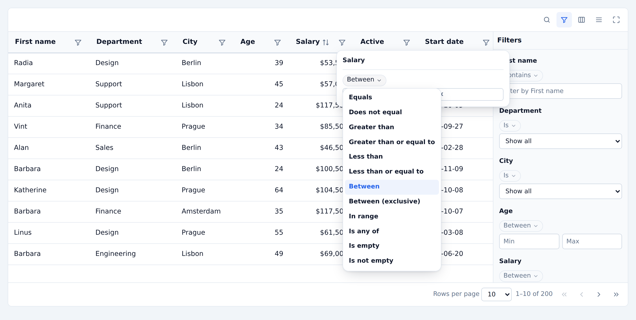
| Mode | Behaviour |
| --- | --- |
| popover (default) | A funnel button in each header opens that column's editor in a popover. |
| panel | A vertical, independently scrolling pane docked beside the table. |
| popover-and-panel | Both. |
| none | No built-in UI; drive columnFilters yourself. |
Because the editors are hidden until opened, active filters surface as
removable chips in the toolbar (showActiveFilterChips, on by default) and the
filtered column's header carries data-rtc-filtered.
The panel is also a standalone export, so it does not have to live inside the table at all:
const table = useDataTable({ columns, data, filterDisplayMode: 'none' })
return (
<Layout>
<Sidebar>
<DataTableFilterPanel table={table} />
</Sidebar>
<DataTable table={table} />
</Layout>
)It installs its own component registry from the table's options, so it works anywhere in the tree.
Filter data types
A column's data type decides what you can ask of it. A date is not a string with a calendar icon: "in the last 3 weeks", "any Tuesday", "between 09:00 and 17:00 on any day" are all questions a text box cannot express, and none of them is a variant of the others. So the operator list, the predicate, and the operand editor all come from the type — not from the filter component, which knows nothing about dates or coordinates.
helper.accessor('lastSeen', {
header: 'Last seen',
meta: {
dataType: 'datetime',
filterTypeMeta: { dateTimeZone: 'utc' }, // per-column type config
filterOperators: ['dateInLast', 'dateBetween'], // optional subset
},
})Declare nothing and the type is inferred from the first non-empty cell — convenient for a quick table, but anything load-bearing should say what it is.
Built-in types
| Type | Operators |
| --- | --- |
| text | contains, equals, startsWith, endsWith, matchesRegex, isAnyOf, isOneOfChecklist, isEmpty, isNotEmpty |
| enum | equals (faceted picker), isAnyOf, isOneOfChecklist, isEmpty, isNotEmpty |
| number | equals, notEquals, greaterThan, greaterThanOrEqual, lessThan, lessThanOrEqual, between, betweenExclusive, inRangeSlider, isAnyOf, isEmpty, isNotEmpty |
| duration | the numeric operators, with a unit-aware operand and summary (filterTypeMeta.durationUnit) |
| boolean | booleanIs (tri-state), isEmpty, isNotEmpty |
| date / datetime | dateIs, dateBefore, dateOnOrBefore, dateAfter, dateOnOrAfter, dateBetween, dateInPeriod, dateInLast, dateInNext, dateWeekdayIs, dateTimeOfDayBetween, isEmpty, isNotEmpty |
| collection | containsAnyOf, containsAllOf, containsNoneOf, countEquals, countAtLeast, isEmpty, isNotEmpty |
| geoPoint | geoWithinRadius (haversine), geoWithinBounds, isEmpty, isNotEmpty |
Temporal detail worth knowing:
- Granularity is orthogonal to the operator. Every comparison truncates to
filterTypeMeta.dateGranularity—dayfordate,minutefordatetime— so "on 3 March" matches a row stored at 14:37 on 3 March. - Periods (
dateInPeriod) covers 14 named windows: today, yesterday, tomorrow, this/last/next week, month, quarter and year. - Rolling windows (
dateInLast/dateInNext) take{ n, unit }and are re-evaluated against a singlenowper filter pass, so rows either side of a boundary are judged against the same clock. PassfilterNowto pin it, which is what the stories and tests do. - Time of day is matched independently of the date, and a window that wraps midnight (22:00–02:00) is treated as a union rather than an empty range.
- Day/week arithmetic is calendar-based rather than
n × 86400000, so it survives DST.
The filter value
The operator lives inside the value, not beside it:
{ "id": "age", "value": { "op": "between", "value": [30, 40] } }
// several conditions on one column:
{ "id": "age", "value": { "join": "or", "conditions": [
{ "op": "lessThan", "value": 30 },
{ "op": "greaterThan", "value": 60 }
] } }That makes columnFilters self-describing: it round-trips through a URL, a
saved view or an API without a parallel map of which function each column
happens to be using. A bare value ("Engineering", [30, 40]) is still
accepted and read as the operand of the type's default operator, so hand-seeded
state keeps working.
Set enableMultipleFilterConditions (per table or per column) to surface the
"add condition" control and the and/or joiner.
Cross-cutting concerns are modelled as modifiers on a condition rather than
by doubling the operator list: negate, caseSensitive, ignoreDiacritics
and includeNulls.
Adding a type
A type is an object; there is nothing to subclass and no component to change.
const semverDataType: ColumnDataType = {
id: 'semver',
defaultOperator: 'semverAtLeast',
Operand: TextOperand, // default operand editor
operators: [
{
id: 'semverAtLeast',
label: 'Is at least',
arity: 1,
test: (dataValue, operand) => compare(parse(dataValue), parse(operand)) >= 0,
},
{
id: 'isEmpty',
label: 'Is empty',
arity: 0,
Operand: NoOperand, // per-operator override
isIncomplete: () => false,
test: (dataValue) => parse(dataValue) == null,
},
],
describe: (condition, ctx) => `${ctx.columnLabel} ≥ ${condition.value}`,
}
<DataTable dataTypes={{ semver: semverDataType }} … />Register it by id through dataTypes, or pass the object straight to
meta.dataType for a one-off column. Composing beats writing from scratch —
spread a built-in and add an operator:
meta: {
dataType: {
...numberDataType,
id: 'salary',
operators: [...numberDataType.operators, isRoundNumber],
},
}An operator declares its arity (0 | 1 | 2 | 'n'), a test, and optionally
an Operand editor, an initialValue for when it is selected, usesFacets to
receive the column's faceted values, and isIncomplete so a half-entered
condition does not hide every row while the user types. Operand editors render
through the component registry, so they pick up
the host design system like everything else.
Types that are deliberately not built in, but are a few lines each on this model: IP address / CIDR, semantic version, colour (ΔE distance), JSON path, relation or reference with async options, file size and MIME type, rating, currency with conversion, and polygon or named-region geo matching.
Grouping
enableGrouping lets a column collapse its rows into group rows, from the
column actions menu or by dragging a header into the chip zone
(enableGroupingChips). Grouping implies expanding: group rows get a chevron
in the expand column whether or not enableExpanding is set.
groupedColumnMode decides where a grouped column goes.
| Mode | Column order | Group row shows |
| --- | --- | --- |
| 'reorder' (default) | Grouped columns move to the front, ahead of the expand column | The value in its own column |
| 'remove' | Grouped columns leave the table; the expand column widens and takes their header | The value and row count next to the chevron |
| false | Untouched; the expand column leads | The value in its own column, wherever that is |
<DataTable
columns={columns}
data={data}
enableGrouping
groupedColumnMode="remove"
initialState={{ grouping: ['department'] }}
/>A group row stands for many records, so the display columns that address a
single one — the drag grip and the row actions — stay blank on it. Columns with
an aggregationFn summarise their group there instead; see aggregatedCell for
how that summary renders.
Theming
Everything visual comes from custom properties declared on .rtc-root. Nothing
in the stylesheet hard-codes a colour, radius, or spacing value outside that
block, so a handful of overrides restyles the whole table.
<DataTable
columns={columns}
data={data}
cssVars={{
'--rtc-color-accent': '#e11d48',
'--rtc-radius': '20px',
'--rtc-row-height-comfortable': '64px',
'--rtc-header-text-transform': 'uppercase',
}}
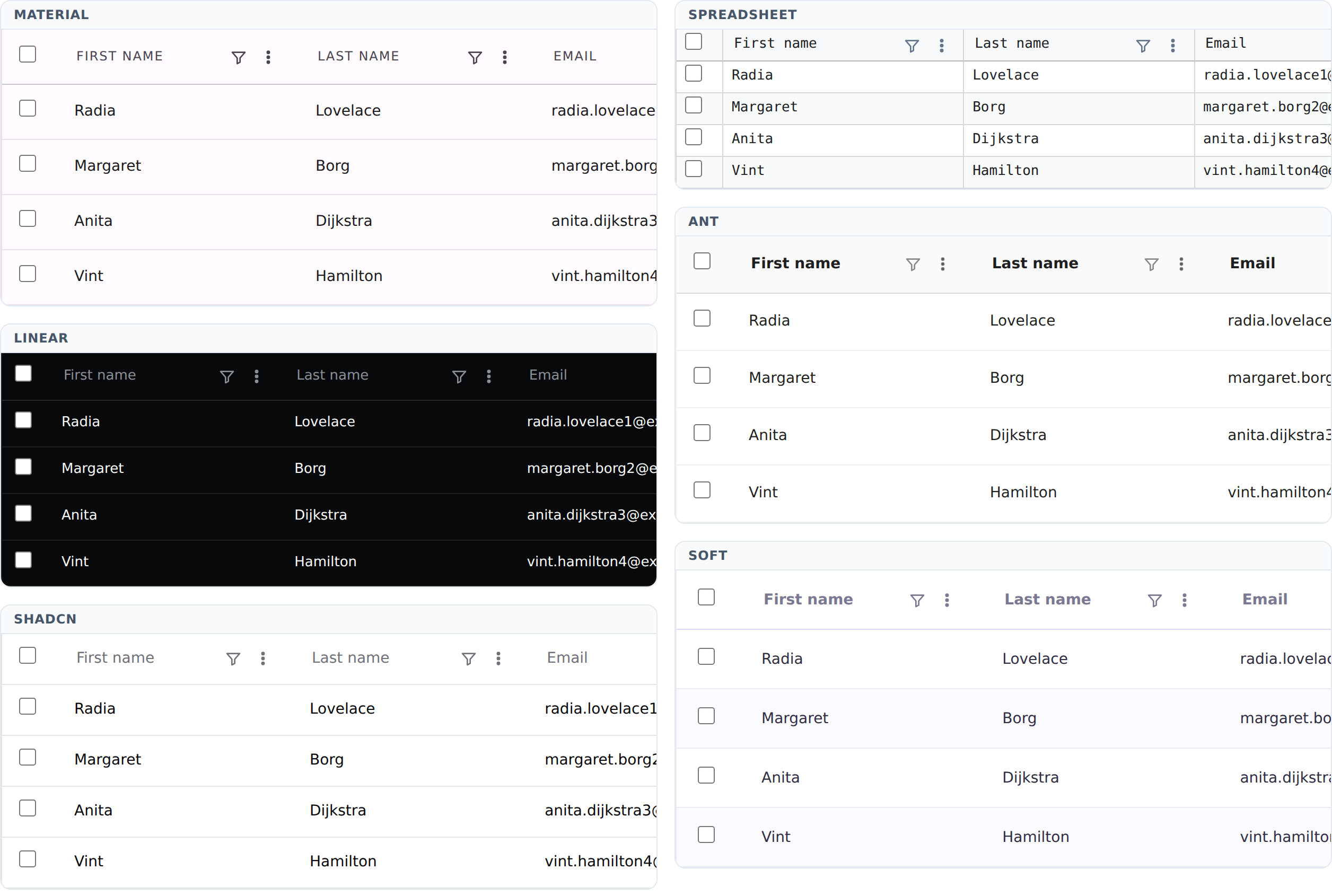
/>Seven presets ship with the package:
import { materialTheme } from '@mvd/table'
<DataTable columns={columns} data={data} cssVars={materialTheme} />material, shadcn, ant, linear, spreadsheet, soft, highContrast —
each a plain Record<string, string>, so copy one as a starting point.
Variables are grouped as --rtc-color-*, --rtc-font-* / --rtc-header-*,
metrics (--rtc-radius, --rtc-cell-padding-*, --rtc-row-height-*),
surfaces (--rtc-row-bg-*, --rtc-cell-bg-*) and effects (--rtc-shadow-*,
--rtc-focus-ring, --rtc-transition). See src/styles.css
for the full list with defaults.
Dark mode follows prefers-color-scheme. Force it either way with
data-rtc-theme="dark" / "light" on the table or any ancestor.
Put the attribute high enough. Not everything the table opens stays inside
it: the modal editor portals to document.body, and every adapter renders its
menus and popovers there too. Those surfaces carry rtc-vars and so resolve
the palette from their ancestors, which is the body — not the wrapper the
table happens to sit in. Setting data-rtc-theme on a <div> around the table
leaves them light while the table is dark. Set it on <html> (or <body>), as
an app switching themes would anyway, and everything lands on the same palette.
The palette also sets color-scheme,
which is what makes the browser paint its own chrome to match: scrollbars, the
drop-down list of a native <select>, date pickers, number spinners. Without
it a dark table opens a white select popup, which no amount of variable
overriding can reach.
A design system with a colour scheme of its own — MUI's ThemeProvider,
Mantine's MantineProvider — is not driven by any of this. Tell it the mode
directly, alongside the attribute:
<ThemeProvider theme={createTheme({ palette: { mode } })}>
<DataTable columns={columns} data={data} components={muiComponents} />
</ThemeProvider>Column widths
A header is not just a label: it carries a sort control, a filter funnel and a
column menu. Give a column size: 90 with all three enabled and the label is
squeezed to nothing, while the table may still have empty space beside it.
So a declared size is a preference and the header's own content is a floor.
When the floor pushes the total past the container the table scrolls
horizontally — the same trade AG Grid's header auto-size makes, and the right
one: a scrollbar is recoverable, a header truncated to A… is not. Sizing to
body content is deliberately not the default, since one long cell blows the
column out.
This is a stylesheet rule, not a measurement pass. A header truncates
because something told the browser it may: overflow: hidden on the cell gives
it a min-content width of zero. Body cells still clip — their content is data,
and one long email address must not set a column's width — but header cells do
not, and carry min-width: min-content. The browser's own table algorithm does
the rest, and keeps doing it through font swaps, translated labels and density
changes, none of which JavaScript would reliably hear about.
One number still crosses in code, in the grid layout modes only. There each
row is its own flex container, so a header that grows to fit its label grows
alone and slides out of alignment with the cells beneath it. subgrid is the
real answer — one set of column tracks spanning header and body, sized
intrinsically — but the virtualized body takes its rows out of flow with
position: absolute, so they would not be grid items. Until that changes, the
header's min-content width is read once per layout change and published to
the column as a custom property.
Set enableHeaderContentFit={false} to restore clipping and let columns shrink
to whatever the container allows.
Server-side data
Set the manual* flags, feed the table the current page, and tell it the total
row count:
<DataTable
columns={columns}
data={page.rows}
manualPagination
manualSorting
manualFiltering
rowCount={page.total}
isLoading={isFetching}
showProgressBars={page.rows.length > 0}
isLoadingError={isError}
state={{ pagination, sorting, globalFilter: search }}
onPaginationChange={applyPaginationUpdater}
onSortingChange={applySortingUpdater}
onGlobalFilterChange={(next) => {
applySearchUpdater(next)
setPagination((old) => ({ ...old, pageIndex: 0 }))
}}
/>A complete working example — including the MSW handler it runs against — lives
in stories/04-Pagination.stories.tsx and stories/remoteApi.ts, covered
end-to-end by e2e/remote-pagination.spec.ts.
Editing
Four modes, matching Material React Table's:
cell— double-click a cell; commits on blur or Enter, reverts on Escape.row— an edit action turns the row into inputs with save/cancel.table— every cell is an input at once.modal— an edit action opens a focus-trapped dialog.
<DataTable
columns={columns}
data={rows}
enableEditing
editMode="row"
onEditingRowSave={({ values, exitEditingMode }) => {
save(values)
exitEditingMode()
}}
/>Editor widgets come from meta.editVariant: text, number, select,
checkbox, date. Generated columns (selection, expand, actions) are never
editable, and neither are display columns without an accessor.
Controlling state
Each slice can be left alone, observed, or fully controlled — independently.
// Uncontrolled, with a starting value.
<DataTable initialState={{ sorting: [{ id: 'name', desc: false }] }} … />
// Observed.
<DataTable onSortingChange={(updater) => log(updater)} … />
// Controlled.
<DataTable state={{ sorting }} onSortingChange={applySortingUpdater} … />initialState also accepts the presentation-only slices — density,
isFullScreen, showColumnFilters, showGlobalFilter, rowOrder,
columnFilterFns — which makes saving and restoring a user's layout a single
object. onStateChange reports all of it, replacing the global callback v9
removed.
To read table state from the surrounding page, build the instance yourself:
const table = useDataTable({ columns, data, enableRowSelection: true })
const selected = Object.keys(table.state.rowSelection).length
return <DataTable table={table} />Accessibility
- Native
<table>semantics, withscope,aria-sort,aria-rowcount/aria-colcount,aria-selected,aria-expandedandaria-busywired up. - Every icon-only control takes its accessible name from
localization. - Anything that names a column — the visibility menu, the grouping chips, the
filter panel, "Sort by {column} ascending" — reads a plain-string
header, falling back tometa.labelwhen the header is a render function or an element. The columns the component generates (selection, expand, row number, row actions) are named fromlocalization, so they are readable and translated rather than showing an internal id. - Menus are portalled, dismiss on Escape and outside click, support arrow-key roving focus, and restore focus to their trigger.
- The modal editor traps focus and is labelled
role="dialog" aria-modal. - Column resize grips are
role="separator"and respond to arrow keys; row drag handles reorder with up/down arrows — both are usable without a pointer. prefers-reduced-motiondisables animation and transitions.- Opt into arrow-key cell navigation with
enableKeyboardNavigation.
Storybook
Every story file gets an autodocs page, and the Code panel beside the
canvas shows the story's own source with a copy button. source.type is
code rather than dynamic: these stories are render functions, and the
dynamic snippet would show the rendered element tree instead of the code worth
copying.
Development
This repo uses pnpm (pinned via packageManager; corepack enable picks
it up automatically).
pnpm install
pnpm run storybook # http://localhost:6006 — 114 stories
pnpm run typecheck
pnpm run build:lib # dist/index.js + dist/style.css + dist/index.d.ts
pnpm run build:storybook # → storybook-static/
pnpm run test:e2e # Playwright, against the built Storybookpnpm install will ask to approve build scripts the first time. esbuild is
on the approved list because Storybook's core needs its postinstall to link a
platform binary; without it build:storybook fails.
The Playwright suite (158 tests) drives the real Storybook build: it starts
vite preview over storybook-static/, so run pnpm run build:storybook
first. The remote-pagination specs intercept /api/people with Mock Service
Worker.
If your environment provides its own Chromium instead of Playwright's managed download, point the suite at it:
CHROMIUM_PATH=/path/to/chromium pnpm run test:e2eChangesets
Versioning and the changelog are handled by changesets. Any change a consumer could notice ships with one:
pnpm changeset # pick the bump, write the entry
pnpm changeset:status # what is pending against mainThe version in package.json is never edited by hand. .github/workflows/release.yml
keeps a "Version Packages" pull request open while changesets are pending on
main; merging it applies the bumps, writes CHANGELOG.md, and publishes to
npm. See .changeset/README.md for which bump to pick.
Build toolchain
The library is bundled by tsdown, which runs on
rolldown and emits declarations through rolldown-plugin-dts; CSS goes
through lightningcss via @tsdown/css. Storybook builds on Vite 8, which
is also rolldown-backed. No rollup anywhere; the only remaining esbuild is
Storybook core's own internal dependency, which cannot be removed without
dropping Storybook.
Two things about the output worth knowing:
- The bundle is not minified. That is deliberate for a library — consumers minify, and shipping readable code plus a sourcemap makes debugging possible.
- The stylesheet is emitted as
dist/style.css(tsdown's name) and exposed on the stable@mvd/table/styles.csssubpath. Importing the package's JS does not inject styles; the CSS import is separate and explicit.
Deployment
Storybook is published to Cloudflare Pages:
| Setting | Value |
| --- | --- |
| Build command | pnpm run build:storybook |
| Output directory | storybook-static |
| Node version | from .nvmrc (22) |
Layout
src/
DataTable.tsx top-level component
useDataTable.tsx state ownership + TanStack wiring
features.ts the registered v9 feature set
types.ts the public option surface
styles.css theme variables + structural CSS
themes.ts preset variable maps
locale.ts localizable strings
editing.ts edit-mode rules
displayColumns.tsx generated select/expand/number/actions columns
dragContext.tsx pointer-based drag reordering
components/ head, body, toolbar, filters, menus, primitives
components/
registry.tsx the component contract + provider
defaultComponents the built-in, dependency-free implementation
FilterPanel.tsx standalone filter pane
FilterEditor.tsx per-variant editor, shared by popover and panel
stories/ one file per feature area
stories/adapters/ MUI, Radix and Mantine registry adapters
e2e/ Playwright specs
tsdown.config.ts library build (rolldown + lightningcss)License
MIT