
@newnpmjs/data-table-react
v0.1.0
Published
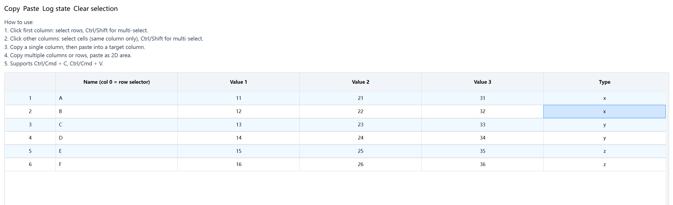
A React table component with fixed header, cell selection, row selection, drag selection, and clipboard support
Downloads
162
Maintainers
 newnpmjs
Readme
DataTable
A React table component with fixed headers, cell/row selection, drag selection, and clipboard copy/paste support. No external UI library dependencies.
Features
- Fixed Header — Header sticks to the top while scrolling
- Row Selection — Click row index column to select rows, Ctrl/Shift for multi-select
- Cell Selection — Click cells for single select, Ctrl/Shift for range select within a column
- Drag Selection — Mouse drag to select a range of rows or cells in a column
- Clipboard — Copy selected cells/rows, paste into compatible columns
- Editable Cells — Inline editing for text (type 1) and dropdown (type 2) fields
- Stripe Rows — Alternating row colors for readability
- Imperative API — Access selection state, clipboard data, and more via ref
Installation
npm install @newnpmjs/data-table-reactUsage
import { useState, useMemo, useCallback, useRef } from "react";
import {
  DataTable,
  DataTableRef,
  TableDataProps,
  TableFldsProps,
  TableClipboard,
} from "@newnpmjs/data-table-react";

// Import styles (tailwind required in your project)
// Or add to your tailwind config content array:
// content: ['./node_modules/@newnpmjs/data-table-react/**/*.{ts,tsx}']
Tailwind CSS Setup
This package uses Tailwind CSS classes. Include the package in your Tailwind config:
// tailwind.config.js
export default {
  content: [
    "./src/**/*.{ts,tsx}",
    "./node_modules/@newnpmjs/data-table-react/**/*.{ts,tsx}",
  ],
  // ...
};
Basic Example
function MyTable() {
  const tableRef = useRef<DataTableRef>(null);
  const [clipboard, setClipboard] = useState<TableClipboard | null>(null);
  const [data, setData] = useState([
    { id: 1, name: "Apple", price: 5.5, type: "fruit" },
    { id: 2, name: "Carrot", price: 3.2, type: "vegetable" },
  ]);

  const flds: TableFldsProps[] = useMemo(
    () => [
      { label: "Name", name: "name", type: 0, isnum: 0 },
      { label: "Price", name: "price", type: 1, isnum: 1 },
      {
        label: "Type",
        name: "type",
        type: 2,
        isnum: 0,
        options: [
          { value: "fruit", name: "Fruit" },
          { value: "vegetable", name: "Vegetable" },
        ],
      },
    ],
    [],
  );

  const handleChange = useCallback(({ value, item, fld }: any) => {
    setData((prev) =>
      prev.map((row) =>
        row.id === item.id ? { ...row, [fld.name]: value } : row,
      ),
    );
  }, []);

  const fldsWithHandlers = useMemo(
    () => flds.map((f) => ({ ...f, onChange: handleChange })),
    [flds, handleChange],
  );

  return (
    <div style={{ height: 400 }}>
      <DataTable
        ref={tableRef}
        flds={fldsWithHandlers}
        tableData={data}
        clipboard={clipboard}
        onClipboardChange={setClipboard}
        showIndex
        showStripe
      />
    </div>
  );
}
Props
| Prop | Type | Default | Description |
| ------------------- | ------------------------ | -------- | --------------------------------- |
| flds | TableFldsProps[] | required | Column definitions |
| tableData | TableDataProps[] | required | Table data |
| showIndex | boolean | false | Show row number column |
| showStripe | boolean | false | Alternating row colors |
| className | string | — | Root container class |
| tableHeadHeight | string | — | Header row height |
| classNameRow | string | — | Row class name |
| isSelected | (item) => boolean | — | External row selection state |
| onRowClick | RowEventHandler | — | Row click handler |
| onDoubleClick | RowEventHandler | — | Row double-click handler |
| onContextMenuBody | (e) => void | — | Table body context menu |
| onContextMenuRow | RowEventHandler | — | Row context menu |
| onCancelSelection | () => void | — | When selection is cancelled |
| clipboard | TableClipboard \| null | — | Clipboard data |
| onClipboardChange | (data) => void | — | Clipboard data changed |
| onPasteApply | (apply) => void | — | Called when paste action is ready |
| onClipboardResult | (result) => void | — | Clipboard operation result |
Column Definition (TableFldsProps)
| Field | Type | Description |
| ------------------- | ----------------------- | ----------------------------------------------- |
| label | string \| JSX.Element | Column header label |
| name | string | Data field name |
| type | number | 0=display, 1=input, 2=select, 3=checkbox |
| isnum | number | 0=string, 1=number |
| copyable | boolean | Allow copy/paste for this column (default true) |
| options | array \| function | Options for type=2 (select) |
| formatter | (value) => any | Value formatter for display |
| onChange | CellEventHandler | Cell change handler |
| onBlur | CellEventHandler | Cell blur handler |
| onClick | CellEventHandler | Cell click handler |
| onDoubleClick | CellEventHandler | Cell double-click handler |
| onContextMenu | CellEventHandler | Cell context menu handler |
| classNameCell | string | Cell class name |
| classNameHeadCell | string | Header cell class name |
| classNameBodyCell | string | Body cell class name |
| controlclass | string | Control element class name |
| align | string | Cell text alignment |
Refs (DataTableRef)
| Method | Returns | Description |
| --------------------------------- | ------------------------- | ------------------------------ |
| getSelectionMode() | 'row' \| 'cell' \| null | Current selection mode |
| getSelectedRows() | number[] | Selected row indices |
| getSelectedCells() | string[] | Selected cell keys ("row:col") |
| getSelectedCellPositions() | {rowIndex, colIndex}[] | Selected cell positions |
| getSelectionBounds() | bounds or null | Row/column index ranges |
| getPasteStart() | position or null | Computed paste start position |
| buildClipboardData() | TableClipboard \| null | Build clipboard from selection |
| copySelection() | TableClipboard \| null | Copy selection to clipboard |
| validatePasteTarget(clip, flds) | validation result | Check if paste is valid |
| buildPasteAction(clip, flds) | action result | Build paste action |
| clearSelections() | void | Clear all selections |
License
MIT