
@newnpmjs/react-context-menu
v0.2.2
Published
A lightweight, dependency-free React context menu component with global provider pattern
Downloads
1,444
Maintainers
 newnpmjs
Readme
@newnpmjs/react-context-menu
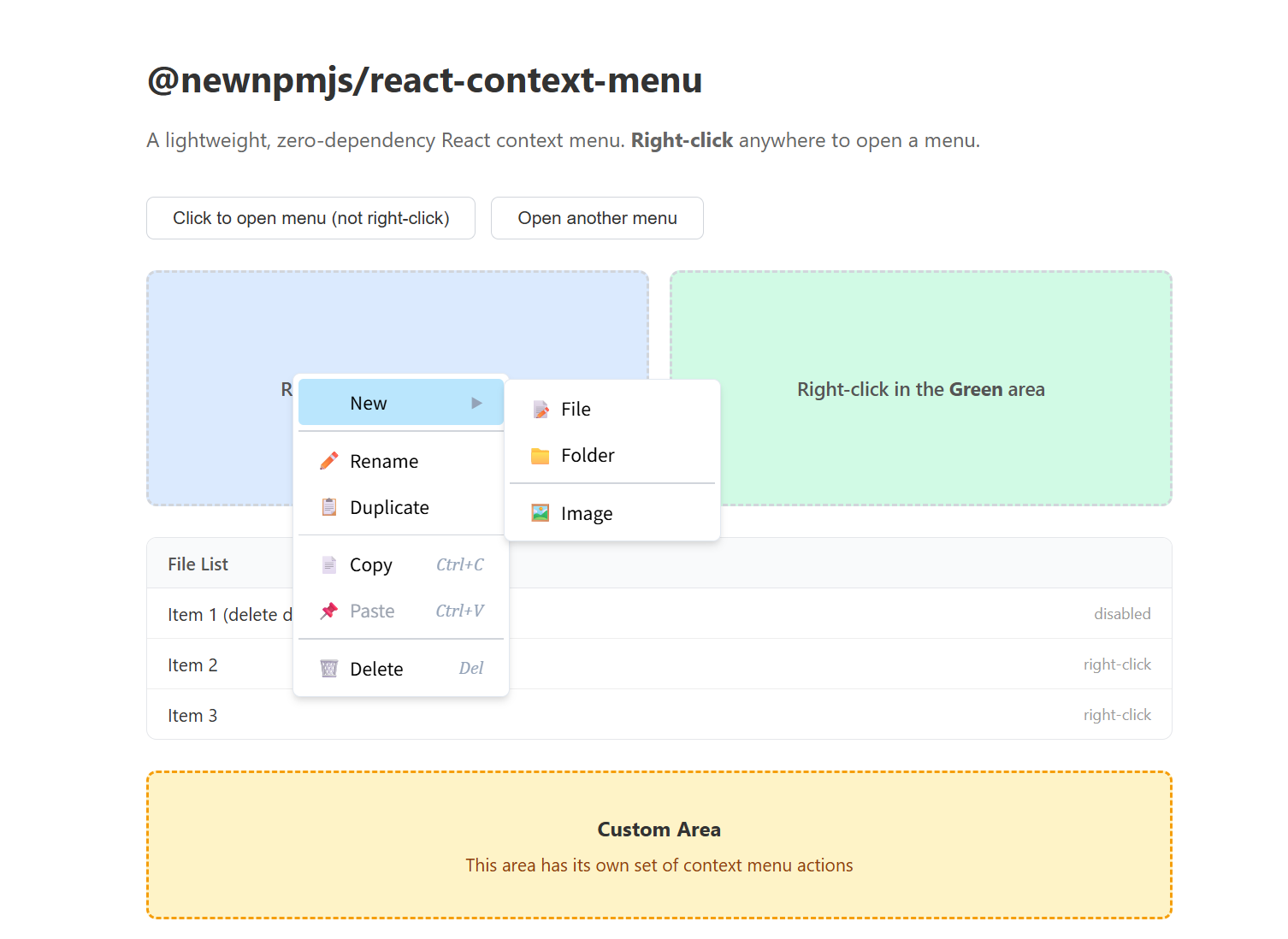
A lightweight, zero-dependency React context menu (right-click menu) component. Comes with a global provider pattern so you can open menus from anywhere in your app.
🚀 Live demo: react-context-menu-henna.vercel.app
Installation
npm install @newnpmjs/react-context-menuPeer Dependencies
react >= 16.8
No other runtime dependencies.
Quick Start
Wrap your app with ContextMenuProvider, then use useContextMenu anywhere to open a right‑click menu.
import {
  ContextMenuProvider,
  useContextMenu,
} from "@newnpmjs/react-context-menu";

function App() {
  return (
    <ContextMenuProvider>
      <MyComponent />
    </ContextMenuProvider>
  );
}

function MyComponent() {
  const { openContextMenu } = useContextMenu();

  const handleContextMenu = (e: React.MouseEvent) => {
    e.preventDefault();
    openContextMenu(e.clientX, e.clientY, [
      { key: "edit", name: "Edit", show: true, onClick: () => alert("Edit") },
      { key: "sep1", type: "divider" },
      {
        key: "delete",
        name: "Delete",
        show: true,
        disabled: true,
        onClick: () => alert("Delete"),
      },
    ]);
  };

  return <div onContextMenu={handleContextMenu}>Right-click me</div>;
}
API
ContextMenuProvider
Wrap your component tree with this provider. It manages the menu state and renders the menu overlay.
<ContextMenuProvider
  menuClassName="my-menu"
  menuStyle={{ background: "#1e293b", border: "1px solid #334155" }}
>
  <App />
</ContextMenuProvider>
| Prop | Type | Description |
| --------------- | --------------------- | ------------------------------------------ |
| menuClassName | string | Custom class name for the top-level menu |
| menuStyle | CSSProperties | Inline style for the top-level menu |
useContextMenu()
Returns an object with two methods:
| Method | Signature | Description |
| ------------------ | ------------------------------------------------------------ | ----------------------------------------------- |
| openContextMenu | (x: number, y: number, menus: MenuItem[], options?: OpenContextMenuOptions) => void | Opens the context menu at the given coordinates |
| closeContextMenu | () => void | Closes the menu programmatically |
OpenContextMenuOptions
| Field | Type | Description |
| ---------------- | --------------------- | ------------------------------------------------------------ |
| width | number | Fixed width for the menu |
| menuClassName | string | Per-call class name override (merged with Provider's menuClassName) |
| menuStyle | CSSProperties | Per-call inline style override (merged with Provider's menuStyle) |
Example with per-call styling:
openContextMenu(e.clientX, e.clientY, items, {
  width: 200,
  menuClassName: "rcm-log-menu",
  menuStyle: { background: "#0f172a" },
});
Menu Items
Types
interface BaseMenuItem {
  key: string;
  name?: string;
  onClick?: () => void;
  disabled?: boolean;
  icon?: string | ReactNode;
  keyboard?: string;
  children?: MenuItem[];
  /** Custom class name for this menu item */
  itemClassName?: string;
  /** Custom style for this menu item */
  itemStyle?: CSSProperties;
  /** Custom class name for this item's submenu layer (if it has children) */
  submenuClassName?: string;
  /** Custom style for this item's submenu layer (if it has children) */
  submenuStyle?: CSSProperties;
}

interface MenuItemMenu extends BaseMenuItem {
  type?: "menu"; // default
  show: boolean;
}

interface MenuItemDivider extends Omit<
  BaseMenuItem,
  "name" | "onClick" | "icon" | "keyboard" | "disabled"
  | "itemClassName" | "itemStyle" | "submenuClassName" | "submenuStyle"
> {
  type: "divider";
}

type MenuItem = MenuItemMenu | MenuItemDivider;
Fields
| Field | Type | Applies to | Description |
| ------------------ | --------------------- | ---------- | ------------------------------------------------------------- |
| key | string | all | Unique identifier for the menu item |
| name | string | menu | Display text |
| show | boolean | menu | Whether the item is visible. false hides the item entirely |
| disabled | boolean | menu | When true, dims the item and prevents click/submenu |
| icon | string \| ReactNode | menu | Emoji string, image URL (auto-detected), or any React element |
| keyboard | string | menu | Keyboard shortcut hint (e.g. ⌘Z), rendered as italic text |
| onClick | () => void | menu | Callback when the item is clicked |
| children | MenuItem[] | menu | Submenu items — hover to reveal a nested menu |
| type | 'menu' \| 'divider' | all | 'menu' (default) or 'divider' for a separator line |
| itemClassName | string | menu | Custom class name for the item element |
| itemStyle | CSSProperties | menu | Inline style for the item element |
| submenuClassName | string | menu | Custom class name for this item's submenu layer |
| submenuStyle | CSSProperties | menu | Inline style for this item's submenu layer |
Note:
itemClassName/itemStyle/submenuClassName/submenuStyledo not apply to dividers (type: "divider").
Icon usage
The icon field accepts three forms:
// 1. Emoji string
{ key: 'copy', name: 'Copy', icon: '📋', show: true }

// 2. Image URL (auto-detected by http/https/data: prefix)
{ key: 'save', name: 'Save', icon: 'https://example.com/save-icon.png', show: true }

// 3. React element (component, JSX, etc.)
{ key: 'bold', name: 'Bold', icon: <BoldIcon />, show: true }
Submenus
Nest menu items via children to create submenus:
openContextMenu(e.clientX, e.clientY, [
  {
    key: "text",
    name: "Text",
    show: true,
    children: [
      { key: "bold", name: "Bold", show: true, onClick: () => exec("bold") },
      {
        key: "italic",
        name: "Italic",
        show: true,
        onClick: () => exec("italic"),
      },
      { key: "sep", type: "divider" },
      {
        key: "clear",
        name: "Clear formatting",
        show: true,
        onClick: () => exec("clear"),
      },
    ],
  },
  { key: "insert", name: "Insert image", show: true, onClick: () => insert() },
]);
Custom Styling
You can customize the look at three levels: overall menu, submenu layers, and individual items.
Overall menu — via ContextMenuProvider (or per-call)
<ContextMenuProvider
  menuClassName="dark-menu"
  menuStyle={{ background: "#1e293b", border: "1px solid #334155" }}
>
Per-call override:
openContextMenu(x, y, items, {
  menuClassName: "danger-menu",
  menuStyle: { background: "#450a0a" },
});
Submenu layer — per item
{
  key: "share",
  name: "Share",
  show: true,
  submenuClassName: "share-submenu",
  submenuStyle: { minWidth: 200 },
  children: [ /* ... */ ],
}
Individual item — per item
{
  key: "delete",
  name: "Delete",
  show: true,
  itemClassName: "danger-item",
  itemStyle: { color: "red", fontWeight: 600 },
  onClick: () => handleDelete(),
}
CSS example — dark theme
.dark-menu .rcm-item {
  color: #e2e8f0;
}
.dark-menu .rcm-item:hover {
  background: #334155;
}
.dark-menu .rcm-item.rcm-disabled {
  color: #64748b;
}
.share-submenu {
  background: #0f172a;
  border-color: #334155;
}
.danger-item:hover {
  background: #fef2f2 !important;
}
.danger-item:active {
  background: #fee2e2 !important;
}
Features
- Zero dependencies — only requires React
- Submenu support — nested menus with hover delay and position flipping
- Overflow prevention — menu auto-adjusts to stay within the viewport; submenus flip to the left when near the right edge
- Auto-close — closes on outside click, scroll, or window blur
- Keyboard shortcut hints — display shortcut text per item
- Dividers — separate item groups with
type: 'divider' - Disabled state — dimmed items with
disabled: true - Smart icon alignment — when no item in a menu level has an icon, the icon placeholder is hidden automatically, keeping the menu compact and avoiding unnecessary left padding
- Self-contained styles — CSS injected once via
useEffect, no external stylesheet needed
License
MIT