
@ng-ar/input
v13.0.4
Published
This angular npm library package allows us to add an pre-stored icons and user's svg icons as well inside a html input element, which helps better identify common input fields like email, etc.
Downloads
13
Maintainers
 actionanand
Readme
Angular SVG Input
This angular npm library package allows us to add an pre-stored icons and user's svg icons as well inside a html input element, which helps better identify common input fields like email, etc.
The default theme of the input is designed to look just like a plain HTML input, including the focus blue border (tab and shift-tab are supported)
Demo
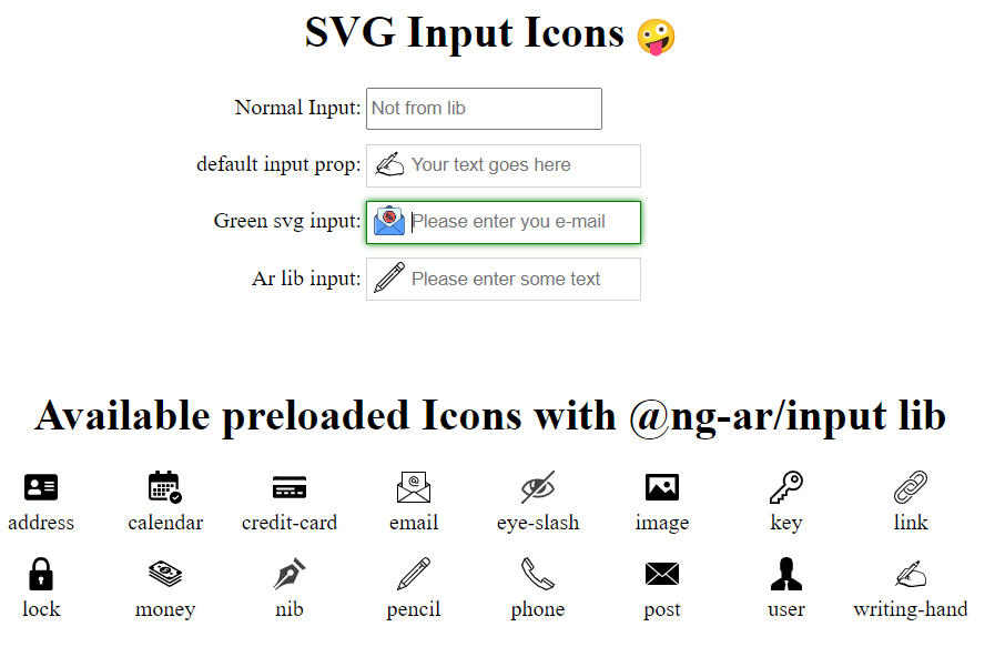
Here is how the inputs with the icons look like on the screen:
Installation
This is how to install the components:
npm install @ng-ar/inputor
yarn add @ng-ar/inputMinimum angular version needed for this library is v13.0.0.
And on your application module:
import { InputModule } from '@ng-ar/input';

@NgModule({
  declarations: [ ...],
  imports: [
    BrowserModule,
    ....,
    InputModule
],
})
export class AppModule { }
Then we can use the Prime Ng Input in html view as below:
<div class="container">
  <h1>SVG Input Icons</h1>
  <div class="form">
    <div class="form-row">
      <label>Normal Input:</label>
      <input type="text" placeholder="Not from lib">
    </div>

    <div class="form-row">
      <label>default input prop:</label>
      <ng-ar-input>
        <input type="text" placeholder="Your text goes here">
      </ng-ar-input>
    </div>

    <div class="form-row input-green-theme">
      <label>Green svg input:</label>
      <ng-ar-input src="../assets/images/blue-mail.svg" [isSrcUrl]="true" [isIconColorChange]="false">
        <input type="email" placeholder="Please enter you e-mail">
      </ng-ar-input>
    </div>

    <div class="form-row">
      <label>Ar lib input:</label>
      <ng-ar-input [icon]="pencil">
        <input type="text" placeholder="Please enter some text">
      </ng-ar-input>
    </div>
  </div>
</div>
The html core components to be added
  <ng-ar-input [isIconColorChange]="true" icon="pencil">
    <input type="text" placeholder="Your text goes here">
  </ng-ar-input>

  <ng-ar-input src="../assets/images/blue-mail.svg" [isSrcUrl]="true" [isIconColorChange]="false">
    <input type="email" placeholder="Please enter you e-mail">
</ng-ar-input>- The inputs receive a prop named
iconthat identifies which pre-stored icon we want to apply. - You can add all the things as per your requirement inside
<input>html element. - If you are not providing
icon, default icon will be applied. - You can find all the available icons in the demo image.
- Aprat from pre-stored icons, user also can provide their own svg. To enable this, user has to provide the value
trueto the propisSrcUrl. Then user can pass the image loction, to the propsrc. Default value ofisSrcUrlisfalse. isIconColorChangeprop will give the user an extra control of whether to highlight the svg on focus(html input) or not. Default value istrue.
Using add-on extra theme
  <div class="form-row input-green-theme">
    <label>Green svg input:</label>
    <ng-ar-input src="../assets/images/blue-mail.svg" [isSrcUrl]="true" [isIconColorChange]="false">
      <input type="email" placeholder="Please enter you e-mail">
    </ng-ar-input>
</div>- Add
input-green-themeto the ancestor of the selector (say<ng-ar-input></ng-ar-input>), then the particular them will be applied to the child(children).
Sample scss (you can uses css also) used for the demo.
.container {
  padding-top: 4.1rem;
  padding-bottom: 2rem;
  display: flex;
  flex-direction: column;
  justify-content: center;
  align-items: center;

  & h1{
    text-align: center;
  }
}

.form-row {
  width:500px;
  margin-bottom: 10px;

  & label {
    width: 157px;
    text-align: right;
    padding-right: 3px;
    display: inline-block;
  }

  & input {
    height: 25px;
  }
}