
@ng-ar/md-input
v13.0.3
Published
This angular npm library package allows us to add an icon inside a html input element, which helps better identify common input fields like email, etc.
Downloads
9
Maintainers
 actionanand
Readme
Angular Material Input(MdInput)
This angular npm library package allows us to add an icon inside a html input element, which helps better identify common input fields like email, etc.
The default theme of the input is designed to look just like a plain HTML input, including the focus blue border (tab and shift-tab are supported)
Demo
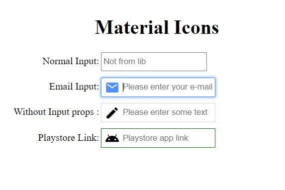
Here is how the inputs with the icons look like on the screen:
Installation
This is how to install the components:
npm install @ng-ar/md-inputor
yarn add @ng-ar/md-inputMinimum angular version needed for this library is v13.0.0.
And on your application module:
import { MdInputModule } from '@ng-ar/md-input';

@NgModule({
  declarations: [ ...],
  imports: [
    BrowserModule,
    ....,
    MdInputModule
],
})
export class AppModule { }
Add the following material icon style sheet url to your index.htlm file.
<link href = "https://fonts.googleapis.com/icon?family=Material+Icons" rel = "stylesheet">Then we can use the Prime Ng Input in html view as below:
<div class="container">
  <h1>Material Icons</h1>
  <div class="form">
    <div class="form-row">
      <label>Normal Input:</label>
      <input type="text" placeholder="Not from lib">
    </div>

    <div class="form-row">
      <label>Email Input:</label>
      <ng-ar-md-input [icon]="'mail'">
        <input class="normal-input" type="email" name="email" placeholder="Please enter your e-mail">
      </ng-ar-md-input>
    </div>

    <div class="form-row">
      <label>Without Input props :</label>
      <ng-ar-md-input>
        <input class="normal-input" type="text" placeholder="Please enter some text">
      </ng-ar-md-input>
    </div>

  </div>
</div>
The html core components to be added
  <ng-ar-md-input icon="edit">
    <input type="text" placeholder="please enter your text">
</ng-ar-md-input>- The inputs receive a prop named
iconthat identifies which material icon we want to apply. - You can add all the things as per your requirement inside
<input>html element. - If you are not providing
icon, default icon will be applied. - You can find the available Material Icons' Symbols
Using add-on extra theme
  <div class="form-row md-input-green-theme">
    <label>Playstore Link:</label>
    <ng-ar-md-input icon="android">
      <input class="normal-input" type="url" name="url" placeholder="Playstore app link">
    </ng-ar-md-input>
</div>- Add
md-input-green-themeto the ancestor of the selector (say<ng-ar-md-input></ng-ar-md-input>), then the particular them will be applied to the child(children).
Sample scss (you can uses css also) used for the demo.
.container {
  padding-top: 4.1rem;
  padding-bottom: 2rem;
  display: flex;
  flex-direction: column;
  justify-content: center;
  align-items: center;

  & h1{
    text-align: center;
  }
}

.form-row {
  width:500px;
  margin-bottom: 10px;

  & label {
    width: 157px;
    text-align: right;
    padding-right: 3px;
    display: inline-block;
  }

  & input {
    height: 25px;
  }
}