@ng-ar/tab
v14.0.5
Published
This angular npm library package will help us create tabs with appropriate contents. There is a default style for the tab panel and tab. The interesting part is user also can provide there own template, if they have their own.
Maintainers
 actionanand
Readme
Angular Tab
This angular npm library package will help us create tabs with appropriate contents. There is a default style for the tab panel and tab. The interesting part is user also can provide there own template, if they have their own.
Demo
Here is how the tabs(default) look like on the screen:
Installation
This is how to install the components:
npm install @ng-ar/tabor
yarn add @ng-ar/tabMinimum angular version needed for this library is v14.0.2.
And on your application module:
import { TabModule } from '@ng-ar/tab';

@NgModule({
  declarations: [ ...],
  imports: [
    BrowserModule,
    ....,
    TabModule
],
})
export class AppModule { }
We can use them as below in HTML view:
<div class="container">
  <ng-ar-tab-panel>
    <ng-ar-tab title="Login">
      <form>
        <div class="form-field">
            <label>Email:</label><input class="login-email">
        </div>
        <div class="form-field">
            <label>Password:</label><input>
        </div>
      </form>
    </ng-ar-tab>

    <ng-ar-tab title="Sign Up">
      <form>
        <div class="form-field">
            <label>Email:</label><input>
        </div>
        <div class="form-field">
            <label>Password:</label><input>
        </div>
        <div class="form-field">
            <label>Confirm Password:</label><input>
        </div>
      </form>
    </ng-ar-tab>

    <ng-ar-tab title="Contact">
      <form>
        <div class="form-field">
            <label>Email:</label><input class="contact-email">
        </div>
        <div class="form-field">
            <label>Message:</label>
            <textarea></textarea>
        </div>
      </form>
    </ng-ar-tab>
  </ng-ar-tab-panel>
</div>
Prop title is used to pass the tab name. If you want to select some tab when loading, you can pass the prop selected and value as true to the particular tab.
General partern as follow:
<ng-ar-tab-panel>
  <ng-ar-tab title="My Title" [selected]="true">
    ... html content
  </ng-ar-tab>
</ng-ar-tab-panel>
You can find the demo project scss as below:
.container {
margin: 0 auto;
max-width: 400px;
padding-top: 1rem;
& .form-field {
display: inline-block;
margin-bottom: 10px;
& label {
display: inline-block;
width: 100px;
text-align: right;
margin-right: 5px;
}
& input {
height: 20px;
border-radius: 2px;
}
& input, textarea {
border: 1px solid grey;
}
}
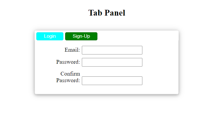
}We can see how user can provide their own html and style as below:
<div class="container">
  <ng-template #headerButtons>
    <button (click)="tabPanel.onSelectTab(loginTab)" class="btn-test"
      [ngClass]="{ 'btn-selected': tabPanel.tabSelected?.title === 'Login' }">
      Login
    </button>
    <button (click)="tabPanel.onSelectTab(signupTab)" class="btn-test"
      [ngClass]="{ 'btn-selected': tabPanel.tabSelected?.title === 'Sign Up' }">
      Sign-Up
    </button>
  </ng-template>

  <ng-ar-tab-panel [headerTemplate]="headerButtons" #tabPanel>
    <ng-ar-tab title="Login" #loginTab>
      <form>
        <div class="form-field">
            <label>Email:</label><input class="login-email">
        </div>
        <div class="form-field">
            <label>Password:</label><input>
        </div>
      </form>
    </ng-ar-tab>

    <ng-ar-tab title="Sign Up" #signupTab>
      <form>
        <div class="form-field">
            <label>Email:</label><input>
        </div>
        <div class="form-field">
            <label>Password:</label><input>
        </div>
        <div class="form-field">
            <label>Confirm Password:</label><input>
        </div>
      </form>
    </ng-ar-tab>
  </ng-ar-tab-panel>
</div>
Prop headerTemplate used to feed template and tabSelected public api object is used to know the currently selected tab. You can define your template with ng-template angulat html tag.
you can find the sample style for the new template as below:
.btn-test{
  display: inline-block;
  color: white;
  background-color: aqua;
  padding: 2px 20px;
  cursor: pointer;
  margin-left: 5px;
  margin-top: 5px;
  border: 1px solid rgb(17, 239, 239);
  border-radius: 4px;

  &:hover {
    background-color: white;
    color: rgb(17, 239, 239);
    border: 1px solid rgb(17, 239, 239);
  }
}

.btn-selected {
  background-color: green;
  border: 1px solid rgb(6, 95, 6);
}
You can find the demo screenshot for the html provided one as below: