
@ngx-tailwind-ui/bottom-sheet-modal
v7.1.1
Published
Angular 22 and TailwindCSS 4 Bottom Sheet Modal

Maintainers
 quedicesebas
Readme
🪟 @ngx-tailwind-ui/bottom-sheet-modal
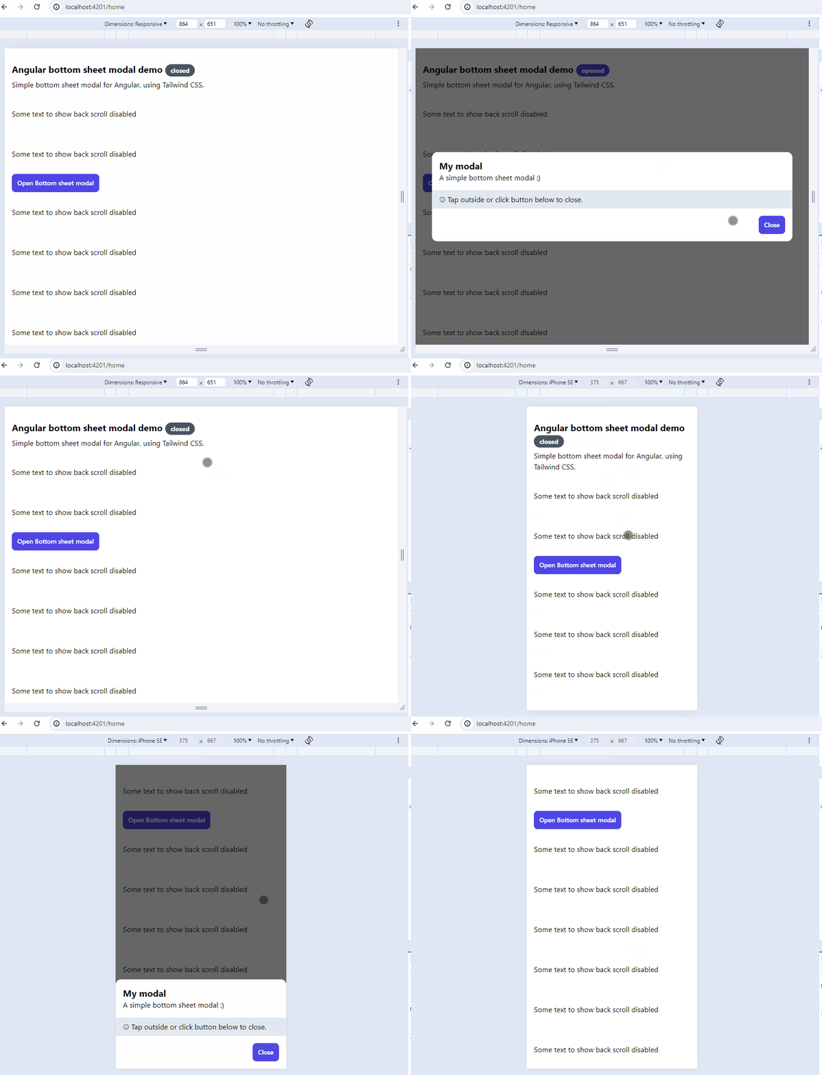
A responsive bottom sheet modal component for Angular applications that adapts to screen size. On mobile devices, it slides up from the bottom, while on desktop it appears as a centered modal dialog. Built with TailwindCSS for easy customization.
✨ Features
- 📱 Responsive Design: Automatically adapts to screen size
- 📲 Mobile: Slides up from bottom
- 🖥️ Desktop: Centered modal dialog
- 🎯 Smooth Animations: Built-in enter/exit transitions
- ♿ Accessibility: ARIA labels and keyboard navigation support
- 🌓 Dark Mode: Built-in support for dark mode themes
- 🎨 Customizable: Easy to style with TailwindCSS
- 📦 Data Passing: Pass data to modal components
- 🖱️ Backdrop Click: Option to close on backdrop click
- ⌨️ Escape Key: Option to close with Escape key
🎮 Demo
View the live demo to see the component in action.
🛠️ Prerequisites
- Angular 17+ project
- Tailwind CSS (v3 or v4) configured in your project
📦 Installation
npm install @ngx-tailwind-ui/bottom-sheet-modalConfigure Tailwind CSS
To scan the bottom sheet modal for styles:
For Tailwind CSS v4 (Recommended)
Add the @source directive to your main stylesheet (e.g. src/styles.scss or src/styles.css):
@import "tailwindcss";

@source "../node_modules/@ngx-tailwind-ui/bottom-sheet-modal/**/*.{html,ts,js,mjs}";
For Tailwind CSS v3
Add the package path to the content array in your tailwind.config.js file:
/** @type {import('tailwindcss').Config} */
module.exports = {
  content: ["./src/**/*.{html,ts}", "./node_modules/@ngx-tailwind-ui/bottom-sheet-modal/**/*.{html,ts,js,mjs}"],
  theme: {
    extend: {},
  },
  plugins: [],
};
🚀 Usage
1. Add the Component
Add the bottom sheet modal wrapper to your app root component:
import { Component } from "@angular/core";
import { RouterOutlet } from "@angular/router";
import { TauiBottomSheetModalComponent } from "@ngx-tailwind-ui/bottom-sheet-modal";

@Component({
  selector: "app-root",
  template: `
    <router-outlet></router-outlet>
    <taui-bottom-sheet-modal />
  `,
  imports: [RouterOutlet, TauiBottomSheetModalComponent],
})
export class AppComponent {}
2. Create Modal Content Component
Create a component for your modal content:
import { Component, Input, inject } from "@angular/core";
import { TauiBottomSheetModalService } from "@ngx-tailwind-ui/bottom-sheet-modal";

@Component({
  selector: "app-modal-content-component",
  template: `
    <div class="pt-4 md:w-96 bg-white dark:bg-slate-900 dark:text-white">
      <div class="px-4">
        <h1 class="font-bold text-xl">{{ title }}</h1>
        <p>{{ description }}</p>
      </div>
      <p class="px-4 py-2 mt-4 bg-slate-200 dark:bg-slate-700">ⓘ Tap outside, press Esc or click button below to close.</p>
      <div class="p-4 flex justify-end sticky bottom-0 bg-white dark:bg-slate-900 border-t-2 border-gray-200 dark:border-slate-700 w-full md:rounded-b-xl">
        <button type="button" (click)="close()" class="bg-cyan-600 text-white text-sm leading-6 font-medium py-2 px-3 rounded-lg">Close</button>
      </div>
    </div>
  `,
})
export class ModalContentComponent {
  private readonly bottomSheetModalService = inject(TauiBottomSheetModalService);

  @Input() title!: string;
  @Input() description!: string;

  close() {
    this.bottomSheetModalService.closeBottomSheet();
  }
}
3. Open the Modal
Inject the service and open the modal:
import { Component, inject } from "@angular/core";
import { TauiBottomSheetModalService } from "@ngx-tailwind-ui/bottom-sheet-modal";
import { ModalContentComponent } from "./modal-content.component";

@Component({
  selector: "app-demo",
  template: ` <button type="button" (click)="openModal()" class="bg-cyan-600 text-white leading-6 font-medium py-2 px-3 rounded-lg">Open Modal</button> `,
})
export class DemoComponent {
  private readonly bottomSheetModalService = inject(TauiBottomSheetModalService);

  openModal() {
    this.bottomSheetModalService.openBottomSheet({
      contentComponent: ModalContentComponent,
      inputs: {
        title: "Welcome",
        description: "This is a responsive bottom sheet modal.",
      },
      onClose: () => {
        console.log("Modal closed");
      },
    });
  }
}
📚 API Reference
BottomSheetModalService
| Method | Parameters | Description |
| ------------------ | ---------------------------------- | ------------------------------------------------------------- |
| openBottomSheet | config: TauiBottomSheetModalConfig | Opens the bottom sheet modal with the specified configuration |
| closeBottomSheet | - | Closes the currently open bottom sheet modal |
TauiBottomSheetModalConfig
| Property | Type | Required | Default | Description |
| ------------------ | ----------------------- | -------- | ---------------------------------- | ---------------------------------------------------------------------- |
| contentComponent | Type | Yes | - | The component class to render inside the modal |
| inputs | Record<string, unknown> | No | - | Input properties to pass to the content component |
| onClose | () => void | No | - | Callback function called when the modal is closed |
| canClose | boolean | No | true | Whether the modal can be closed by clicking outside or pressing Escape |
| showCloseButton | boolean | No | true | Whether to show the close button in the top-right corner |
| closeButtonClass | string | No | "text-gray-500 dark:text-gray-300" | CSS classes for the close button |
💡 Examples
Basic Modal
this.bottomSheetModalService.openBottomSheet({
  contentComponent: SimpleModalComponent,
  inputs: {
    title: "Simple Modal",
  },
});
Modal with Custom Close Button
this.bottomSheetModalService.openBottomSheet({
  contentComponent: CustomModalComponent,
  showCloseButton: true,
  closeButtonClass: "text-blue-500 hover:text-blue-700",
});
Modal with Callback
this.bottomSheetModalService.openBottomSheet({
  contentComponent: CallbackModalComponent,
  onClose: () => {
    // Handle modal close
    console.log("Modal closed");
  },
});
🌐 Browser Support
The package is tested and supported on the following browsers:
- Chrome (latest)
- Safari (latest)
- Edge (latest)
📦 Dependencies
- Peer Dependencies:
- @angular/common: ^19.2.0
- @angular/core: ^19.2.0
- Runtime Dependencies:
- tslib: ^2.3.0
⚡ Performance Considerations
- Change Detection: Optimized to minimize change detection cycles
- Lazy Loading: Supports lazy loading for better initial load performance
- Bundle Size: Minimal impact on bundle size
- Memory Usage: Efficient memory management
♿ Accessibility
The component includes built-in accessibility features:
- ARIA labels for screen readers
- Keyboard navigation support
- Focus management
- Mobile-friendly interactions
🤝 Contributing
Contributions are welcome!
📄 License
This project is licensed under the MIT License - see the LICENSE file for details.