
@nouisi/orb
v0.1.1
Published
<noui-orb>: the living orange o of the noui mark. A voice surface and loading indicator as a framework-free Web Component.

Maintainers
 revupulse-admin
Readme
@nouisi/orb
<noui-orb> is the living form of the orange o in the noui mark: a voice surface, a loading and processing indicator, and the place assembled interface comes from. It is a framework-free Web Component (Custom Elements v1, Shadow DOM) with no runtime dependencies, about 16 KB gzipped.
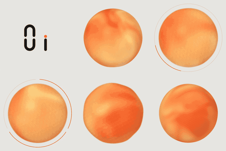
Try it: https://noui-orb-demo.pages.dev/lab/orb/ (it will also live at https://noui.si/lab/orb/). The demo has a Get started walkthrough and runs on the public API only.
Status: early release (0.1.x). It is a scripted prototype: it draws and reacts to audio, it does not understand speech. Your app listens and thinks and tells the orb what is happening. Tested in Chrome and Safari; not yet in Firefox. The full reference is docs/SPEC.md.
Quick start
npm i @nouisi/orb<noui-orb id="orb" gestures intro="auto" style="width: 320px"></noui-orb>
<script type="module">
import "@nouisi/orb"; // registers <noui-orb>
const orb = document.getElementById("orb");
orb.state = "thinking"; // idle | listening | thinking | working | speaking | error
orb.addEventListener("orb-statechange", (e) => console.log(e.detail)); // { from, to }
orb.state = "working";
orb.progress = { steps: 3, done: 1, current: 0.4 }; // determinate ring; null means the spinning arc
orb.gesture("nod").catch(() => {}); // rejects with "suppressed" when gestures are off or rate limited
</script>- Size the element from the outside; it fills its box and should be square.
- Without the
gesturesattribute, character motion (springs, lean, breath, wait) is off. States, audio and the ring still work. intro="manual"(the default) shows the logo and waits fororb.intro(). Useintro="auto"to play it on load orintro="none"to start as the orb.- Importing
@nouisi/orb/elementgives you the class without registering it.
API
Attributes
| Attribute | Values | Default | Notes |
|---|---|---|---|
| state | idle listening thinking working speaking error | idle | Same as the state property. |
| placement | center room aside | center | Where the orb sits inside its box. |
| gestures | boolean | absent (off) | Character motion: springs, lean, breath, wait. States, audio and the ring work without it. |
| intro | auto manual none | manual | auto plays the logo intro on first connect, none starts as the orb, manual waits for intro(). |
| reduced-motion | auto on off | auto | auto follows prefers-reduced-motion. |
| label | string | noui | Used in the accessible name ("noui is listening"). |
Properties
| Property | Type | Notes |
|---|---|---|
| state | OrbState | Setting it fires orb-statechange. |
| placement | Placement | Same as place() without the promise. |
| gestures | boolean | |
| progress | { steps, done, current? } \| null | Determinate ring while working. null shows the spinning arc, never fake progress. |
| config | partial OrbConfig | Tuning (reactivity, swell, attack and release, flow, grain, geometry, placements). Assign a partial; read it back as a full copy. Defaults are in SPEC §13. |
| levels | read-only | The smoothed signal the orb is showing: { amp, bright, bass, treble, pace, paceRate }. For your own meters. |
Methods
| Method | What it does |
|---|---|
| gesture(name, { target?, duration? }) | Plays nod, shake, huh, hop, interrupt, emit, point or wait. Resolves when the motion settles. Rejects with "suppressed" if gestures are off, reduced motion is on or the 1.2 s rate limit drops it. target is an element or DOMPoint (for point); duration is in ms. |
| stopWaiting() | Ends a running wait. |
| place(placement) | Moves the orb inside its box (650 ms, springy). Resolves when it arrives. |
| originRect() | { x, y, r }: the orb's circle in viewport pixels, to animate your interface out of it or into it. |
| attachInput(stream \| node) / detachInput() | The user's voice (a MediaStream or AudioNode). Drives listening. |
| attachOutput(element \| node) / detachOutput() | The reply's audio. Drives speaking. |
| setLevels({ amp, bright?, bass?, treble? }, "input" \| "output") | Push levels instead of attaching audio. Call it every frame or analysis tick; levels older than 300 ms are ignored. |
| intro() / outro() | Logo to orb (about 3.4 s) and back (about 1.3 s). |
Events
All bubble and are composed. The payload is in event.detail.
| Event | detail | When |
|---|---|---|
| orb-statechange | { from, to } | After state changes. |
| orb-gesture | { name, phase: "start" \| "end" } | Around every gesture, including automatic ones (the nod before thinking, the hop when a task finishes). |
| orb-recall | {} | The user clicked, tapped or pressed Enter or Space on the orb while it was aside. You decide whether to bring it back. |
| orb-intro-end, orb-outro-end | {} | A logo transition finished. |
| orb-input-silent | { seconds } | Input attached, state listening, and under 3% loudness for 4 s; or the input's track ended (seconds: 0). |
| orb-fallback | { reason } | WebGL is unavailable; the CSS fallback orb is in use. |
Theming
The orb's own colours are brand constants and never change. The ring and the mark follow the light or dark scheme, and you can override them with CSS custom properties on the element or any ancestor: --orb-accent, --orb-mark-ink, --orb-ring, --orb-ring-track, --orb-ring-broken.
Accessibility
The element has role="img" and an accessible name that tracks the state ("noui is working, step 2 of 3"). Name changes are not announced, so show the reply as text or captions. It is not focusable, except in aside, where it becomes a button named "Bring back noui". prefers-reduced-motion turns gestures off, makes the intro a 200 ms crossfade and slows the flow to 0.35x.
Microphone and audio
The component never asks for the microphone. You do, and hand it the stream:
const stream = await navigator.mediaDevices.getUserMedia({
  audio: { echoCancellation: false, noiseSuppression: false, autoGainControl: true },
});
orb.attachInput(stream);       // the user's voice (drives `listening`)
orb.state = "listening";

orb.attachOutput(audioElement); // the reply's audio (drives `speaking`); an AudioNode works too
If you analyse audio yourself (a native bridge, server-side audio), push levels instead: orb.setLevels({ amp, bright, bass, treble }, "input" | "output"). The orb fires orb-input-silent when an attached input stays quiet for 4 s or its track ends. Call getUserMedia from a click or tap, and serve the page over HTTPS.
Driving it from a voice pipeline
The component stays dumb on purpose: it has no speech recognition and makes no network calls. Your app owns those and maps its events onto the orb. This is the pattern (vad, stt, tts and backend stand for whatever you use):
vad.on("speechStart", () => {
  if (orb.state === "speaking") { tts.stop(); orb.gesture("interrupt").catch(() => {}); }
  else orb.state = "listening";
});
vad.on("speechEnd", () => { orb.state = "thinking"; });        // the orb nods by itself
stt.on("final", (text) => backend.send(text));

backend.on("progress", (p) => { orb.state = "working"; orb.progress = p; });
backend.on("reply", (r) => {
  if (r.gesture && r.confidence >= 0.7) orb.gesture(r.gesture, { target: r.targetEl }).catch(() => {});
  if (r.ui) { orb.gesture("emit").catch(() => {}); renderCardFrom(orb.originRect(), r.ui); }
  if (r.audio) { orb.attachOutput(r.audio); orb.state = "speaking"; }
});
tts.on("ended", () => {
  orb.state = cardShown ? "idle" : "listening";
  if (cardShown) orb.gesture("wait").catch(() => {});
});

userStartsEditingCard(() => orb.place("aside"));
orb.addEventListener("orb-recall", () => orb.place(cardShown ? "room" : "center"));
Only send a gesture from your backend when it is confident (0.7 or more). A wrong nod is worse than no nod. While an on-device speech model downloads, use the ring as the progress bar: orb.state = "working"; orb.progress = { steps: 1, done: 0, current: bytes / total }.
Using it with a framework
It is a standard custom element, so it works anywhere a custom element does. Set object-valued things (progress, config) as properties, listen to events with addEventListener, and import the package only in code that runs in the browser or is safe to run on the server (see below).
Verified in this repo: plain JavaScript, React 19, and importing and server-rendering under Node. The other frameworks below follow the same custom element rules but have not been tried here.
React 19
Props are set as properties when the element has them, and on<event-name> attaches an event listener, so this works directly:
import "@nouisi/orb";

function Orb({ state, progress }) {
  return (
    <noui-orb
      state={state}
      progress={progress}                       // an object, set as a property
      gestures=""                               // boolean attribute: present means on
      onorb-statechange={(e) => console.log(e.detail)}
      style={{ width: 320 }}
    />
  );
}
Call methods through a ref: ref.current.gesture("hop"), ref.current.originRect().
React 18 and earlier
React 18 turns object props into strings and has no event props for custom elements. Use a ref:
const ref = useRef(null);
useEffect(() => { ref.current.progress = progress; }, [progress]);
useEffect(() => {
  const el = ref.current;
  const on = (e) => console.log(e.detail);
  el.addEventListener("orb-statechange", on);
  return () => el.removeEventListener("orb-statechange", on);
}, []);
return <noui-orb ref={ref} state={state} gestures="" />;
Next.js and other server-rendered apps
The package is safe to import on a server: it only registers the element when customElements exists, so there is no HTMLElement is not defined. The server renders an empty <noui-orb> tag, and the browser upgrades it. In the Next.js App Router, use it from a client component ("use client") as in the React example. I verified importing under Node and rendering with react-dom/server; I have not run a full Next.js app.
Vue 3
Tell the compiler it is a custom element (compilerOptions.isCustomElement: (tag) => tag === "noui-orb"), then use .prop for objects: <noui-orb :state="state" :progress.prop="progress" gestures @orb-statechange="onChange" />.
Svelte
Svelte sets props on custom elements as properties and supports on: for their events: <noui-orb {state} {progress} gestures on:orb-statechange={onChange} />.
Not provided yet
- Type declarations for the
<noui-orb>tag in React JSX, Vue templates and Svelte. The element class and its types are exported (NouiOrbElement,OrbState,OrbProgress, ...), so you can write the declaration for your framework yourself. - CommonJS and a plain
<script>tag build. The package is ESM only. - Thin framework wrapper packages.
Licence
The code is MIT licensed (see LICENSE). The noui name and the noui mark are not licensed for reuse.