
@olivieralexander/usetabs
v1.0.3
Published
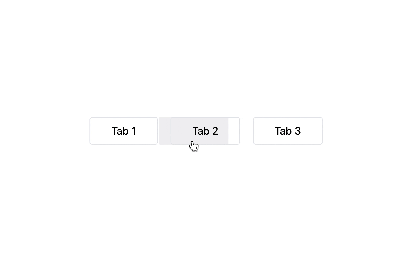
Reusable implementation of Emil Kowalskis smooth tab hover effect

Readme
useTabs
Reusable way to create smooth tab highlights.
Installation
Install with npm
npm install @olivieralexander/usetabsYarn
yarn add @olivieralexander/usetabsPnpm
pnpm add @olivieralexander/usetabsUsage/Examples
To get started you will need a couple things:
- A component or element to be used as the highlighter.
- A container element with a ref and position relative that will wrap your tabs.
useTabs will return 2 things:
setHightlight(ref | e): function to trigger the hightlight, takes either a react ref, focus or mouseEnter event.hightlightStyles: object containing styles that will need to be applied on your highlight element.
Note: These examples use TailwindCSS but you're free to use any styling library you want.
setHightlight
<li onMouseEnter={setHightlight} onFocus={setHighlight}>
    Tab 1
</li>
It is also advised to add a onMouseLeave event on the container to hide the highlight when the user finished hovering.
<div className="container" ref={containerRef} onMouseLeave={() => setHighlight(null)} />hightlightStyles
<div
  style={highlightStyles}
  className="bg-gray-500 bg-opacity-10 rounded-sm"
/>
Full Example:
import { useRef } from "react";
import useTabs from "@olivieralexander/usetabs";

export default function Home() {
  const containerRef = useRef(null);
  const defaultRef = useRef(null);

  const { setHightlight, highlightStyles } = useTabs({
    container: containerRef,
    // defaultTab: defaultRef,
    // duration: 150,
  });

  const tabs = [
    {
      name: "Tab 1",
      id: "tab-1",
    },
    {
      name: "Tab 2",
      id: "tab-2",
    },
    {
      name: "Tab 3",
      id: "tab-3",
    },
  ];

  return (
    <main className="w-screen h-screen grid place-items-center">
      <ul className="w-[50%] flex md:flex-row gap-2 justify-between relative" ref={containerRef}>
        {tabs.map((tab, i) => (
          <li
            key={tab.id}
            className="py-2 px-8 border rounded cursor-pointer"
            ref={i === 1 ? defaultRef : null}
            onMouseEnter={setHightlight}
          >
            {tab.name}
          </li>
        ))}

        <div
          style={highlightStyles}
          className="bg-gray-500 bg-opacity-10 rounded-sm"
        />
      </ul>
    </main>
  );
}
API Reference
useTabs
| Parameter | Type | Description |
| :-------- | :------- | :------------------------- |
| container | ref | Required. Ref of your tab container |
| defaultTab | ref | Ref of a tab you would like to set as the default highlighted tab |
| duration | number | Number to represent the amount of time in ms how long the animations should take |