
@open-tender/components-pos
v1.3.7
Published
A component library built for use with the Open Tender open source web app
Downloads
184


Readme
@open-tender/components-pos
A component library for use with the Open Tender open source POS and KDS apps:
This library is only relevant for restaurant brands that are customers of Open Tender. To learn more about establishing an Open Tender account, please visit our website.
Installation
Install via yarn:
yarn add @open-tender/components-posOr via npm:
npm install --save @open-tender/components-posPurpose
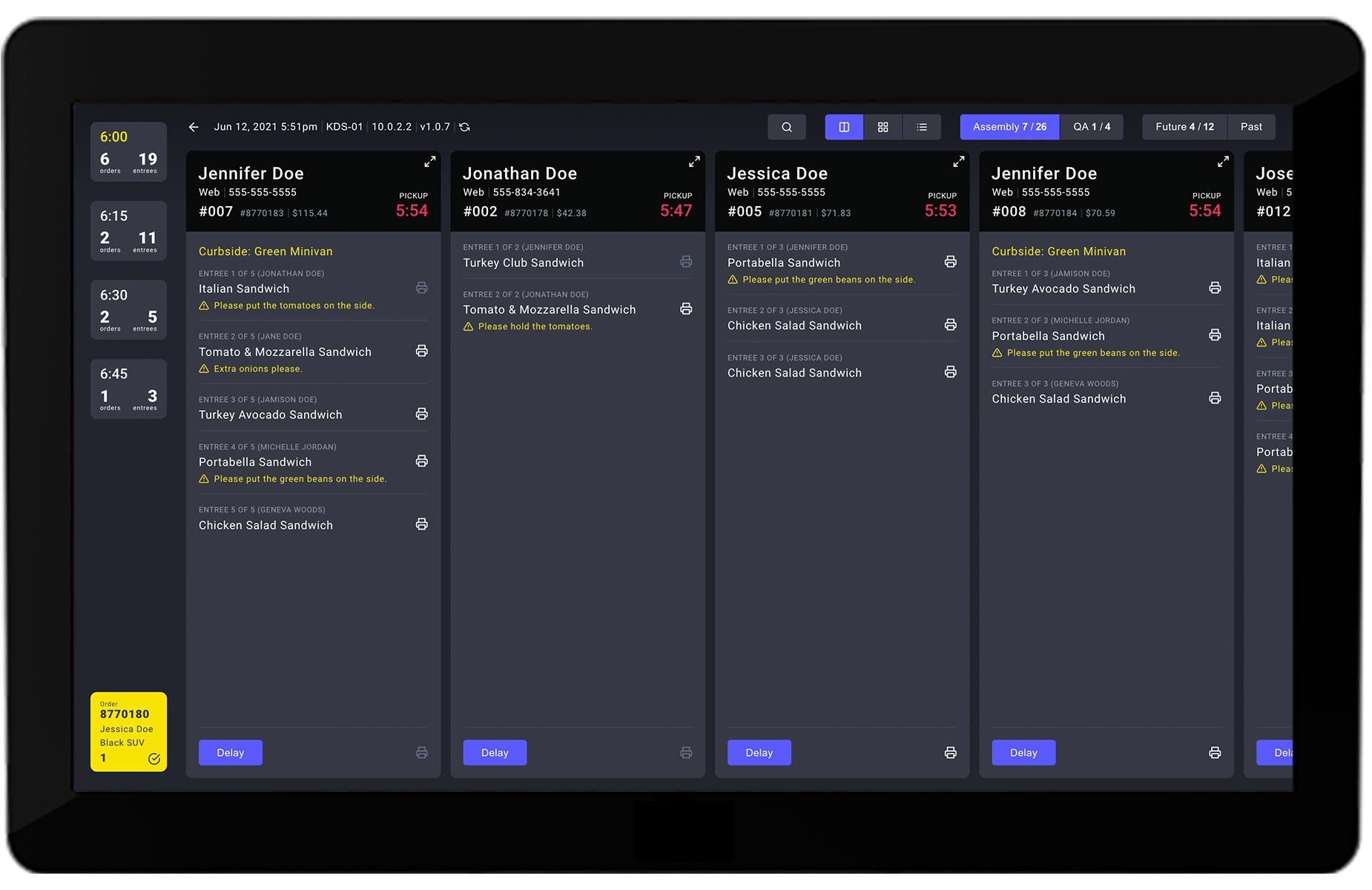
This library provides many of the components used in the Open Tender POS app and KDS app, which is useful for providing a similar interface across both applications. This is helpful because the apps are typically utilized by the same set of employees at a given restaurant. To give you a sense, here's what the two apps look like:
Open Tender POS App

Open Tender KDS App
Storybook
You can find the storybook for all of the available components here:
@open-tender/components-pos Storybook
Theme Support via Emotion
This library leverages Emotion for CSS-in-JS styled components and theme support via the @emotion/react and @emotion/styled packages, which are installed and passed down in each of the open-tender-pos app and open-tender-kds app.
The theme itself is also passed down by the POS and KDS app, but, out of the box, the theme originates in this component libray (in order to provide a common set of styles). However, you can easily override this with your own theme in the <App /> component of each of the apps.
Usage
Here's an example of a custom component that is built exclusively from components from this library:
import {
  ModalClose,
  ModalHeader,
  ModalFooter,
  Button,
  ButtonGroup,
} from '@open-tender/components-pos'
const CustomModal = () => {
// code excluded for brevity
return (
<>
<ModalClose close={() => dispatch(closeModal())} />
<ModalHeader title="Please swipe card" />
<ModalFooter>
<ButtonGroup>
<Button text="Cancel" onClick={cancelSwipe} color="active" />
<Button text="Enter Pin" onClick={enterPin} color="dark" />
</ButtonGroup>
</ModalFooter>
</>
)
}As you can see above, each of the buttons has a color prop that determines the color scheme. You can refer to the @open-tender/components-pos Storybook to see all of the possibilities.
More Examples
You can see many more examples in the open-tender-pos and open-tender-kds apps themselves.
Issues
If you find a bug or have a question, please file an issue on our issue tracker on GitHub.
License
About
Built and maintained by Open Tender.