
@othree/react-designer
v1.0.20
Published
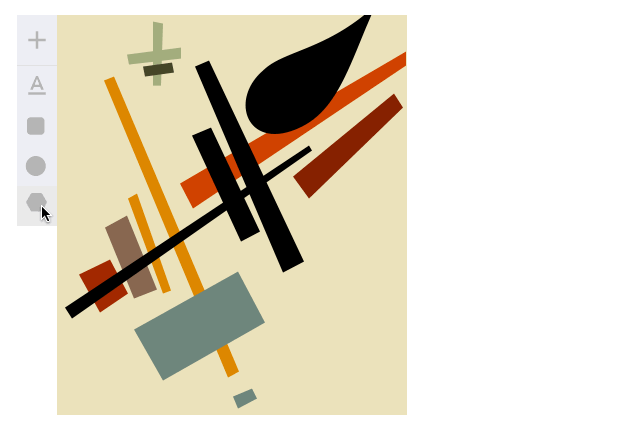
Easy to configure, lightweight, editable vector graphics in your react components.
Downloads
68

Readme
This project is back to being maintained, redirect any new PRs and issues to @wassgha
React-designer

Easy to configure, lightweight, editable vector graphics in your react components.
- Supports polygon and shape designing (with bezier curves)
- Implemented default scale, rotate, drag, and arrange actions
- Custom object types and custom panels
Examples and demonstration: http://fatiherikli.github.io/react-designer
Keymap
| Parameter | Default |
| :------------- |:-------------------------------
| del or back | Removes the current object |
| arrows | Move the current object by 1px |
| shift + arrows | Move the currnet object by 10px |
| enter | Close the drawing path |
Usage
All the entities are pure react components except action strategies in react-designer. I have tried to explain that. I'm starting with components.
Component: Designer
This is the main canvas component which holds the all toolset and manages all drawing data. You could use this component to create drawing canvas.
An example with default configuration:
import Designer, {Text, Rectangle} from 'react-designer';

class App() {
  state = {
    objects: [
      {type: "text", x: 10, y: 20, text: "Hello!", fill: "red"},
      {type: "rect", x: 50, y: 70, fill: "red"}
    ]
  }

  render() {
    return (
      <Designer width={250} height={350}
        objectTypes={{
          'text': Text,
          'rect': Rect
        }}
        onUpdate={(objects) => this.setState({objects})}
        objects={this.state.objects} />
    )
  }
}
The Designer component expects the following parameters:
| Parameter | Default | | | :------------- |:------------------------------- | :----- | | width | 300 | The width of document | | height | 300 | The height of document | | canvasWidth | null | The width of canvas. Same with document if it's null. | | canvasHeight | null | The height of canvas. Same with document if it's null. | | objects | [] | Your object set. | | onUpdate | [] | Your update callback. | | objectTypes | Text, Circle, Rectangle, Path | Mapping of object types. | | insertMenu | | Insert menu component. You can set null for hiding | snapToGrid | 1 | Snaps the objects accordingly this multipier. | | rotator | rotate({object, mouse}) | The rotating strategy of objects | scale | scale({object, mouse}) | The scaling strategy of objects | drag | drag({object, mouse}) | The dragging strategy of objects
Object types are pure react components which are derived from Vector.
Component: Vector
You can create an object type by subclassing Vector component. Each object types have static meta object which contains icon and initial, and optionally editor value.
Example implementation:
class MyRectangle extends Vector {
  static meta = {
    icon: <Icon icon={'rectangle'} size={30} />,
    initial: {
      width: 5,
      height: 5,
      strokeWidth: 0,
      fill: "yellow",
      radius: 5,
      blendMode: "normal"
    }
  };

  render() {
    let {object, index} = this.props;
    return (
      <rect style={this.getStyle()}
         {...this.getObjectAttributes()}
         rx={object.radius}
         width={object.width}
         height={object.height} />
    );
  }
}
You can register this object type in your Designer instance.
<Designer
    objectTypes={{rectangle: MyRectangle}}
    width={500}
    height={500}
    onUpdate={...}
    objects={...}
    onUpdate={...} />
Apart from meta options, the vectors have panels static definition which contains the available panels of their.
Here are default panels in Vector component:
static panels = [
    SizePanel,
    TextPanel,
    StylePanel,
    ArrangePanel
];
Component: Preview
You can use Preview component to disable editing tool set and controllers. This component just renders the SVG output of your data. It may be useful for presenting edited or created graphic, instead of building a SVG file.
The parameters are same with Designer component, except for two: the onUpdate callback is not necessary and an additional responsive option can be added, which given the original width and height will expand the preview to cover the width and height of its parent component, scaling its SVG while keeping the original aspect ratio of elements. Note that the original width and height still need to be provided in order for the responsive Preview to work.
<Preview
  objectTypes={{rectangle: MyRectangle}}
  objects={this.state.objects}
  height={500}
  width={500}
  responsive />
Action strategies
The actions of rotate, scale, drag are pure functions. You can change this actions by passing your strategy. The action functions calling with the following object bundle.
{
  object, // the current object
  mouse, // mouse coordinates bundle. it have x and y attribtues
  startPoint, // starting points of mouse and object bundles.
  objectIndex, // the index of the object in the documen,
  objectRefs, // DOM references of objects in the document
}
Here are default action strategies:
Dragger
Moves the object to mouse bundle by the center of object.
// dragger.js
export default ({object, startPoint, mouse}) => {
  return {
    ...object,
    x: mouse.x - (startPoint.clientX - startPoint.objectX),
    y: mouse.y - (startPoint.clientY - startPoint.objectY)
  };
};
Scaler
Scales the object by the difference with startPoint and current mouse bundle. If the difference lower than zero, changes the position of object.
// scale.js
export default ({object, startPoint, mouse}) => {
  let {objectX, objectY, clientX, clientY} = startPoint;
  let width = startPoint.width + mouse.x - clientX;
  let height = startPoint.height + mouse.y - clientY;

  return {
    ...object,
    x: width > 0 ? objectX: objectX + width,
    y: height > 0 ? objectY: objectY + height,
    width: Math.abs(width),
    height: Math.abs(height)
  };
};
Rotator
Changes the rotation as degree of object. This action may needs some improvement, I'm calculating with a base value (45 degree) because of the rotator anchor is on the upper right corner of object.
// rotate.js
export default ({object, startPoint, mouse}) => {
  let angle = Math.atan2(
    startPoint.objectX + (object.width || 0) / 2 - mouse.x,
    startPoint.objectY + (object.height || 0) / 2 - mouse.y
  );

  let asDegree = angle * 180 / Math.PI;
  let rotation = (asDegree + 45) * -1;

  return {
    ...object,
    rotate: rotation
  };
};
To-do
I built this project to create user-designed areas in my side project. So, this was just a hobby project, there may be things missing for a svg editor. I'm open to pull requests and feedback, and I need help to maintain.
Here is a todo list that in my mind. You could extend this list.
- Implement
Exportpanel- Export selected object
- Export document
- Write initial tests and setup test environment
- Add a key map to keep the ratio of objects when scaling
- Implement theme support for UI
Release Notes
1.0.8
- Move React-dom dependency to dev-dependencies
1.0.6
Designercomponent exported as default now.- Added
insertMenuprop toDesignercomponent.
Contributors (You can add your name here in your pull-request)
- Fatih Erikli [email protected] - fatiherikli
- Wassim Gharbi [email protected] - wassgha
- iamraffe
- thatneat